Trendlines are useful linear graphs that make the direction of a data series clearer. Visualizing trends with a trendline, is a practical asset that makes analyzing charts easier, and completes the image for that data series.
Google Sheets lets you add trendlines to any chart with a click. But if you want to project the trend value in your spreadsheet's cells, then you can use the TREND function. Either way, you'll get a trendline on your chart.
What Is a Trendline?
A trendline, also called a line of best fit, is a line that shows where a series of data is headed and with what slope it is headed in that direction. By drawing a trendline in your chart, you can see how different values compare to the trend, judge how previous values have performed, and set targets for future values.
The trendlines in Google Sheets are linear by default and have an equation of y = ax + b, though you can change it to different types. A trendline is a line that's closest to all the values on average. This means that the trendline might pass through some values, and might be far off of some, but it is the best fit line that is closest to the values.
How to Add Trendlines to a Chart in Google Sheets
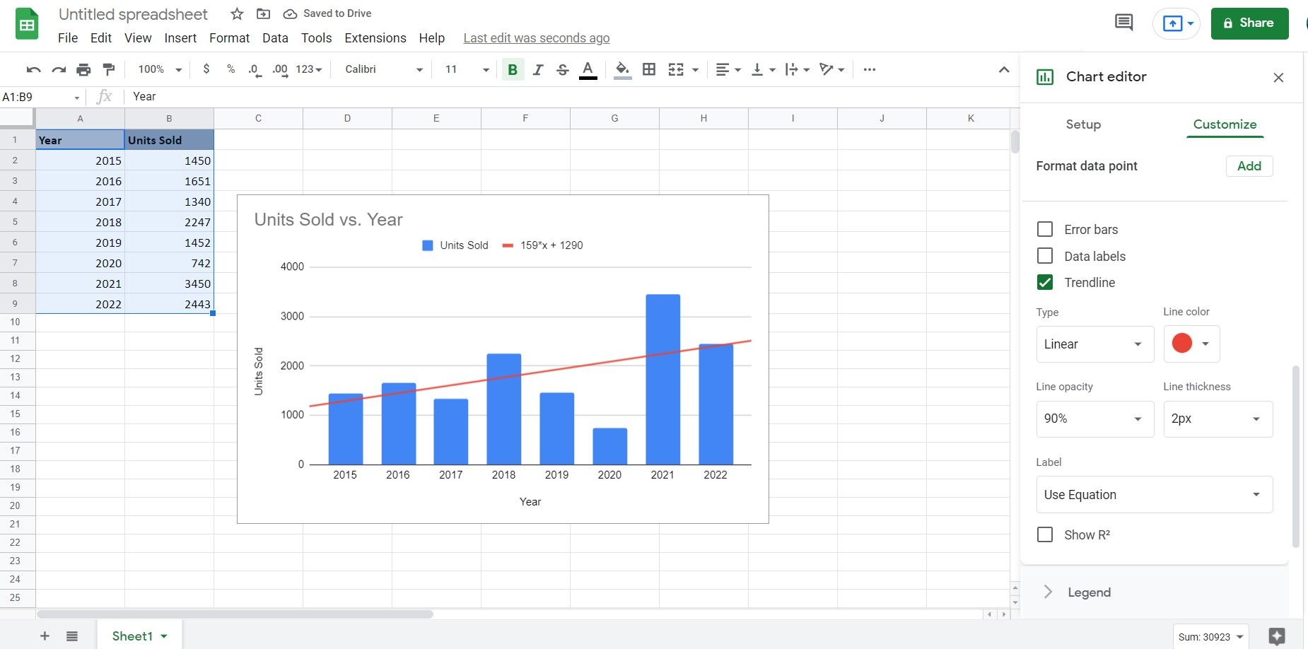
To add a trendline to your chart, you obviously need to have a chart first, and to have a chart, you need a series of data. In this sample spreadsheet, we have the number of units sold for a certain product each year. The goal is to create a column chart for this time series and then add a trendline to it.
- Select your series. In this example, those will be columns A and B.
- Go to Insert.
- Click Chart. Google Sheets will automatically create a chart for you.
- Go to the Chart editor window and click Setup.
- Under Chart type, select Column chart. Sheets will turn your chart into a column chart.
Now that you have the chart for your series, it's time to add a trendline to complete the image.
- Double-click the chart. This will bring up the Chart editor window.
- Go to Customize and then scroll to Series.
- Check Trendline. This will add a trendline to your chart and the trendline settings will become visible.
- Customize the trendline to your liking. You can also see the equation by changing the Label to Use Equation.
How to Create a Trendline With the TREND Function in Google Sheets
Alternatively, you could also use the TREND function to create a trendline. To do this, you'll need to create a series of projected values with the TREND function, and then create a chart for it.
=TREND(known_Ys, known_Xs, new_Xs)
The TREND function takes the known Xs and known Ys, creates a trendline, and then projects values for new Xs based on this trendline.
Let's create the same chart as the previous example (column chart with linear trendline) with the TREND function.
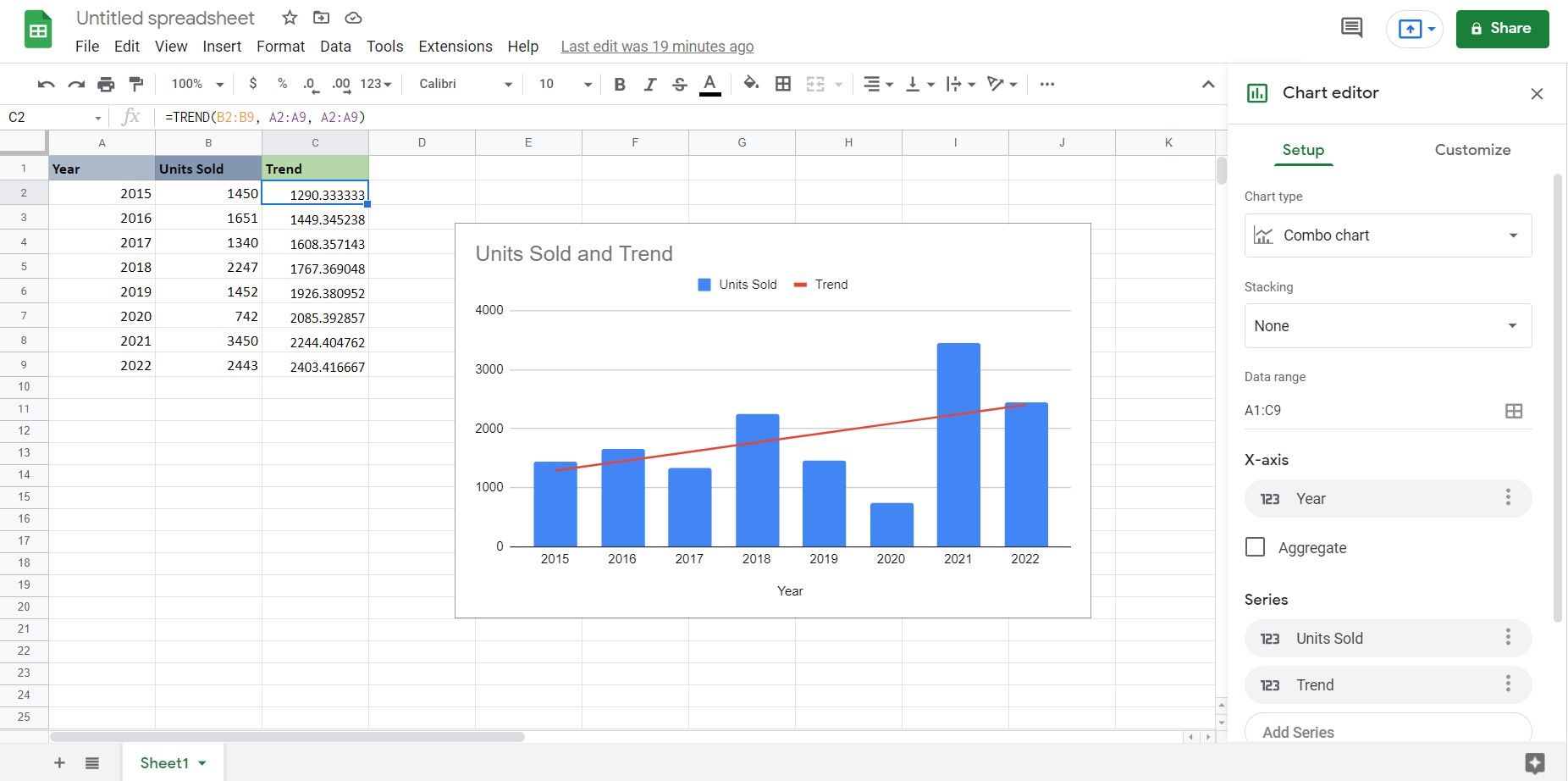
- Select the cell where you want to show the projected trend values. In this example, that will be cell C2.
-
Go to the formula bar and enter the formula below:
=TREND(B2:B9, A2:A9, A2:A9)
This formula feeds the units sold as the known Ys (B2 to B9) and then the years (A2 to A9) as the known Xs. Then again, it asks the TREND function to give new Ys based on the trendline for Xs A2 to A9. This will project Ys based on the trendline for the same Xs. - Press Enter. Google Sheets will now project the trend values.
- Select all three columns, and then go to Insert.
- Select Chart.
- In the Chart editor, change the Chart type to Combo chart. You now have a column chart of the actual units sold, with a trendline showing the trend.
Visualize the Trend
A trendline is a line that shows where a series of data is headed to. This trendline is used by analysts to make patterns clearer and compare values or set future targets.
In Google Sheets, you can either create a chart and then add a trendline to it, or use the TREND function to get the trend values and then draw a chart for it. Now you know how to do both and visualize the trend in your data series. Visualization is key!


