
A panel chart is two or more smaller charts combined into one, allowing you to compare data sets at a glance. Since these charts have the same axes and scale, with a clear dividing line between the different data sets, you quickly get a feel of the information presented.
Unfortunately, Excel does not have a built-in feature to create panel charts. But that doesn't mean we cannot create a panel chart in Excel.
So, we'll outline a step-by-step process for creating a panel chart in Microsoft Excel from scratch. Follow the instructions below, and you'll get a panel chart presenting your Excel data in no time.
Panel Chart Data
Before making a panel chart, you should first arrange your data logically. So, at least one column should be sorted in a way that puts your values into logical categories you want to see on your panel chart.
For this example, we're going to use the following data set:
|
Year |
Category |
Value 1 |
Value 2 |
|---|---|---|---|
|
2016 |
A |
100 |
200 |
|
2017 |
A |
90 |
190 |
|
2018 |
A |
120 |
220 |
|
2019 |
A |
110 |
210 |
|
2020 |
A |
130 |
230 |
|
2016 |
B |
80 |
180 |
|
2017 |
B |
70 |
170 |
|
2018 |
B |
95 |
195 |
|
2019 |
B |
105 |
205 |
|
2020 |
B |
75 |
175 |
|
2016 |
C |
85 |
185 |
|
2017 |
C |
95 |
195 |
|
2018 |
C |
100 |
200 |
|
2019 |
C |
60 |
160 |
|
2020 |
C |
70 |
170 |
You can copy the table above to your own Excel spreadsheet if you want to follow along as you learn how to make a panel chart.
Step 1: Add Separators to the Dataset
The first step is to organize your dataset into two sets of separators. Here's how to do that:

- Create a Separator column next to the value columns in your data set, i.e., Column E.
- Enter 1 under the Separator column next to all values of category A, i.e., E2:E6.
- Enter 2 under the Separator column next to all values of category B, i.e., E7:E11.
- Enter 1 under the Separator column next to all values of category C, i.e., E12:E16.
Keep alternating between 1 and 2 for each succeeding category, if any.
Step 2: Create a Pivot Table
The next step is to create a pivot table of our chart data to organize the data according to our needs. Create a pivot table in Excel by following the steps below:
- Select any cell from your dataset.
-
Click on Insert and select PivotTable. A Create PivotTable dialogue box will appear.
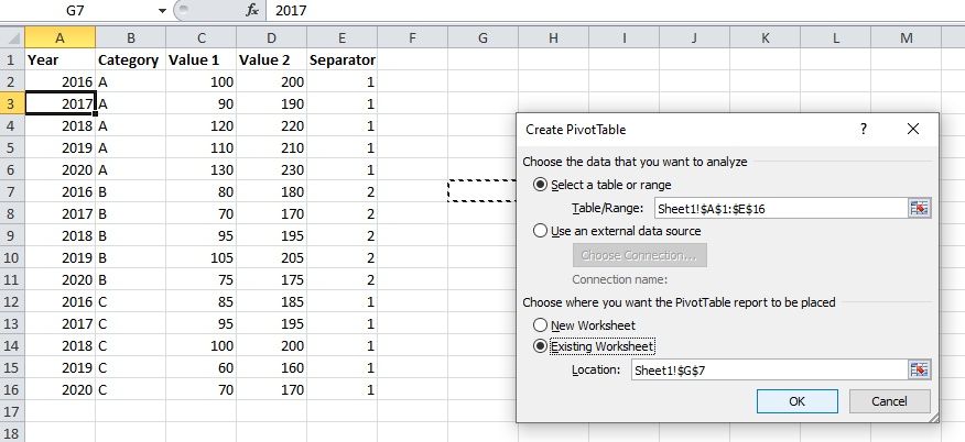
- Click on Existing Worksheet and select any empty cell next to your dataset.
- Click OK. The PivotTable Field List will appear.

In the PivotTable Field List panel, you need to rearrange the order of the fields as follows:

Arrange the fields in this exact order to avoid errors.
- Check all the fields.
- Drag and place the Category and Year fields in the Row Labels, with the Category at the top.
- Darg and place the Value 1 and Value 2 fields in Values.
- Drag and place the Separator field in the Column Labels (above Values).
After you've finished arranging your PivotTable's fields, it should look like this:

Step 3: Change the PivotTable Layout and Remove Unnecessary Items
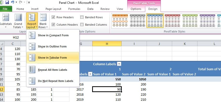
Follow the steps below to change the layout of your pivot table to a tabular form:
- Select any cell of your pivot table.
- Go to the Design tab in the Excel ribbon.
-
Click the arrow next to Report Layout and select Show in Tabular Form.

Now remove the unnecessary items from your pivot table by following the steps below:
- Click the arrow next to the Grand Totals icon in the Design tab and select Off for Rows and Columns.
- Click the Subtotals icon and select Do Not Show Subtotals.
Here's how your pivot table should look after changing its layout and removing unnecessary items:

Step 4: Extract Data from the PivotTable for your Panel Chart
Copy the pivot table data (G10:L24) and paste it (Paste Special > Values) to the empty cells next to your pivot table.

Add headers (to use as chart legend of your panel chart) to the pasted data by copying the value headers from your pivot table (Value 1, Value 2). Since the Separators split the data into two sets, you must duplicate the headers accordingly.

Step 5: Create the Panel Chart
Now that we've got everything we need, let's create a panel chart by following the steps below:
- Select the extracted data (N9:S24).
-
Go to the Insert tab in the Excel ribbon.
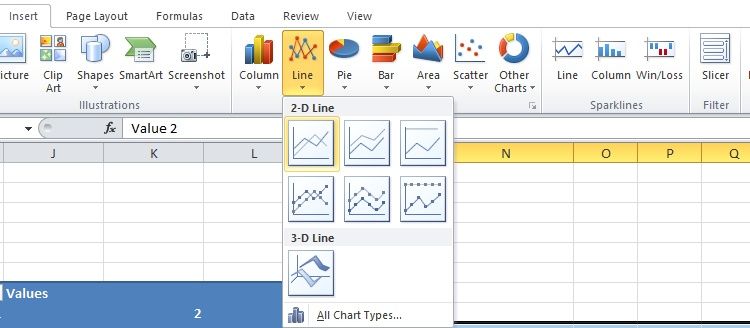
- Click the arrow next to the Line icon and select Line. You'll get a line chart that looks something like this:


You'll see that the line chart has four different data series. However, to make it a panel chart, we must unify that data by making the color scheme more consistent by following the steps below:
- Right-click any line from the line chart and click Format Data Series.
- In the Format Data Series tab, go to Line Color.
-
Select Solid Line and choose the desired color.
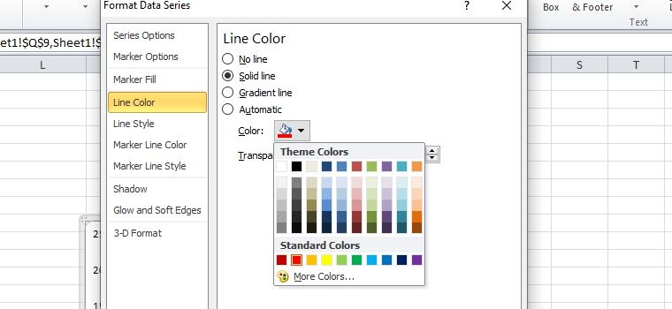
- Repeat the process for other lines, such that all the lines representing Value 1 are of one color and all lines representing Value 2 are of another color.

You can confirm the color consistency of the chart lines from the chart legend.
Finally, let's add some final touches to make the chart look visually appealing:
- Remove repetitive chart legend labels by right-clicking the label you want to remove and selecting Delete.
- Move the chart legend at the bottom. Right-click the chart legend and select Format Legend. In the Format Legend tab, select Bottom under Legend Position.
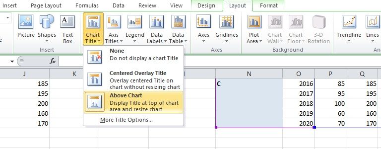
-
To add a chart title, click anywhere on the chart and go to the Layout section in the Excel ribbon. Click Chart Title and select Above Chart.
-
Resize the chart by dragging the chart using your cursor.
Check out these tips for formatting an Excel chart to make your chart look even better.


Step 6: Add Lines to Separate Different Categories of the Panel Chart
To distinguish between the different categories of the panel chart, it's vital to add separator lines. One way to do that is to draw these lines using built-in shapes in Excel. However, these drawn lines are misplaced if you resize your chart.
A more reliable method is to use error bars as separator lines between each category. Here's how to do that:

- Create a new chart data next to the chart data of your panel chart.
- Add the headings X Axis Value and Y Axis Value.
-
Type Dividers below Y Axis Value and type 0s below it.
The number of cells below Dividers containing values should be equal to the number of dividers you need. Since we've got three categories, we only need two separator lines, so we'll add two 0s below Dividers.
- The cell below the X Axis Value header needs to be empty. Below that (in cell V11), enter 5.5. Since we have 5 data points for each category and want to add the separator line between the categories, the value will be 5 + 0.5.
- Similarly, in cell V12, well add 5.5 + 5 (since each category has 5 data points). We would follow the same approach for all succeeding categories. Since we only have three categories, so we'll stop here.
- Add another column with the header Error Bar; below it, add 1s to the cells next to the 0s.
Insert Chart Data Into Your Panel Chart
Now that you have the data representing your separator lines, it's time to incorporate them into your original chart data.
- Copy the new chart data (excluding the headers and the Error Bar column), i.e., V10:W12.
- Click on the panel chart area.
-
Go to the Home tab, and select Paste > Paste Special.
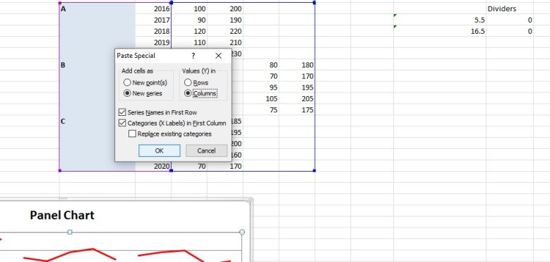
- In the Paste Special dial box, check the following: New series, Columns, Series Names in, First Row, Categories (X Labels) in First Column.
- Click OK.

Once added to the chart, it will appear as a little blue at the bottom-left of the graph. It's so small we won't see it if we click away from the chart. Now, we need to change that small line to a scatter chart by following the steps below:
- Right-click the little blue line.
-
Select Change Chart Type.
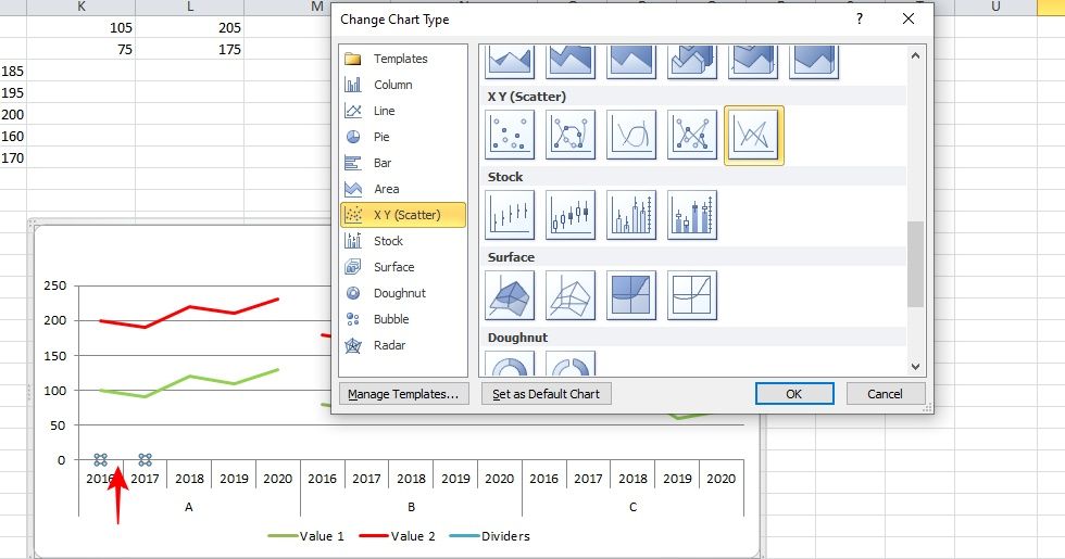
- In the Change Chart Type tab, select Scatter with Straight Lines and click OK. Doing this, a secondary axis will be added to the chart, and the blue line will become longer.

Add Error Bars
These error bars will serve as your actual separator lines. Here's how to add them to your panel chart.
- In the Layout tab, there is a drop-down below File. Click it and select Series Dividers.
-
Go to the Error Bars option in the Analysis section of the Layout tab and click More Error Bar Options. A Format Error Bars tab will appear.
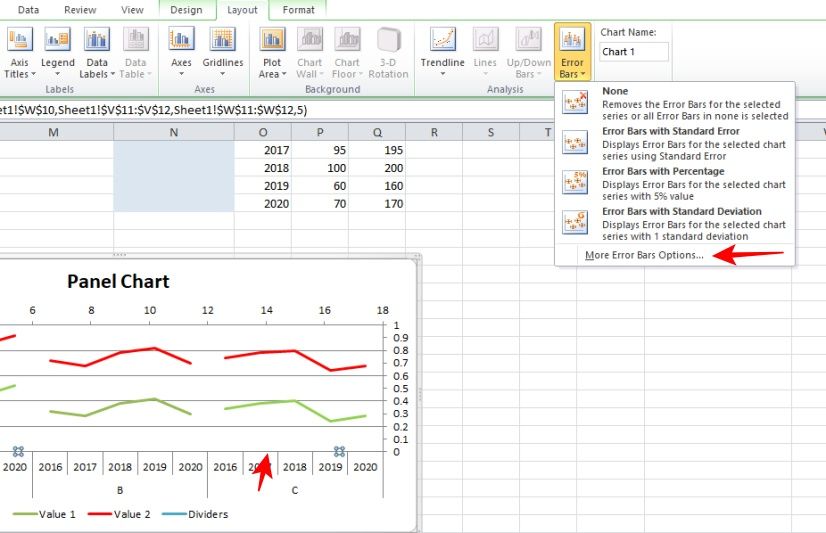
- Here, select the Plus and No Cap boxes.
-
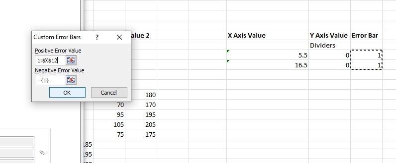
Click the Specify Value button next to the Custom option at the bottom, and for the Positive Error Value, select the 1s under the Error Bar header.
- Click OK and close the window.


You'll now have the beginnings of your separators. However, these don't reach the top of your chart. Follow these steps to fix this:
- Click on the vertical axis on the right.
- Select Format Selection in the Layout tab.
-
A Format Axis tab will open.
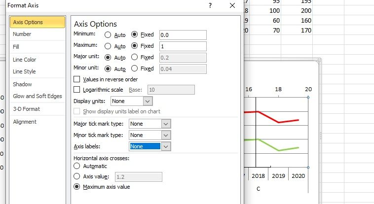
- Fix the minimum and maximum at 0 and 1, respectively.
- And set the Major tick mark type, Minor tick mark type, and Axis labels to none.
- Close the tab.
- Now remove the secondary horizontal axis at the top.

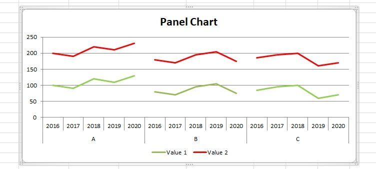
Your panel chart (with separators) is now ready. It should look something like this:

Analyze Multiple Datasets Using Panel Charts
Now that you know how to create a basic panel chart in Excel, you can replicate the same process for creating a panel chart for different data sets. And although creating a panel chart looks complicated, it's pretty quick and simple to make if you follow these steps.
You can use panel charts to compare the performance of multiple products on various metrics such as sales, demand, trends, etc. In our sample, the categories were analyzed on just two data sets (values), but the same method can be used for as many data sets as you like.
Excel is an excellent tool for data consolidation and graphing. This app will make it easy for you to visualize and analyze your data, whether you want to present it as a complex graph, like the panel chart we just explored, or simple line, bar, and pie charts.