
If you want to visually represent data, using a pie chart is one of the best ways to do it. A pie chart shows how a whole is divided into its components, as each component is represented by a slice.
Because pie charts can represent only a single data series, they are quite easy to create and customize. In this article, we’ll show you how to make a pie chart in Google Sheets.
How to Create a Pie Chart
Once you’ve gathered all the needed information, creating a pie chart is quite easy.
Start by selecting the cells containing the information. Open the Insert menu and click Chart. Google Sheets will create a chart based on your data. Usually, the default chart isn’t a pie chart but don’t worry as we’ll change that in a few clicks.
Double-click the chart to bring up the Chart editor window. In the Setup tab, open the Chart type menu and select Pie Chart. There are three options that you can use: Pie chart, Doughnut chart, 3D pie chart.
Once you’ve decided on which pie chart type you want to use, Google Sheets will insert it.

Note: If you haven’t selected all the necessary cells or need to add more data, double-click on the pie chart to bring up the editor. Then, edit the cells below the Data range to add new data into the chart.
How to Customize the Pie Chart
Now that your Google Sheets pie chart has all the needed information, it’s time to customize it. Double-click on the chart to bring up the Chart editor and select the Customize tab. Here you’ll find the options to customize the pie chart.
- Chart style. Here you can set the background and chart border color, set a new font, and make the chart 3D or maximized.
-
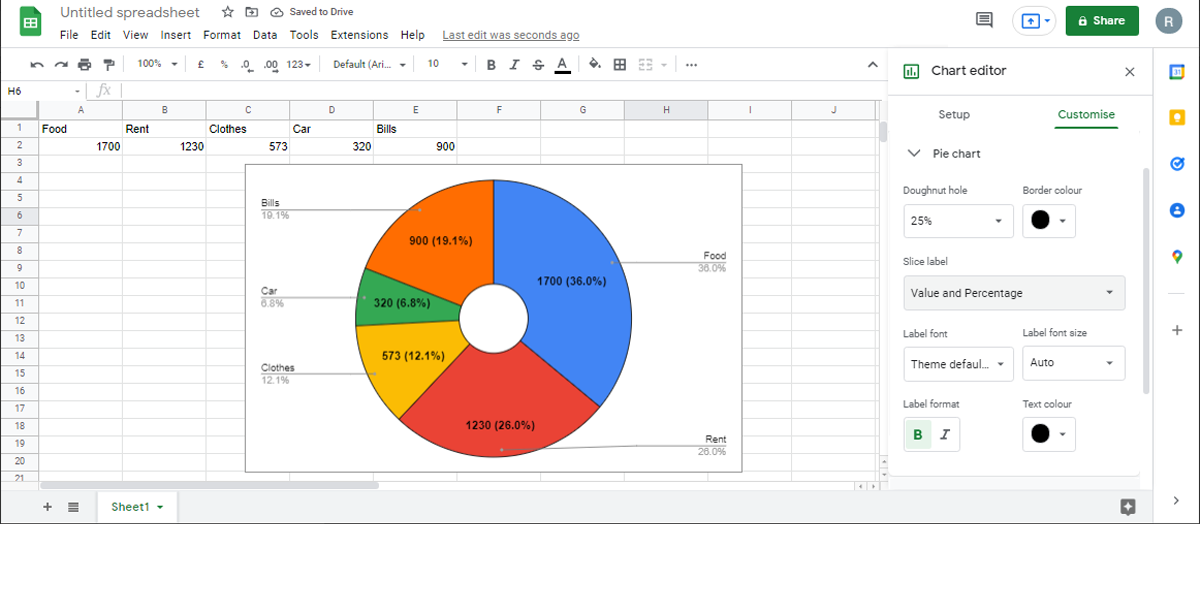
Pie Chart. Use this section to choose how the information is displayed within the chart. For example, using the Slice label drop-down menu, you can choose to represent data as Value, Percentage, and so on. Also, you can turn the pie chart into a donut chart by setting a Doughnut hole value.
-
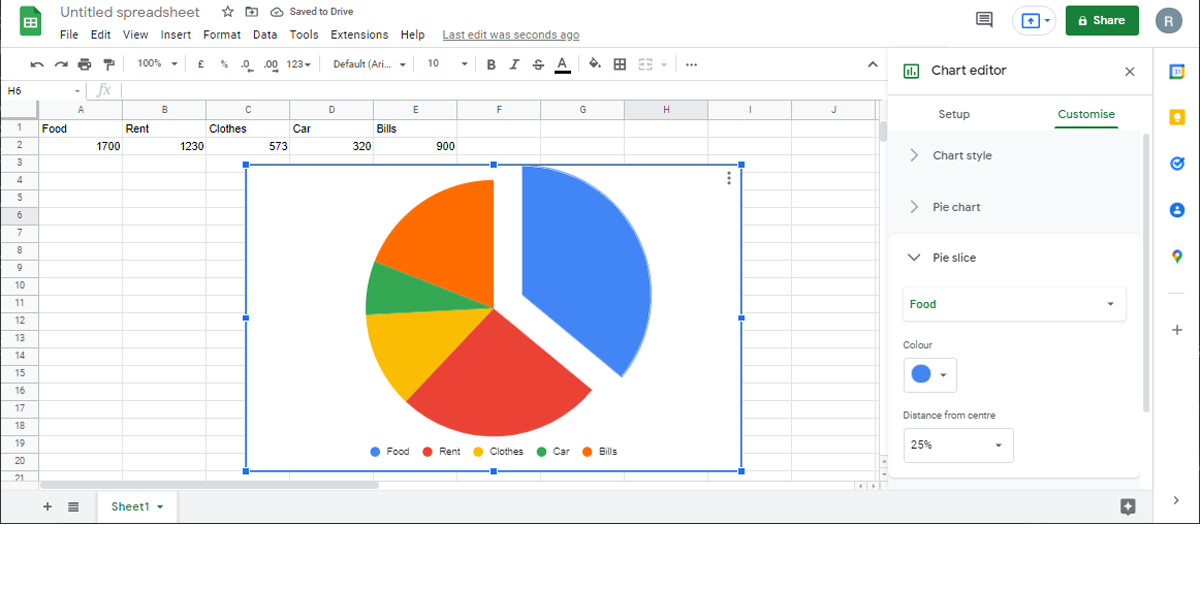
Pie slice. You can change a slice’s color and evidentiate it by separating it from the center.
-
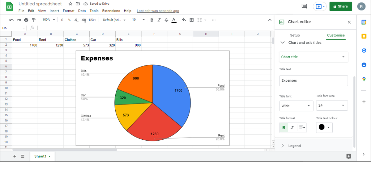
Chart and axis titles. Edit the chart title and subtitle and select the font, font size, color, and format.
- Legend. Allows you to control the legend’s position, font, font size, among other options.


Add a Pie Chart to Your Presentation
Hopefully, you are now looking at a customized pie chart containing all the necessary info. If you need to represent more complex information, Google Sheets has plenty of options that you can use.