Visualizing trigonometric equations is an important step in understanding the relationship between the X and Y axis. Without a graph, guessing a complex trigonometric equation's behavior can become quite a challenge. Fortunately, Microsoft Excel is an excellent tool for graphing and visualizing data, including trigonometric equations.
Visualizing an equation makes it easier to grasp, and once you've got the hang of graphing trigonometric equations with Excel, you'll have a better time understanding trigonometry. In this article, we'll explain how to use Excel to graph trigonometric equations and provide a step-by-step example to help you get started.
How to Graph Trigonometric Equations With Excel
To graph an equation with Excel, you'll need to create a chart for the X and Y values. The good news is that you don't have to manually calculate the Y values, as Excel has an arsenal of trigonometric functions built into it.
All you need to do is create a data table with the X values, and then write an Excel formula to automatically calculate the Y values. With your data table ready, you can create an Excel chart to graph the equation.
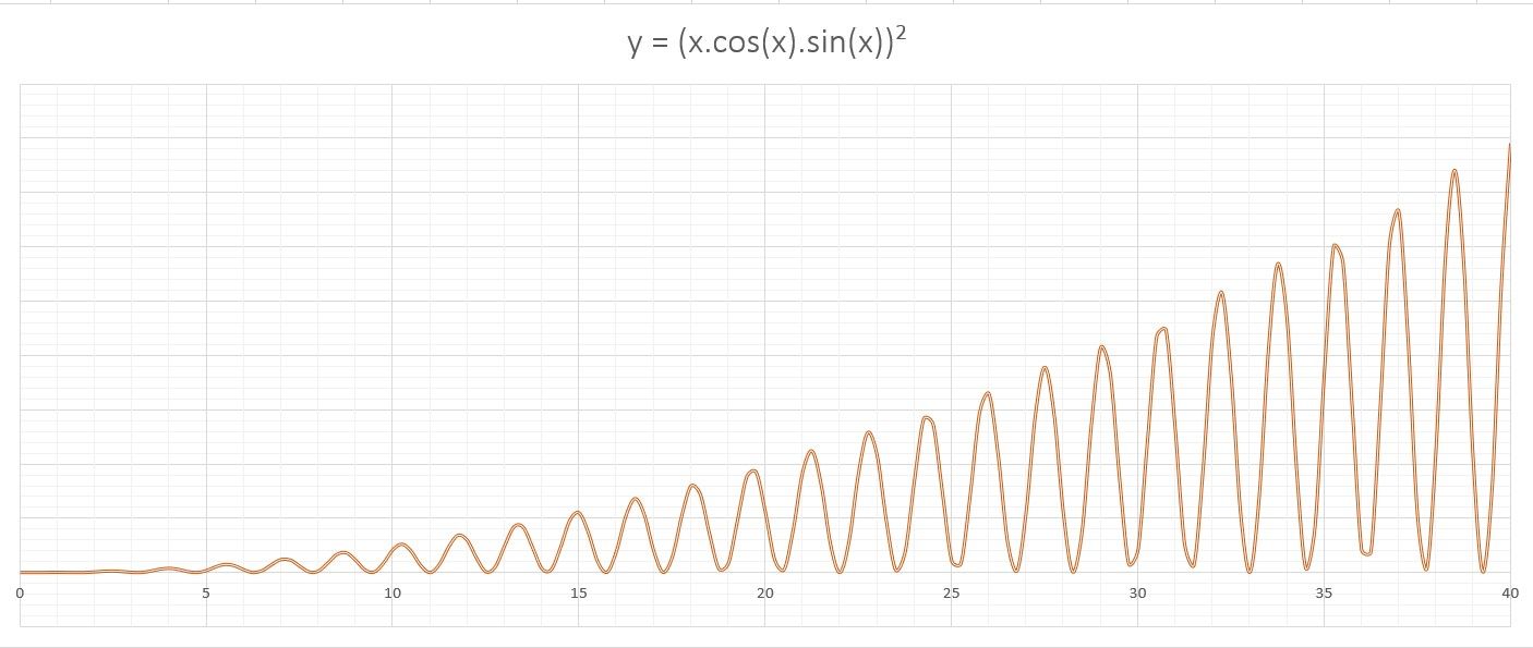
Now let's put this outline to use and graph the y = (x.cos(x).sin(x))² equation. This equation is tough to imagine just by looking at it, but you can save yourself the burden by quickly graphing the equation with Excel.
1. Input the X Values
A graph needs X and Y values. You can enter the domain you want to graph in the X values, and then calculate the Y values with a formula in the next step. It's a good idea to create a table for your data, as it will enable Excel's autofill feature.
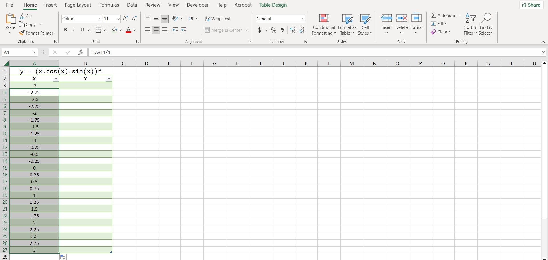
The smaller the increment between your X values is, the more accurate your graph will be. We're going to have each X value increase by 1/4 in this table. Here's how you can automatically input the X values:
- Type in the first value in a cell. In this example, we're going to type -3 in cell A3.
- Select the cell below. That's A4 in our case.
-
In the formula bar, enter the formula below:
=A3+1/4 - Press Enter.
- Grab the fill handle and drop it into the cells below.
Excel will now fill in all the other X values. The advantage of using a formula to input the values is that you can now quickly change the values by editing the first value or altering the formula.
2. Create a Formula to Calculate the Y Values
With the X values in place, it's time to calculate the Y values. You can calculate the Y values by translating the trigonometric equation into Excel's language. It's essential that you have an understanding of the trigonometric functions in Excel to proceed with this step.
When creating your formula, you can use a circumflex (^) to specify the power. Use parentheses where needed to indicate the order of operations.
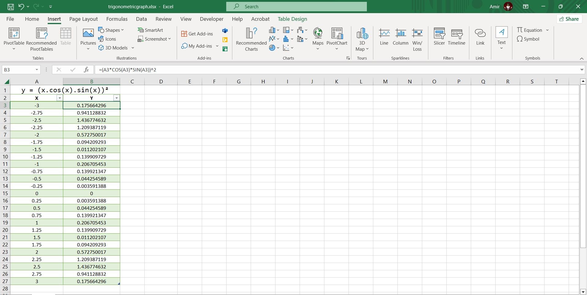
- Select the first cell where you want to calculate the Y value. That's B3 in our case.
-
Go to the formula bar and enter the formula below:
=(A3*COS(A3)*SIN(A3))^2 - Press Enter.
Excel will now calculate all Y values in the table. Excel's trigonometric functions use radians, so this formula will perceive the X values as radians as well. If you want your X-axis to be on a pi-radian scale rather than a radian scale, you can multiply the cell reference by pi using the PI function in Excel.
=(A3*PI()*COS(A3*PI())*SIN(A3*PI()))^2
The formula above will output the Y values for the same trigonometric equation, but the values will be on a pi-radian scale instead.
3. Create a Scatter Plot Chart
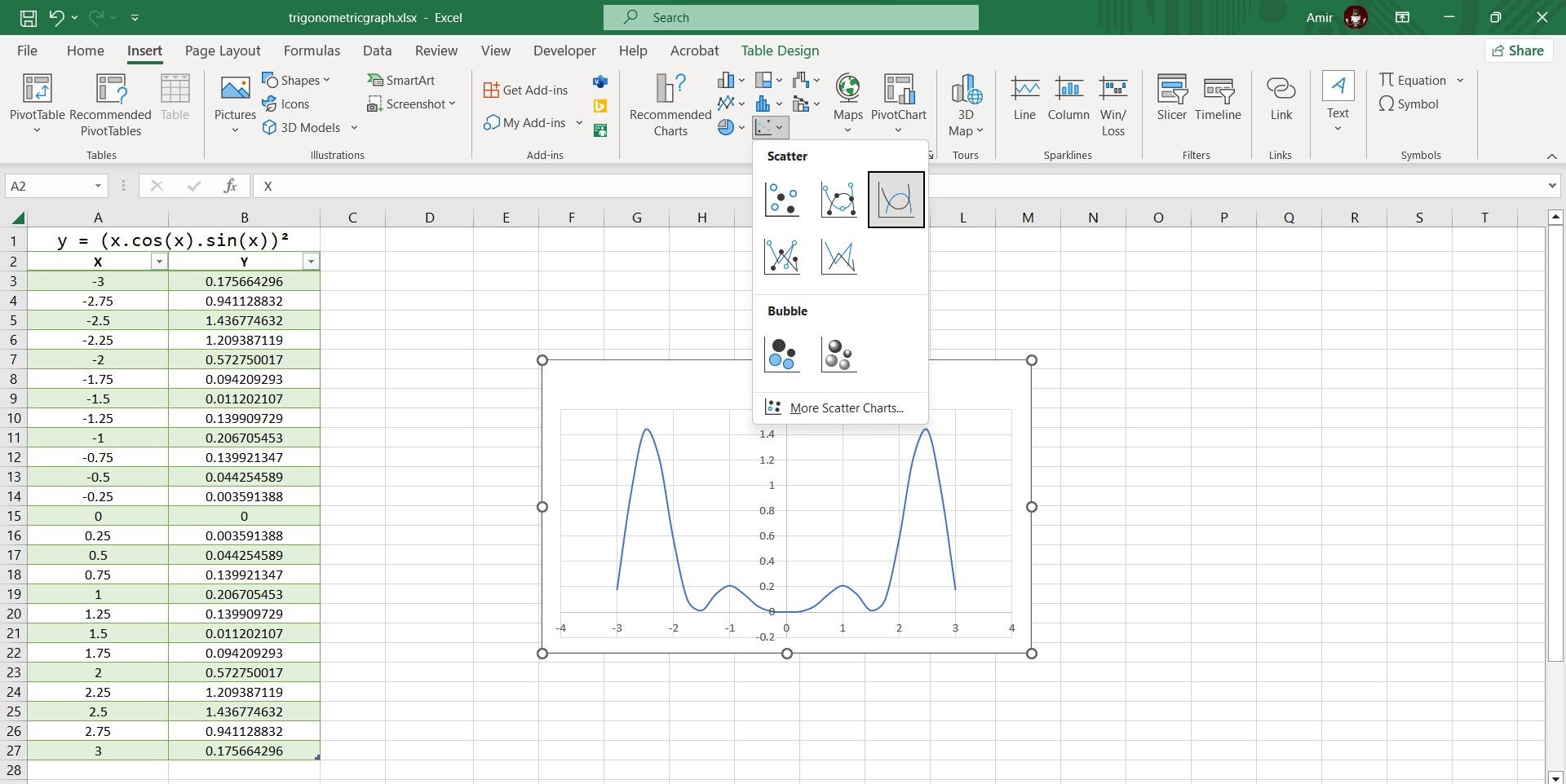
A scatter plot is the best way to graph a trigonometric equation in Excel. Since you've got your X and Y values ready, you can graph your equation with a single click:
- Select the table containing the X and Y values.
- Go to the Insert tab.
- In the Charts section, click on Scatter and then select Scatter with Smooth Lines.
There you have it! You can now inspect the graph to better understand the equation's behavior. This is the last step if you're looking for a quick visualization, but if you want to present the graph, you can fully customize the Excel chart to properly graph the trigonometric equation.
4. Modify the Excel Chart
Although the chart does display the graph, you can make some changes to improve the chart's readability and make it more presentable. There are lots of things you can customize to improve the chart, and in the end, it's a matter of personal preference. Still, here are some adjustments that can always improve your trigonometric graph.
I. Set the Axis Units and Add Tick Marks
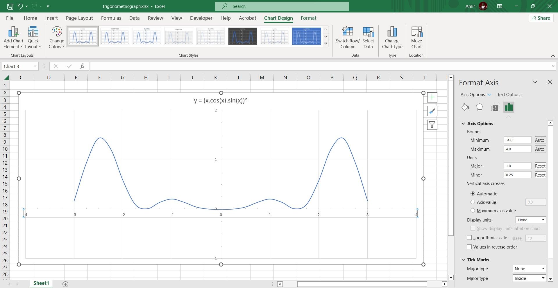
If you take a closer look at your chart, you'll see that the horizontal and vertical grid lines aren't the same unit. Here's how you can fix that:
- Click on the chart to select it.
- Double-click the axis. This will bring up Format Axis on the right.
- In Format Axis, find Units under Axis Options and change Major and Minor.
- Go to Tick Marks and change Minor type to what you want.
Repeat the same process for the other axis, and make sure that you use the same major and minor units for both. Your graph should look tidier now.
II. Add Minor Gridlines
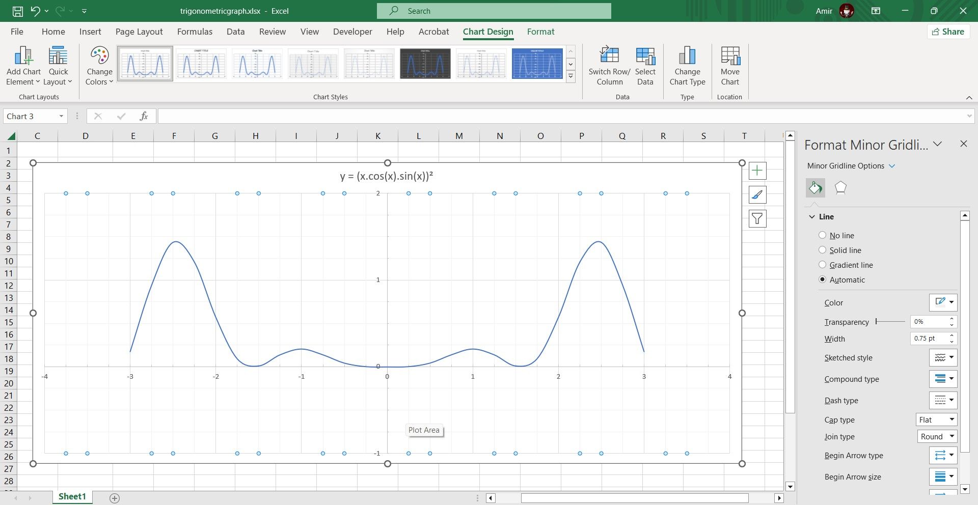
You can add minor gridlines to make the graph easier to read. To do this, simply right-click on the axis and then select Add Minor Gridlines. Repeat the process for the other axis to add gridlines there as well. You can then right-click the axis and select Format Minor Gridlines to change their appearance.
III. Add Axis Titles
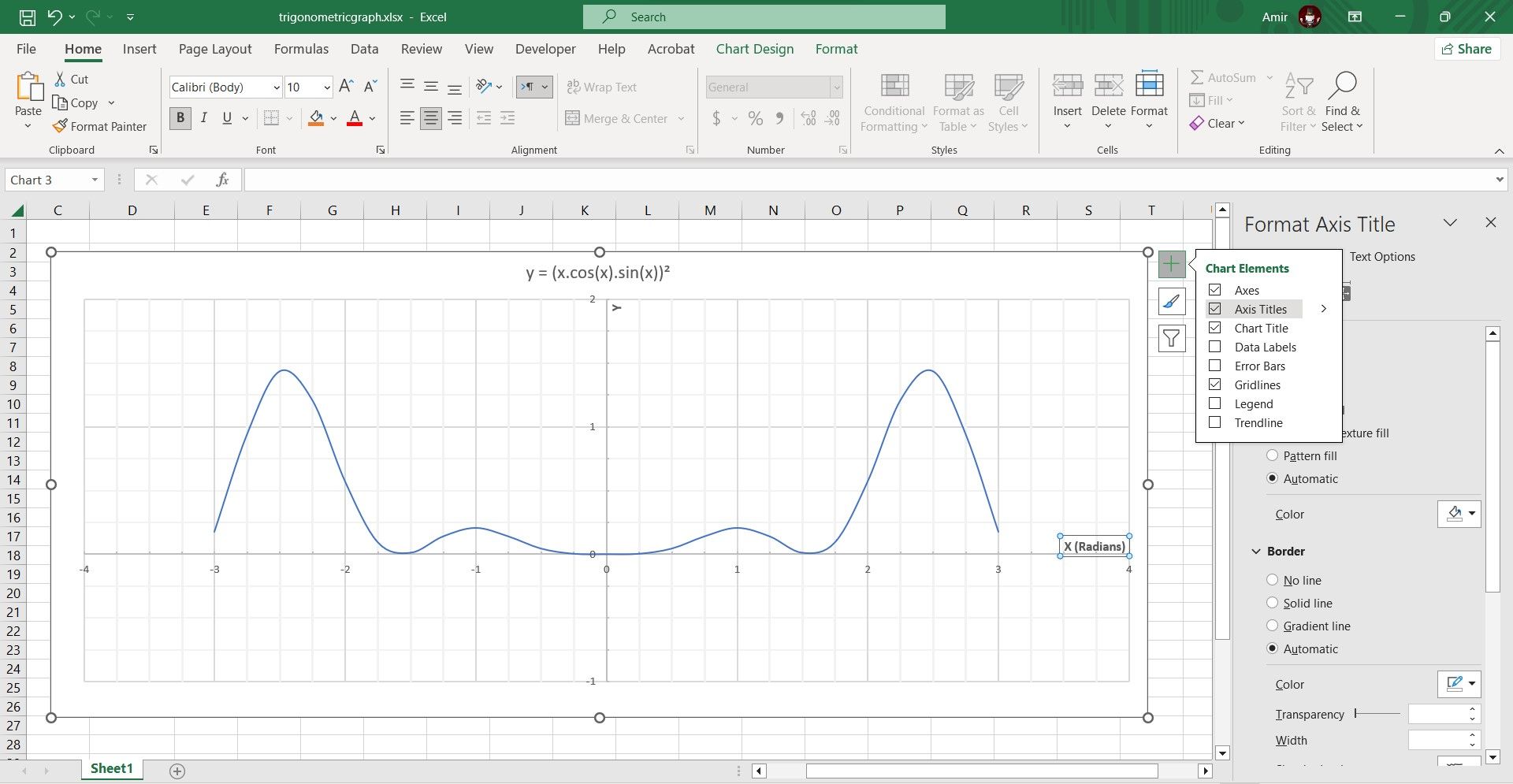
Although it's obvious that the horizontal axis is displaying the X values, you can add a title to specify that the values are in radians. This prevents confusion with pi-radians.
- Select the chart.
- Click on Chart Elements on the top right. This is marked with a + sign.
- Select Axis Titles.
- Double-click the axis titles and edit the text.
IV. Add Data Callouts
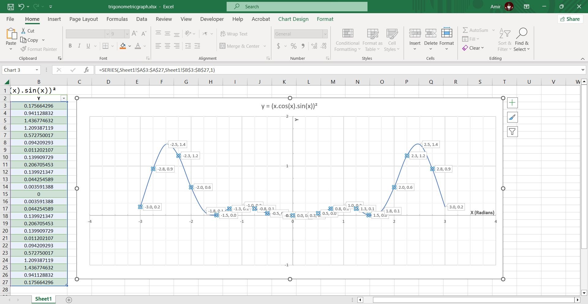
Finally, you can add callouts to identify the minimum and maximum points on your graph. Here's how you can do that:
- Select the chart.
- Right-click the series line.
- Go to Add Data Labels and then select Add Data Callouts.
If some of the callouts seem unnecessary to you, you can individually select them and then press Del on your keyboard to delete the callout.
Graph It Properly With Excel
Visualizing an equation is vital to understanding it. This is especially true when you're dealing with complex trigonometric equations and can't quickly guess the values. Well, there's no need to tax your brain to get a mental image of an equation. You can use Excel to efficiently graph a trigonometric function.
The only elements that you need to manually input are the starting X value and the increment. From there, you can have Excel automatically fill in the X values. Thanks to its array of trigonometric functions, you can easily turn your equation into an Excel formula and calculate the Y values as well.
With both the X and Y values set out in a table, graphing the equation is only a matter of selecting the data and creating a scatter plot to visualize it.


