As a designer, your creative work is a combination of form and content. You make an effort to present your design in an attractive form to your audience, and that includes paying close attention to the fonts you use.
During the design process, you can use Google Fonts to create fantastic font combinations. Here are some of the best Google Font pairings that you can use for just about any design.
1. Rokkitt Black and Raleway
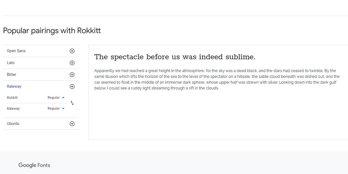
Rokkitt is a geometric slab serif font. You can use this display font to add character to the headings in your design. Using its Black variation is a great choice for headlines, however, the regular format of this font is suitable for body text as well.
If you’re looking for a Rokkitt pairing, the beautiful sans serif font, Raleway, pairs perfectly. There is a sharp distinction between Rokkitt Black and Raleway, which will make for a striking effect. You can also try Raleway Dots for the headlines coupled with Raleway if you're searching for an alternative.
2. Archivo Black and Hind
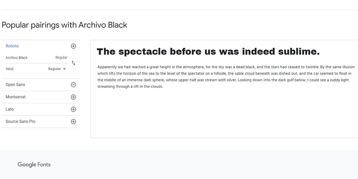
Another awesome font from Google is Archivo Black. It's specifically designed for headline use, so it serves its purpose well when used in headings.
This sans serif typeface is capable of adding life to any text, and might even remind you of headlines from 19th-century newspapers. Pairing this with Archivo or Archivo Narrow as the body text is an excellent choice.
If you want to combine it with another font for body text, choose Hind. Specially developed for user interfaces, this neat-looking font supports Latin and Devnagari scripts. Hence, you can use it to create designs in multiple languages.
3. Poiret One and Didact Gothic
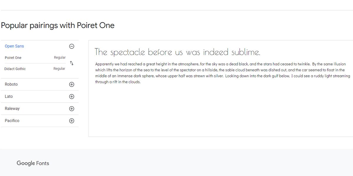
To add an artistic look to your design, this font pairing is the right choice. Using the bold variation of Poiret One, you can make your headlines stylish, decorative, and intriguing at the same time. It will surely win the heart of every vintage fonts lover.
Combine Poiret One with Didactic Gothic for simplistic yet delicate text. Didactic Gothic is a sans serif font that has higher readability and is often used to teach elementary school students.
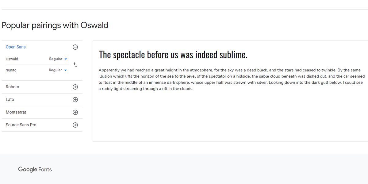
4. Oswald Bold and Nunito Semibold
Oswald garnered inspiration from Alternate Gothic and Franklin Gothic. Because of its narrow spacing and condensed look, the font looks exceptionally well in headings. It is also suitable for short but impactful body text.
However, for detailed body text, you need to pair it with Nunito. This sans serif typeface comes with rounded terminals to offer a casual, yet charming look to body text. Select its semibold version, and pair it with Oswald Bold for a more lively look.
You can also choose Nunito Sans. This variation of Nunito has straighter lines in its letterforms.
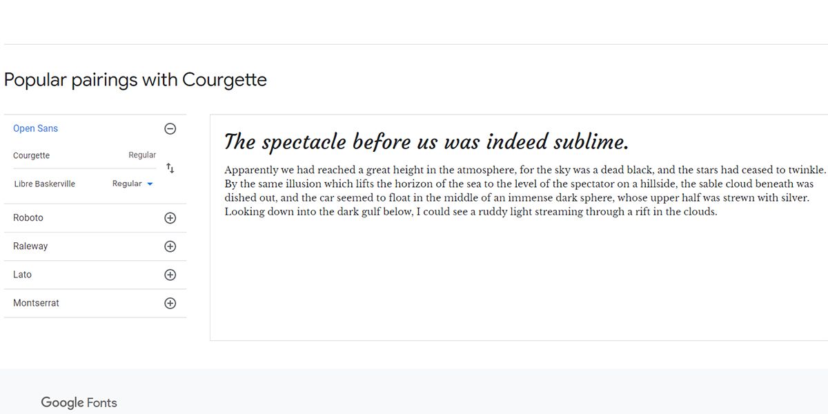
5. Courgette and Libre Baskerville
Courgette is a classic italic-script typeface that has low-stroke contrast. This font has an elegant look that works best for large titles or headlines. However, it also looks perfect on the web, making it suitable for concise body text.
You can combine Courgette with the gorgeous Libre Baskerville for a delicate font pairing. Due to its wide counterform, this open-source serif typeface is easily readable on the screen. That's why you can use Libre Baskerville for longer bodies of text as well. If you want a safe but stylish Google Font pairing, go for this combination.
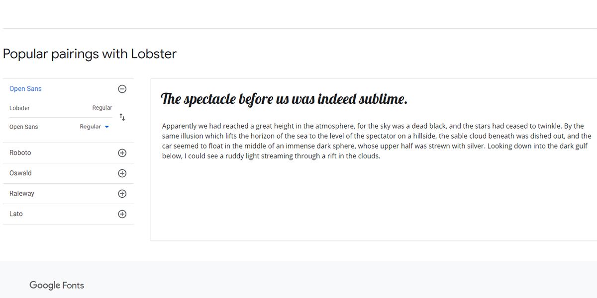
6. Lobster and Open Sans Regular
Do you want to add some playfulness to your design? Try using Lobster. This bold and condensed script font will make headlines stand out to your audience. It has an OpenType format, so it's scalable and supports the international character set. As a result, you get diverse variants of the same letter to use on any platform.
Because Lobster is so easy to read, pairing it with Open Sans is the right choice. The regular style of this font comes with an open, round, and clean format. For this reason, readers can pleasantly read this font in print, on the web, and on mobile.
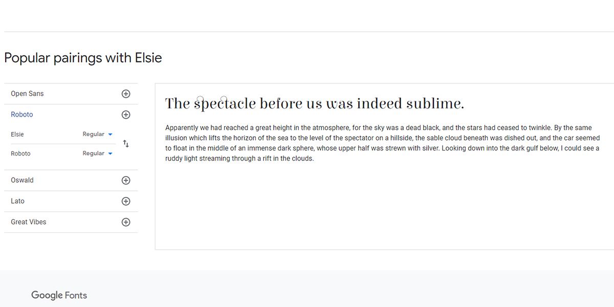
7. Elsie and Roboto
If you're looking for a free-flowing font, choose Elsie—a font that celebrates femininity. Its gentle serifs and flowing lettering make it an elegant choice.
When using this font as your heading, use Roboto as the body text to create a striking pair. Gorgeous Elsie and simple Roboto offers balance to your design, and will immediately capture the attention of readers.
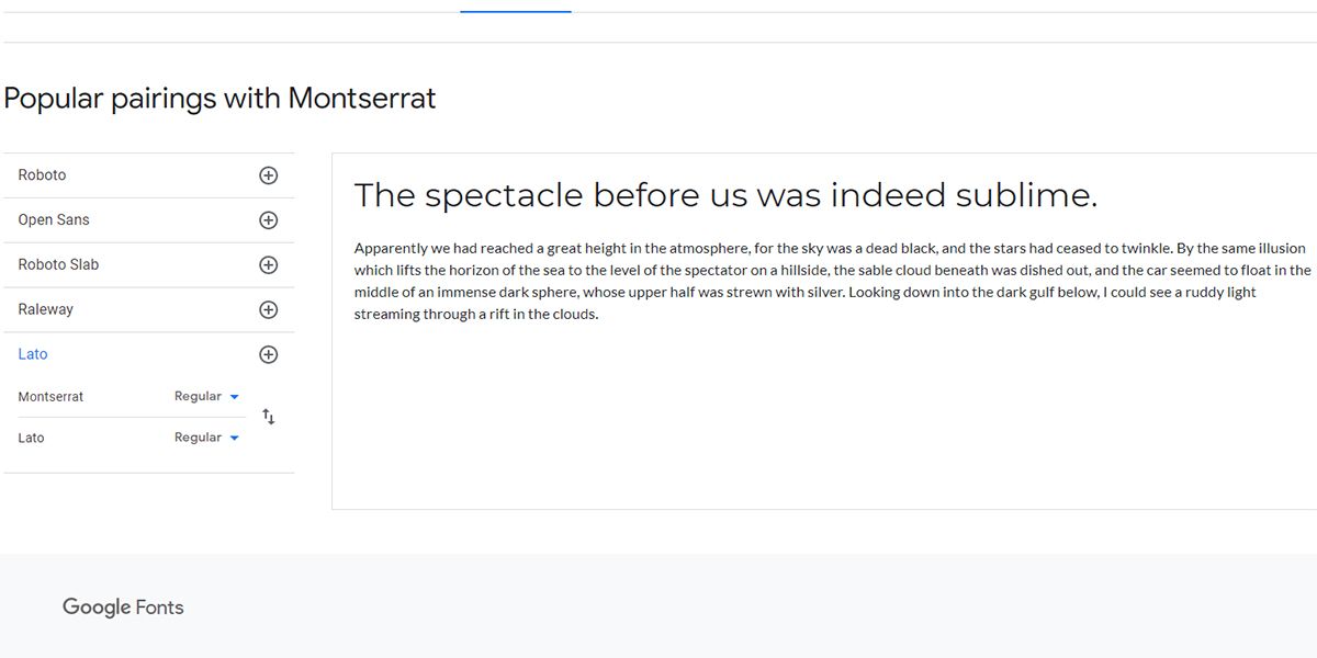
8. Montserrat and Lato
Inspired by old urban typography, Monsterrat can make beautiful headings. One crucial feature of this font is the sufficient spacing between the letters. Thus, readers always find it easy to follow.
With Montserrat as the font for headings, use Lato in your body text. Its semi-rounded details make the body copy highly legible, and offer a feeling of warmth and seriousness.
Use this combination to create designs for fitness-focused businesses and other professional projects.
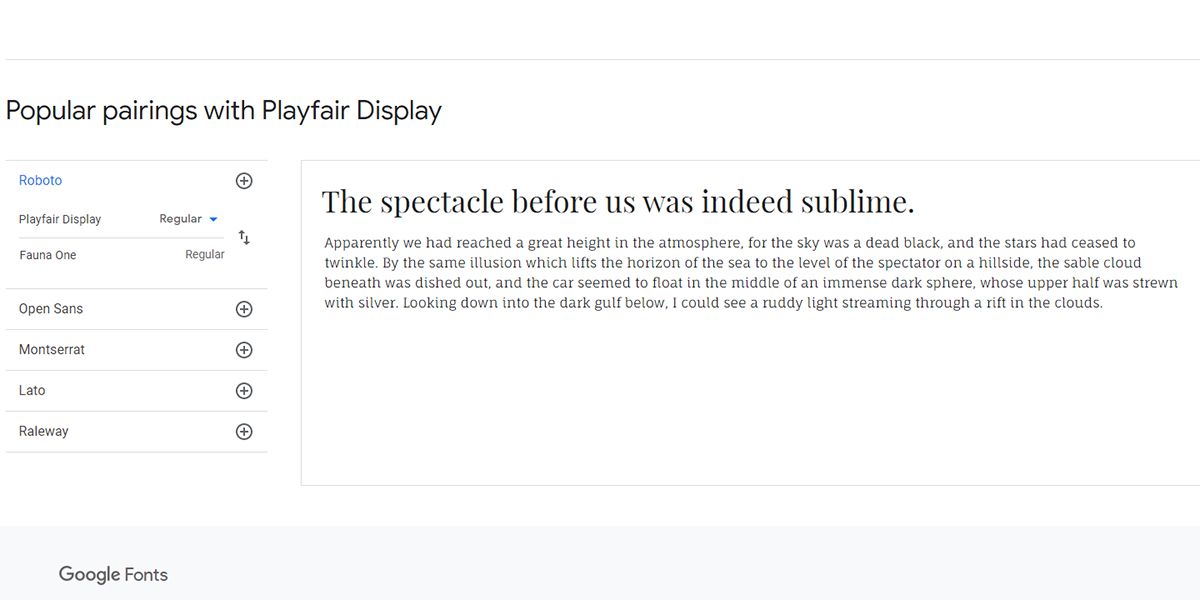
9. Playfair Display and Fauna One
Playfair Display is an ideal title font, as it adds grace and sophistication to any design. It offers old charm, but with a modern touch. This serif neoclassical font will make your headlines pop.
When you've got bulky paragraphs to follow, use Fauna One for the body. These two fonts complement each other beautifully.
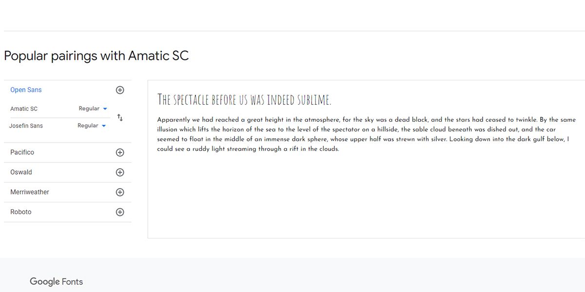
10. Amatic SC and Josefin Sans
Are you looking for fonts that offer a quirky, user-friendly design? Use Amatic SC in the headings and Josefin Sans in the body text to create a killer combo.
Amatic SC is a freestyle typeface best suited to convey the message of informality and openness. On the other hand, Josefin Sans offers a unique, easy-to-read look. When used in light-hearted situations, this pair will grab the audience's attention.
Just remember to avoid putting Amatic SC in the main body text.
Get Inspired by These Google Font Pairings
The right font combination is essential for creating a smashing design. These Google Font pairings offer something for every kind of creative project. Experiment with them, and see how they can improve your designs!

