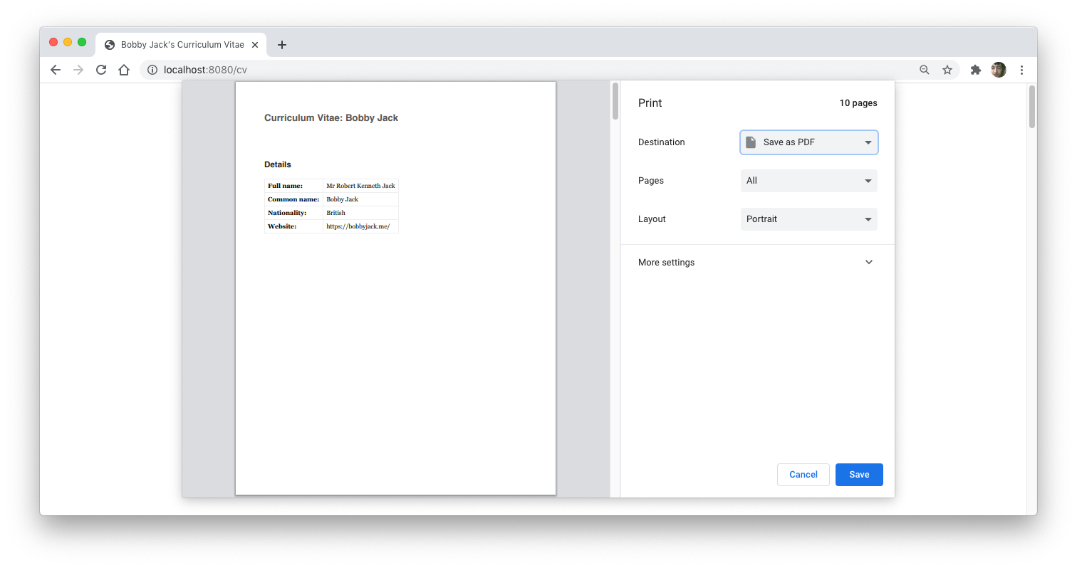
If you’ve ever printed off ticket reservations or directions to a hotel from the web, you've probably been less than impressed with the results. You may, therefore, be unaware that printed documents can be styled in much the same way that they can on-screen, using Cascading Style Sheets (CSS).
Separation of Concerns
A key benefit of CSS is the separation of content from presentation. In the simplest terms, this means instead of very old-fashioned stylistic markup such as:
<font size="7"><b>Heading</b></font>
We use semantic markup:
<h1>Heading</h1>
Not only is this much cleaner, it also means our presentation is separated from our content. Browsers render h1 elements as large, bold text by default, but we can change that style at any time with a stylesheet:
h1 { font-weight: normal; }
By gathering those style declarations in a separate file, and referencing that file from our HTML document, we can make even better use of separation. The style sheet can be reused, and we can change that single file at any time to update the formatting in every document that uses it.
Including a Print Style Sheet
In a similar manner to including a screen style sheet, we can specify a style sheet for print. A screen style sheet is typically included like so:
<link href="base.css" rel="stylesheet" />
However, an additional attribute, media, allows targeting based on the context in which the document is rendered. By default, the previous element is equivalent to:
<link href="base.css" rel="stylesheet" media="all" />
This means the stylesheet will be applied for any medium the document is rendered in. However, the media attribute can also take values of print and screen:
<link href="print.css" rel="stylesheet" media="print" />
In this example, the print.css stylesheet will only be used when the document is printed out. This is a very useful mechanism. We can gather all common styling (perhaps font family or line spacing) in a stylesheet that applies to all media, and media-specific formatting in individual stylesheets. Again, this is another use of separation of concerns.
Some Example Style Declarations
A Clean Background
You almost certainly don’t want to waste ink printing out a colorful background or a background image. Start by resetting any defaults for these values that may have been set in your document:
        body {
  background: white;
  color: black;
}
You might also want to prevent any background images from printing—these should be decorative and, therefore, not a required part of your content:
        * {
  background-image: none !important;
}
Controlling Margins
Another obvious point to consider regarding print is the page margin. Whilst CSS provides a means of setting margin size, you should bear in mind that your browser and printer may also influence margin settings themselves.
For example, in Chrome’s print dialog, there is a margin setting that has values including none and custom which will override anything specified via CSS:
For this reason, it's recommended to leave margin decisions to the reader on public webpages. However, for personal use, or for creating a default layout, setting print margins via CSS may be appropriate. The @page rule allows margins to be set, and should be used as follows:
        @page {
  margin: 2cm;
}
CSS also has the capacity for more sophisticated print layouts, such as varying the margin according to whether the page is an odd-numbered one (right), even-numbered (left), or the cover page.
Unfortunately, this is poorly supported—especially the cover page option—but it can be used to a minimal extent. The following styles produce pages with slightly larger bottom margins than top and slightly larger margins on the outer page edge than the spine:
        @page {
  margin-left: 20mm;
  margin-right: 20mm;
  margin-top: 40mm;
  margin-bottom: 50mm;
}

@page :left {
  margin-left: 30mm;
}

@page :right {
  margin-right: 30mm;
}
Hiding Irrelevant Content
Not all content will be suitable for a print version of your document. If your page includes banner navigation, advertisements, or a sidebar, you might want to prevent those details from appearing in the print version, for example:
#contents, div.ad { display: none; }
Fixing links
Hyperlinks are obviously not relevant in printed material, so you’ll probably want to remove any styles which differentiate them from surrounding text:
a { text-decoration: none; color: inherit; }
However, you might still want readers to have access to the original URLs, and a straightforward solution is to automatically insert them after the linked text:
        a[href]:after {
  content: " (" attr(href) ")";
  font-size: 90%;
  color: #333;
}
This CSS gives results such as the following:
a[href]:after specifically targets the position after (:after) each link element (a) that actually has a URL ([href]). The content declaration here inserts the value of the href attribute between brackets. Note that other style rules can be applied to control the display of the generated content.
Handling Page Breaks
To avoid page breaks leaving isolated content, or breaking it awkwardly in the middle, make use of the page-break properties: page-break-before, page-break-after and page-break-inside. For example:
table { page-break-inside: avoid; }
This should help to keep tables from spanning multiple pages, providing none are taller than a single page. Similarly:
h1, h2 { page-break-before: always; }
This means that such headings always start a new page. It might cause problems if you immediately follow your page’s h1 with an h2, though, since the h1 will end up on a page all on its own. To avoid this, simply cancel the page break using a selector that targets that specific instance, for example:
h1 + h2 { page-break-before: avoid; }
Viewing Print Styles
In all cases, your browser and operating system should provide a print preview feature, often as part of the standard print dialog.
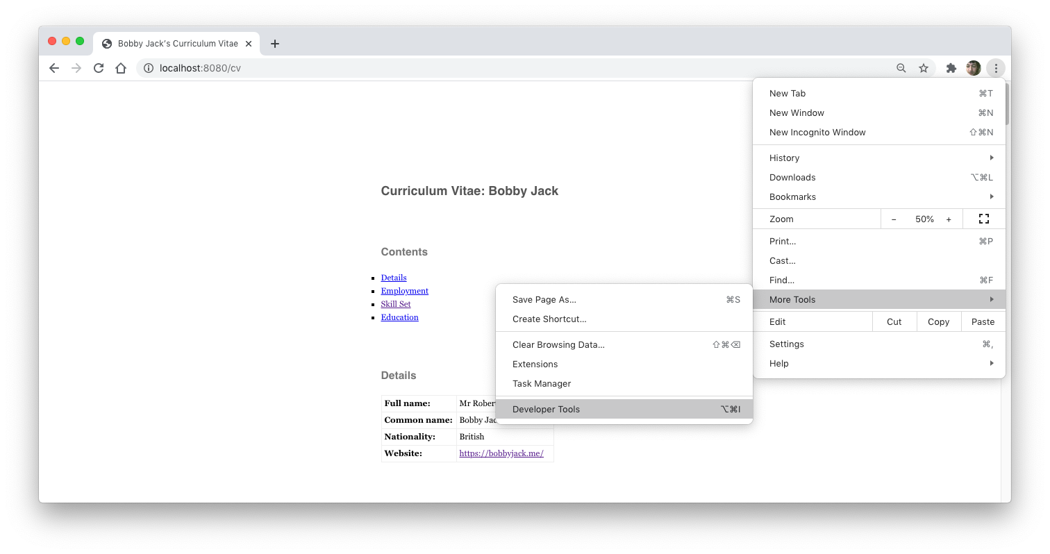
The Chrome browser makes it more convenient to check and even debug your print styles via Developer Tools, as demonstrated by this example showing a CV with a print style sheet. First, open the main menu and select More Tools followed by the Developer Tools option:
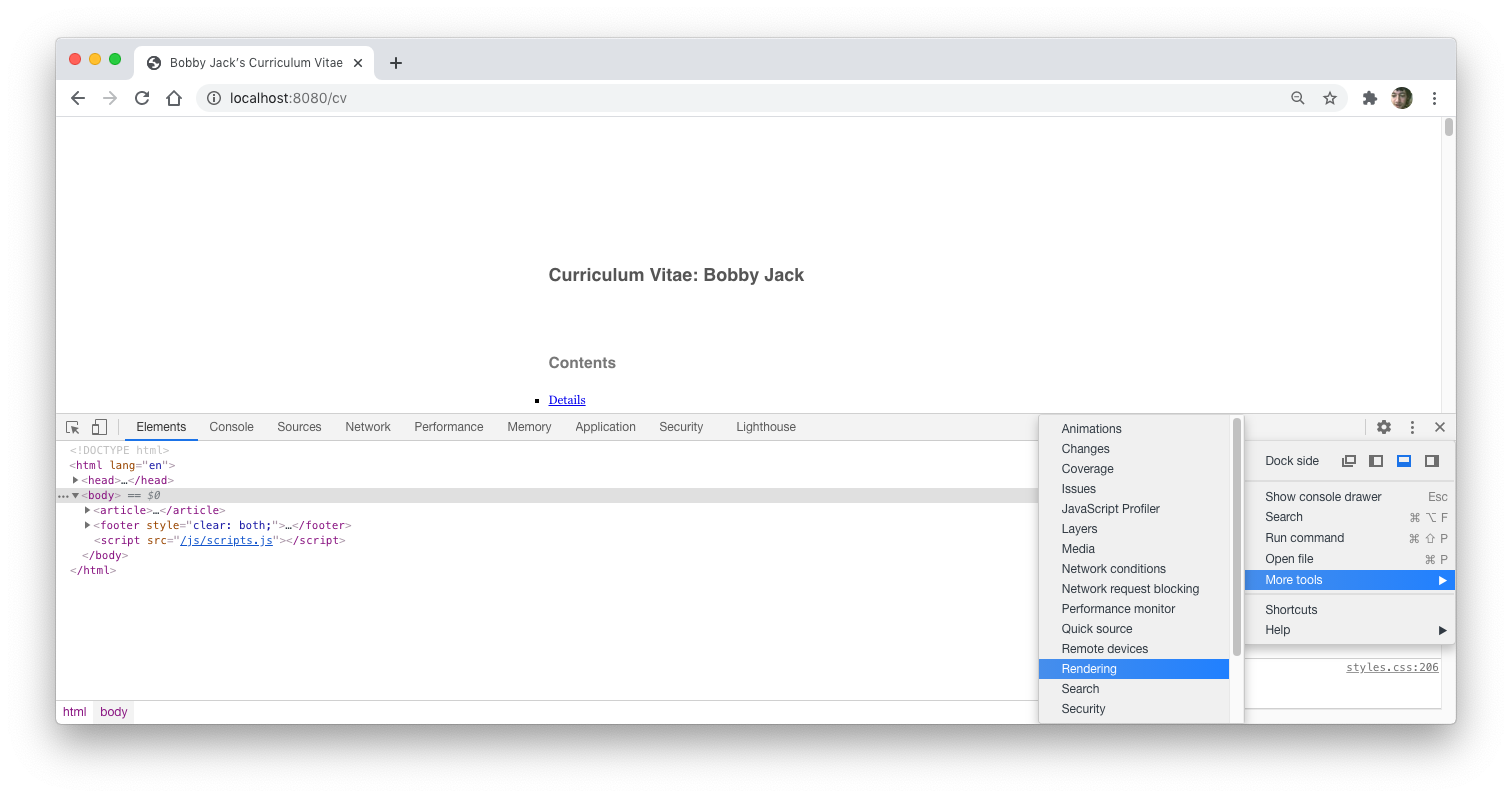
From the new panel that appears, select Menu, then More tools, followed by Rendering:
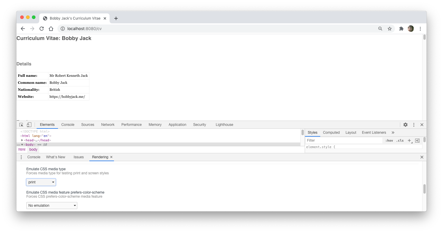
Then scroll down to the Emulate CSS media type setting. The dropdown allows you to toggle between the print and screen views of your document:
When emulating the print stylesheet, the standard Styles browser is available to inspect and modify the live style rules. Bear in mind that emulating print output on a screen is still not 100% accurate. The browser knows nothing about paper size, and the @page rule cannot be emulated.
Printing to a PDF
A handy feature of modern operating systems is the ability to print to a PDF file. In effect, anything you can print can, instead, be sent to a PDF file—no real surprise since a PDF file is supposed to represent a printed document, after all.
This makes HTML, in combination with a print stylesheet, an excellent means for creating a high-quality document that can be sent as an attachment, as well as printed.
Print a Variety of Documents
You can use a print stylesheet to create quality documents, including anything from your CV to recipes or event announcements. Web pages typically look ugly and contain unwanted details when printed, but a small number of style tweaks can dramatically improve print results. Saving the final results as a PDF is a quick way to create attractive, professional documents.

