Your portfolio is the digital equivalent of a resume. It's where you get to show off all your skills, knowledge, and experience in a way that potential employers can easily browse through to see if you're right for the job.
But just like a real resume, your portfolio needs to be well-designed and professionally presented in order to impress. Here are some design tips to help make your portfolio look amazing.
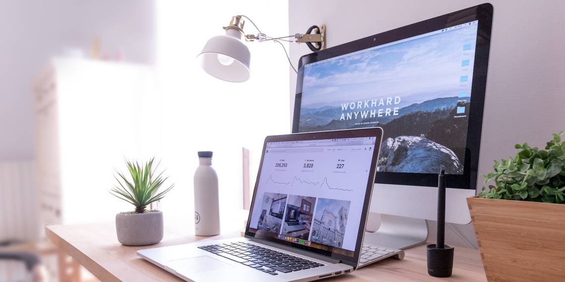
1. Include White Space Between Design Elements

When you're building a portfolio, it's tempting to cram everything in there. But if you're going for an elegant, professional look to attract a potential client or recruiter, you'll want to work in some white space and make sure your content is spaced out nicely on the page.
White space means the empty (negative) space between design elements. It helps set apart different kinds of content from each other. Say, if you have an image on the left side of a page and a paragraph on the right side, the white space between them makes it clear where one ends, and the next begins.
Essentially, it helps to have your design, text, or image elements things spread out across the page in an organized way. This helps visitors scan your content easily and also prevents it from looking cluttered or overwhelming.
2. Choose a Theme That Matches What You Do

When it comes to creating a portfolio website, there's no one right way to do it. You need to think about what you're trying to showcase and what your goals are.
For instance, if you're a photographer, choose a theme with lots of white space and well-designed photo galleries. If you're a writer and want people to read your articles, you might want to pick a blog format or theme with easy-to-read sections.
There are plenty of free portfolio website creators out there that can help you build a portfolio easily without spending hours on coding. It's worth looking around and trying out some different ones to see which one works for you.
3. Get the Right Typefaces or Fonts for Your Portfolio

You would need to consider several factors when selecting a font for web design, such as legibility, readability, emotion, and tone, to name just a few. Some fonts are great for titles and headlines, but not so great when it comes to the body copy.
It's important that you understand how to choose a proper font for your creative projects. Sometimes it makes sense to choose multiple fonts for different text elements. That said, a single font could also work across multiple areas of your website, creating cohesion and an overall pleasing visual experience.
For instance, if you're looking to build a business-oriented portfolio site, then something popular such as Helvetica (or Arial) will probably work well. But if you'd like something more casual and personal with a bit of artistic flair, then Bogart or Argesta might be better choices.
These typefaces can add a bit of personality to your website and appear less stuffy. They might also fit better with the aesthetics of other visuals on your site, which could help create a stronger overall design effect. To help you make better font choices, we've compiled a list of strategies to help you choose which fonts to use and how to pair them together.
4. Use Professional Headshots and Imagery

Your profile picture is going to be the first thing people notice when they visit your portfolio. Use a professional photo that shows you in the best possible way—smiling and relaxed. Make sure you've got a well-lit background for your profile pictures to look good.
When it comes to images, make sure all images are high quality and cropped well. If there are elements of an image that aren't working for you, try making changes using online photo editing tools.
5. Show Off Your Work With a Card Layout

If you want to make sure people get a good sense of your work without having to dig too deep, consider using a card layout for your website. This is a simple grid that's easy for the eye to follow, and it allows you to put in the right mix of imagery and text without overwhelming visitors.
Cards are like small packages of information that highlight the most important parts of a project, so you can consume it quickly and easily without wading through a bunch of other content. This allows visitors to learn more about your content in a bite-sized way. They also help your site look pretty!
If you have multiple pieces of work, consider making separate pages for each project, so it doesn't get overwhelming with too much information in a single card. This layout allows for more creativity and flexibility, which is important when trying to highlight a variety of projects.
6. Take Advantage of Visual Hierarchy Patterns

One of the most important design concepts to consider when creating a portfolio is visual hierarchy. Visual hierarchy is an artful arrangement of elements on a page. One way to ensure this is to use color contrast and scale. This means that you can make some design elements bigger than others, or use more colors in specific design elements compared to others.
There are usually two ways visitors scan a page—an F-pattern (ideal for text-heavy web pages) and a Z-pattern (for pages with more visuals). It's important to keep these patterns in mind while designing your portfolio because it will help direct your visitors' attention to the most important information on each page.
For instance, by organizing elements in an F-shaped pattern, you can ensure that visitors see what you want them to see first. On the top-left of each page, you'll want to include something that makes you stand out from other candidates—your name or a headshot. In the lower-left corner of each page, it may be helpful for visitors to see contact information so that they can quickly reach out to you if they are interested in learning more about working with you.
7. Check Text and Color Contrasts for Readability

When tweaking elements to make them look pretty, don't forget to check the text-contrast ratio between your fonts and background color. Text contrast is the difference between light and dark colors on a screen.
The WebAIM Color Contrast Checker tool can help you create accessible and readable content for visitors, especially for those with vision impairments. The tool helps to check the color contrast of your text and other elements against the Web Content Accessibility Guidelines (WCAG).
The rule of thumb for a high-contrast color ratio is 4.5:1 for normal text and 3:1 for larger text (such as headings or titles). Once you input the foreground and background colors using the slider or the RGB values, the tool will come up with the contrast ratio to check whether your web pages are accessible and readable.
8. Optimize Your Portfolio for Mobile Devices

A majority of online traffic nowadays comes from mobile devices. Optimizing your images is a good place to start, as well as making sure you're not loading too many fonts or running too many plugins.
If you're making a custom website, you will need to utilize responsive design principles for your portfolio to look great on all devices, including mobile devices. This means making sure that your site looks good and functions properly, no matter the size of the screen it's being viewed on. Finally, you'll need to check whether all elements are interactive—including buttons and other clickable items.
9. Showcase Your Personality in Design Choices

When you're creating your portfolio, do not be afraid to add a bit of your own unique personality into the mix. For example, if you're an app developer, try to include playful elements in your interfaces.
If you're a designer, you probably have an affinity for bright colors that makes you stand out from the rest. If you've worked on formal or corporate projects in the past, you might want to create a passionate about creating a clean, minimalist aesthetic. It's important that you let some of your characteristic flairs shine through in color and style choices for your portfolio. That's what will make your work truly shine.
Build a Portfolio Your Prospective Clients Will Love
To sum up, don't be afraid to try out new themes and get creative. Find out what works for you, not just in terms of your personal preferences, but also your goals as a professional and your target audience. The more effort you put into designing your portfolio, the better results you'll get.
Ultimately, it should reflect who you are, and your interests and endeavors. It should give potential employers or clients a good sense of the type of work you do. Use these design tips to your advantage—it's a great way to get noticed.