Do you get lost in vivid thought when you start designing or revamping a website? Do you spend more time planning a website design rather than designing one?
Globally, there are more than 1.8 billion websites as per the latest data. Hence, you have to invest in designing artistic layouts to create a website that stands out. Additionally, it’s necessary that your website must speak of your brand uniquely. Apply the following standard set of rules to design an impeccable website that attracts users as well as impress clients.
1. Adopt a Clutter-Free and Minimalistic Website Design
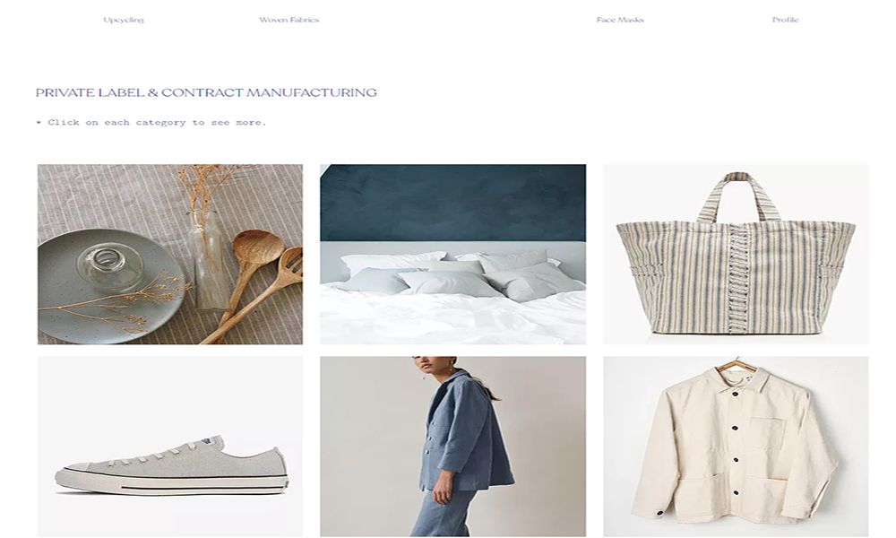
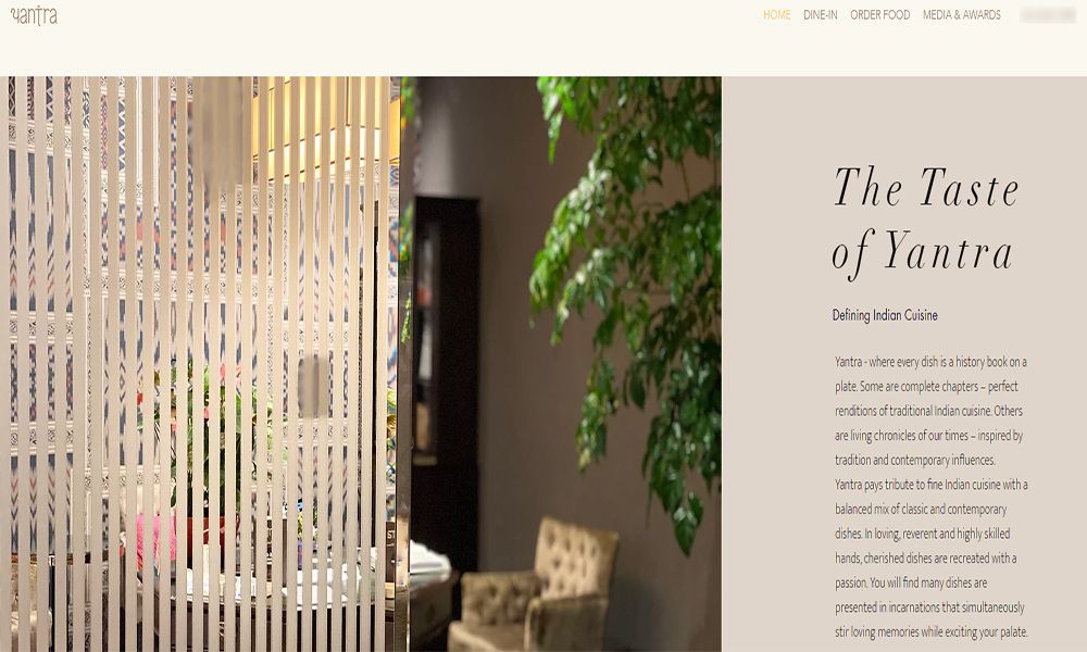
The top trending websites from successful businesses follow a minimalistic design approach to convey the core message clearly and instantly. The top-rated websites also focus on keeping the homepage and service pages as decluttered as possible.
You’ve got a few seconds to convince the user to stay on your website. Therefore, you need to target the users’ emotions rather than focusing on long content. Also, design the website in such a way that the user has to click less, read less, and remember less while getting the essential message.
2. Take Extra Care of Above the Fold Website Contents
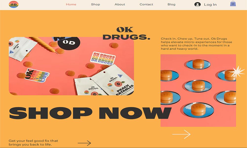
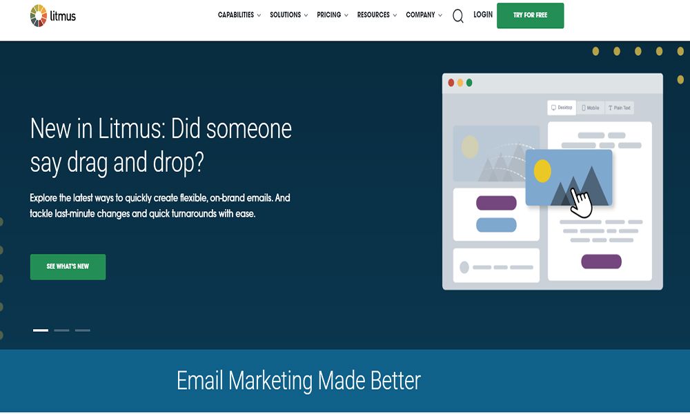
Above the Fold contents are the first elements you see when a web page loads before you need to scroll further to know more. Experienced web designers consider this section the most crucial part of the entire website as it generates the most clicks and leads.
You need to ensure that you include the following when designing Above the Fold content:
- Brand taglines or marketing copies
- Relevant Call-to-Action (CTA) fields
- Product or service brief
- Any exclusive discounts or holiday sales call-outs
3. Place Call-to-Action Buttons at Uniform Distance
An impressive website design strategy must also include additional spaces for Call-to-Action buttons. You shouldn’t rely exclusively on Above the Fold content for every visitor to fill in the form or subscribe to your newsletter.
To persuade the users, place more than one Call-to-Action button apart from the Above the Fold section. Place them at a uniform interval—thus, the website will look aesthetically pleasing and influence the visitor to act on it.
4. Website Design Should Include Easy to Read and View Contents
To create an impressive website, focus on web content Readability Score. You can increase this metric by following these rules:
Choose the color scheme of your website that offers sufficient contrast between the content and background. You can use any of the freely available website contrast checker tools like WebAIM, Coolors, Contrast Ratio, etc.
You can increase your website readability score by using a good font. For long-form content, choose sans serif-type fonts. For short-form content, you can stick to more stylish serif font types.
Depending on your font type, you'll need to adjust the font size as well. You can use a 16pt font size for content paragraphs. Additionally, include multiple H2, H3, and H4 subheadings depending on the SEO technique you follow.
To reduce clutter and bounce rate, limit the website content to a maximum of three typefaces.
5. Create Headlines That Attract Users
Descriptive, emotional, and brand-centered headlines are equally effective to attract users as high-tech animations, graphics, and videos. Catchy and quality headlines should effortlessly explain the product or service snapshot to the users. They'll also increase your website’s SEO score.
When you need to design a text-heavy website, you can make good use of multiple headings and subheadings. Your content headings should be to the point so that the reader can easily find what they're looking for without scrolling through the whole website.
6. Website Designing Should Be Load-Speed Focused
When users visit, your website should be fast enough to display all contents swiftly. Many users will bounce away to a competing website if your website load speed is low.
Consider the followings while designing the next website:
- A light website theme
- Highly compressed yet pleasing to the eye images
- Minimal video and animated files
7. Follow a Visual Hierarchy for Website Designing
Visual hierarchy is a crucial part of website design principles. The best website designers employ a visual hierarchy to guide the visitors to Call-to-Action buttons, subscribe to Newsletter forms, or even buy products or services. The significant hierarchy components are:
A. Web Elements Placements: Place web elements by following standard website layouts that will steer the visitors to website sections where you want them. For example, place the brand logo in the header and the Call-to-Action button in the middle of the website.
B. Size and Weight of Contents: Don't forget to rightly highlight your brand name, vision, mission, products, and tag lines at the top of the screen. Then start presenting smaller contents like descriptions, advantages, disadvantages, comparisons, etc.
8. Your Website Design Should Offer Effortless Navigation
When you’re designing a great website, make sure that visitors can effortlessly find what they want. You can confidently say that your website’s navigation is user friendly if you consider the following:
A. Place relevant links throughout the website so the visitors can reach important website service pages effortlessly. Place the links for product list, product pricing, product description, buy button, Call-to-Action, sales lead form, product cart, checkout, payment method, etc.
B. Make a logo for your company and link it to your website's homepage.
C. When designing the website menu, highlight significant service pages. You can choose from the Hamburger Menu, Mega Menu, or Horizontal Menu, but it should be easily visible on the Fold.
D. If you need a long-form one-page website, you can include an anchor menu. Supplement this design with a Back to Top button for seamless navigation.
E. Your website footer is the last thing a visitor will notice. However, the standard rule says to add important links, social media buttons, and contact details in the footer area.
9. Add Photos of People and Visual Cues on Your Website
Consider adding real photos of people related to your brand on your website. It will increase the trust score of your website. Eventually, more users will purchase your products or services.
If you need to rely on stock photos, choose them carefully from reputed stock photo websites. You’ll want to avoid stock photos that portray terrible fake looks.
You can also increase clicks and sign-ups by displaying a person clicking on the Call-to-Action button or looking at the Newsletter subscription form.
10. Web Design Should Be Compatible With Multiple Devices
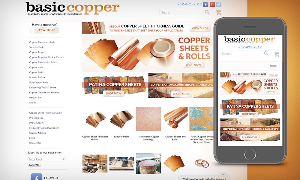
Your design should be compatible and easy to navigate from a range of devices like computers, smartphones, or tablets.
For small screen-sized devices, minimize website assets to make them clutter-free. You can scale down website sections like the Menu.
Be Confident and Design Awesome Websites That Amaze Clients
You can follow the above designing tips to save some productive hours on website layout brainstorming. Additionally, you can also apply these rules to almost all kinds of websites to complete more projects in less time.


