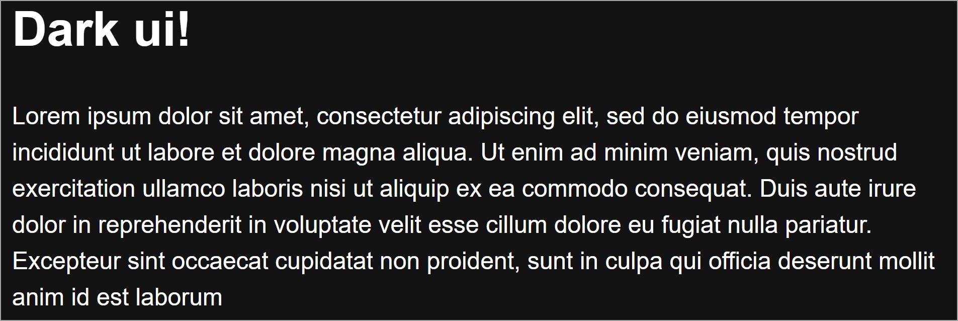
Dark user interfaces have gained popularity, and many applications now offer the option to switch between a light and dark mode. However, implementing a dark UI can be a challenging task that requires careful attention to the colors, fonts, images, and spacing used.
Any mistakes in these elements can result in a poor user experience. The following tips should help you when designing your first dark UI.
1. Don’t Use Pure Black
When designing a dark UI, avoid using pure black backgrounds. It’s better to use a dark shade of gray. For example, Google’s material design theme recommends the color #121212.
A black background combined with white text can have too much contrast and cause eyestrain. Darker shades of gray instead can show shadows, depth, and elevation easily.
2. Ensure Text Contrast Meet WCAG 2.0 Guidelines
Choose a color combination that offers a proper level of contrast, so the text is legible. WCAG 2.0 guidelines state that text or images of text must have a contrast ratio of at least 4.5:1 with large text (at least 18 point or 14 point bold) must have a contrast ratio of at least 3:1.
There are several tools for checking color contrast, including the WAVE Chrome extension which also checks how accessible the colors are.
3. Pick the Right Font Style
You must also take into account the font styles of your text including the size, weight, and line height. If you’re looking for font options, don’t forget there are plenty of sites that offer free fonts. As for font size, use values that are sufficient to ensure the text is clear and visible on a dark background.
Consider the following styles for a web page:
        body {
  font-family: "Courier New", monospace;
  font-size: 12px;
  font-weight: 200;
  line-height: 1;
  color: #333333;
}
The font family is difficult to read, the font size is too small, and the font weight is too light. These styles make the page difficult to read as you can see from the screenshot below.
Below are some appropriate styles you could use instead.
        body {
  font-family: "Arial", sans-serif;
  font-size: 16px;
  font-weight: 400;
  line-height: 1.5;
  color: #FFFFFF;
  background-color: #121212;
}
And here is the resulting page:
4. Avoid Saturated Accent Colors
Saturated colors can be too bright and blurry on dark backgrounds. Instead, use colors that are less intense and muted. This way you create a user interface that has visible text.
To demonstrate, consider these two button styles:
        /* Saturated blue */
.btn-saturated-blue {
  background-color: #121212;
  color: #0e0bf6;
}

/* Muted blue */
.btn-muted-blue {
  background-color: #121212;
  color: #4c5ab3;
}
The saturated blue color may be too bright and difficult to read on a dark background, while the muted blue color provides good contrast and is easier to read.
A tool like colorable is helpful for generating color combinations that follow accessibility guidelines.
5. Use Negative Space to Prevent Creating a Heavy UI
A dark color palette can make UI appear heavy to users. When used properly, negative space can help you highlight important UI elements and make text easy to scan. Sufficient spacing can also make the design cleaner and more modern.
Take, for instance, Apple’s landing page. Space between elements makes the page look very modern, and visually interesting, allowing important elements to stand out.
6. Use Different Color Shades to Add Depth to the UI
When designing light UIs, you may use shadows to add depth and elevation to elements. However, because of the dark backgrounds, shadows are sometimes hard to see in dark UIs.
You can achieve depth in a dark UI by using multiple shades of dark colors. For example, instead of just one dark background, you can add lighter shades of the same color to different elements like buttons and modals.
7. Ensure Your Images Match the Dark UI
You don’t need to use the same images for light mode and dark mode. You can use dark mode CSS media queries to switch out images that match the dark UI whenever the user toggles to dark mode.
For example, to apply a specific background pattern to sections of your page in dark mode, you can use the .bgpattern class name and add the following code to your stylesheet.
        @media (prefers-color-scheme: dark) {
  /* Apply this style in dark mode only */
  .bgpattern {
    background-image: url("/dark.jpg");
  }
}
This media query ensures that the referenced background image is only displayed when the user's preferred color scheme is dark.
When to Use a Dark UI
Dark UI designs are a great way to give a modern aesthetic to your website or application. They can also minimize eye strain and conserve battery life. However, dark UIs are not suitable for every application, and you should always consider the brand and user base.
Generally, dark UIs are best suited for brands that prioritize luxury, prestige, minimalism, or mystery. They can also be a great choice for dashboards and visualization tools.


