Anyone with experience in web design, whether you've used DIY website builders or made a site from scratch, is likely to have heard of CSS before. This incredibly powerful tool can be used to transform your web layouts, giving you the power to take control of your website and achieve your creative vision. But how can you use cascading style sheets to unlock the potential of your next website?
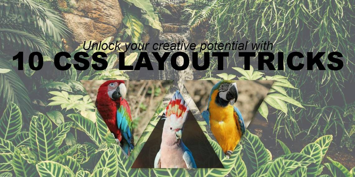
This guide will only be detailing a range of CSS properties that have all been used to create the header you can see in the image above. You can find this project here on CodePen, giving you the chance to try it for yourself.
CSS Image Manipulation
The first step we need to take to build our header section is adding images to the page. You can use a range of methods to achieve this goal, so we've covered the most popular, along with a couple of tricks to help you to manipulate your images.
1. CSS Background-Image

We want to have a full-screen background image for our header, and the background-image CSS property is ideal. First, we need to create a container for our image (and the rest of the elements within the header).
We started by adding a div tag with "header" as its class, followed by setting its height to 100vh and its width to 100vw; this gives us a box that is exactly the same size as the viewport. We also added a CSS rule for the body of the page, with its overflow set to hidden and its margins set to 0px.


With the container in place, we can add a background image, and there are three different CSS rules we need to achieve this goal. The first, background-image, needs a URL to act as the source of the background image, and we've used the handy Unsplash catalog for this. We also need to set the background-size to cover and the background-position to bottom, but you may want to experiment with these for the best results.
2. CSS Background-Blend-Mode

CSS blend modes make it possible to blend images and text, much like the blend feature in software like Adobe Photoshop. To make blend modes work with our background image, we set the background-color to semi-transparent white before adding the blend mode we wanted to use.

Following this, background-blend-mode was set to soft-light, allowing us to soften the image.
3. CSS Clip-Path

For our next trick, we will be using a rule called clip-path. When using img HTML tags, you can set a path that will hide parts of the images that you are working with. You can choose to use general shapes for this, but you could also use an SVG-generating app to create a more intricate design.


We added a div tag with "flex_image_box" to act as a container for three images, using the display CSS property to turn it into a flexbox (we'll talk about this later). Three img tags were added inside the div tag, with IDs set as "img1", "img2", and "img3". Setting the width of each image to 600px, we are able to leave the height property blank without changing the aspect ratio of the images; now it's time to add our clip-path!

To create our three triangles, we used the same polygon clip-path for img1 and img3, with an inverted version in place for img2. We also had to play with the positioning of our flex-box container to make sure that the images sit in the right position on the screen. Our clip-path rules can be seen below.

4. CSS Opacity

Opacity sets the level of transparency of any HTML element. We set the opacity of our images to 90%, making them slightly opaque so that they meld nicely with the background.
CSS Responsive Text & Images
We've already explored the art of creating stunning responsive websites using HTML, CSS, and JavaScript in the past, but we can build on the principles you already understand providing a deeper insight into the skills you need to master your website layouts.
1. CSS Responsive/Relative Units
CSS units like px, pt, and cm are absolute units, and this means that a web browser will render them at the same size no matter the width and height of the window they occupy. Relative units are different, producing heights and lengths that are relative to other measurements, like the browser window or a parent element. The relative units below are commonly used and essential for responsive web design.
- em: This unit is usually used with text. It is relative to the font-size of the current element, making 4em four times as large as the font-size that is set.
- rem: Like em, rem is relative to the font-size of an element; the root element in a hierarchy is used to define the output size.
- vw/vh: Determining width and height based on the size of the viewport, 2vw equals 2% of the browser width while 2vh equals 2% of the browser height.
- %: The % unit calculates dimensions based on the size of an element's parent.
- vmin/vmax: These units produce dimensions relative to 1% of the viewport's smallest or largest dimensions, providing elements with the means to respond directly to the size of a browser window.
2. CSS Font-Size

This property can be set using default values that are predefined by either the website's main stylesheet or the user's web browser. These values include medium, xx-small, x-small, small, large, x-large, and xx-large, with medium being set as the default for any text that lacks a font-size CSS tag. Alternatively, relative values can be employed when using the font-size CSS property, and this is the method that we have used to ensure that the text in our header section is sized appropriately for any viewport.

We added two heading tags to our HTML, enabling us to add text to the project. One is a main large header, while the other is a subheader, and they both use relative units.

3. CSS Width & Height

All HTML elements come with height and width dimensions, whether they are div, img, a, or any other type of tag. These dimensions can be automatically set to default values, but they can also be dictated by web designers using the correct rules; we've used both of these methods for this header.
Responsive units have been used for the background image, with the height set to 100vh and the width set to 100vw, but we have also used absolute units for our three images. It's worth exploring and experimenting with CSS width and height units, with options like "inherit" providing the means to adopt the dimensions of a parent element, and there are loads of other tricks like this that you can use.
4. CSS Mix-Blend-Mode

CSS mix-blend-mode is very similar to background-blend mode, only it can be applied to any element, rather than being exclusively for backgrounds. We have used this property on our H1 heading to add texture and make the project more interesting. We started by setting our text color to black, followed by setting the mix-blend-mode to overlay.
It's well worth exploring the different blend options you have when dealing with text, as backgrounds with unique color profiles will respond differently to the settings you use.

5. CSS Text-Transform

CSS text-transform is a clever property that enables designers to change the case of the text on their websites without impacting the way that search engines read it. For example, we have set text-transform to uppercase on our H1 heading, making each letter a capital no matter how we input it in our HTML.

CSS Overflow Properties
HTML can often seem like a rigid framework that sets strict boundaries for the content on your websites, but this doesn't have the case when overflow properties are employed.
CSS Overflow & Text-Overflow
Overflow and text-overflow are very similar CSS properties. Overflow can be applied to any element, giving you control over the content that is able to escape its boundaries. Text-overflow is similar, though it only applies to text, and gives you the ability to add additional parameters to your rules. We have only used overflow for this project (we used it to restrict the size of our page's body), but you can read about text-overflow on the W3Schools website.
Using CSS for Your Web Layouts
CSS is an incredibly powerful tool, enabling web designers and developers to create stunning websites using code. We encourage you to take a look at the CodePen we provided at the beginning of the article, as this will give you an even deeper insight into how all of these tools work. Plus, you can play with the header we've made to add your own finishing touches.