CSS3 allows you to be creative and experiment with your design to build beautiful and unique web pages. One area of design that CSS allows you to work with is typography.
You can use the font-family and text-shadow properties to create simple yet remarkable effects. You may already know about basic applications of text shadow in CSS. However, you can create a wide range of styles with these properties.
In this article, you’ll learn an effective way to create different text shadow effects using HTML and CSS.
Getting Started With HTML and CSS
You can copy and paste these code examples to get whichever text shadow effect you prefer. Start by creating an index.html file and a style.css file. These are the only files you'll need to try out the examples, but you'll need to change both files for each example.
index.html
        <!DOCTYPE html>

<html lang="en">

 <head>

   <meta charset="UTF-8" />

   <meta http-equiv="X-UA-Compatible" content="IE=edge" />

   <meta name="viewport" content="width=device-width, initial-scale=1.0" />


   <em><!-- shadow #01 --></em>

   <link rel="preconnect" href="https://fonts.googleapis.com" />

   <link rel="preconnect" href="https://fonts.gstatic.com" crossorigin />

   <link

     href="https://fonts.googleapis.com/css2?family=Bowlby+One&display=swap"

     rel="stylesheet"

   />

   <em><!-- shadow   #02 --></em>

   <link rel="preconnect" href="https://fonts.googleapis.com" />

   <link rel="preconnect" href="https://fonts.gstatic.com" crossorigin />

   <link

     href="https://fonts.googleapis.com/css2?family=Monoton&display=swap"

     rel="stylesheet"

   />

   <em><!-- shadow #03 --></em>

   <link rel="preconnect" href="https://fonts.googleapis.com" />

   <link rel="preconnect" href="https://fonts.gstatic.com" crossorigin />

   <link

     href="https://fonts.googleapis.com/css2?family=Bungee+Shade&display=swap"

     rel="stylesheet"

   />


   <em><!-- shadow #04 --></em>

   <link rel="preconnect" href="https://fonts.googleapis.com" />

   <link rel="preconnect" href="https://fonts.gstatic.com" crossorigin />

   <link

     href="https://fonts.googleapis.com/css2?family=Rampart+One&display=swap"

     rel="stylesheet"

   />


   <em><!-- shadow #05 --></em>

   <link rel="preconnect" href="https://fonts.googleapis.com" />

   <link rel="preconnect" href="https://fonts.gstatic.com" crossorigin />

   <link

     href="https://fonts.googleapis.com/css2?family=Faster+One&display=swap"

     rel="stylesheet"

   />


   <em><!-- shadow #06 --></em>

   <link rel="preconnect" href="https://fonts.googleapis.com" />

   <link rel="preconnect" href="https://fonts.gstatic.com" crossorigin />

   <link

     href="https://fonts.googleapis.com/css2?family=Eater&display=swap"

     rel="stylesheet"

   />


   <em><!-- shadow #07 --></em>

   <link rel="preconnect" href="https://fonts.googleapis.com" />

   <link rel="preconnect" href="https://fonts.gstatic.com" crossorigin />

   <link

     href="https://fonts.googleapis.com/css2?family=Codystar&display=swap"

     rel="stylesheet"

   />


   <link rel="stylesheet" href="style.css" />

   <title>CSS Text Shadow Examples</title>

 </head>

</html>
style.css
        body {

 text-transform: uppercase;

 line-height: 1;

 text-align: center;

 font-size: 5rem;

 display: grid;

 gap: 4rem;

}
Now, let’s go through 11 text shadow examples for you to try out.
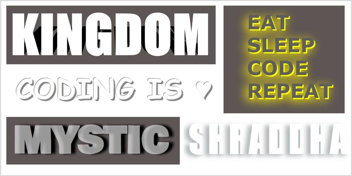
Mystic
Mystic is a glassy style giving a cool transition-like effect without using the transform property. It is a super simple, yet aesthetically pleasing, effect for a bold and growth-oriented website.
Output

HTML
        <body>

 <em><!-- Shadow #01 --></em>

 <h1 class="mystic">Mystic</h1>

</body>
CSS
        body {

 background-color: #5e5555;

}

.mystic {

 font-family: 'Bowlby One', cursive;

 color: rgba(255, 255, 255, 0.596);

 text-shadow: 20px 0px 10px rgb(0, 0, 0);

}
Monoton
This is a playful text effect using the ‘Monoton’ font. You can play around with the text and shadow color to match your website’s primary colors.
Output

HTML
        <body>

 <em><!-- Shadow #02 --></em>

 <h1 class="monoton">Monoton</h1>

</body>
CSS
        .monoton {

 font-family: 'Monoton', cursive;

 font-size: 15rem;

 color: rgb(255, 0, 0);

 opacity: 0.5;

 text-shadow: 0px -78px rgb(255, 196, 0);

}
Bungee
This is a cool style using the ‘Bungee Shade’ font. Combined with a dark background, it produces a raw effect with a sense of suspicion.
Output

HTML
        <body>

 <em><!-- shadow #03 --></em>

 <h1 class="bungee">Bungee</h1>

</body>
CSS
        body {

 background-color: #222;

}

.bungee {

 font-family: 'Bungee Shade', cursive;

 color: rgb(160, 12, 12);

 opacity: 0.9;

 text-shadow: -18px 18px 0 rgb(66, 45, 45);

}
Radioactive
You can use this effect for alert or danger signs. It uses the ‘Rampart One’ font.
Output

HTML
        <body>

 <em><!-- shadow #04 --></em>

 <h1 class="radioactive">Radioactive</h1>

</body>
CSS
        body {

 background-color: #27292d;

}

.radioactive {

 font-family: 'Rampart One', cursive;

 color: rgb(97, 214, 43);

 <em>opacity: 0.6;</em>

 text-shadow: -18px -18px 20px rgb(87, 255, 9);

}
Sprint
This running text effect uses the ‘Faster One’ font, the text-shadow property, and an ::after pseudo-element with the same content as the text. This creates a ‘doubling’ effect.
Output

HTML
        <body>

 <em><!-- shadow #05 --></em>

 <h1 class="sprint">Sprint</h1>

</body>
CSS
        body {

 background-color: #27292d;

}

.sprint {

 font-family: 'Faster One', cursive;

 font-size: 10rem;

 color: rgba(255, 0, 242, 0.322);

 text-shadow: -20px -108px 0px rgba(255, 255, 255, 0.445);

 letter-spacing: 1rem;

 position: relative;

}

.sprint::after {

 content: 'sprint';

 position: absolute;

 top: 215px;

 right: 300px;

}
Prickly
This horrifying prickly text effect uses the ‘Eater’ font. You can try shifting the text-shadow towards the bottom-right instead.
Output

HTML
        <body>

 <em><!-- shadow #06 --></em>

 <p class="prickly">Prickly</p>

</body>
CSS
        .prickly {

 font-family: 'Eater', cursive;

 text-shadow: -18px -18px 2px #777;

}
Codystar
The text-shadow can act as a blurred yet visible outline to the text. This bright effect works wonders with the ‘Codystar’ font.
Output

HTML
        <body>

 <em><!-- shadow #06 --></em>

 <p class="codystar">Codystar</p>

</body>
CSS
        .codystar {

 font-family: 'Codystar', cursive;

 font-weight: bold;

 color: rgb(55, 58, 255);

 text-shadow: 1px 1px 10px rgb(16, 72, 255), 1px 1px 10px rgb(0, 195, 255);

}
Kingdom
You can achieve authoritative typography with this shadow effect. It uses the ::before pseudo-element and the transform property to slant the shadow.
Output

HTML
        <body>

 <em><!-- shadow #08 --></em>

 <h1 class="kingdom kingdom--shadow" data-text="kingdom">Kingdom</h1>

</body>
CSS
        body {

 background-color: #5e5555;

}

.kingdom {

 color: white;

 font-family: Impact, Haettenschweiler, 'Arial Narrow Bold', sans-serif;

 font-size: 10rem;

 line-height: 1;

 text-align: center;

}

.kingdom--shadow::before {

 color: #000;

 content: attr(<em>data-text</em>);

 margin-top: 0.7rem;

 position: absolute;

 transform: perspective(205px) rotateX(38deg) scale(0.84);

 z-index: -1;

}
Coder
This bright and positive text-shadow effect conveys a self-aware and motivated website personality. You can add it to your website to produce a simple smokey look.
Output

HTML
        <body>

 <em><!-- shadow #09 --></em>

 <div class="coder-life">

   Eat


   Sleep


   Code


   Repeat

 </div>

</body>
CSS
        body {

 background-color: #5e5555;

}

div {

 font-family: Verdana, Geneva, Tahoma, sans-serif;

 padding: 40px;

 margin: 0px auto;

 font-weight: bold;

 line-height: 5.8rem;

 text-align: left;

 color: rgb(94, 94, 94);

}

.coder-life {

 text-shadow: 5px 5px #ffff00;

 filter: drop-shadow(-10px 10px 20px #fff000);

}
Elegant
If you love minimalism, then this text shadow effect is a perfect fit. Since it uses a large font size, we reduced the letter-spacing and applied the text-shadow property to create this effect.
Output

HTML
        <body>

 <em><!-- shadow #10 --></em>

 <div class="elegant">

   <span>s</span>

   <span>h</span>

   <span>r</span>

   <span>a</span>

   <span>d</span>

   <span>d</span>

   <span>h</span>

   <span>a</span>

 </div>

</body>
CSS
        .elegant {

 font-family: Impact, Haettenschweiler, 'Arial Narrow Bold', sans-serif;

 font-size: 10rem;

 letter-spacing: -1rem;

 color: white;

 text-shadow: -18px 8px 18px #b4bbbb;

}
Playful
The thin and bold outline makes this text attractive and lively. You can play around with the text-shadow property with no blur radius at different positions. Text shadows apply to all characters, including HTML entities such as ♥. You can use a Character Entity Reference Chart to explore further.
Output

HTML
<body>
<em><!-- shadow #11 --></em>
<h2 class="playful">Coding is ♥</h2>
</body>
CSS
        .playful {

 font-family: 'Baloo Tamma', cursive;

 color: #fff;

 letter-spacing: 0.2rem;

 text-shadow: -2px -2px 0px #888,

                4px 4px 0px #888,

                7px 7px 0px #888;

}
Keep Experimenting With Advanced Shadow Effects
Text shadows are an easy and effective way to enhance your web design and make your website visually appealing. You can also experiment with different shadow effects. You can learn more about drop shadow effects to continue your CSS journey.