Skeleton screens are an integral part of visitor retention in modern design trends. They create an illusion of speed and manage the users’ expectations by keeping them informed about the status of a page's content. One of the most essential yet underrated solutions that skeleton screens offer is their help in avoiding Cumulative Layout Shift (CLS), allowing content to display all at once rather than sequentially as it loads.
Ready to make your interfaces more intuitive and expressive by implementing skeleton screens in your own projects? Here's how to get started.
Design the Web Page Layout

Designing a web page layout helps you crystalize your expectations. You should set your goal, define the layout, add any required pages, and make it accessible and responsive for different screen sizes. For now, consider a simple design with a cover image, profile image, a little text, and call-to-action buttons.
Once you’ve drafted the design of the layout, either using paper or an app like Figma or Adobe XD, it’s time to prepare the HTML structure.
Build the Basic Structure
Create a new file index.html and write some HTML for the layout inside a parent <div> with class=”profile-container”. Add class=”skeleton” to every element in order to apply the skeleton screen loading effect. You’ll be removing this class when the content is loaded using JavaScript.
Note: Don’t forget to link the CSS and JavaScript files in the header of your index.html file.
<head>
<meta charset="UTF-8" />
<meta http-equiv="X-UA-Compatible" content="IE=edge" />
<meta name="viewport" content="width=device-width, initial-scale=1.0" />
<link rel="stylesheet" href="style.css" />
<title>Skeleton Screen Loading Effect</title>
</head>
<body>
<div class="profile-container">
<div class="profile-images">
<div class="cover-img skeleton">
<img src="./image/linkedin banner.jpg">
</div>
<div class="profile-img skeleton">
<img src="./image/user-profile.jpg" alt="Photo by Ian Dooley on Unsplash">
</div>
</div>
<div class="profile-text">
<h1 class="skeleton">John Doe</h1>
<p class="skeleton">Software Engineer @ Google || Full Stack Developer || Self Taught</p>
<h5 class="skeleton">Bengaluru, Karnataka, India • <a class="skeleton" href="/">Contact info</a></h5>
<p class="skeleton"><a class="skeleton" href="/">534 connections</a></p>
</div>
<div class="profile-cta">
<a class="message-btn skeleton" href="/">Message</a>
<a class="more-btn skeleton" href="/">More</a>
</div>
</div>
<script src="script.js"></script>
</body>
Start Styling Your Page
Apply the basic CSS attributes like margin, font-family, and color all over the body.
        body {

 margin: 0;

 font-family: Arial;

 color: rgba(255, 255, 255, 0.9);

}
Add loading effect
To add a loading effect, add an ::after pseudo-element to the skeleton class that moves from the left (-100%) to the right (100%) over a second or two, resulting in a shimmer animation.
        .skeleton {

 position: relative;

 width: max-content;

 overflow: hidden;

 border-radius: 4px;

 background-color: #1e2226 !important;

 color: transparent !important;

 border-color: #1e2226  !important;

 user-select: none;

 cursor: default;

}


.skeleton img {

 opacity: 0;

}


.skeleton::after {

 position: absolute;

 top: 0;

 right: 0;

 bottom: 0;

 left: 0;

 transform: translateX(-100%);

 background-image: linear-gradient(

   90deg,

   rgba(255, 255, 255, 0) 0,

   rgba(255, 255, 255, 0.2) 20%,

   rgba(255, 255, 255, 0.5) 60%,

   rgba(255, 255, 255, 0)

 );

 animation: shimmer 2s infinite;

 content: '';

}


@keyframes <em>shimmer</em> {

 100% {

   transform: translateX(100%);

 }

}

Style the Images
Now, let’s style the profile and cover image. Don’t forget to set overflow: hidden; to avoid any inconsistencies.
        img {

 width: 100%;

 vertical-align: middle;

}


.profile-container {

 width: 95%;

 max-width: 780px;

 margin: 0 auto;

 border-radius: 8px;

 margin-top: 32px;

 background-color: #1e2226;

 overflow: hidden;

 position: relative;

}


.cover-img {

 width: 100%;

 overflow: hidden;

 background-color: #1e2226;

 aspect-ratio: 4 / 1;

}


.profile-img {

 border-radius: 50%;

 width: 160px;

 height: 160px;

 border: 4px solid #000;

 background-color: #1e2226;

 margin: 0 auto;

 position: relative;

 overflow: hidden;

 bottom: 100px;

}
Make It Responsive
To make sure that your design is responsive on different screens, apply media queries accordingly. If you're a beginner to web development, you should learn how to use media queries in HTML and CSS because they're super important when building responsive websites.
        @media (max-width: 560px) {

 .profile-img {

   width: 100px;

   height: 100px;

   bottom: 60px;

 }

}
Style the Text
Style the text by setting a margin, font-size, and font-weight. You can also change the text color, add a heading, paragraph, or anchor <a> tag according to your preferences. Adding a hover effect to the anchor tag is useful because it lets the user know about a link.
        .profile-text {

 margin-top: -80px;

 padding: 0 16px;

}


.profile-text h1 {

 margin-bottom: 0;

 font-size: 24px;

 overflow: hidden;

}


.profile-text p {

 margin: 4px 0;

 overflow: hidden;

}

.profile-text h5 {

 margin-top: 4px;

 font-size: 14px;

 margin-bottom: 8px;

 font-weight: 400;

 color: #ffffff99;

 overflow: hidden;

}

.profile-text a {

 color: #70b5f9;

 font-size: 14px;

 text-decoration: none;

 font-weight: 600;

}


.profile-text a:hover {

 color: #70b5f9;

 text-decoration: underline;

}
Style the CTA
A Call to Action (CTA) is important because you'll generally want to convert your users' visits in some way. Giving it an easily noticeable color will help your CTA stand out on the page.
        .profile-cta {

 padding: 16px 16px 32px;

 display: flex;

}

.profile-cta a {

 padding: 6px 16px;

 border-radius: 24px;

 text-decoration: none;

 display: block;

}


.message-btn {

 background-color: #70b5f9;

 color: #000;

}


.more-btn {

 color: inherit;

 border: 1px solid rgba(255, 255, 255, 0.9);

 margin-left: 8px;

}
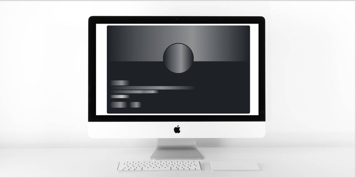
Output:

Turn Off Skeleton Loading Effect Using JavaScript
Now that you've added the leading effect using CSS, it’s time to turn it off using JavaScript. The animation will repeat an infinite number of times by default, but you want it to run only for a few seconds. You can set the time to 4000 milliseconds using setTimeout. It’ll remove the skeleton class from all the elements after 4 seconds.
Note: Make sure to add <script src="script.js"></script> just before the end of the <body> section.
        const skeletons = document.querySelectorAll('.skeleton')

skeletons.forEach((<em>skeleton</em>) => {

 setTimeout(() => {

   <em>skeleton</em>.classList.remove('skeleton')

 }, 4000)

})
Output:

What's JavaScript and How Does It Work?
You have successfully created a skeleton screen loading effect using HTML, CSS, and JavaScript. Now, whenever anyone requests new content from the server, you can display the skeleton screen loading effect while the data is loading. It's becoming more of a popular design trend, as you can see it on sites like Google, Facebook, and Slack.
Meanwhile, if you’re new to JavaScript, you can learn the basics by understanding JavaScript and how it interacts with HTML and CSS.