A solid understanding of Flexbox and CSS Grid is necessary if you want to build stunning, responsive websites.
If you've been writing CSS for any length of time, the chances are good you've at least heard of these terms. You might even have used one or both to some degree. They're both powerful parts of CSS, with similar but subtly different use cases.
What Is Flexbox?
Flexbox is a one-dimensional CSS layout method that's been around for a while now. You can think of Flexbox as a bunch of related CSS properties you can use to align HTML elements in a container and manage the space between them.
Before Flexbox, this type of layout required frustrating and unwieldy use of the float and position properties.
If you're worried about browser support for Flexbox, don't be. According to caniuse.com, all modern browsers support Flexbox.
The Basics of Flexbox
While Flexbox includes many CSS properties, the basics are pretty simple. Using Flexbox always starts by declaring a parent container as a flex-container by adding display: flex to its style rules. Doing this automatically makes all children of this element flex-items.
After that, you can control the distribution of space within the flex-container using the justify-content property. You can control the alignment of flex-items with the align-items property.
Here's a code example that uses Flexbox to spread the space in a container evenly between its children, and align them all in the center of the container. This is the HTML:
        <div class="container">
    <div>1</div>
    <div>2</div>
    <div>3</div>
    <div>4</div>
    <div>5</div>
</div>
This is the CSS:
        .container {
    display: flex;
    width: 100%;
    justify-content: space-around;
    align-items: center;
    border: 1px solid black;
    height: 200px;
}

.container > div {
    height: 100px;
    width: 100px;
    background-color: red;
    color: white;
    font-size: 5rem;
    text-align: center;
    border-radius: 5px;
}
And here's the output:
What Is CSS Grid?
CSS Grid is a layout system that's complementary to Flexbox. Flexbox is powerful, but not very suited for certain types of layouts. Trying to lay out the structure of an entire page with Flexbox will end up being a frustrating task involving ugly, non-sematic markup and hacky CSS.
CSS Grid is not a Flexbox replacement, but rather an alternative system for some situations.
The support for CSS Grid isn't quite as extensive as it is for Flexbox, but Grid is reasonably well-supported in 2022.
The Basics of CSS Grid
The concept of Grid is simple. As the name suggests, CSS Grid allows you to divide the space in a parent container into a row-and-column grid, with any number of rows/columns you like. After that, you specify the position of the child items by referencing the lines of the parent's grid.
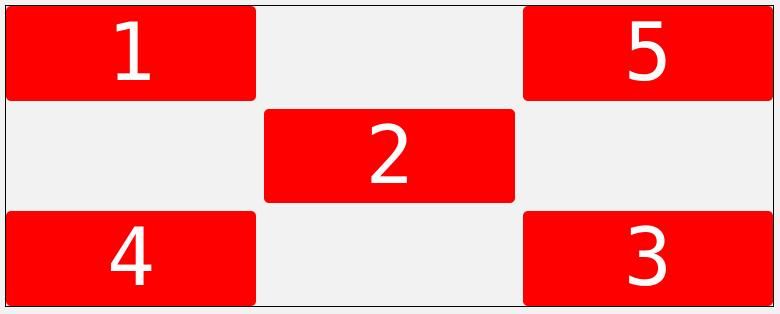
Start by adding display: grid to the parent container. Then use the grid-template-rows and grid-template-columns properties to specify the rows and columns you want to split the grid into. You can then use the grid-column and grid-row properties on the child elements to tell them where in the grid they should be. Let's look at a Grid example that uses the five-element setup from before, but in a more complicated arrangement.
Here's the HTML:
        <div class="container">
    <div>1</div>
    <div class="two">2</div>
    <div class="three">3</div>
    <div class="four">4</div>
    <div class="five">5</div>
</div>
Here's the CSS:
        .container {
    display: grid;
    width: 100%;
    grid-template-rows: repeat(3, 1fr);
    grid-template-columns: repeat(3, 1fr);
    gap: 0.5rem;
    border: 1px solid black;
    height: 300px;
}

.container > div {
    background-color: red;
    color: white;
    font-size: 5rem;
    text-align: center;
    border-radius: 5px;
}

.container > .two {
   grid-row: 2;
   grid-column: 2;
}
Here's the output:
CSS Grid also includes a good deal of other properties you can use to build more complex layouts.
Which One Should You Use?
First, it's important to note that nothing stops you from using Flexbox and Grid together and, in some cases, that's the optimal choice. That said, let's answer the question of which layouts each of these systems is most suited to implementing.
Flexbox is best suited to building layouts that involve aligning and distributing elements on a single line. Examples of this kind of layout are aligning icons at the end of a section, or arranging the links in a navigation bar.
Grid, on the other hand, shines brightest when you have to precisely position elements relative to others (both horizontally and vertically), and you need this positioning to easily adapt to various screen sizes.
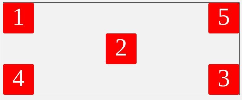
To demonstrate, here's the code you would need to write to recreate the layout from the Grid example with Flexbox.
The HTML:
        <div class="container">
    <div class="sub one">
        <div>1</div>
        <div>5</div>
    </div>

    <div class="sub two">
        <div>2</div>
    </div>

    <div class="sub three">
        <div>4</div>
        <div>3</div>
    </div>
</div>
The CSS:
        .container {
    border: 1px solid black;
    height: 300px;
}

.sub {
    display: flex;
    width: 100%;
}

.one, .three {
    justify-content: space-between
}

.two {
    justify-content: center;
}

.sub > div {
    height: 100px;
    width: 100px;
    background-color: red;
    color: white;
    font-size: 5rem;
    text-align: center;
    border-radius: 5px;
}
And here's the output:
The main thing to note here is that while this code produces the same output as the Grid example, the markup here is significantly more complicated. Implementing this layout requires sub-containers, and you have to place the numbered divs out of order in the markup.
Furthermore, assume you needed to shift this layout into an awkward position: say aligning the 5th div with the 2nd. If you'd used Flexbox for this, you would have to resort to position: relative or something similar. Using Grid, all you need is to shift the grid-column property.
But, in contrast, implementing the simple single line alignment from the Flexbox example with Grid would result in much more CSS. Grid is obviously less suited for that kind of layout.
While Flexbox and Grid can mostly replicate each other's effects, there are some exceptions. Making elements overlap is pretty hard with just Flexbox but is very easy with Grid. Grid also doesn't allow elements to push themselves away from other elements with margin:auto the way Flexbox does.
Flexbox and Grid Are Powerful Layout Systems
Flexbox and CSS Grid are both design systems that make laying out your webpage content easy. Grid is best for two-dimensional layouts with many elements that need to be precisely positioned relative to each other. Flexbox is better for one-dimensional or single-line layouts where you just need to space a bunch of elements a certain way.


