The flex properties in CSS allow you to align items more flexibly and responsively. This makes it useful when you want your HTML elements to be more responsive inside the web browser.
This article will go through how you can use certain flex properties. This includes the flex-direction, justify-content, align-self, align-items, align-content, and gap properties.
How to Set Up CSS Flex Display
An example structure that you can use to explore the basics of flexbox is a set of child divs underneath a single parent div. In the code below, there is a main "parent" div. The three child divs represent items that you can align using flex properties.
        <div class="parent">
    <div class="child-item"></div>
    <div class="child-item"></div>
    <div class="child-item"></div>
</div>
For any flex styling to work, you will need to add the display: flex property to the parent flex container.
        .parent {
  display: flex;
}
Without flex, the child divs display one after another in a column formation down the page.
To view an example of this setup, view and run the code in this CodePen snippet.
How to Control Layout Direction
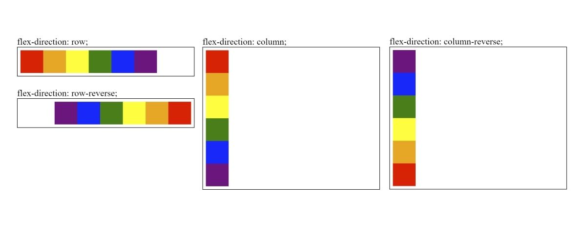
The flex-direction property determines the row or column direction of the child items.
Options for the flex-direction property include:
flex-direction: row | column | row-reverse | column-reverse
You will need to add a parent container surrounding the items you would like to align.
HTML:
        <div class="parent">
  <div class="red"></div>
  <div class="orange"></div>
  <div class="yellow"></div>
  <div class="green"></div>
  <div class="blue"></div>
  <div class="purple"></div>
</div>
CSS:
        .red { background-color:red; }
.orange { background-color: orange; }
.yellow { background-color: yellow; }
.green { background-color: green;}
.blue { background-color: blue; }
.purple { background-color: purple; }


.parent div {
 width: 40px;
 height: 40px;
}
Apply the flex-direction property to the parent flex container. This will align the child div items.
        .parent {
 width: 300px;
 display: flex;
 flex-direction: row;
}
Many flex properties refer to the concept of the main axis and the cross axis. When flex-direction is row, the main axis represents the horizontal direction, and the cross axis represents the vertical. A value of column switches these axes.
View the code for the flex-direction property in this CodePen snippet to see some examples.
How to Align Items Along the Cross Axis
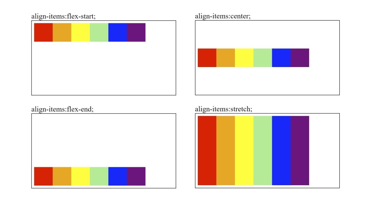
The align-items property controls the alignment of items along the cross axis. For the default flex-direction, row, align-items controls the vertical alignment of the items.
Options for the align-items property include:
align-items: flex-start | flex-end | align-items | stretch
Add the align-items property to the parent container to align its children.
        .parent {
  display: flex;
  align-items: flex-start;
}
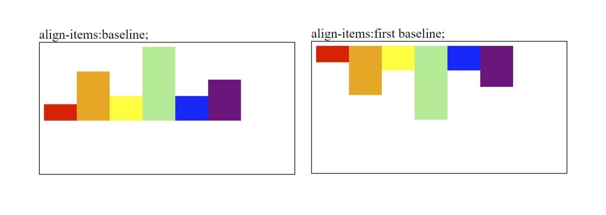
Additionally, you can choose to align the items using a baseline. By default, the baseline option aligns all items based on the base of the items.
You can also choose where the baseline starts from, such as the top (first baseline) or bottom (last baseline).
align-items: baseline | first baseline | last baseline;
For align-items: baseline to work, make sure that each item has a different height or width (depending on the axis you are using).
        <div class="parent">
  <div class="red" style="height:20px"></div>
  <div class="orange" style="height:60px"></div>
  <div class="yellow" style="height:30px"></div>
  <div class="green" style="height:90px"></div>
  <div class="blue" style="height:30px"></div>
  <div class="purple" style="height:50px"></div>
</div>
View the code for the align-items property in this CodePen snippet to see some examples.
How to Override Alignment on Individual Items
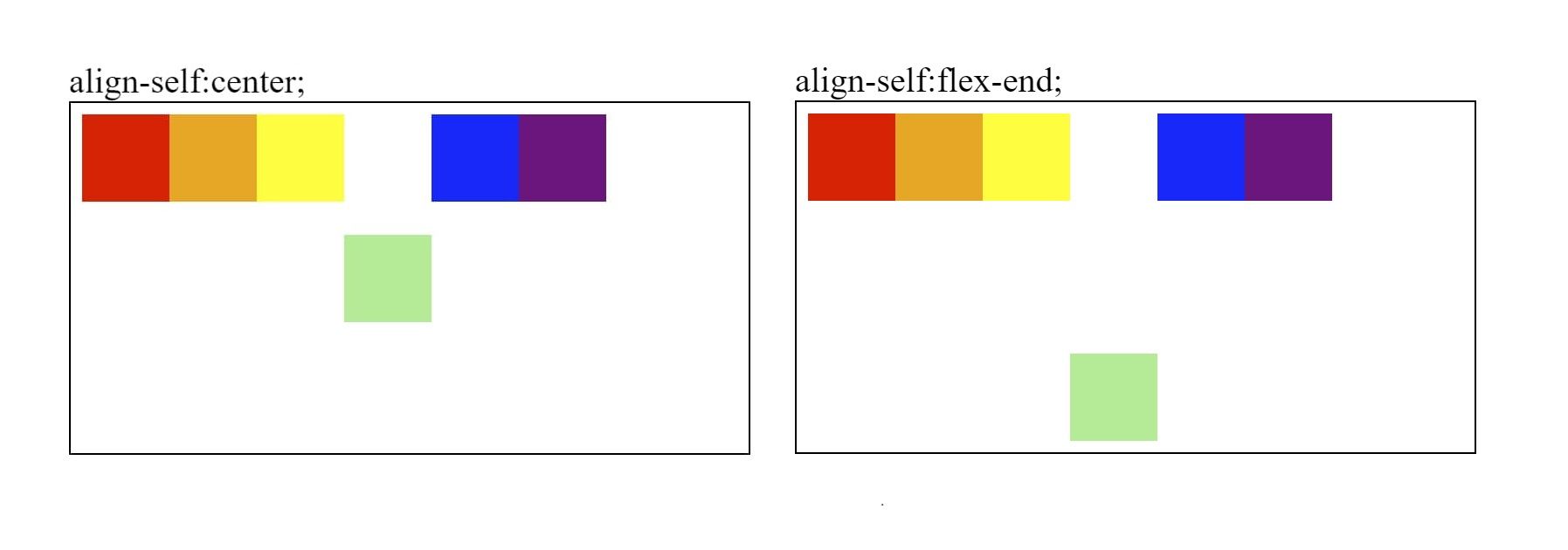
You can use the align-self property to override any align-items styling of the parent container. This means that you can set a separate flex alignment on an individual item.
Options for the align-self property include:
align-self: auto | flex-start | flex-end | center | baseline | stretch
Say for instance that the parent container has a flex-direction styling set to "row".
        .parent {
  display: flex;
  flex-direction: row;
}
You can apply the align-self property on the individual item. The individual item will use the styling of the align-self property, and will center the item across the parent container.
        <div class="parent">
  <div class="red"></div>
  <div class="orange"></div>
  <div class="yellow"></div>
  <div class="green" style="align-self:center"></div>
  <div class="blue"></div>
  <div class="purple"></div>
</div>
View the code for the align-self property in this CodePen snippet to see some examples.
How to Distribute Lines Across the Cross Axis
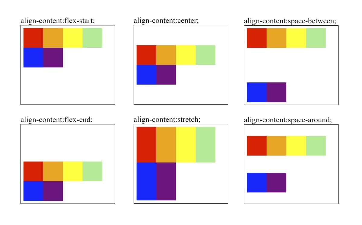
The align-content property aligns children along the vertical axis. It can also determine the spacing between items that are on multiple lines.
Options for the align-content property include:
align-content: flex-start | flex-end | center | stretch | space-between | space-around
Add the align-content property to the parent flex container. The align-content property will only work if the flex-wrap property is set. Add flex-wrap:wrap to the parent container, and reduce the width of the parent div to force the items onto more than one line.
        .parent {
  flex-wrap: wrap;
  display: flex;
  align-content: flex-start;
  width: 180px;
}
View the code for the align-content property in this CodePen snippet to see some examples.
How to Align Items on the Main Axis
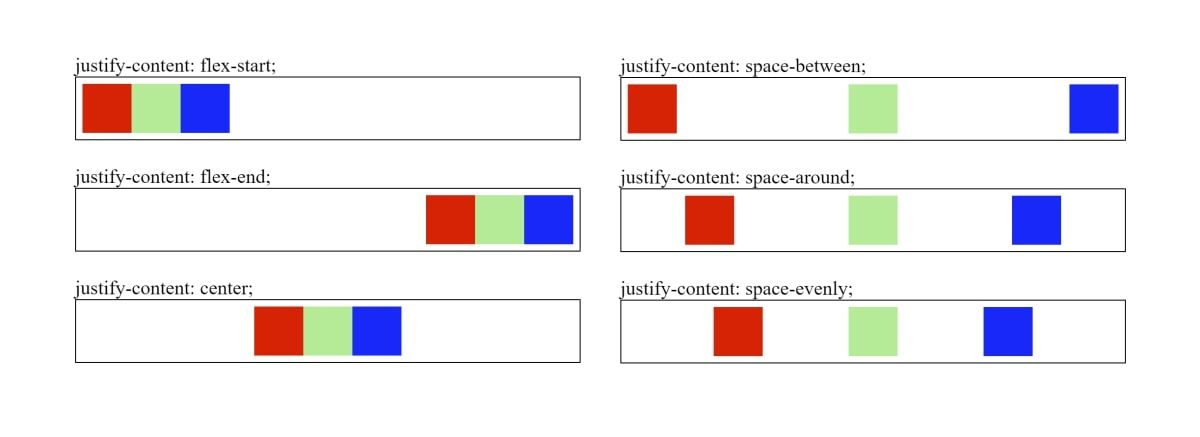
The justify-content property adds right, left, or center alignment to the child items. It also spreads out the items by adding spaces between them when justifying content.
Options for the justify-content property include:
justify-content: flex-start | flex-end | center | space-between | space-around | space-evenly
Wrap the items you want to align under a parent flex container.
HTML:
        <div class="parent">
 <div class="red"></div>
 <div class="green"></div>
 <div class="blue"></div>
</div>
CSS:
        .red { background-color: red; }
.green { background-color: lightgreen; }
.blue { background-color: blue; }
Add the justify-content property to the parent flex container.
        .parent {
 width: 300px;
 display: flex;
 justify-content: flex-start;
}
The justify-content property also supports values listed in the CSS Box Alignment specification. This includes values such as "start", "end", "left", and "right". Some browsers do not support these.
The justify-content property also has a "safe" keyword that you can use. This ensures that the elements try to stay within the range of the parent container.
It is also used to prevent data loss, in the event where you center a long word. Using the safe keyword prevents a shorter div from cutting off the first and last letters.
        .parent {
 display: flex;
 justify-content: safe center;
}
The safe keyword is also limited to certain browsers. You can check compatibility at Can I use.
View the code for the justify-content property in this CodePen snippet to see some examples.
How to Add Spacing Between Items
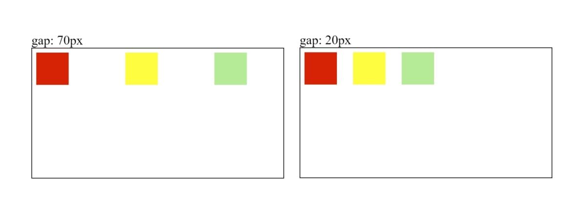
The gap property allows you to add an amount of space between items. It’s one of the newer CSS features that can help you build a responsive layout.
Apply the gap property to the parent flex container.
        .parent {
  display: flex;
  gap: 70px;
}
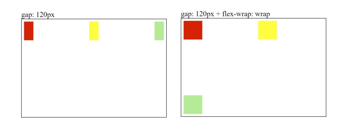
If you add a gap that forces the length of the items to exceed the width of the parent, the items will shrink to try and fit inside the row.
        .parent {
    width: 300px;
    gap: 120px;
}
If you use flex-wrap: wrap to push the items to a new line, the gap amount will also apply to the space between the rows.
        .parent {
    width: 300px;
    flex-wrap: wrap;
    gap: 120px;
}
Additionally, you can also set the row-gap and column-gap properties. Again, you’ll need to apply these to the parent flex container.
The row-gap property determines the space between each row. The column-gap property determines the space between each column.
        .parent {
    row-gap: 120px;
}
.parent {
    column-gap: 120px;
}
View the code for the gap property in this CodePen snippet to see some examples.
Using More Flex Properties on Your Website
Hopefully, you are now familiar with the various flex properties you can use to align items on your webpage. This includes how you can use the flex-direction, justify-content, align-self, align-items, align-content, and gap properties.
Flexbox is a powerful layout technique, but it’s just one small part of CSS. You can also learn about new CSS properties, clean coding techniques, and tools used for CSS optimization.


