Visualization of data is one of the highlight features of spreadsheet tools like Google Sheets. It allows you to have a better insight into your data at a glance.
Creating charts and tables is one of the best ways to visualize your data. Scatter charts are a great example of a top-quality way to visualize your data points in Google sheets.
This article discusses what a scatter plot is, how to build one, and how you can analyze the trends in your data using a trend line.
What Is a Scatter Chart/Plot?
Scatter charts are one of the many available charting options in Google Sheets. To explain in simple words, you can use a scatter plot to represent two or more values in a dataset and easily view their correlation. Usually, dots represent the two values on the y and x-axis’. It is a mathematical function where one value is usually the independent variable and plotted on the x-axis.
The other value is the dependent variable and is generally plotted on the y-axis. You observe the y value to see the differences when the x variable increases or decreases. Both values can be independent, but you’re unlikely to see any real correlation in that case.
A scatter plot allows you to:
- Define trends in a data set
- Visually represent your data
- See the range of data, the minimum, and the maximum values
- Understand the non-linear as well as the linear relationships between the variables
- Makes it easier to interpret the data
When you're working with large sets of data, it becomes nearly impossible to interpret their relationship with each other. Scatter plots counteract this by making your data much easier to look at as a whole and creating trend lines. No one wants to spend time looking at raw data on a spreadsheet, it can be incredibly dull and unintuitive.
How to Build a Basic Scatter Plot in Google Sheets
Creating a scatter plot is really easy and requires only a few simple steps. In this example, we are using Height and Weight as our variables. Height is the independent variable, while Weight is the dependent one.
We already have the sample data in our spreadsheet below. Without further ado, here are the steps you need to follow to create a basic scatter plot in Google Sheets:

-
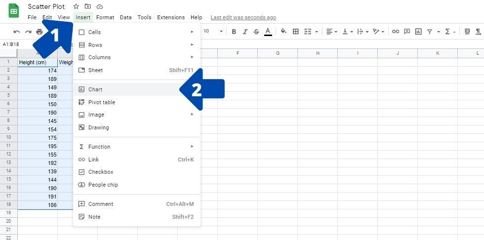
Select the data in your spreadsheet by clicking and dragging your cursor over it. You can also choose to select the data labels if you like.
-
Click on Insert and then on Chart. This will create the chart on the spreadsheet and opens the Chart editor on the right side of the page.
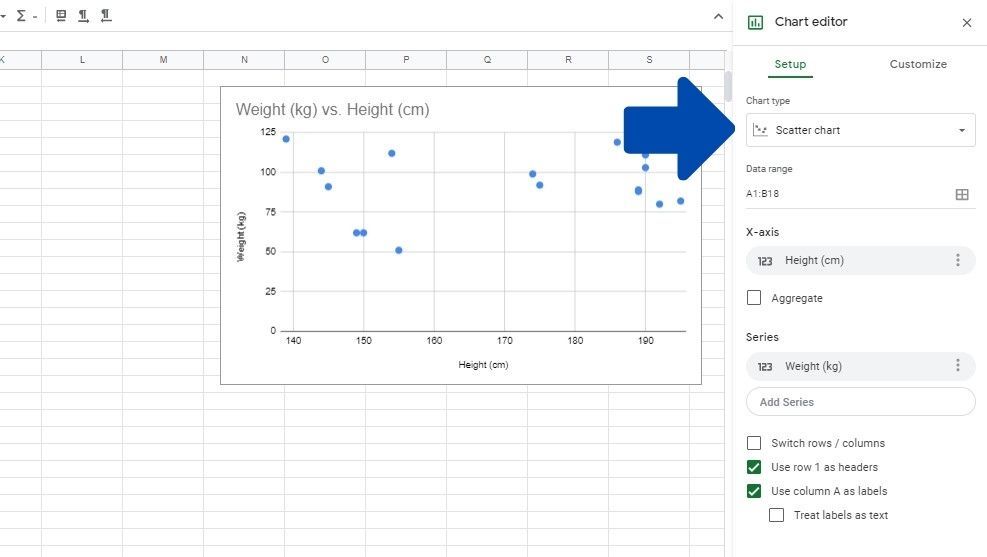
- Sheets will usually create a Scatter chart. However, if that’s not the case, click on Chart type and select the Scatter chart.


The scatter chart has now been created. You may notice that the scatter chart isn't particularly useful, as there is no way to gauge the relationship between the points. We need to add a trend line to the chart to do this.
Why Add a Trend Line?
Adding a trend line in Google Sheets serves these three purposes:
- It allows you to see if there is a correlation between the value on the x-axis and the y-axis. The closer the data points are to the trend line, the stronger the correlation is. The points being further apart means less correlation between the plotted points.
- The trend line allows you to gauge the trends in your dataset. If the line is pointing downwards, there is a negative trend, while there is a positive trend in your data if the line goes upwards.
- You can also identify the points out of the range using a trend line. This can simplify sorting through data as you know which data values are unique in the set.
How to Add a Trendline in Scatter Plot
To add a trend line to your scatter chart, first, you need to open the Chart editor again:

- Click anywhere on the chart and then click on the three dots in the top-right corner. This will open a dropdown menu.
- Click on Edit chart. You will see the Chart editor show up on the right side of the screen.
Follow these steps to add the trend line to your scatter chart in Google Sheets:

- Click on the Customize button in the top-right corner of the Chart editor.
- Click on Series in the dropdown menu.
- Scroll down and click on the check-box next to the Trend line.
You will now see the trend line on your scatter chart. If you want to connect to each data point instead, consider adding a line graph in Google Sheets.
Wrapping Up the Scatter Plot Feature in Google Sheets
Scatter charts can be extremely useful for analyzing the data in a spreadsheet. However, it's essential to know that you can’t plot any type of data on a scatter chart. There should be an independent and dependent variable.
If you see a flat trend line or huge error bars, it's safe to assume that your data isn't appropriate for a scatter chart. Knowing that, you can now use scatter plots alongside other Google Sheets functions to forecast business decisions, and compare data points.