Semi-log and log-log graphs are useful tools for analyzing and finding exponential and power functions relations. Logarithmic graphs have the potential to give you a perspective of a relationship between your data that isn't obvious on a plain graph.
While a semi-log graph is logarithmic on only one axis, a log-log graph is logarithmic on both axes. Each of these graphs has its own uses. With Excel, you can create semi-log and log-log charts and graphs with a few clicks to further analyze your data. Read on to find out how you can create such graphs in Excel.
How to Create a Semi-Log Graph in Excel
A semi-log graph is a graph that has one of the two axes on a logarithmic scale. Usually, the Y-axis is logarithmic. This means that the Y-axis grid lines will be exponential, while the X-axis gridlines stay even.
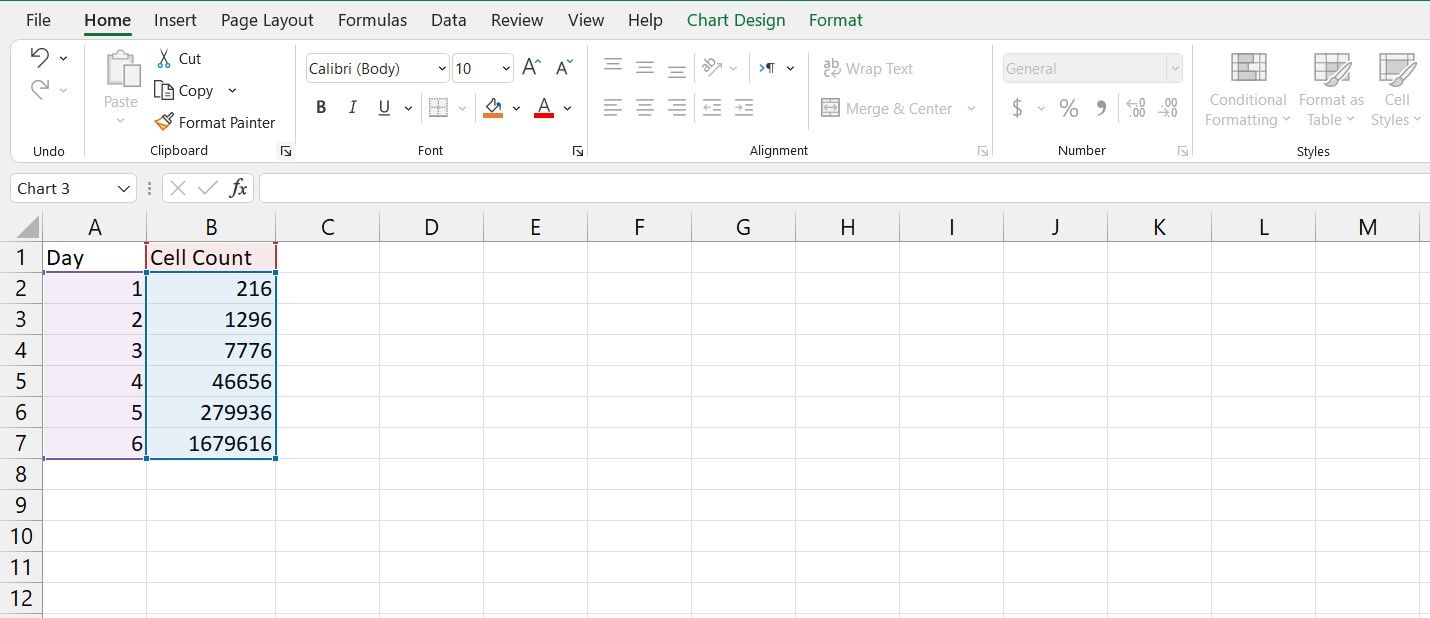
As an example, in this spreadsheet, we have the number of cells in a cell culture environment in an experiment on different days. The goal is to plot this data on a semi-log graph. If you're not familiar with creating graphs in Excel, read our article on how to create graphs in Excel to get a good understanding of the process.
- Select the entire table. That will be cells A1 to B7 in this example.
- Go to the Insert menu.
- From the Charts section, click Insert Scatter (X, Y) or Bubble Chart.
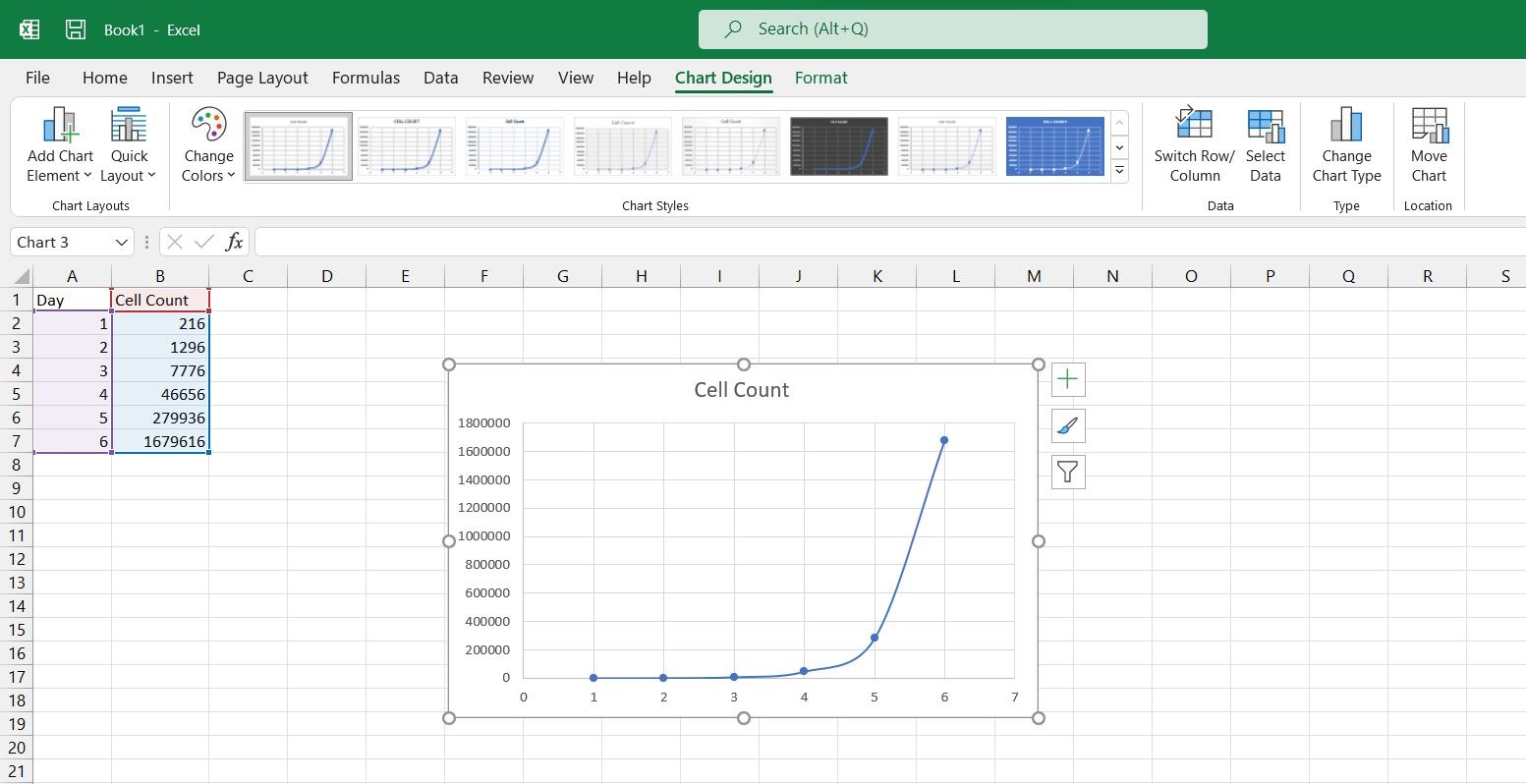
- Select Scatter with Smooth Lines and Markers.
You now have a scatter chart of your data. Now it's time to make it a semi-log one.
- Select the chart you just made.
- Double-click the Y-axis.
- In the Format Axis panel on the right, go to the Axis Options tab.
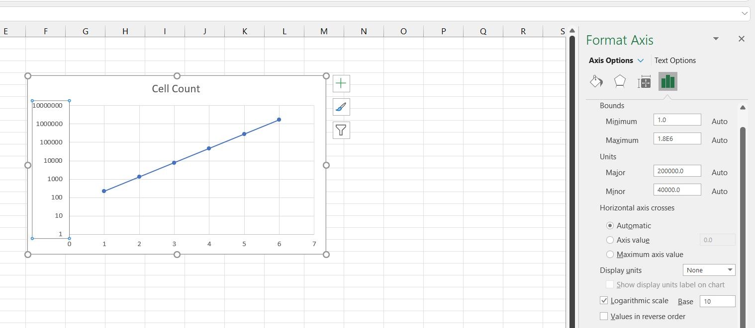
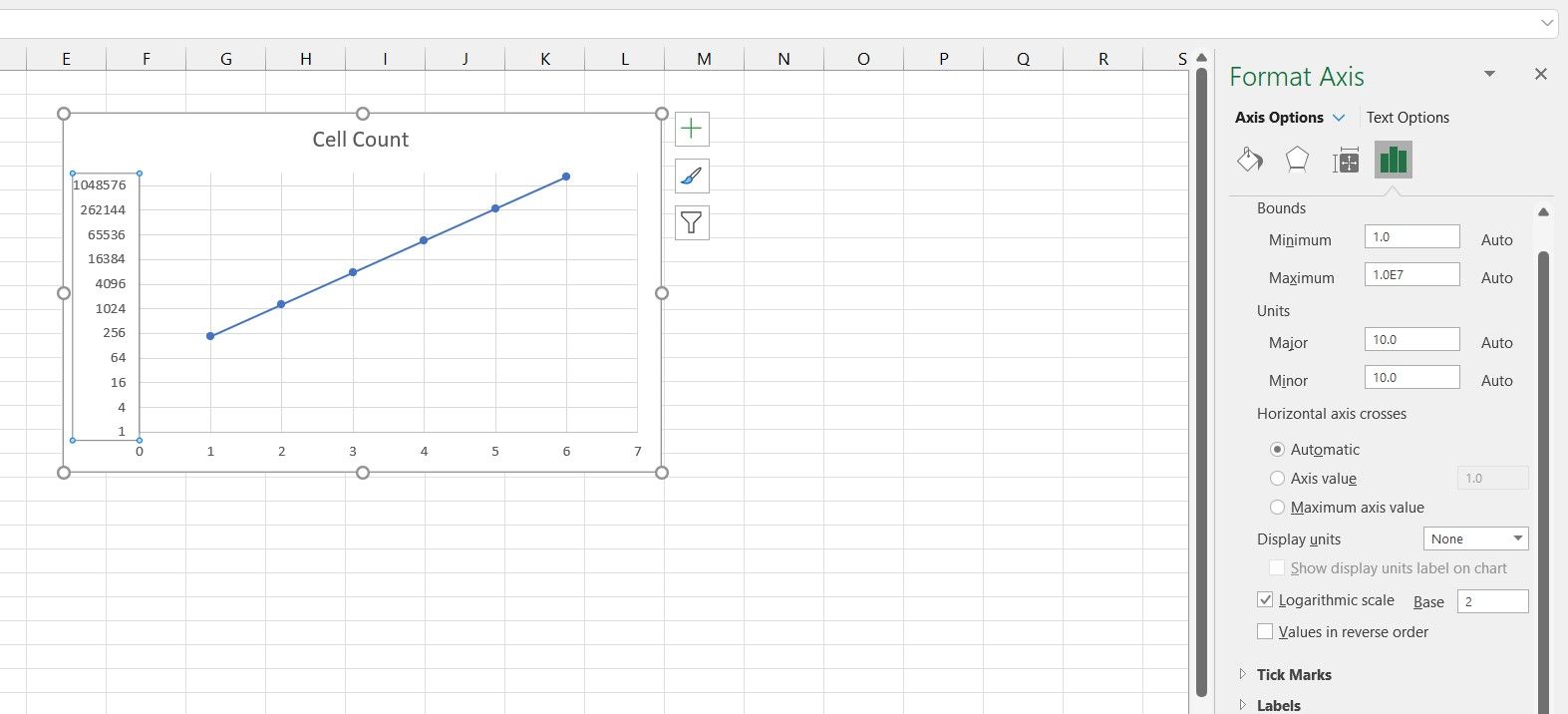
- In Axis Options, check Logarithmic Scale.
There's your semi-log graph! Note that the graph is now a straight line now.
You can also alter the base from the default 10 to any other number that suits you better. That is because the cell count in the data table was exponential, as they are actually powers of six. You can further improve your graph's readability by changing the logarithm base from 10 to 6.
How to Create a Log-Log Graph in Excel
A log-log graph is a graph that has both axes on a logarithmic scale. So then, the grid lines for both the X and Y axes are exponential and uneven in this graph. Let's see the log-log graph in action with an example.
In a similar example, we have the cell counts on different days, but this time the days are exponential as well. A data table such as this practically begs for a log-log graph.
Just like the previous example, select the table and create a scatter chart for it. If you want to learn more about scatter charts, read our article on how to make a scatter plot in Excel to find out what exactly it is and when you should use it.
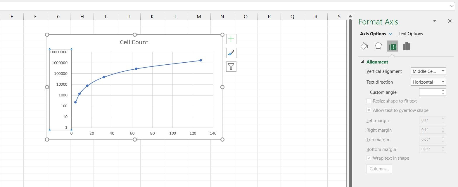
After you've created the scatter plot, change the Y-axis to log the way you learned in the previous section. You can see that the graph still isn't a straight line. That's because the X-axis (day number in this example) is exponential as well.
- Select the chart.
- Double-click the X-axis.
- From the Format Axis panel, click Axis Options.
- Under Axis Options, check Logarithmic Scale.
Now both your axes are on a logarithmic scale, and you can see that your graph has become a straight line as well. This is because the data on both axes are exponential.
Considering that the data on the X-axis are all powers of two, then changing the logarithm base to two will give you a better image of this graph.
Logarithmic Graphs in Excel
Semi-log and log-log graphs are useful assets that can help you discover new relations between your data. These tools are widely used in different areas, and though not immediately visible in the chart settings, Excel is also capable of creating semi-log and log-log graphs.
Now that you know how to create semi-log and log-log graphs in Excel, it's time to use these graphs and see your data from a new perspective.


