Though design trends vary every year, you can count on the use of staple shadow effects like box-shadow and drop-shadow to positively contribute to a website's aesthetics. You can use drop-shadows to create pleasant, beautifully rendered effects without coming off as cheesy.
Let’s take a closer look at the CSS drop-shadow property.
What Is CSS drop-shadow?
drop-shadow( ) is a CSS effect that displays a shadow around the shape of a specified object. Here's the syntax for applying a CSS drop-shadow.
        <strong>Syntax:</strong>
filter: drop-shadow(offset-x offset-y blur-radius color);
There are a wide range of filter functions including blur( ), brightness( ), and drop-shadow( ).
offset-x determines the horizontal distance and offset-y determines the vertical distance. Note that negative values place the shadow to the left (offset-x) and above (offset-y) the object.
The last two parameters are optional. You can specify the blur radius of the shadow as a length. By default, it's set to 0. You cannot have a negative blur radius.
The color of the shadow is specified as <color>. If you haven’t specified a color, it follows the value of the color property.
When Is CSS drop-shadow Useful?
You may already know that box-shadow does the job pretty well. So, you may think, why do we need drop-shadow at all? There are numerous cases where the drop-shadow( ) function is a lifesaver. Let’s take a look at a few of them:
Non-Rectangular Shapes
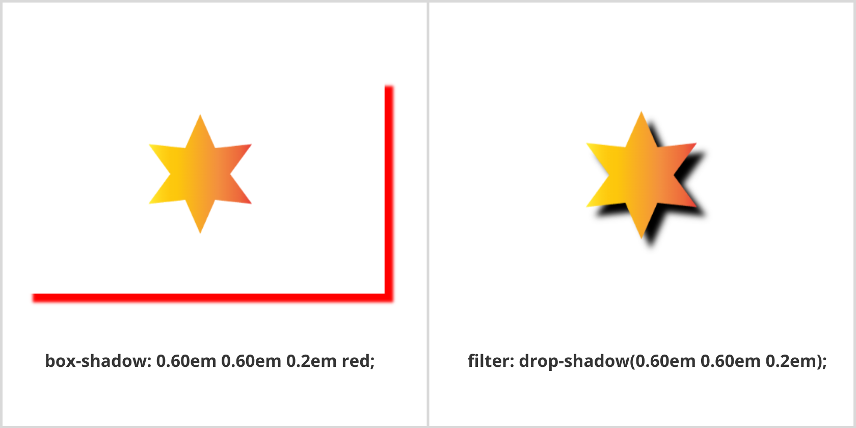
Unlike a box-shadow, you can add a drop-shadow to non-rectangular shapes. For instance, we have a transparent SVG or PNG with a non-rectangular shape—a star for instance. Here, adding a shadow that corresponds to the object itself can be completed with either box-shadow or drop-shadow. Consider both scenarios:
HTML
        <!DOCTYPE html>
<html lang="en">
<head>
  <meta charset="UTF-8">
  <meta http-equiv="X-UA-Compatible" content="IE=edge">
  <meta name="viewport" content="width=device-width, initial-scale=1.0">
  <link rel="stylesheet" href="style.css">
  <title>Drop-shadow</title>
</head>
<body>
  <div class="star-img">
    <img class="box-shadow" src="star.svg" alt="">
    <img class="drop-shadow" src="star.svg" alt="">
  </div>
</body>
</html>
CSS
        .star-img img {

display: inline-block;

height: 15em;

width: 25em;

}

.box-shadow {

color: red;

box-shadow: 0.60em 0.60em 0.2em;

}

.drop-shadow {

filter: drop-shadow(0.60em 0.60em 0.2em);

}
Output:
When comparing both effects, it's apparent that a box-shadow gives a rectangular shadow; it also doesn’t matter whether the image is transparent or already possesses a background. On the other hand, drop-shadow allows you to create a shadow that conforms to the shape of the image itself.
The limiting factors are that the drop-shadow( ) function accepts all parameters of type <shadow> except the inset keyword and spread parameter.
Grouped Elements
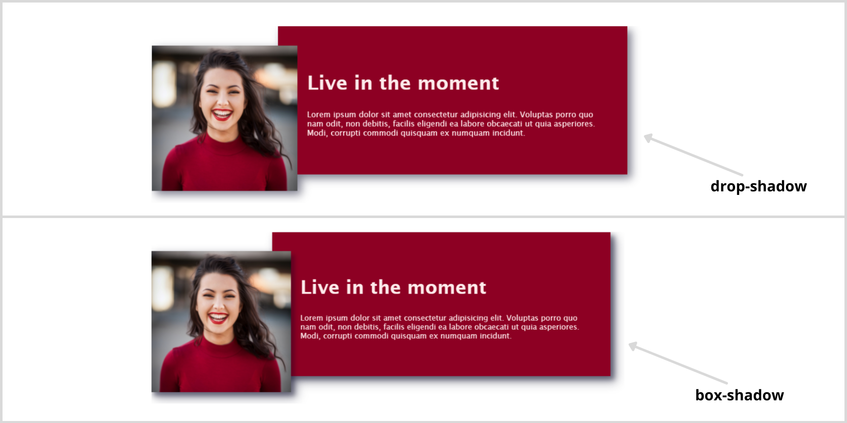
There are several instances when you may need to build components by overlapping certain elements. If you're using box-shadow, you’ll face the issue of trying to cast a shadow the right way. Here's how it works when grouping an image and a text component:
HTML
        <body>

<div class="parent-container drop-shadow">

<div class="image-container box">

<img src="smiling-girl.jpg" alt="smiling girl" />

</div>

<div class="text-container box">

<h2>Live in the moment</h2>

<p>Lorem ipsum dolor sit amet consectetur adipisicing elit. Voluptas porro quo nam odit, non debitis, facilis eligendi ea labore obcaecati ut quia asperiores. Modi, corrupti commodi quisquam ex numquam incidunt.</p>

</div>

</div>

</body>
Basic CSS
        body {

padding: 5em 1em;

font-family: 'Lucida Sans', 'Lucida Sans Regular', 'Lucida Grande',

'Lucida Sans Unicode', Geneva, Verdana, sans-serif;

}

h2 {

font-size: 2rem;

}

p {

font-size: 0.8rem;

}

.parent-container {

display: flex;

flex-direction: column;

height: 17rem;

width: 50em;

}

.image-container img {

width: 15em;

position: absolute;

z-index: 1;

top: 2em;

left: 1.5em;

}

.text-container {

color: rgb(255, 236, 236);

background-color: rgb(141 0 35);

width: 30rem;

padding: 3rem;

align-self: flex-end;

position: relative;

}
Now, apply the box-shadow and drop-shadow to see the difference.
        .drop-shadow {

filter: drop-shadow(0.4rem 0.4rem 0.45rem rgba(0, 0, 30, 0.5));

}

.box,

.box img {

box-shadow: 0.4rem 0.4rem 0.45rem rgba(0, 0, 30, 0.3);

}
Output:
As you can see, the box-shadow is applied on each element individually while the drop-shadow groups both of them and applies the shadow.
Clipped Elements
You can use the clip-path property to clip a certain region that determines what parts of an image or element should be shown. The drop-shadow filter allows us to create a drop-shadow on the clipped element by applying it to the parent of that element:
HTML
        <body>

<div class="parent-container">

<div class="clipped-element">

</div>

</div>

</body>
CSS
        .parent-container {

filter: drop-shadow(0rem 0rem 1.5rem maroon);

}

.clipped-element {

width: 50em;

height: 50em;

margin: 0 auto;

background-image: url(smiling-girl.jpg);

clip-path: circle(50%);

background-size: cover;

background-repeat: no-repeat;

}
Output:
We've clipped 50% of the image with a circular path. Therefore, the drop-shadow filter is applied to only the visible part of the image. Isn’t it awesome?
Limitations and Differences
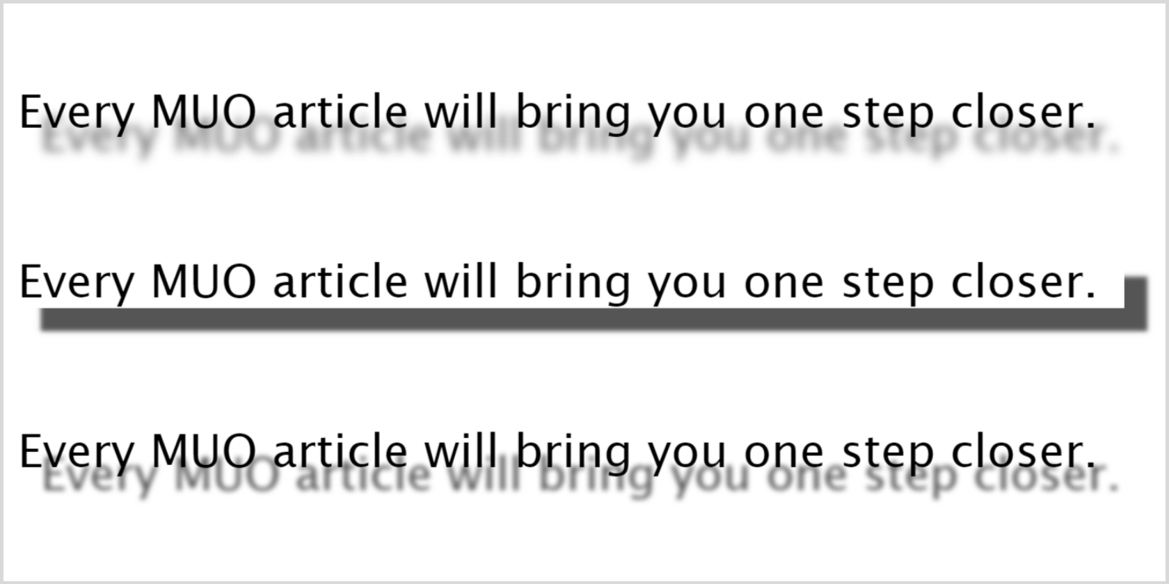
As we discussed above, drop-shadow doesn’t support the spread parameter. This means that creating an outline effect wouldn’t be possible using the drop-shadow( ) function because it gets killed everywhere. Also, it renders different shadow effects from the box-shadow and text-shadow (with the same parameters). You may feel that the differences between the box-shadow and drop-shadow boil down to the CSS Box Model. One follows it while the other doesn't. Here's an example:
HTML
        <body>

<div class="parent-container">

<p class="drop-shadow">Every MUO article will bring you one step closer.</p>

<p class="box-shadow">

Every MUO article will bring you one step closer.

</p>

<p class="text-shadow">

Every MUO article will bring you one step closer.

</p>

</div>

</body>
Basic CSS
        body {

padding: 5em 1em;

font-family: 'Lucida Sans', 'Lucida Sans Regular', 'Lucida Grande',

'Lucida Sans Unicode', Geneva, Verdana, sans-serif;

}

.parent-container {

width: 72rem;

}

p {

font-size: 3em;

font-style: bold;

}
Applying shadow-effects
        .drop-shadow {

filter: drop-shadow(0.5em 0.5em 0.1em #555);

}

.box-shadow {

box-shadow: 0.5em 0.5em 0.1em #555;

}

.text-shadow {

text-shadow: 0.5em 0.5em 0.1em #555;

}
Output:
You can see that the box-shadow gives a heavier, darker shadow than the text-shadow and drop-shadow. Also, there's a slight difference in the shadow's positioning between the text-shadow and drop-shadow. Nevertheless, you may prefer different shadow effects according to your requirements.
Browser Support
The drop-shadow( ) function is supported in all modern browsers except older browsers like Internet Explorer. Though it isn’t something that would seriously hamper the UX, you can add a feature query with a box-shadow fallback.
Experiment With Different Shadow Effects
The popularity of box-shadow is quite obvious because of the multitude of use cases. However, the drop-shadow( ) function is highly under-utilized. We hope that you’ll experiment with different shadow effects and try to implement drop-shadow in your future projects.
Pseudo-classes add an entirely new range of functionality to CSS and your personal web development repertoire. Learn more about them to become a more proficient and efficient web developer.


