
Gaussian distribution curves, commonly known as bell curves, are normal distribution graphs that help in the analysis of variance in datasets. In a bell curve, the highest point (which is also the mean) represents the event that's most likely to occur, while the rest of the events are distributed in a symmetrical manner with respect to the mean.
From the relative grading of students and creating competitive appraisal systems to predicting returns, bell curves have a wide range of applications. Here, we’ll walk you through the process of creating a bell curve in Excel.
The Basics of Creating a Bell Curve in Excel
To understand how to create a bell curve in Excel, let’s assume you’re a history professor that needs to grade students based on their performance on a test. Suppose the class has 15 students with the following marks:

Now, before you can create the bell curve of any dataset, you need to calculate its:
- Mean — the average value of the dataset (gives the center of the curve)
- Standard Deviation — measures how much the data points are dispersed relative to the mean (gives the spread of the curve)
Finding Mean
You can use built-in functions in Excel to calculate basic statistics such as mean, standard deviation, percentage, etc. To find the mean, use the AVERAGE function in Excel:
Type =AVERAGE(B2:B16) to find the mean of the mark sheet given above. You’ll notice that it gives a value of 53.93.

If you want a whole number value, which you’ll usually want, you can use the ROUND function. To do so, type:
=ROUND(AVERAGE(B2:B16),0)
Now the mean becomes 54.
Finding Standard Deviation
Excel shows two formulas for standard deviation:
- STDEV.P is used when you know that your data is complete, i.e. it’s a population.
- STDEV.S is used when your data is incomplete, i.e. you have a sample of a population.
In statistics, people often pick out samples from a population, so STEV.S is normally used. Since you have the complete data i.e. marks of all the students in the class, we’ll use STDEV.P. To get the standard deviation of the given mark sheet, type:
=STDEV.P(B2:B16)

You’ll get 27.755. If you want your value in whole numbers, simply round it off by typing:
=ROUND(STDEV.P(B2:B16),0)
You'll get 28.
Sorting the Data in Ascending Order
For you to create the bell shape for your normal distribution chart, the data needs to be in ascending order. If your data is not in ascending order (as in our example), simply select all the values (test marks) in your dataset, go to the Sort & Filter in the top panel, and select Sort Ascending.

How to Make a Bell Curve in Excel
Now that you’ve got both standard deviation and mean (average), it’s time to calculate the normal distribution of the given values. Once we have that, we’ll have everything we need to create our bell curve using Excel’s scatter plot option. Let’s first find the normal distribution of all the values inside the dataset:
1. Finding Normal Distribution
It’s time to calculate the normal distribution of the data points. In Excel, you can find the normal distribution using the NORM.DIST function, which requires the following variables:
- X is the data point for which you want to calculate the normal distribution.
- Mean is the average of the given data (already calculated).
- Standard Deviation is the standard deviation of the given data (already calculated).
- Cumulative is the logical value used to specify the type of distribution needed.
To calculate the normal distribution of our test scores:
- Type =NORM.DIST( in a new cell (cell C2 in our case.)
-
Enter the required values with commas between the values as shown in the syntax.
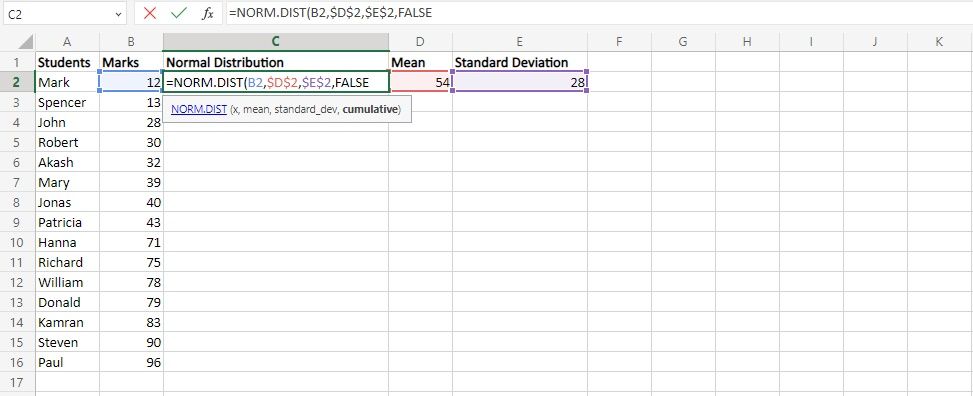
- For x, enter B2, which gives the first data point, i.e. 12.
- For mean, enter D2, which gives the mean of our data, and press F4. The F4 locks the value of the mean signified by the dollar sign ($D$2) so that when you copy this formula for different values in our data, the value of the mean remains the same.
- For standard deviation, enter E2 to get the standard deviation and lock its value by pressing F4.
- Lastly, type FALSE in place of the cumulative logical value and close the parentheses. By typing FALSE, you get the normal probability density function (PDF.) Note: You’d need to type TRUE to get a cumulative normal distribution function (CDF).
-
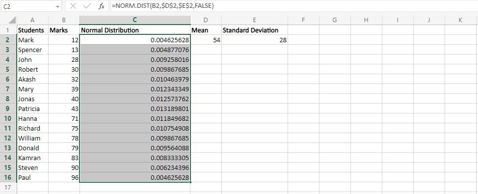
After getting the normal distribution for the first value, simply drag it to get the normal distribution for the remaining values of your data set.


2. Creating a Scatter Plot
Now that you’ve got the data points and the normal distribution, you have everything required to create your bell curve. For that, you have to make a scatter plot in Excel by following the steps given below:
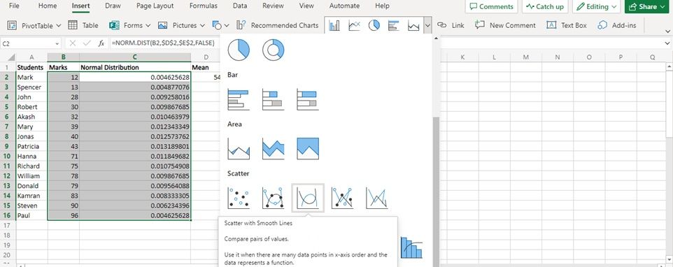
- Select the dataset (students' marks) and their normal distribution.
- Go to Insert > Scatter Diagram.
-
Select Scatter with Smooth Lines.
-
And you’ve got your bell curve.
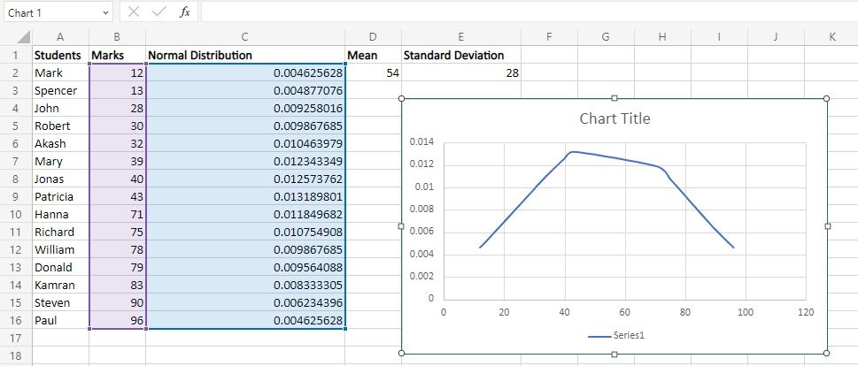


You can see that the graph is not perfectly bell-shaped. That's because the dataset (student's marks) is not normally distributed (i.e. the mean, median, and mode of the dataset are not the same.)
3. Customizing the Bell Curve
We already have our bell curve, but we can make it a bit better by customizing it. First off, let’s update the title of our curve by double-clicking on the title and entering the desired title. (You can modify the font type, font size, and positioning of the title, among other things.)

You can remove the Series1 written at the bottom of your bell curve by turning off the Legend toggle. To give your bell curve a better shape, you can define the maximum and minimum values of your bell chart. For that, double-click the x-axis, and you’ll get the Axis Options tab, from where you can make the required changes.

Using Bell Curves in Excel
Now that you have your bell curve, which shows insightful distribution data, you can use it to grade your students. You can apply the same process to create a bell curve for any given data.
While a bell curve provides the probability of a particular data point in your data set, there are several other graphs that you can create in Excel to find other interesting insights about your data set.