Have you ever seen a pure CSS website where each and every element is finished through CSS? CSS does more than just styling elements. CSS shapes allow web designers to create custom paths like a triangle, circles, polygons, and more. This way, you are no longer constrained to insert a floating image with a transparent background, only to be disappointed by a rectangular box around it.
In this article, we’ll use CSS shapes and a few functional values to code different shapes.
Drawing Basic CSS Shapes
Let’s start with the basic shapes like square, rectangle, triangle, circle, and ellipse.
Square and Rectangle
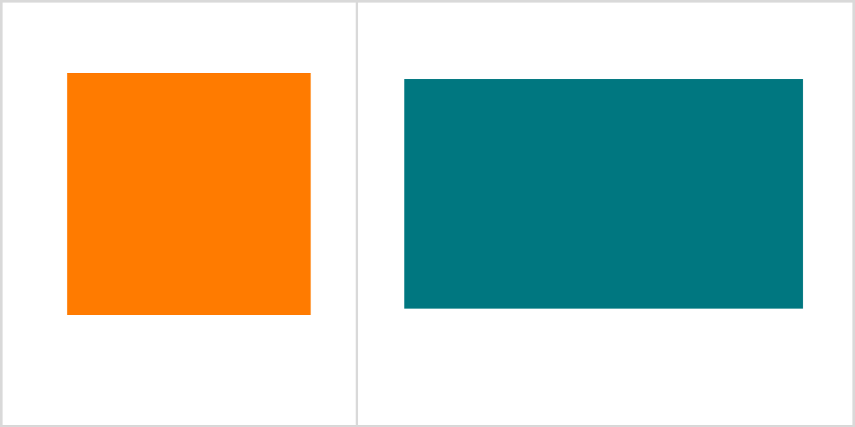
Square and rectangle are the easiest shapes to make in CSS. All you need to do is to create a <div> and give it a height and a width.
HTML
        <body>
   <div class="rec-sq">
     <div class="square"></div>
     <div class="rectangle"></div>
   </div>
 </body>
CSS
        .rec-sq {
 display: flex;
 gap: 2em;
 margin: 2em;
}
.square {
 width: 15rem;
 height: 15rem;
 background: rgb(255, 123, 0);
}
.rectangle {
 width: 24rem;
 height: 14rem;
 background: rgb(0, 119, 128);
}
Output:
Circle and Ellipse
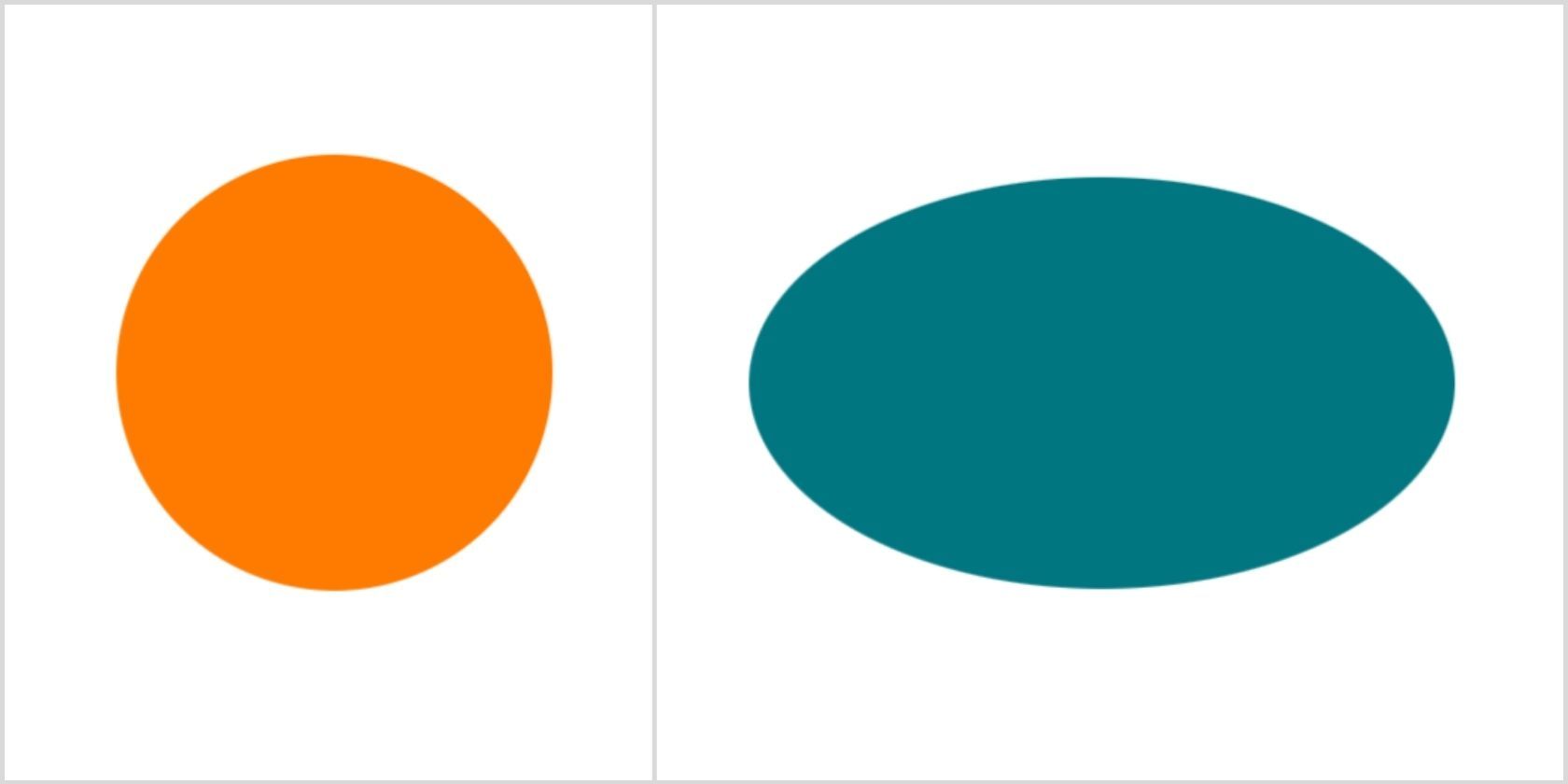
You just need to assign a border-radius of 50% to a square and you’ll get a circle. Do the same with the rectangle to get an ellipse.
HTML
        <div class="rec-sq">
     <div class="circle"></div>
     <div class="ellipse"></div>
</div>
CSS
        .circle {

 width: 15rem;

 height: 15rem;

 background: rgb(255, 123, 0);

 border-radius: 50%;

}

.ellipse {

 width: 24rem;

 height: 14rem;

 background: rgb(0, 119, 128);

 border-radius: 50%;

}
Output:
Triangles
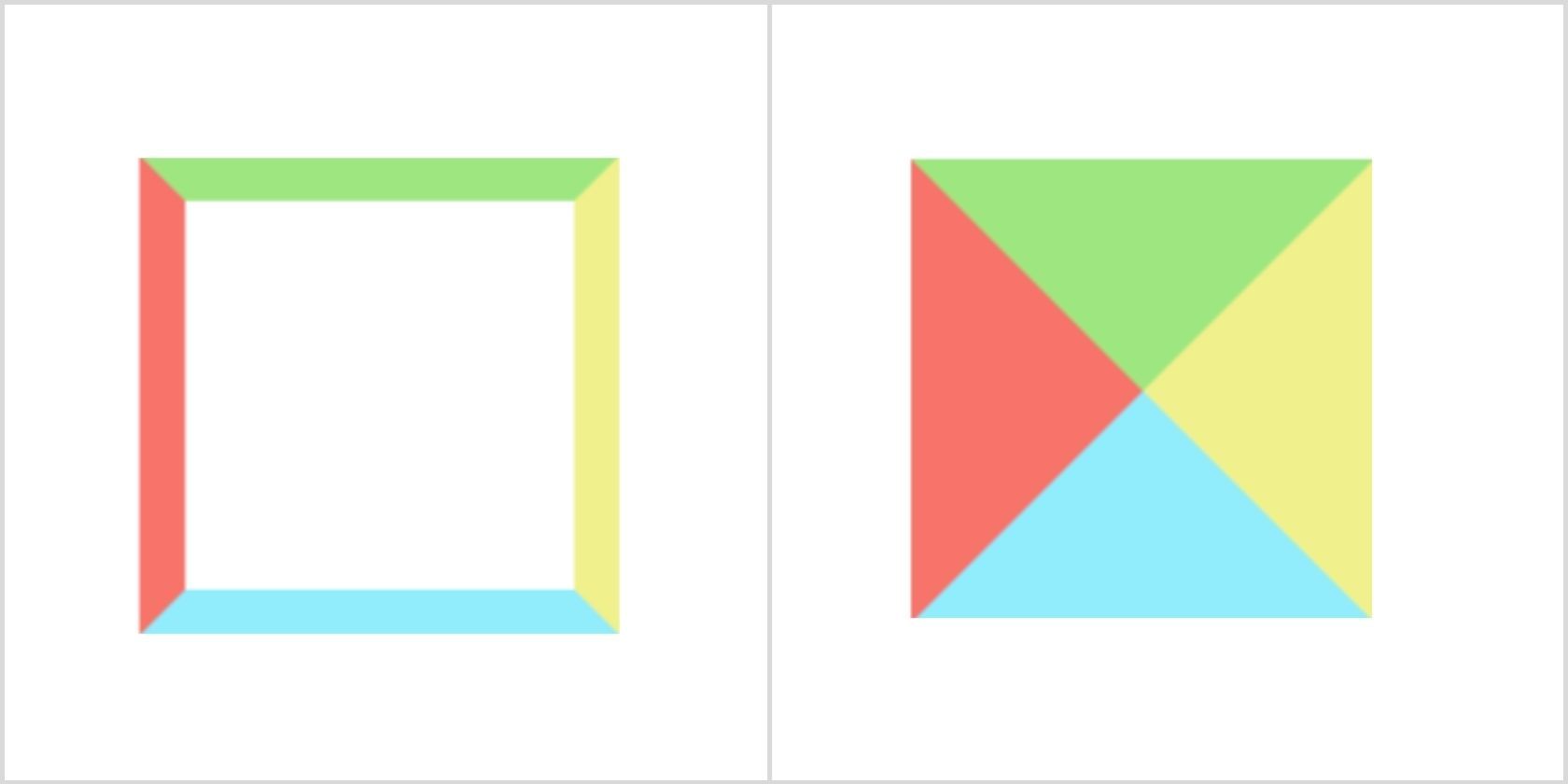
We’ll use borders to create triangles. Wondering how it works? All you need to do is to set the width and height of the triangle to zero. It means, moving forward, the actual width of the element will be the width of the border. Also, you may already know that the border edges are 45-degrees diagonals to each other. Give different colors to each border and set any three of them to transparent. Ultimately, you’ll have your triangle.
HTML
        <body>

   <div class="sample"></div>

   <div class="triangle"></div>

 </body>
CSS
        //common to all
body {
 display: flex;
 gap: 5em;
 margin: 15em;
}.sample {
 height: 8.5em;
 width: 8.5em;
 border-top: 1em solid #9ee780;
 border-right: 1em solid rgb(240, 241, 141);
 border-bottom: 1em solid rgb(145, 236, 252);
 border-left: 1em solid rgb(248, 115, 106);
}.triangle {

 height: 0;

 width: 0;

 border-top: 5em solid #9ee780;

 border-right: 5em solid rgb(240, 241, 141);

 border-bottom: 5em solid rgb(145, 236, 252);

 border-left: 5em solid rgb(248, 115, 106);

}
Output:
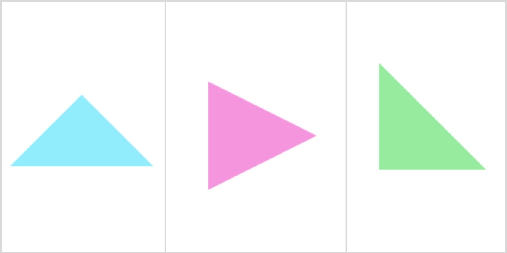
You can play around with height and border-color to get different types of triangles. For instance, you can create a triangle pointing towards the upward direction by giving the border-bottom a solid color while all the other borders are set to transparent. Also, you can create a triangle pointing towards the right direction or a right-angle triangle by playing around with border-width and border-color.
HTML
        <body>

   <div class="triangle-up"></div>

   <div class="triangle-right"></div>

   <div class="triangle-bottom-right"></div>


</body>
CSS
        .triangle-up {

 height: 0;

 width: 0;

 border-top: 5em solid transparent;

 border-right: 5em solid transparent;

 border-bottom: 5em solid rgb(145, 236, 252);

 border-left: 5em solid transparent;

}

.triangle-right {

 width: 0;

 height: 0;

 border-style: solid;

 border-width: 4em 0 4em 8em;

 border-color: transparent transparent transparent rgb(245, 149, 221);

}

.triangle-bottom-right {

 width: 0;

 height: 0;

 border-style: solid;

 border-width: 8em 0 0 8em;

 border-color: transparent transparent transparent rgb(151, 235, 158);

}
Output:
Creating Advanced Shapes Using CSS
You can use ::before and ::after pseudo-elements to create advanced shapes. With the intelligent use of position and transform properties, you can easily build complex shapes using pure CSS.
Star Shape (5-Points)
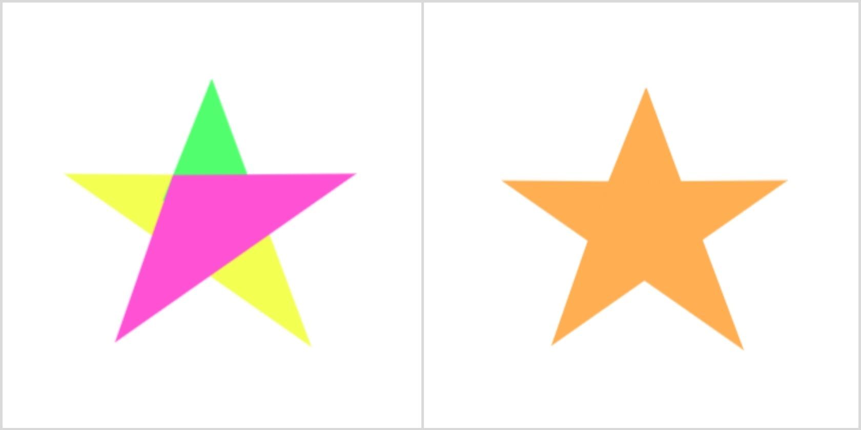
You’ll need to manipulate the borders using the rotate value of the transform. The idea is to create two sides using a class=”star”, the other two sides using the ::after element, and the last side using the ::before element.
HTML
<div class="star-five"></div>
CSS
        .star-five {

 margin: 3.125em 0;

 position: relative;

 display: block;

 width: 0em;

 height: 0em;

 border-right: 6.25em solid transparent;

 border-bottom: 4.3em solid rgb(255, 174, 81);

 border-left: 6.25em solid transparent;

 transform: rotate(35deg);

}

.star-five:before {

 border-bottom: 5em solid rgb(255, 174, 81);

 border-left: 2em solid transparent;

 border-right: 1.875em solid transparent;

 position: absolute;

 height: 0;

 width: 0;

 top: -45px;

 left: -65px;

 display: block;

 content: '';

 transform: rotate(-35deg);

}

.star-five:after {

 position: absolute;

 display: block;

 top: 3px;

 left: -105px;

 width: 0;

 height: 0;

 border-right: 6.25em solid transparent;

 border-bottom: 4.3em solid rgb(255, 174, 81);

 border-left: 5.95em solid transparent;

 transform: rotate(-70deg);

 content: '';

}
Output:
Pentagon
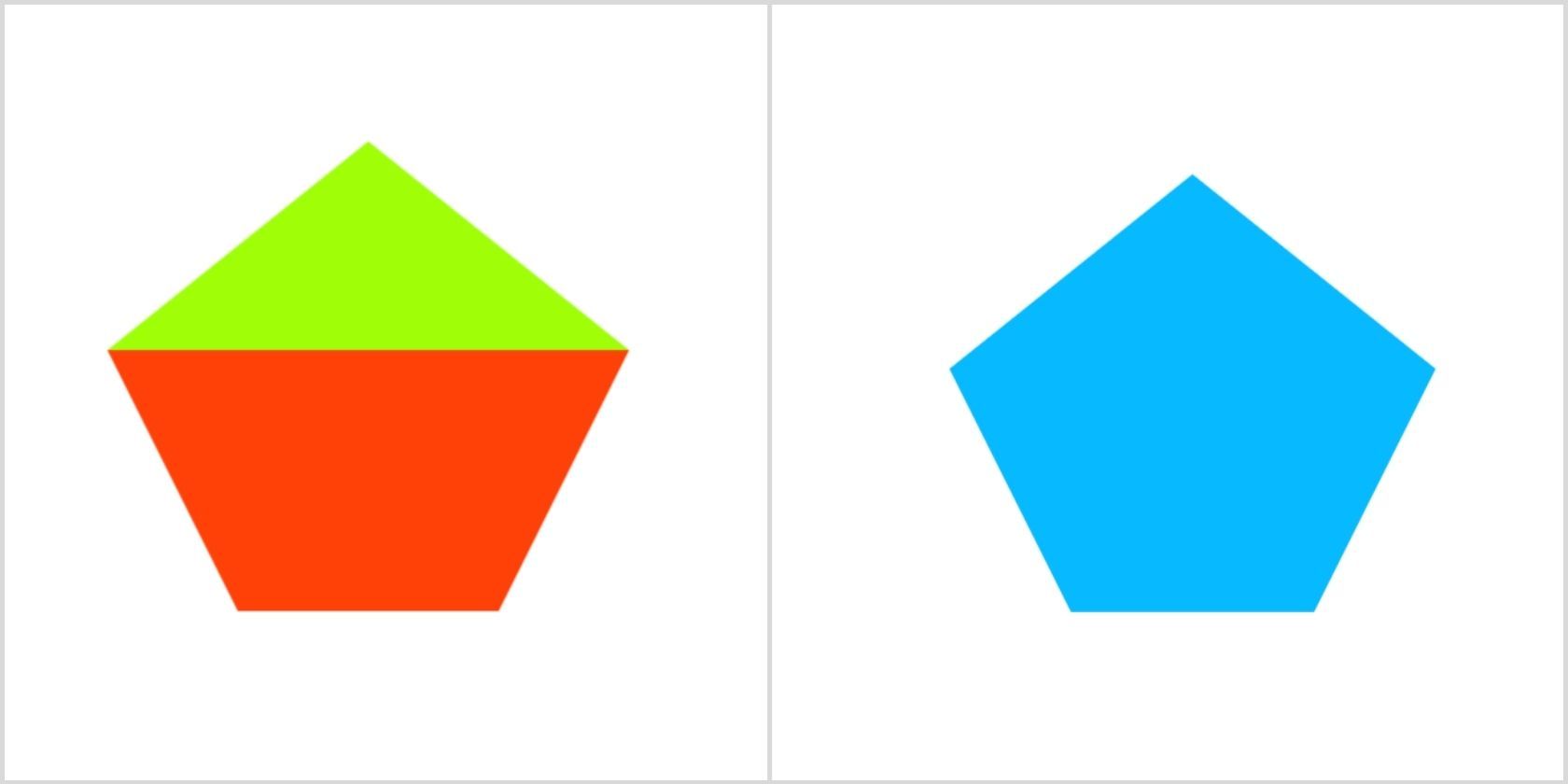
You can create a pentagon by combining a trapezoid and a triangle. Use border and position properties shape and group them.
HTML
<div class="pentagon"></div>
CSS
        .pentagon {

 position: relative;

 width: 10em;

 box-sizing: content-box;

 border-width: 10em 5em 0;

 border-style: solid;

 border-color: rgb(7, 185, 255) transparent;

margin-top: 20rem;

margin-left: 10rem;

}


.pentagon:before {

 content: "";

 position: absolute;

 height: 0;

 width: 0;

 top: -18em;

 left: -5em;

 border-width: 0 10em 8em;

 border-style: solid;

 border-color: transparent transparent rgb(7, 185, 255);

}
Output:
Diamond
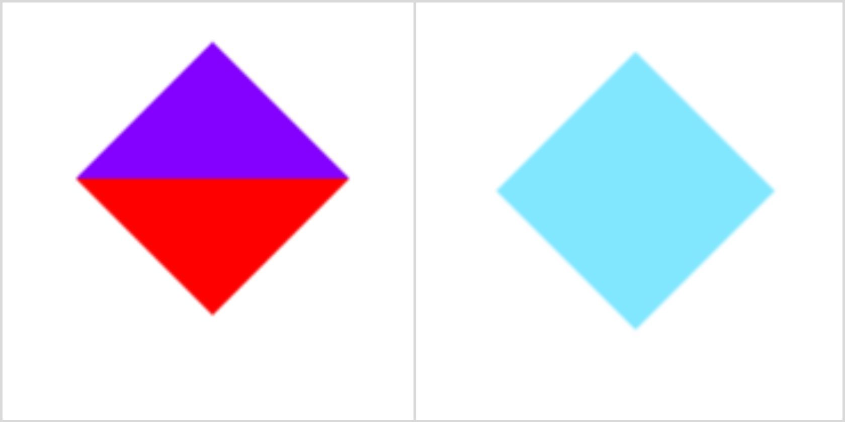
Group two triangles pointing upwards and downwards using position to create a diamond shape. Yes, we’ll use the border properties to create these triangles.
HTML
<div class="diamond"></div>
CSS
        .diamond {

 width: 0;

 height: 0;

 position: relative;

 top: -3em;

 border: 3em solid transparent;

 border-bottom-color: rgb(129, 230, 255);


}

.diamond:after {

 content: '';

 width: 0;

 height: 0;

 position: absolute;

 left: -3em;

 top: 3em;

 border: 3em solid transparent;

 border-top-color: rgb(129, 230, 255);

}
Output:
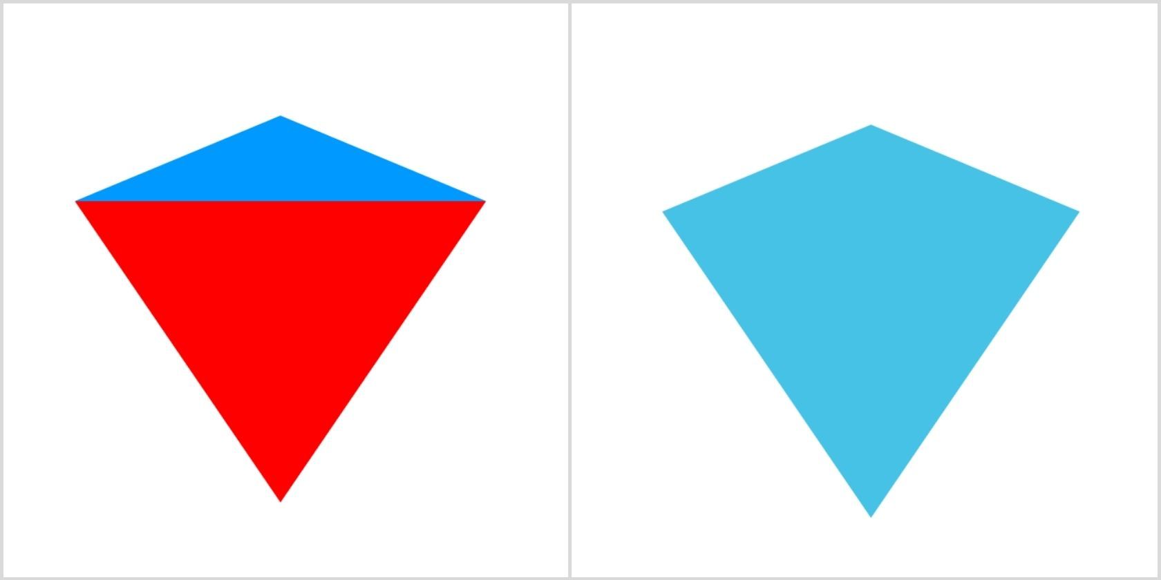
You can create a diamond shield shape by altering the height of the top-triangle as shown below:
HTML
<div class="diamond-shield"></div>
CSS
        .diamond-shield

{

 width: 0;

 height: 0;

 border: 3em solid transparent;

 border-bottom: 1.25em solid rgb(71, 194, 231);

 position: relative;

 top: -3em;

}

.diamond-cut:after {

 content: '';

 position: absolute;

 left: -3em;

 top: 1.25em;

 width: 0;

 height: 0;

 border: 3em solid transparent;

 border-top: 4.4em solid rgb(71, 194, 231);

}
Output:
Heart
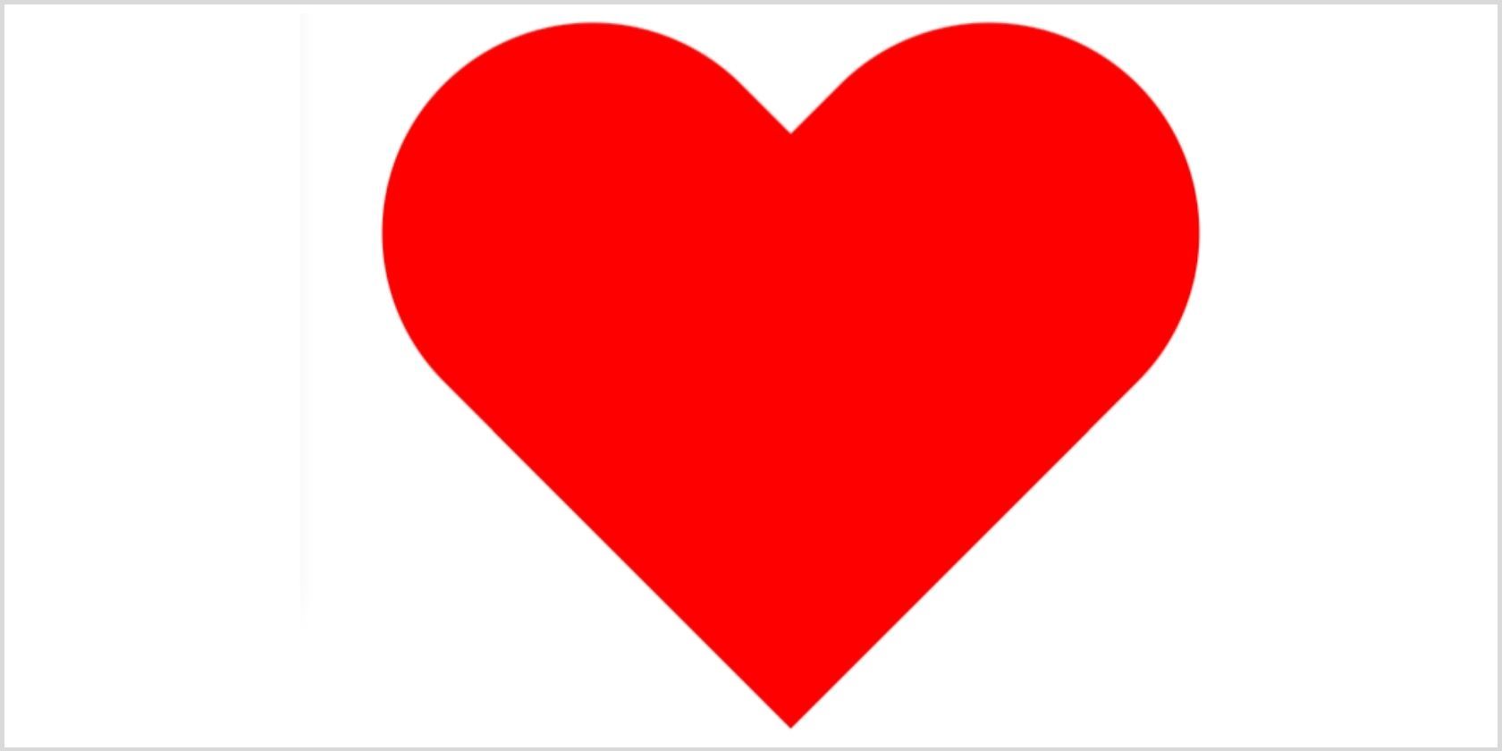
The heart shape is a little hard but you can do it by using ::before and ::after pseudo-elements. You can use different values of transform to rotate them from different angles until they perfectly form a heart shape. Ultimately, you can set transform-origin to set the point around which the transformation is applied.
HTML
<div class="heart"></div>
CSS
        .heart {

 width: 6.25em;

 height: 55em;

 position: relative;

}

.heart:before,

.heart:after {

 content: "";

 width: 3em;

 height: 5em;

 position: absolute;

 left: 3em;

 top: 0;

 background: red;

 border-radius: 3em 3em 0 0;

 transform: rotate(-45deg);

 transform-origin: 0 100%;

}

.heart:after {

 left: 0;

 transform: rotate(45deg);

 transform-origin: 100% 100%;

}
Output:
Experiment With Pure CSS Shapes
You should now be familiar with different pure CSS images that can be built by writing a few lines of code. Building a super-fast website isn’t a hectic task anymore as you know how to play around with the code. The best part is that you can resonate with the brand’s voice by manipulating different shapes and colors according to your requirement. Therefore, keep experimenting and discover new ways to draw awesome shapes purely by CSS.


