Looking for a quick project to practice your web dev skills? You've probably seen many different COVID trackers and charts throughout the pandemic—here’s how to make your own with minimal effort.
You’ll learn some useful techniques in JavaScript including how to fetch remote data from an API and how to use a charting library to display it. Let's get into it.
What You’ll Be Building
This guide will help demonstrate the basics of working with an API using JavaScript. You’ll learn how to fetch data from a remote source. You’ll also see how to use a chart library to display the fetched data.
All code used in this article is available in a Github repository.
Exploring the Data Source
To get the latest COVID-related figures, we’ll use disease.sh which describes itself as an “Open Disease Data API”.
This API is excellent because:
- It has many different sources of data, each offering slightly different formats
- It’s well documented, not with examples, but with plenty of detail on how each of the disease.sh endpoints work
- It returns JSON, which is easy to work with from JavaScript
- It’s totally open and free to use, no authentication required
This last point is particularly important: many APIs require you to go through a complicated OpenAuth process, or simply aren’t available to JavaScript running in a browser.
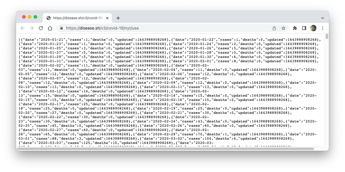
For this tutorial, we’ll use the New York Times data for the US from disease.sh. This endpoint includes data from the duration of the pandemic (since 21st Jan 2020), in a format that’s easy to work with. Take a look at some data from the disease.sh endpoint we’ll be using:
If you’re used to dealing with JSON, you may be able to read that without any problem. Here’s a small excerpt in a more readable layout:
        [{
  "date":"2020-01-21",
  "cases":1,
  "deaths":0,
  "updated":1643386814538
},{
  "date":"2020-01-22",
  "cases":1,
  "deaths":0,
  "updated":1643386814538
}]
The API returns a simple array of objects, each object representing a data point with date, cases, etc.
Setting Up the HTML
For now, we’ll set up some very simple skeleton HTML. Ultimately, you’ll need to include a few external resources, but this is enough to get started:
        <!DOCTYPE html>
<html>
 <head>
   <title>Covid Tracker</title>
 </head>
 <body>
   <h2>Covid cases, US</h2>
   <div class="chart" id="covid-all-us-cases"></div>

   <script src="covid.js"></script>
 </body>
</html>
Fetching the Data Using JavaScript
Start by just getting the data from the API and displaying it in the browser console. This will help you verify that you can fetch from the remote server and process the response. Add the following code to your covid.js file:
        var api = 'https://disease.sh/v3/covid-19/nyt/usa';

fetch(api)
	.then(response => response.json())
	.then(data => {
    console.log(data);
	});
The Fetch JavaScript API is a newer alternative to XMLHttpRequest (read about it in detail at MDN). It uses a Promise which makes asynchronous programming with callbacks a bit easier. Using this paradigm, you can chain several asynchronous steps together.
After fetching the required URL, use the then method of the Promise to handle the success case. Parse the Response’s body as JSON via the json() method.
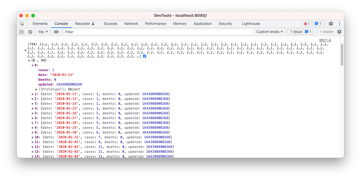
Since then() always returns a Promise, you can keep chaining to handle each step. In the second step, for now, simply log the data to the console so you can inspect it:
You’ll be able to interact with the object displayed in the console to inspect the data from the API. You’ve already made a lot of progress, so move on to the next step when you’re ready.
Displaying the Data Using billboard.js
Instead of logging the data, let’s plot it using a JavaScript library. Prepare for this by updating the previous code to look like this:
        fetch(api)
	.then(response => response.json())
	.then(data => {
		plotData(data);
	});

function plotData(data) {
}
We’ll use the billboard.js library to give us a simple, interactive graph. billboard.js is basic, but it supports a few different chart types, and allows you to customize axes, labels, and all the standard ingredients of a chart.
You’ll need to include three external files, so add these to the HEAD of your html:
        <script src="https://d3js.org/d3.v6.min.js"></script>

<script src="https://cdnjs.cloudflare.com/ajax/libs/billboard.js/3.3.0/billboard.min.js"></script>

<link rel="stylesheet" href="https://cdnjs.cloudflare.com/ajax/libs/billboard.js/3.3.0/billboard.min.css" />
Try out billboard.js with the most basic chart. Add the following to plotData():
        bb.generate({
    bindto: "#covid-all-us-cases",
    data: {
        type: "line",
        columns: [
            [ "data", 10, 40, 20 ]
        ]
    }
});
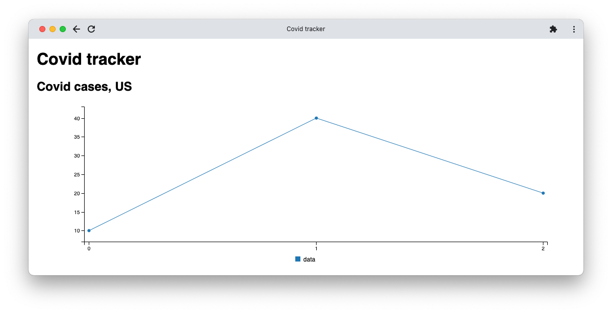
The bindto property defines a selector which identifies the target HTML element in which to generate the chart. The data is for a line chart, with a single column. Note that the column data is an array consisting of four values, with the first value a string acting as that data’s name (“data”).
You should see a chart that looks a bit like this, with three values in the series and a legend labeling it as “data”:
All that’s left for you to do is to use the actual data from the API that you’re already passing into plotData(). This requires a bit more work because you’ll need to translate it into an appropriate format and instruct billboard.js to display everything correctly.
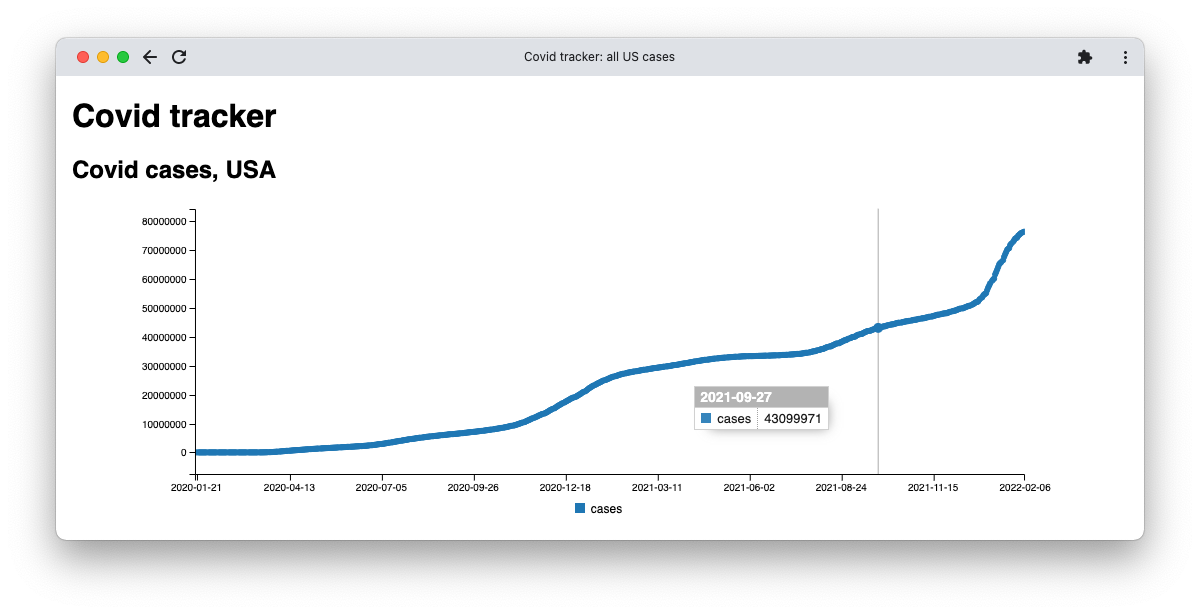
We’ll plot a chart that shows the full case history. Start by building two columns, one for the x-axis which contains dates, and one for the actual data series we’ll plot on the graph:
        var keys = data.map(a => a.date),
    cases = data.map(a => a.cases);

keys.unshift("dates");
cases.unshift("cases");
The remaining work requires tweaks to the billboard object.
        bb.generate({
    bindto: "#covid-all-us-cases",
    data: {
<strong>        x: "dates",</strong>
        type: "line",
<strong>        columns: [
            keys,
            cases
        ]</strong>
    }
});
Also add the following axis property:
                axis: {
            x: {
                type: "category",
        		tick: {
                    count: 10
                }
            }
        }
This ensures the x-axis displays just 10 dates so they're nicely spaced. Note that the final result is interactive. As you move your cursor over the graph, billboard displays data in a popup:
Check out the source for this tracker in GitHub.
Variations
Take a look at how you can use the source data in different ways to change what you plot using billboard.js.
Viewing Data Just for a Single Year
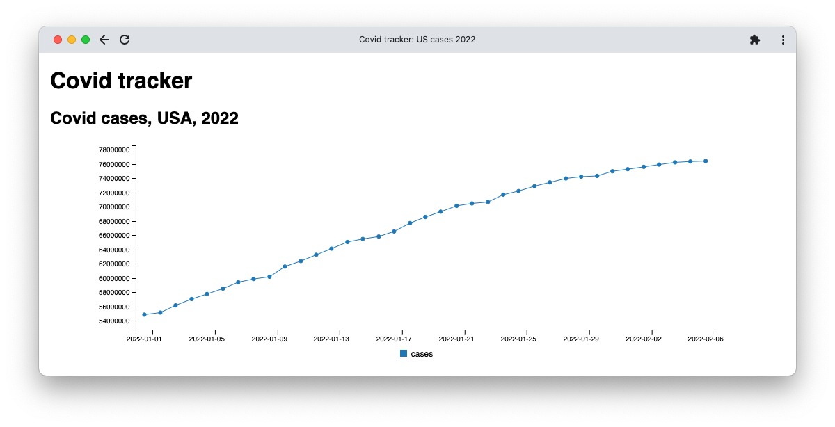
The overall chart is very busy because it contains so much data. A simple way of reducing the noise is to limit the time period, to a single year for example (GitHub). You just need to change one line to do this, and you don’t need to touch the plotData function at all; it’s general enough to handle a reduced set of data.
In the second .then() call, replace:
plotData(data);
With:
plotData(data.filter(a => a.date > '2022'));
The filter() method reduces an array by calling a function on each value in the array. When that function returns true, it keeps the value. Otherwise, it discards it.
The function above returns true if the value’s date property is greater than ‘2022’. This is a simple string comparison, but it works for the format of this data which is year-month-day, a very convenient format.
Viewing Data With Less Granularity
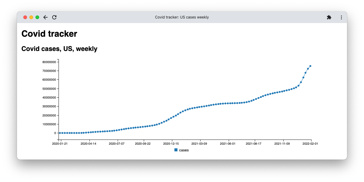
Rather than restricting the data to just one year, another way to reduce the noise is to discard most of it but retain data from a fixed interval (GitHub). The data will then cover the whole original period, but there will be much less of it. An obvious approach is to just keep one value from each week—in other words, every seventh value.
The standard technique for doing this is with the % (modulus) operator. By filtering on the modulus 7 of each array index equaling 0, we’ll retain every 7th value:
plotData(data.filter((a, index) => index % 7 == 0));
Note that, this time, you’ll need to use an alternative form of filter() which uses two arguments, the second representing the index. Here’s the result:
Viewing Cases and Deaths in One Graph
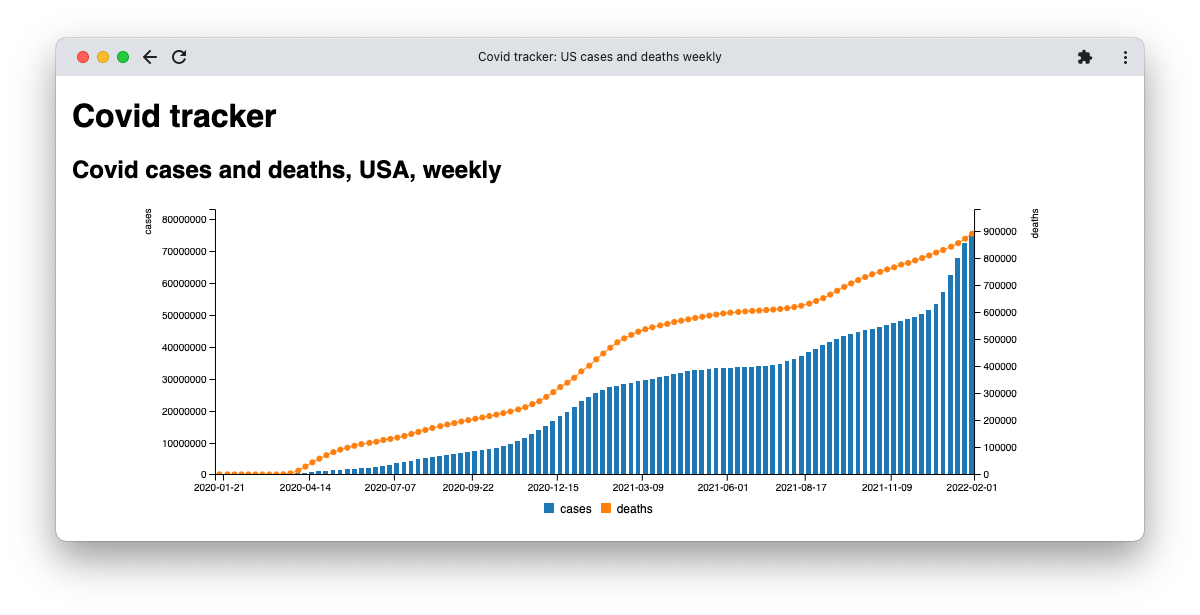
Finally, try displaying both cases and deaths on one chart (GitHub). This time you will need to change the plotData() method, but the approach is mainly the same. The key changes are the addition of the new data:
        deaths = data.map(a => a.deaths)
...
columns = [ keys, cases, deaths ]
And tweaks to ensure billboard.js formats the axes correctly. Note, in particular, the changes to the data structure belonging to the object passed to bb.generate:
        data: {
   x: "dates",
   columns: columns,
   axes: { "cases": "y", "deaths": "y2" },
   types: {
       cases: "bar"
   }
}
Now, define the multiple axes to plot along with a new type specific to the cases series.
Plotting API Results Using JavaScript
This tutorial demonstrates how to use a simple API and a charting library to build a basic COVID-19 tracker in JavaScript. The API supports lots of other data you can work with for different countries and also includes data on vaccine coverage.
You can use a wide range of billboard.js chart types to display it, or a different charting library altogether. The choice is yours!

