Even if you’re not a visual content creator, adding popular visual elements to your content will make it a lot more appealing.
For a blogger or any non-visual content creator, the look of things plays an important role. It’s difficult to grab or retain the attention of an audience with plain text blocks, but by adding some quirky and enthralling visual elements, you can make your content stand out.
This article discusses the best visual elements to add to your content.
1. Images and Illustrations
It’s impossible to imagine a blog or article without any images in it. Besides the mandatory featured image, adding pictures and illustrations between the text blocks have become standard practice.
Images not only help you explain things better to your readers, but it also saves your content from looking like a collection of intimidatingly long text blocks. The more unique the images that you use in your content, the more interested the readers will be.
Always include high-quality and professional-looking images and illustrations to convey your message. If your blog talks about using a tool or app, adding screenshots is the best way to explain each point to readers.
Moreover, you can use any free online graphic design tool to create images and illustrations for your content.
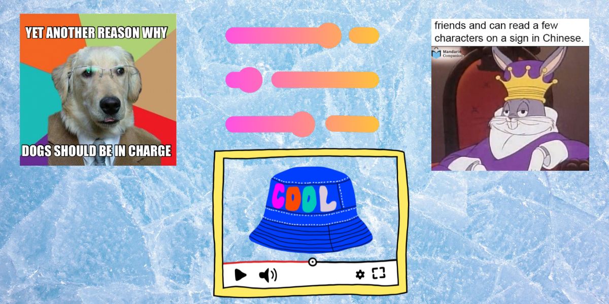
2. Memes and GIFs
Thanks to social media, GIFs and memes have become an integral part of our communication.
Adding memes to your content is not only for adding humor; you can use it while discussing a serious issue to make it more lighthearted. And using GIFs will save your content from getting boring.
Besides using trending memes and GIFs, you can also create your own according to the content type by using meme templates. Moreover, you can use emojis in your writing to display emotions in an unorthodox way. Using these trendy visual elements also makes your content more share-worthy.
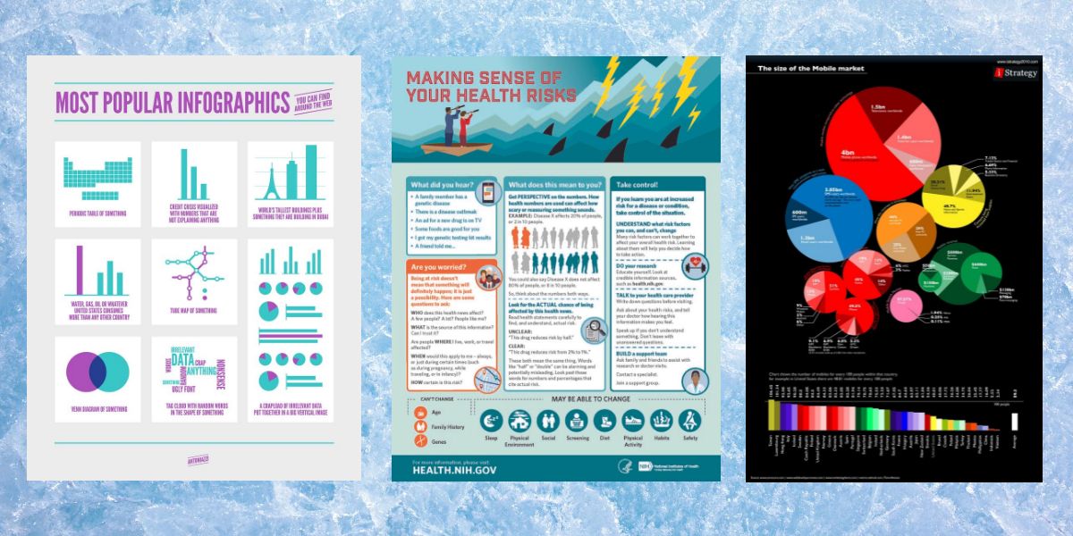
3. Infographics
An infographic is a powerful visual element you can use in any type of content. Readers can quickly grasp the message you’re trying to convey through an infographic. It also leaves a long-lasting impression and helps them to remember the information.
Even if your blog post does not contain any numeric data, it’s always possible to create a beautiful and informative infographic that’ll summarize your content. Add a catchy background and use prominent font styles to create an infographic that compiles the main talking points of your blog.
Making an infographic is relatively easy. You can use any popular drawing tool to create catchy infographics for your content.
4. Slideshows
Many people used to consider slideshows or PowerPoint presentations suitable for boardroom meetings only. However, times have changed, and we have seen the successful use of slideshows across platforms. In fact, it has become a powerful medium of communication and a resourceful visual element.
You can definitely incorporate a slideshow presentation in your content, especially if you’re going to discuss a list of elements. Create one slide for each discussed item, and add an index page in the beginning if you want.
While creating slideshows for your content, follow the best practices for presentation. Make sure it looks professional in terms of language and visuals. Also, be consistent with the font type, size, and color of the content in your presentation.
5. Videos
A relevant and informative video can help increase your engagement. It can immediately capture the attention of your audience and present the topic in an easily-digestible manner.
If you explain the functions of a gadget or app in your blog, using videos will be particularly useful for providing a visual demonstration of the instructions. Just make sure the videos are in HD quality.
You don’t have to make multiple videos for your blog posts; instead, make a comprehensive video. You can use that video for numerous blogs that cover the same theme or its related topics. Add the video in the top section of the content so that it can immediately grab your readers’ attention.
You also need to figure out what type of videos your audience likes. Demonstrations and interviews are two popular types of videos people usually add to their content.
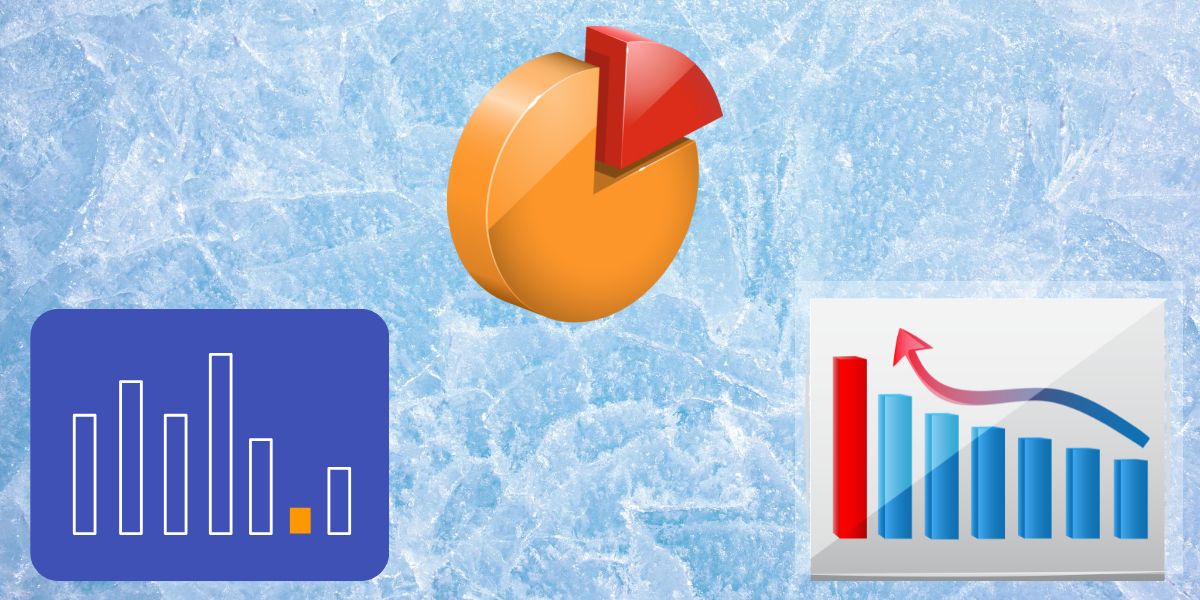
6. Charts and Graphs
A lot of content includes numeric data. Mentioning them in the text might make it difficult for readers to follow along. For data-driven content creators, visualizing numeric data through graphs and charts is more useful to readers.
These visual elements simplify any complicated data, which makes it more appealing and sensible to readers. With a multitude of graph and chart types available, you have to use the most suitable one for your particular data. Here’s a quick guide:
- Bar charts: Simplest way to show the comparison between multiple categories.
- Pie charts: Best for showing a break of data or what something is composed of.
- Line graphs: Another way to display a correlation or pattern.
- Pyramid charts: Ideal for showing the hierarchical relationship between data.
- Scatter charts: Used to show distribution or a relationship between two different variables.
- Flow charts: Perfect for displaying the chronology or sequence of data.
7. Font Style and Bullets
You need to consider the importance of emphasizing the typeface and font styles. By using these tactfully, you can make the audience better see the crucial points.
Choose a typeface that’s easy to read. It’s good to use different fonts for headings, subheadings, and body text. Wisely select the font color based on the background color so they don’t clash.
Utilize text formats like title cases, bold, italics, underscores, and strikethroughs wherever necessary to make the section stand out. When adding a quotation, use a quirky font and a catchy background color.
To make a listicle prominent, don’t forget to use different bullet point styles. You can also sort them using a numbered list. Thus, readers can easily distinguish which point they’re at while reading them.
Make Your Content More Appealing With Visual Elements
By adding various visual elements to your content, you can make it more captivating. Here, we’ve shared the best visual elements for content creation. Start including them in your content and you can up your success as a creator by attracting more readers.


