As a graphic designer, how do you know which color schemes will make the best designs? The answer is to track trendy color schemes.
The success of a design largely depends on the color schemes that you use. Though you need to design unique and creative graphics, you should always stay up-to-date on the latest trends in color.
Here are some of the hottest colors in graphic design for 2021.
1. Gradients With Analogous Palettes

In 2021, graphic designers are relying on harmonious color palettes. With more people seeking togetherness, designers are replicating that on their canvases. Start experimenting with analogous colors that effortlessly merge with each other.
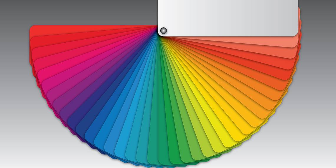
Color trends also show that some graphic designers are using analogous color palettes when creating gradients. Analogous colors create a natural color gradient, as the palettes are combinations of colors that sit next to each other on the color wheel.
2. Gem and Jewel Tones

Graphic designers are increasingly using color tones that match precious gems and jewels to appeal to users' emotions of happiness, pride, love, and joy.
You can experiment with colors like amber, azure, amethyst, jade, and sapphire. Additionally, if you choose precious metals like gold, platinum, or silver, you'll add a luxurious tone to your designs.
3. Soft Pastels

The global pandemic of 2020 increased uncertainty throughout the world. To offset such insecurity with reassurance and safety, graphic designers all over the world started using soft pastels. As a result, the designs are calmer, soothing, and visually attractive.
There are many successful designs that use soft pastels, like GetYourGuide, Mello, and Baltes from Studio Skulptur. The color palettes of these designs convey a calming message.
4. Limited Color Palettes

More graphic designers are utilizing limited color palettes. You can design wonderfully harmonious graphics with a limited palette. This minimalist color scheme goes easy on the eyes and will grab ahold of a viewer's attention.
You can use colors like burnt umber, quinacridone magenta, cadmium red light, primary cyan, transparent yellow, viridian green, burnt sienna, and more, to make a unique limited palette. Use a contrasting background with the aforementioned colors to make your design really pop.
Different businesses are using limited color palettes for graphics on their websites, like the Museum of Peace & Quiet, and even Afterpay, a fintech brand.
5. Ultimate Gray and Illuminating

Ultimate Gray and Illuminating are Pantone's Colors of the Year for 2021. A harmonious combination of vibrant yellow and Ultimate Gray conveys the message of enthusiasm and courage. Successful global brands like Caterpillar, Ferrari, IMDb, National Geographic, Nikon, and more, use gray and yellow colors in their websites and product designs.
If you’re looking to present your brand as practical, optimistic, and welcoming, you might want to try using Ultimate Gray and Illuminating.
6. Saturated and Vibrant Colors

Placing vibrant colors on a background with a pale hue is another rising design trend. Designers use this color combination to grab users' attention, as the intense colors really stand out. You’ll find this color scheme in the designs of big brands like Fanta, Red Bull, Burger King, Wrigley's Juicy Fruit, and more.
If you want to inspire positivity in users, you should start using saturated colors in your design projects. You can create your own juicy color combinations by using vivacious corals, light pink, lilac, and peach on a suitable background.
7. Dreamy Color Schemes

If you love to experiment with unrealistic color schemes, you’ll be glad to know that expressionist or surreal colors are also trending in 2021. These color schemes are used in unexpected ways to design dream-like graphics.
To make subtle statements, graphic designers use unusual shades to color an object. In most cases, the object normally doesn’t exist in that color. It is a creative way to give people a few minutes of solace away from rock-solid reality.
8. Quiet Wave for a Fresh and Sophisticated Look
Graphic designs that use Quiet Wave (#1B7340) display a cool and clean aesthetic look. It’s trending in 2021, as this mint green gives off a fresh look. The color company, Coloro, predicted Quiet Wave as one of this year's trendiest colors.
9. Pale Colors and Rugged Designs

Pale colors coupled with rugged-looking designs are only getting more popular. The brands that are hopping on this trend are giving their designs a raw, yet timeless look.
This look offers a sense of comfort and reassurance, and is also a subtle way to show that your brand has survived throughout time.
10. Nostalgic French Blue

French Blue (#0072B5) is another trending color in graphic design. The Pantone Color Institute forecasted French Blue as one of the hottest colors in fashion for spring and summer 2021.
Brands that want to stand out ask their designers for French Blue-based designs. You can combine French Blue, white, and light yellow to deliver unique designs that captivate users.
Design for Success With These Eye-Catching Colors
Now, it's time to start experimenting with these color schemes. Try combining them with other colors in a design of your choice, and see how your clients react.