Appropriate visualization of data is vital for your team’s success. Data visualizations show how your project is progressing or how you’re doing in terms of earnings. Data Studio comes in handy for such productive data analysis because it’s an easy-to-use tool with a lot of modern features.
You can become your own data analysis expert by knowing various essential features of Data Studio. So, read on to become the master of this platform.
What Is Google Data Studio?
It’s an online tool that helps you visualize data effortlessly for free. You can choose from a wide range of data sources, including Google Sheets and Microsoft Excel files. The AI of Google Data Studio automatically combines data from several sources, analyzes those data, and enables you to make interactive charts, dashboards, or reports.
All you need to do is select the charts or tables that you want in your report and add some colorful themes to those. You don’t need to go through extensive learning sessions to become knowledgeable about the tool. You can simply drag-and-drop charts into the canvas to create regular project reports, team performance reports, project budget forecasts, etc.
Following are the features and functionalities of Data Studio that’ll help you get started with basic but actionable reports.
1. A Nifty Dashboard
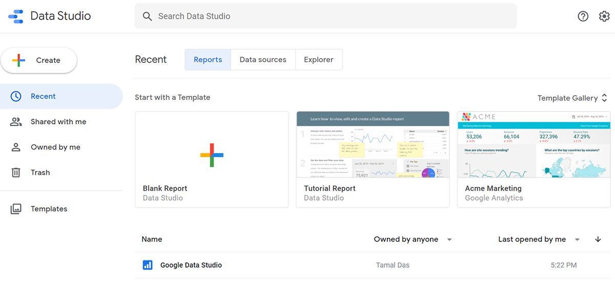
Data Studio’s dashboard and UI resemble that of Google Drive. So, you already know about the tool’s UI a lot. The following are the essential elements that you’ll interact with a lot:
- The Search Data Studio box at the top enables you to look for reports, templates, and data sources.
- The Recent section gives you the option to swap the visibility for Reports, Data sources, and Explorer.
- The left-side menu lets you create a new Report, Data source, or Explorer. You can also find shared items and the Templates gallery in this space.
- The gear icon in the top right corner lets you customize several fields of the User settings.
2. Multiple Data Collection Sources
Data Studio saves you from managing multiple versions of Google Sheets or Microsoft Excel files that are related to your work. The tool can analyze raw data from more than 800 data sets across 490+ data connectors. Therefore, you can now import data from third-party sources like Funnel, TapClicks, Amazon Seller Central, Asana, Jira Cloud, etc.
Additionally, you can let the tool access and analyze data from Google tools like Campaign Manager 360, Google Analytics, MySQL, and Google Sheets.
You don’t need to worry about data integrity and security while using Data Studio. It employs stringent encryption technologies to safeguard your data during transit and within the tool.
3. Performance Driven In-Memory BI Engine
Let’s say you’re presenting a project performance report to your client. Though you’ve got premium and modern tools in your data visualization arsenal, the presentation is not going well as the data keeps on loading. Moreover, when you’re working with numerous data sources, the lag could be even worse.
Data Studio comes with sub-second performance thanks to the BI Engine from the Google Cloud BigQuery team. It’s an in-memory data access and analysis service that can integrate with your in-house BigQuery data warehouse. As a result, you can present live data from hundreds of sources in one dashboard that updates and loads instantaneously.
4. Interactive Data Visualization
The view mode of the Data Studio report is highly responsive thanks to advanced programming features like chart interaction controls, drill-downs, and cross-chart interactions. Therefore, a viewer can customize almost anything from filters to metrics to discover various insights from your reports.
Data Studio Explorer enables the viewer to deep dive into your report by dissecting your graphs and tables into small bits of data. Viewers also need not be SQL database experts when they’re looking at the databases of a report. There are visual queries that the viewers can execute to explore databases.
5. Real-Time Collaboration
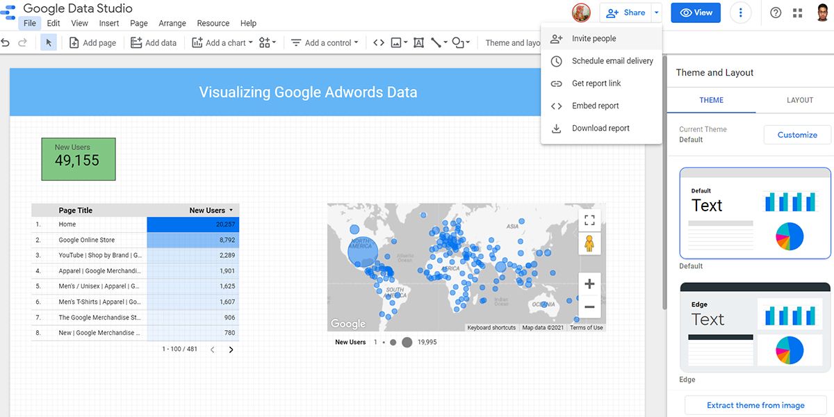
Similar to other productivity tools from Google, you and your collaborators can work on the same Data Studio report in real-time. From the Share menu on top of the report, you can invite people to work with you, manage their access levels, or get a public link for social media.
When you share your Data Studio workspace with someone else, their Google profile will show up on the menu bar if they join with you. Other notable features that enable collaborative work easier on Data Studio are:
- Let collaborators edit a reusable data source and add that to their own reports.
- Embed a Data Studio report in various media like newsletters, emails, blogs, etc.
- Restrict third parties from printing, downloading, or copying your Data Studio reports.
6. Ease of Use
Its web UI is easy-to-use, and users from Google Workspace are already familiar with the navigation. The report editing workspace offers complete drag-and-drop actions. You can access custom property panels for each object that you use in your reports.
You also don’t need to learn a lot about graphs and tables if you use ready-to-use templates of Data Studio. The Templates library consists of eight types of report categories to choose from.
7. Scheduling a Report
Sharing the data visualization report regularly or as per the client’s preference is an important task. When you’re engaged in multiple tasks and taking care of the team, you may forget to send project reports to your client.
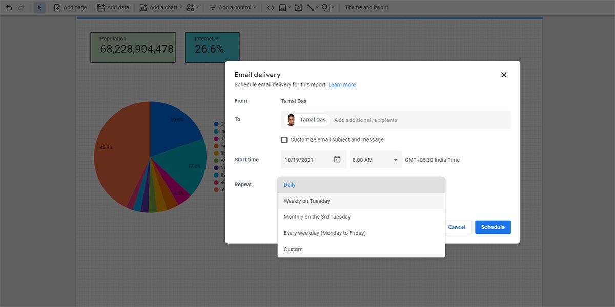
Thanks to the Schedule email delivery feature of Data Studio, you can plan ahead. You can create a report for your client and schedule the delivery.
Data Studio will automatically notify your client when the report is due. Moreover, you can edit the Repeat settings to let the tool know if the client needs to see reports after particular intervals.
8. Various Charts and Graphs
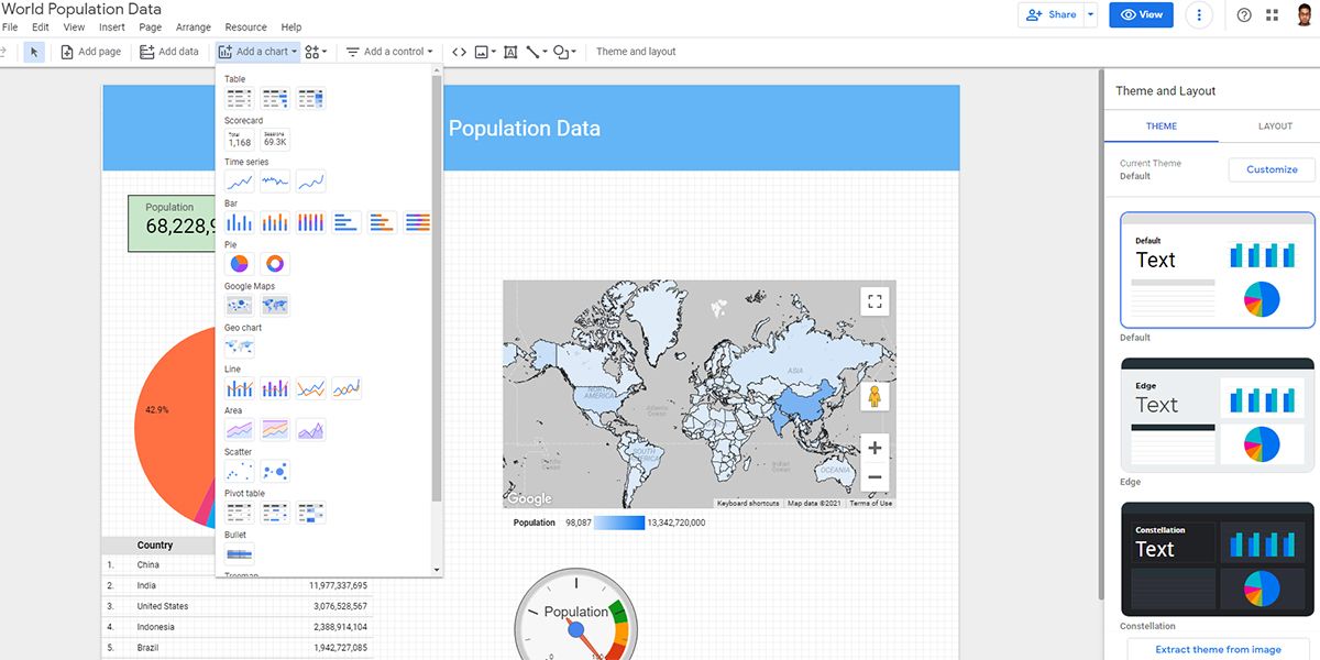
Data Studio has 14 different types of charts that you can insert into your reports. Whether you need Bar, Pie, or Line charts, most of them are available with a single click. The in-memory BI Engine analyzes the type of data and structures it according to the charts or tables that you select.
Apart from charts, you can also insert Community visualizations into your report to give it a professional and creative look. You freely access various visualizations like Gantt chart, Radar chart, gauge, Start Rating, etc.
Know Your Data Inside Out
Now that you know the various features of Data Studio and how they help you in data analysis, you can create cool data visualizations for work. Go on and try creating interactive reports that help you and your team to plan future projects.
As you’re on the course of becoming an expert data analyst, you may also want to explore data analysis basics and their importance in professional life.

.jpg)


