Using typography in design is important; everyone does it. But you don’t want your text to look like every other designer’s, right?
Here, we share our top tips and tools to help improve your custom typography in Adobe Illustrator. You might have heard of some of these before, but there are plenty of hidden gems for you to discover and try out.
1. Touch Type
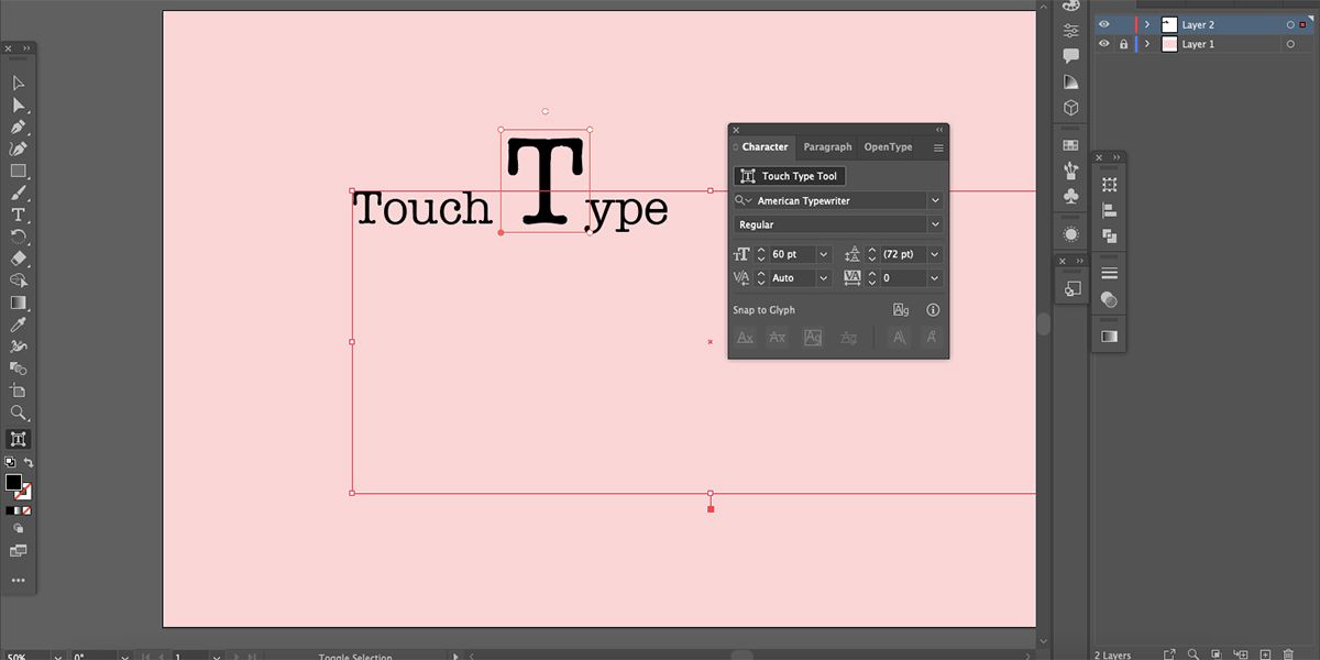
Touch Type is a lesser-known feature that allows you to scale, rotate, kern, or move individual letters while retaining editable text. You don’t have to create outlines, and you can still change your text at any point even after you’ve applied effects to your letters.
After typing your text, open the Character panel by going to Window > Type > Character. At the top of the popup, select Touch Type Tool. Then you can select any individual letter to edit.
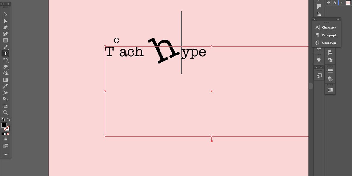
Once you’ve selected a letter, you can use the top left anchor point to scale vertically, the top right anchor point to scale proportionally, the bottom right anchor point to scale horizontally, the circular anchor above the selection to rotate, or the keyboard’s arrow keys to kern horizontally or to move up and down. You can also click and move with your mouse.
You can highlight the edited letter to type a new one with the same effect, and you can change the font of an individual letter to follow the same effect too. But if you highlight the entire word to rewrite it then the effects will be lost.
2. Adding Glyphs
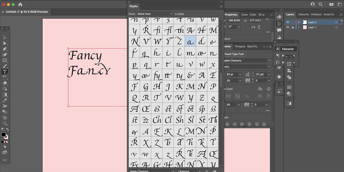
While this isn’t an option for all fonts, is it a hidden option for many. Find out if your chosen font comes with added glyphs by going to Window > Type > Glyphs. This will open a tab showing all available letters, digits, punctuation marks, non-English letters, ligatures, and glyphs.
Not all typefaces come with the added extras, but if it does, you’ll find them here. It is more likely that cursive fonts will offer decorative glyphs.
To add a glyph, ligature, or accent, either highlight a letter and double-click the square with the new choice to replace your original letter, or you can place your cursor where you’d like your new glyph or accent to appear and double-click the square to insert it there.
3. Create Outlines
Creating outlines of your text in Illustrator can be helpful for many reasons. For example, for logotypes with added elements to the text, or when creating a design for a client, you should create outlines of all text to ensure it doesn’t get edited and that the font isn’t lost later.
To create outlines, first, type out your text. Set any settings you want from the Character and Paragraph panels. Once you’re happy with what you have, right-click the text and choose Create Outlines.
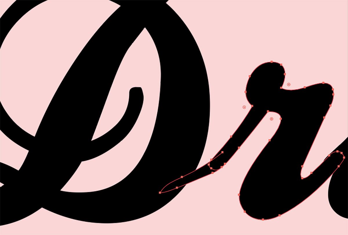
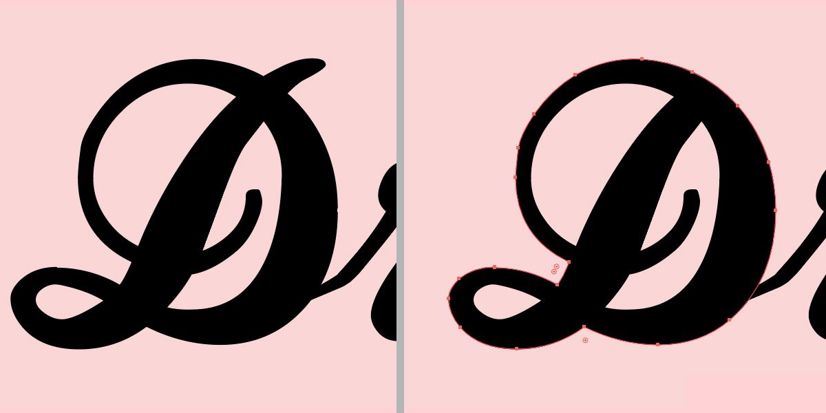
Now your text is a path and can be edited as such. If you want to edit elements, such as removing the holes in letters, you can delete, move, or edit the paths now. This allows you to create custom text any way you want, but it saves time as you didn’t have to create the font yourself first.
4. Redraw Text Paths With the Pencil Tool
If you’ve created outlines from your text, then one way to customize it further is by drawing paths on your text. You can draw to elongate letters, change the shape of holes, remove serifs, or anything you’d like.
Select the text, then use the Pencil Tool to draw over the text path, and it will add your new shape to the path. To remove parts of the path, draw from one anchor point to another and the small area between those anchor points will disappear.
5. Offset Text
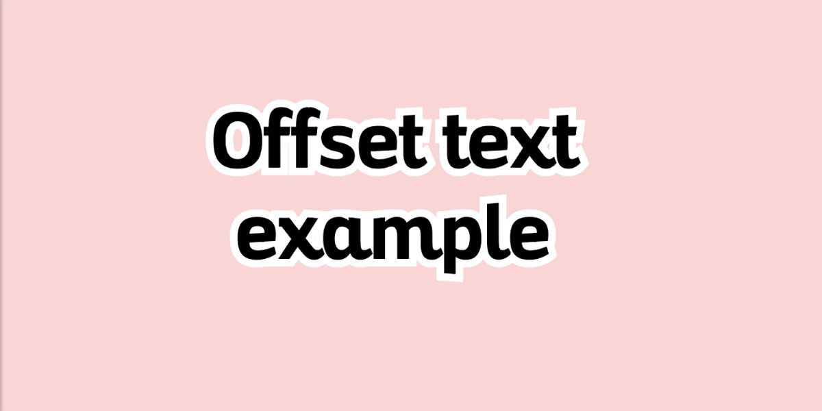
Offset text is like adding a stroke around the outside of your text so that it merges rather than only outlining individual letters. Offsetting your text is a great way to add a border around it.
An offset border can also be used when printing stickers or making logos or GIFs. You can offset text after creating outlines of the text quite easily, but we also have a tutorial to create editable offset text in Illustrator.
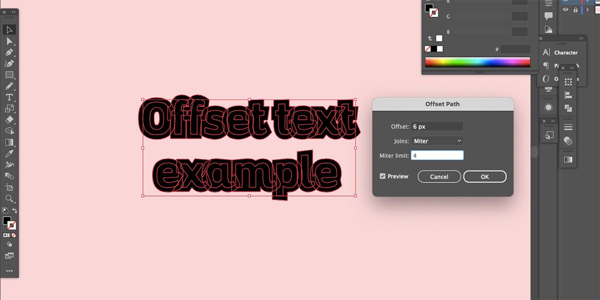
To offset text with created outlines, select the path and go to Object > Path > Offset Path. Choose a size for the border and click OK. Then on the Properties panel, click Merge. Right-click the outline and go to Arrange > Send to Back. Then change the color of the outline to see your original text on top.
You can easily outline text or add borders to text using Photoshop, too. This can produce a similar result as offset text.
6. Set Kerning, Tracking, and Leading
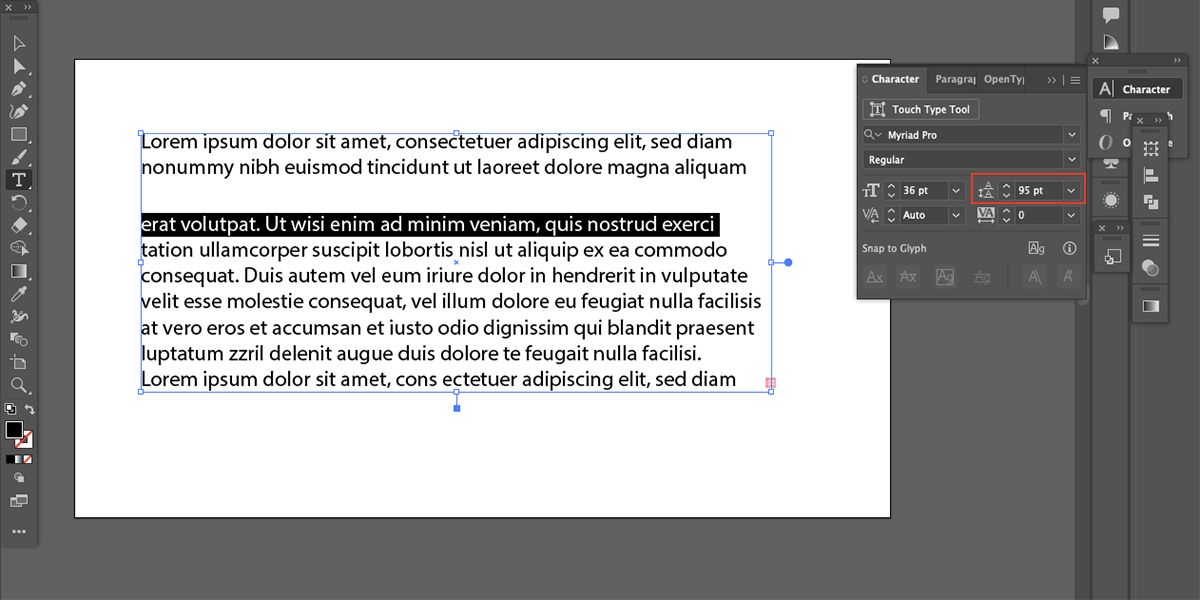
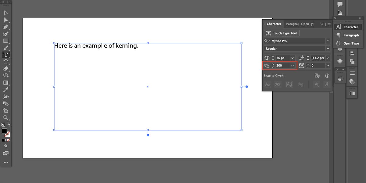
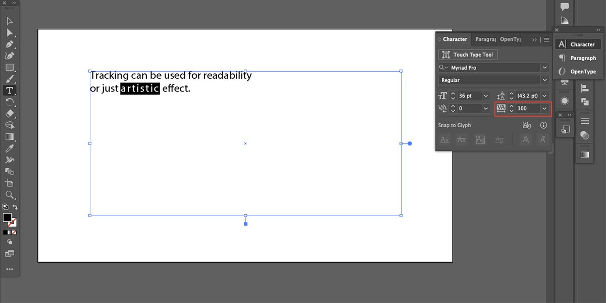
Setting the leading, tracking, and kerning is important for readability and accessibility. Setting these will take any text from an out-of-the-box font to professional typography in seconds.
You’ll find the leading, kerning, and tracking settings in the Character panel after typing your text. These settings are also found in Photoshop; did you know you can make bold text in Photoshop in several different ways?
Leading sets the space above a line of text. Leaving this on auto does a good job most of the time, but if you want a bigger or smaller horizontal space between the lines of text, you can change it by highlighting your line of text and toggling Leading up or down in the Character menu—this will move any text that is below the line, opening or closing the gap.
Kerning is for setting the spaces between individual characters. Most fonts are fine by default, but your text will appear more professional if you meticulously set the spaces for individual letters yourself. Place your cursor in the gap you wish to edit and toggle up or down in the Kerning option until you reach the best readability.
Finally, tracking is used to set spaces across multiple characters or words. Just highlight the letters or words and toggle the Tracking up or down to increase or decrease spacing. This can be used more globally than kerning, and some people use it for artistic effects rather than readability.
7. Download External Fonts
Using unique fonts will always give your typography a custom feel. Here are some great places to find and download new fonts:
If you need help downloading fonts, check our guide on how to install third-party fonts in macOS.
8. Typing on a Path
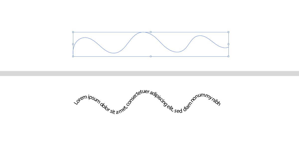
Why type on a straight line all the time when you can type around circles or on wobbly lines? A great way to customize your text is by typing on a path.
Create a path using any path-based tool—Pen Tool, any shape tools, Pencil Tool. Then select and hold the Type Tool and choose Type on a Path Tool. Now, when you hover the cursor over the path, you’ll have the option to click and type on that section of the path. Click and drag the nodes to move your text around the path for best placement.
You might use your custom text for a variety of designs or even add it on top of a photo. Here are the best ways to add text to a photo with different software.
Up Your Typography Game With Illustrator
With these helpful tips and tools, you can take your typography from standard and plain to fun and exciting. Customized text brings a unique touch to your design work, and it’s also fun to experiment with new ways to design. Incorporate a few of these tips into your workflow and see how your text results change for the better.

