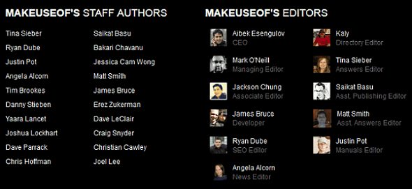
You're reading MakeUseOf right now, a website which primarily uses dark text on a light background. Which is as it should be. That bar across the top with light text on a dark background, and the section at the bottom which hardly anyone reads, are fine because they're just small parts of the site. Any more and I would have to give my bosses advice on how to improve the look and feel of the site as a whole - because websites with dark backgrounds completely suck.
You don't agree with that assessment? Then read on as I argue why this is the case. If you still disagree when you reach the end then I'm afraid there is no saving you from the poor website design future you have set off on the path towards. There's a reason 99 percent (completely made-up figure) of the Web uses dark text on light backgrounds...
Website Design
Website design is constantly evolving. Just type any URL into The Wayback Machine to see quite how far we have come in the last 15 years. The elements included on a webpage have changed, with different media embedded and integrated fully. Oh, and there are now adverts everywhere you look. Which can be annoying but keep sites such as MakeUseOf free for all to use.
However, most websites still retain that all-important component that is text. With the exception of photo blogs and suchlike, if there is no text then there is no way of knowing what you are looking at or the reason you're meant to be looking at it. Text on webpages should be black on a white (or at least light) background. For the most part.
Black and White
Books are primarily made up of white paper and black text. This is therefore the standard way humanity has learned to read printed materials. When computers first hit the mainstream they shipped with monochrome displays, so many of us had a first experience with green text on a black background. Boy, did that suck. Thankfully color monitors soon took over.
When the Web started evolving into the place we know today, many sites took a weird and wacky approach to design. Garish color schemes and flashing text were all the rage. Thankfully we once again moved on, and most of the Web now follows a very careful and considered design line which sees usability and readability given precedent over a visual style meant to stun, but more likely to cause epilepsy.
Web Standards
While colors other than black and white are superior in lots of cases (movies for starters), for text-based media such as most websites, black and white rule. It isn't hard to see why. Black on white works. You can see the text clearly without anything else distracting your field of vision.
As the majority of the Web has adopted this sensible stance, when a web user hits a site which has taken the opposing stance, it's very noticeable. The eyes take some time to adjust to the light writing and dark background, while the brain struggles to comprehend why anyone would do such a thing.
Perhaps if every site employed a dark background, things wouldn't be so bad, but since light backgrounds are the standard the odd exception looks terrible.
Must Try Harder
So, the majority of website with dark backgrounds completely suck. But they don't necessarily have to suck as much as they currently do. Those who are responsible for designing, building, and maintaining websites with dark backgrounds could and should try harder.
Web Designer Depot has some good examples of sites with dark backgrounds that are at least trying to make things better. They still suck, obviously, but by adjusting simple elements such as text size and font, paragraph length, and the contrast between the shade of light text and shade of dark background, these sites have kept the suckage to a minimum.
In other words, the amount that websites with dark backgrounds suck exists on a sliding scale. And a little bit more time and effort (and adapting the design sensibilities to the dark background look) results in more-tolerable examples. Try harder and perhaps we won't reject your design so readily.
Conclusions
Which do you prefer? Dark text on a light background, as is the norm, or light text on a dark background, as is the strange? Feel free to pick apart my argument for why websites with dark backgrounds completely suck. Or if you'd rather agree with everything I said in order to make me feel warm and fuzzy inside then that's fine too.
Image Credits: Tom F, Chris Gilmore, purplejavatroll

