The mere sight of pages of plain text can make your eyelids start to droop. Unformatted Word documents signal to the reader that this will be a dry and dull read. Nobody wants to endure that kind of boredom.
Microsoft Word contains several tools that can make your text more beautiful with aesthetic fonts and subtle effects. Overdoing it can fill your document with distractions, but a sensible approach to design and decoration adds important visual interest to sustain your reader's attention.
Here are some font styles and effects to make your text stand out in Microsoft Word.
1. Install Your Own Aesthetic Fonts for Microsoft Word
One of the easiest ways to spice up text in Word is to introduce some new fonts. You can find plenty of free fonts online, but it's worth taking a moment to consider whether you want to use the OTF or the TTF format before you start your search.
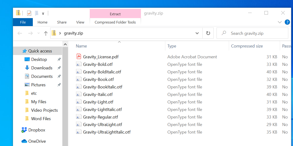
Most fonts are downloaded as a .ZIP file, so first extract that archive if necessary. Depending on the font, you might receive just one file or several with additions to their name like bold, light, and expanded.
These are slightly tweaked versions of the font with amended dimensions—they can be very useful if you're looking for perfection, but most users will be well served by the normal version alone.
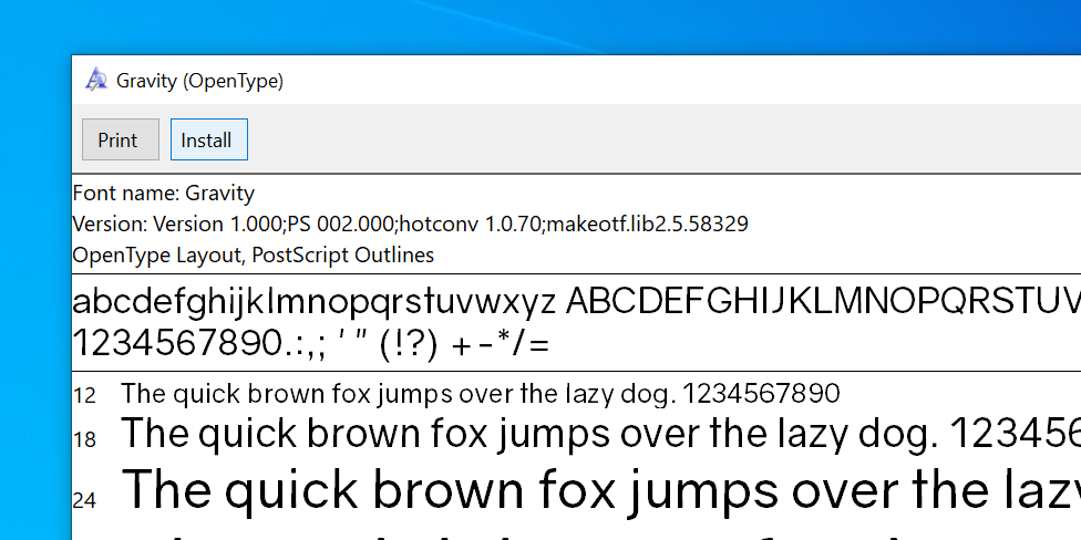
To install a font in Windows 10, all you need to do is double-click the OTF or TTF file and Windows Font Viewer will open automatically. You'll see a full preview of the character set and if you have administrator privileges you can click Install to make the font available across your system.
Then simply select your aesthetic new font from the format options inside Microsoft Word.
2. Add a Simple Shadow
A drop shadow is a classic graphic design technique you can use to make text stand out. Word offers a few different ways to achieve this, and you can use the Text Effects and Typography menu to do it.
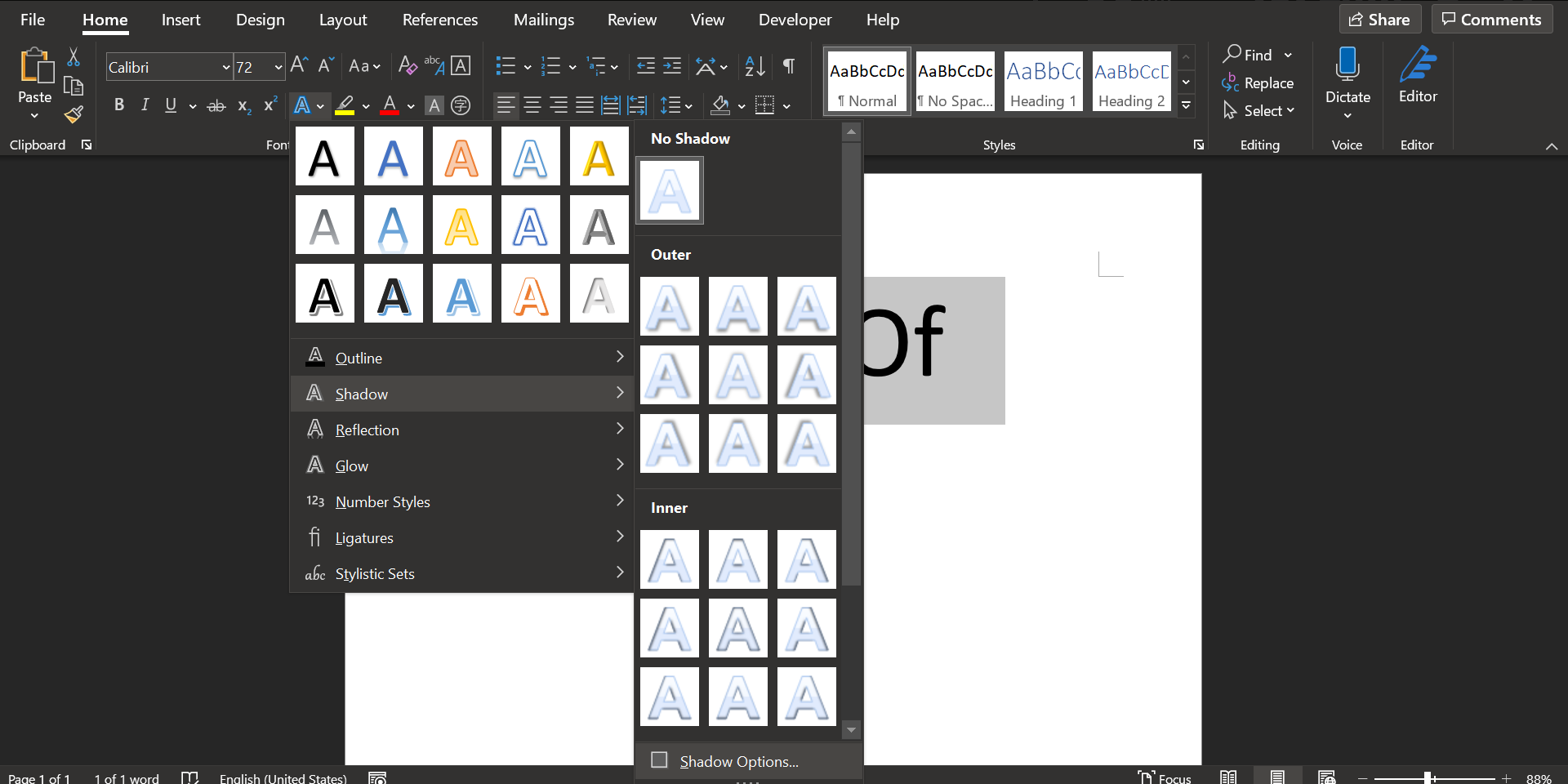
First, type out your desired text and format its size and font to your specifications—you'll need to decide on how you want it to look before you create your shadow. Select your text using the mouse, click the Text Effects and Typography icon (the bluish A button), and then select Shadow followed by Shadow Options.
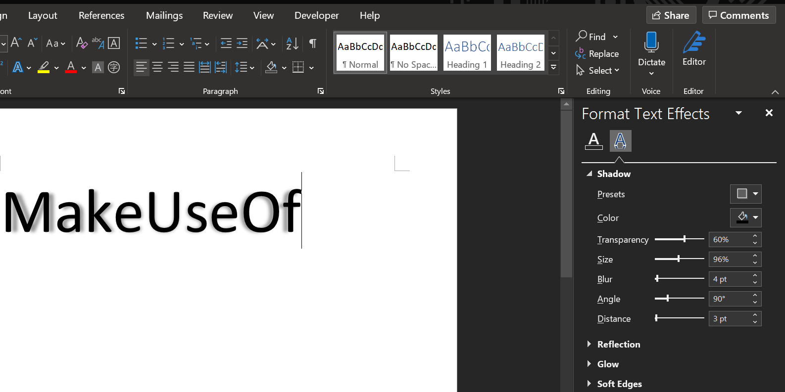
A new menu will open on the right letting you customize the shadow. Either click the Presets option and choose one of the many shadow options or adjust various settings for yourself to create a customized shadow.
You'll see the live preview on the left of the shadow menu.
Keep changing the options until the shadow looks the way you want. You can then click the X icon in the top-right corner of the shadow menu to close it. Word saves the changes to your text automatically.
3. Add a Drop Cap
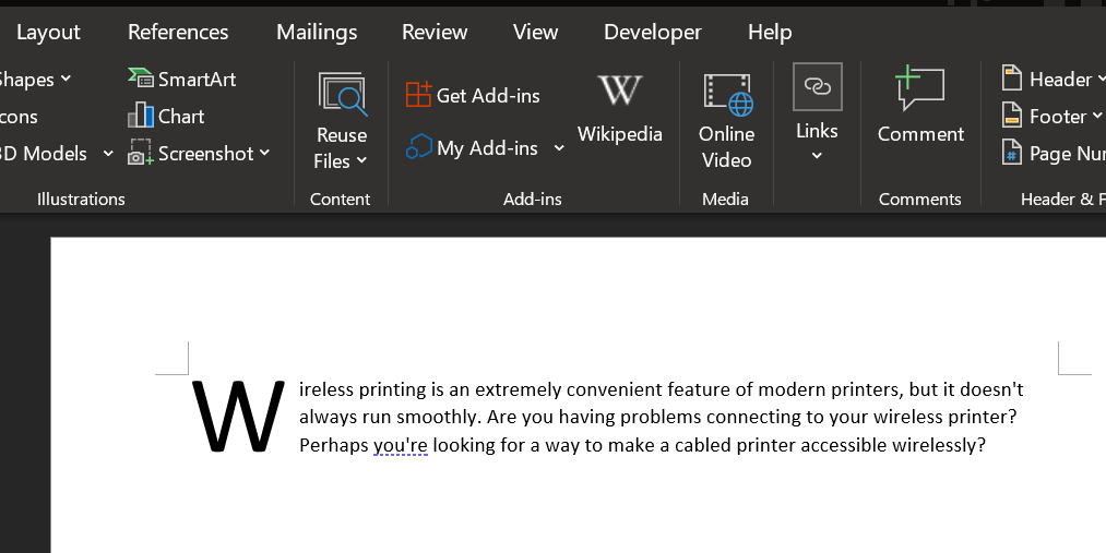
A drop cap is an oversized first letter of a paragraph, often found in old novels. Microsoft Word can outfit your document with this attention-grabbing visual flourish in a matter of seconds, giving you the means of adding interest to a large block of text, or simply calling to mind a classical era.
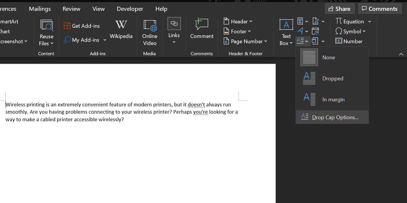
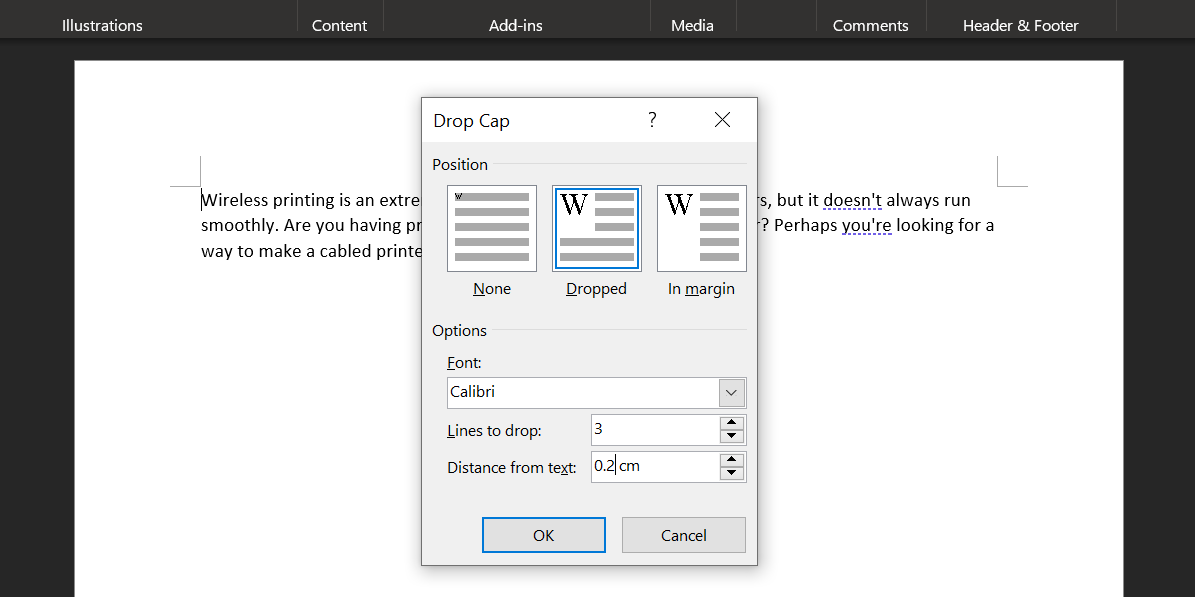
Head to the Text section of the Insert tab and find the Drop Cap dropdown. You'll be able to create a very simple drop cap by selecting either Dropped or In margin here, but for the best results, you will need to click Drop Cap Options, while your cursor is in the paragraph you're looking to add the feature to.
Select Dropped and adjust the Distance from text to 0.2 cm (0.08 inches). You may need to tweak the amount, depending on the font you're using and the scale you're working at, but the drop cap can sometimes look awkward in comparison to standard line spacing when it's left at 0.
Your choice of font will be key to the overall effect. A stark sans font can work well if your primary aim is an eye-catching look, but a more traditional drop cap can be attained with a showier serif typeface.
4. Use Text Effects
Used carelessly, the Text Effects available in Microsoft Word can easily call to mind the worst excesses of WordArt. However, as long as you don't overdo it, these effects can give your document some real visual punch.
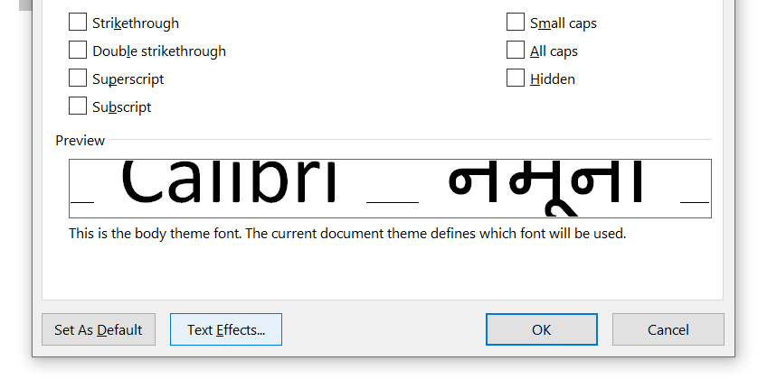
To access the Text Effects menu, head to the Home tab and click the pop-out button in the Fonts section.
Then click the Text Effects button in the window that opens up.
Text Fill
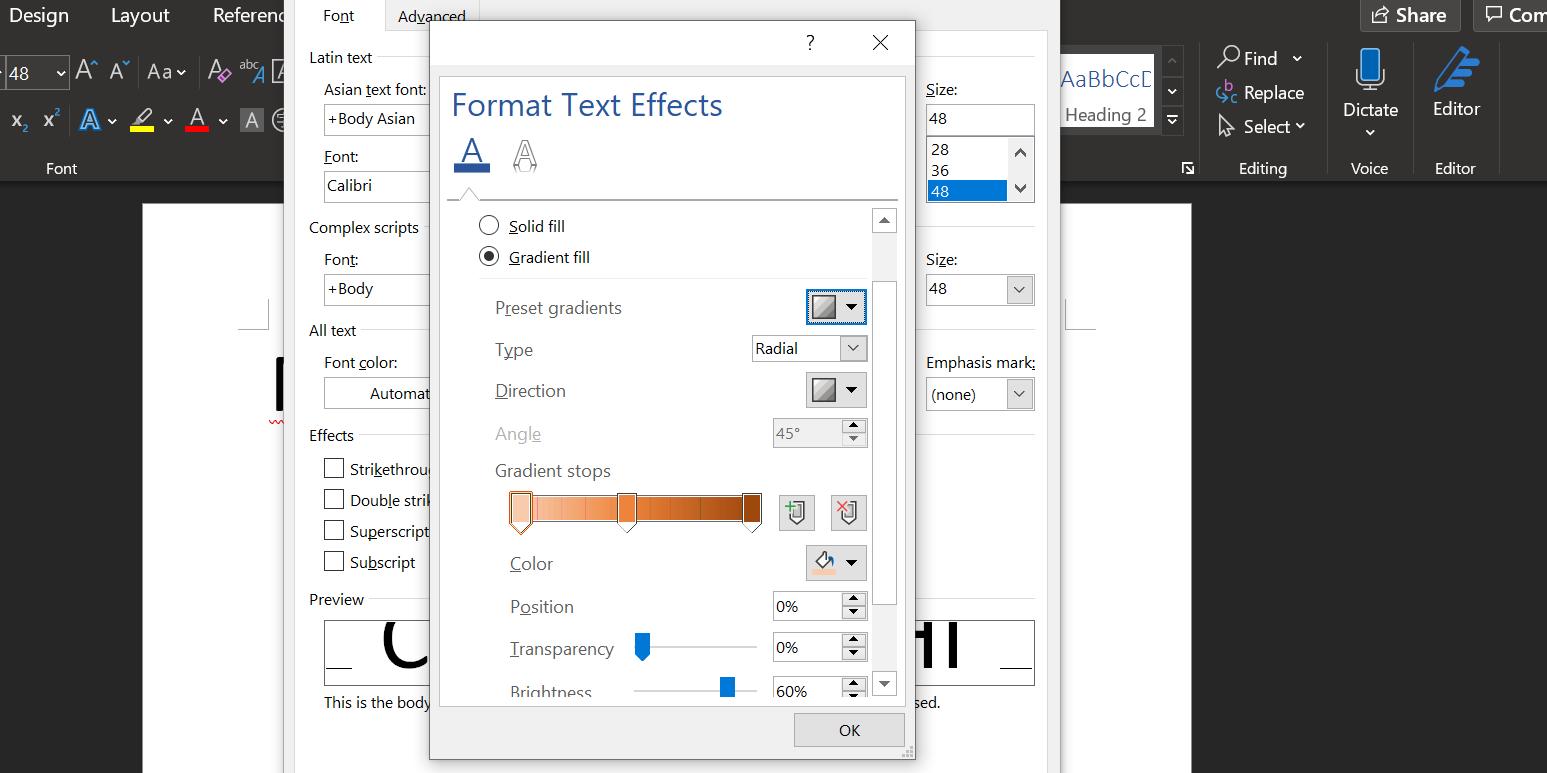
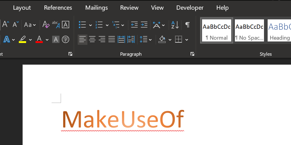
The Text Fill option is a great way of adding some color to a piece of text. Solid fill will just apply a single hue to your selection, which can be done with far less fuss, but the Gradient fill option offers plenty more nuance for any budding graphic designers.
As well as several presets, the Gradient fill menu can be used to hone in on a specific color blend to fill your text with. You can add and remove gradient stops using the two buttons to the far end of the color line, then adjust individual colors by clicking on their corresponding stop and tinkering with the Color dropdown situated directly below.
You can get some great effects using a gradient fill, but it's crucial that you carefully choose your colors to make sure they work well together. Remember to choose colors and color combinations based on your intended audience.
Text Outline
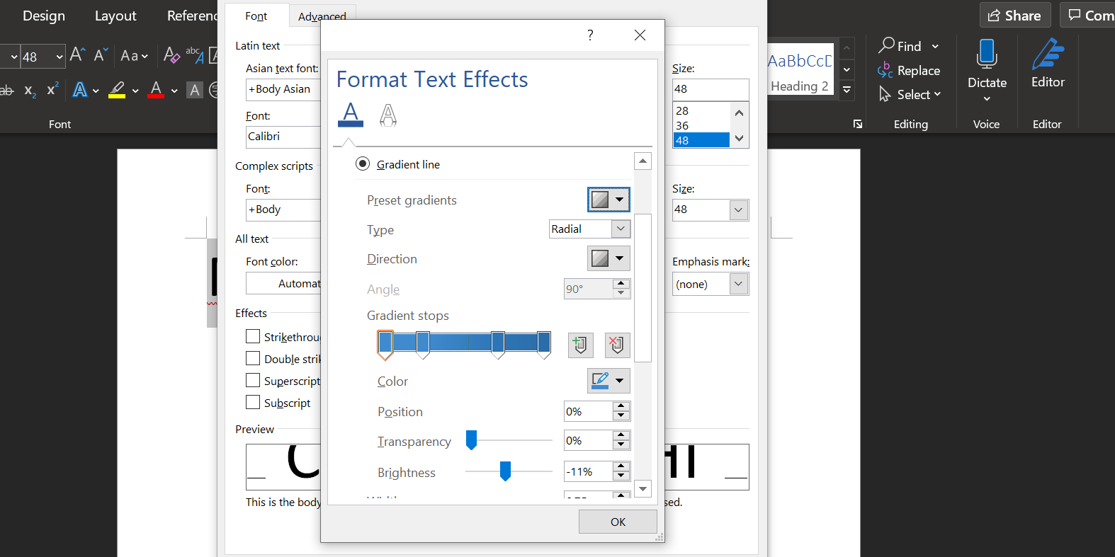
You can also use Text Effects to add an outline to your text, which can really help the words stand out against a background. To get started, head to the Text Effects menu once again, but this time click on the Text Outline dropdown.
You'll see Solid line and Gradient line options, just as you did on the Fill section of the menu earlier.
Setting up the color gradient works exactly as above, although obviously the results will be a bit more subtle because only the outline will be affected, rather than the text itself. Use the Width field to adjust how thick the outline is until you're happy with the results.
5. Adjust Your Character Spacing
Adjusting the space between individual characters of text may seem like a minor tweak, but it can have a powerful impact on its overall appearance and even its readability.
The most important thing to remember when adjusting character spacing is that less is more. A lot of care and attention goes into font design, so it's not always wise to make your own modifications. However, sometimes a small piece of prominent text like a title needs some alterations before it looks correct.
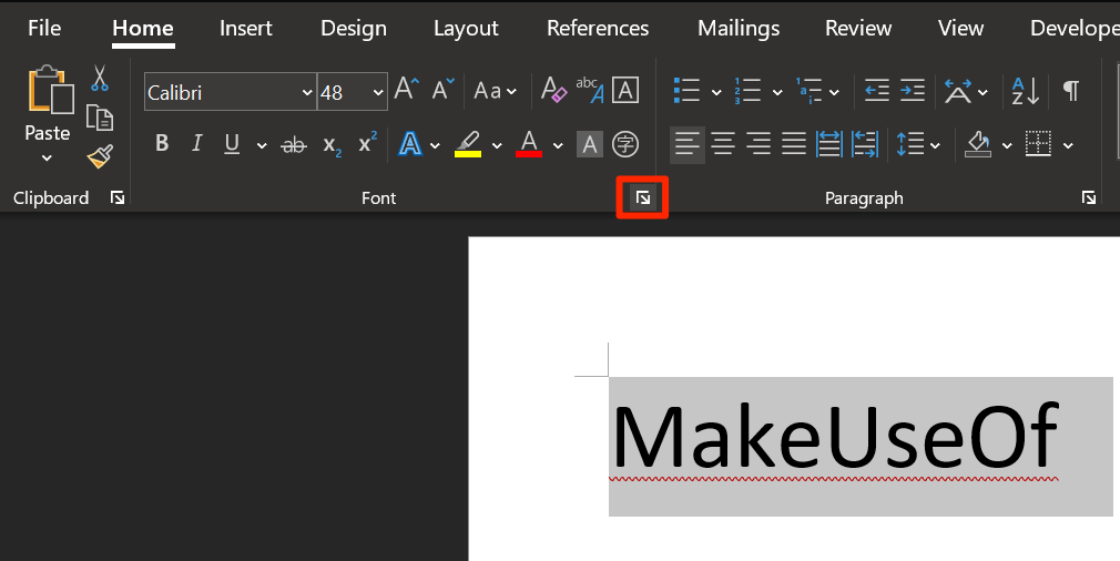
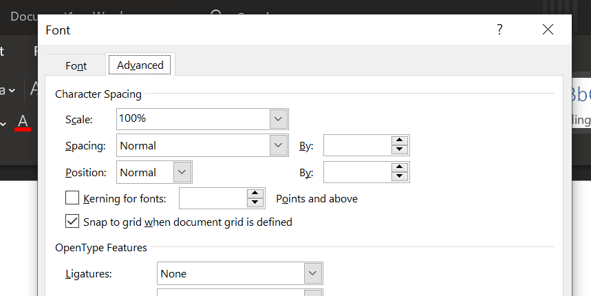
To get started, ensure that you have your text set up to your specifications in terms of size and font—adjustments to character spacing should be the final step toward perfecting your text. Once you're ready, highlight the area you want to tweak and click the pop-out button on the Font section of the Home tab.
Head to the Advanced tab of the window that opens up and look for the Character Spacing section. Here, you can use the Spacing dropdown to switch between Expanded and Condensed to move characters further apart or closer together. Use the input field to the right to specify how drastically you want to alter the spacing
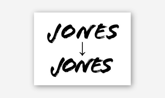
Once you've experimented with these controls a little bit, you should be able to use these options to fine-tune your text. For instance, certain fonts might work better if the characters are grouped close together, particularly if the typeface is based on handwriting or calligraphy.
Alternatively, you can expand the character spacing of some text to make it wide enough to fill a space without increasing its height. This technique is particularly effective when combined with more minimalist fonts.
Make Your Text Flow in Word
With good formatting, your text not only looks more pleasing, but it also offers anchors for the eyes and helps a reader flow through the document.
There plenty more design rules for Microsoft Word that you can follow to give your documents a professional touch. These rules are worth learning if you spend quite a bit of your time with Word.

