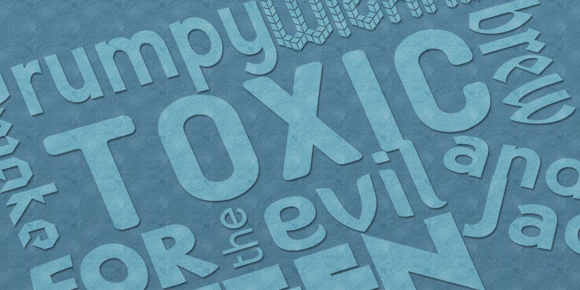
Over the past decade, I've started a number of personal blogs that I never really followed through with, but some of my fondest memories rest on theme design and font tweaks. There’s something satisfying when you find that perfect match of fonts for your website and everything falls into place. Thankfully, with Google Web Fonts, that whole process has never been easier.
So which Google Web Fonts should you use? Well, you can use any of the fonts in the Google Web Fonts directory, which currently houses over 600 different fonts -- and that number continues to grow. But some fonts have been proven, time and time again, as more pleasing to the eye and easier to read than others. Keep reading to find out what those fonts are.
Note: Font appreciation is always a subjective matter but the popularity of these fonts suggests that they have a beautiful quality about them. Font considerations for this list were made in the context of paragraph bodies, not headings, art, or graphic design.
What Is Google Web Fonts?
Google Web Fonts is a centralized collection of different fonts that you can embed into your website(s). For a while, website fonts were limited to whatever was on the viewer’s computer -- if they didn't have the specified font, they'd only see your website in the default font of their browser. With Google Web Fonts, viewers can see your website’s font even if they don't have it, and that opens up a lot of doors in terms of design.
If you use WordPress, some themes (especially the newer ones) come equipped with support for Google Web Fonts in the theme options. For other web projects, James has written up a great guide on how to use Google Web Fonts for your website. If you have any sort of web management experience, this process should be as easy as cake for you.
Google Web Fonts can also be used in other ways, such as through the Font Changer Chrome extension. If a particular website doesn't look very good to you -- or even offends your sense of graphic standards -- then you can use Google Web Fonts to manually change how a website looks on your end. How cool is that?
Serif Fonts
Serif fonts are the ones that have little ticks, strokes, or feet on the end of letters and symbols. Think of the kinds of fonts you'd find in a printed book, a newspaper, a thesis paper, etc. On the whole, they are more formal than sans-serif fonts (which are covered in the second part of this article) and are generally considered to be easier to read, though that's debatable.

Droid Serif: You can’t talk about modern serif fonts without dipping into Droid territory. The Droid family of fonts was designed for use on small mobile screens, particularly the Android platform, but the font has gained in popularity and it’s used all over the place now.

PT Serif: Though it’s been around for a few years, the PT family of fonts is new to me -- and I love it. I now use it for almost all of my text editors, whether it’s Microsoft Word, Scrivener, or blog editing. It’s sleek and modern with its own flavorful take on serifs.

Lora: Lora is perhaps my second favorite serif font ever, next to PT Serif. It has just the right balance of straight and round, lending to easy reading and a pleasant aesthetic. This is the font I use when reading ebooks on my computer.

Judson: Judson makes for a good break when you need a beautiful serif font but don’t want to fall back on some of the more popular ones, like the ones listed above. One reason it isn't used as often is because it lacks a style that has both bold and italics.

Merriweather: I recently saw Merriweather used on a prolific writer’s blog and fell in love. With the right kerning and spacing, Merriweather becomes super easy on the eyes and facilitates quick reading, which is great for blogs and web content.

Vollkorn: This is the font that drew me to Google Web Fonts in the first place. It’s nice to look at in the smaller font size range, but the flaws become more apparent at larger sizes. Nevertheless, it’s great and worth a try.
Sans-Serif Fonts
If serif fonts are the ones with ticks and feet on letters and symbols, then sans-serif fonts are the ones without those ticks and feet. Some people describe sans-serif fonts as "cleaner" and "modern" and they're often seen as less formal than serif fonts, though that’s becoming less true with every year. The name comes from the French word for "without" -- sans -- so whenever you see a font labeled as "Sans," you know it’s the clean version of that font.

Droid Sans: Droid Sans is in the same font family as Droid Serif, but Droid Sans is much more popular for one simple reason: mobile apps are more likely to use sans-serif fonts than serif fonts. Its popularity has overflowed to the Web, though, and you've probably seen this font more than you think you have.

PT Sans: PT Sans is a clean sans-serif font that's actually a bit narrower than traditional sans-serif fonts. It's a wonderful mixture of sharp lines and soft curves, resulting in a font that feels sterile yet artistically so.

Open Sans: On the other side of PT Sans, you have Open Sans which is a bit wider than traditional sans-serif fonts. Think Verdana, except more modern. It’s not my cup of tea, but I predict Open Sans will see more use in the coming years.

Lato: Lato can feel a bit cramped when the font size is lowered too much, but with proper CSS and design techniques, Lato can be more beautiful than most sans-serif fonts. Kerning and line spacing are key, however.

Roboto: Roboto is one of my favorite fonts for headings, but it works just as well in a paragraph body. It’s clean, not too tall, not too short, not too wide, and not too narrow. It’s an easy to read sans-serif font with a subtle futuristic touch, which is appropriate given its name.

Cabin: Like Lato, Cabin can suffer at smaller font sizes by feeling a bit cramped and sharp when the letters are too close to each other, but proper CSS design can fix that easily. It’s a beautiful font that sometimes reminds me of a more modern version of Century Gothic.
Conclusion
No longer do your websites need to be stuck using the same Arial-Helvetica-Verdana sans-serif fonts and Times-Georgia-Palatino serif fonts. Spruce up your designs with a tight injection of Google Web Fonts and take the next step to revolutionizing your website’s appearance. Not only will you better distinguish your website from others, but your readers will thank you too.
What do you think? What are your favorite Google Web Fonts? Do you use them for your own site? Please share your thoughts with us in the comments.