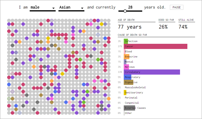
Mortality isn't fun to contemplate, especially when it's our own mortality in the spotlight -- but when someone tells you that they probably know what's going to kill you, it's hard not to feel a bit of morbid curiosity, right?
Well, that's exactly what How You Will Die is all about.
The tool is extremely easy to use. You can choose between Male or Female for gender, then choose between White, Black, Asian, or Native for race. Use the slider to adjust to your current age, and watch it go!
The app steps through your life year by year. At every step, it shows you how many people in your demographic will have died by that year, and a percentage breakdown of the different causes of death and how likely each one is. Fifteen causes of death are tracked:
- Infection
- Cancer
- Blood
- Endocrine
- Mental
- Nervous
- Circulatory
- Respiratory
- Digestive
- Musculoskeletal
- Genitourinary
- Perinatal
- Congenital
- External Causes
- Other
All of the data is supplied by the Underlying Cause of Death database, which is maintained by the Centers for Disease Control and Prevention. The data for this app is pulled from the years between 1999 and 2014.
The most interesting part of this app is the visualization aspect. It's one thing to know that I'll have a 15% chance of dying by age 70, but it's frightening to see the rate of death in action (symbolized by the circles turning colors).
Fascinating.
We've highlighted a few other lifestyle-related prediction tools in the past, including this quit-smoking-and-save-money calculator and this how-early-can-you-retire calculator. They complement this site strangely well.
Website -- How You Will Die
How useful did you find this tool? Will you be making any lifestyle changes after seeing the statistics? Or is it something you won't even think twice about? Let us know in a comment below!


