As much as I like to rant about how Windows 8 is probably going to be a bit of a disaster - and I'm certainly not alone there in the tech community - I do actually really want it to be awesome. I still run my home network with the reliable Windows Home Server 2011 at the core; I love my Windows Media Center as the best PVR yet (there's certainly no Apple TV in this house); and rarely a night goes by when I'm not on my Xbox.
I want to be surprised by Windows 8; I want to be pushed into a new paradigm of home computing, one that feels futuristic with it's bold colors and simplistic interface; I'm fully prepared for that. This is the premise of Windows 8, and I decided to try out the recently released Consumer Preview build to just get a taste of what's coming.
Please bear in mind, the consumer preview is not the final build. What I say here may not necessarily apply to Windows 8 once it's released.
The Invisible Start Menu
I already knew about the hotspot in the bottom right. Most users won't know that at first, though perhaps its a minor point if it only takes a few seconds to learn. With any luck, there'll be an auto playing video tutorial to show them new features and changes. Hover there and click to bring up the Metro start screen.
I figure if there's one hot corner there must be more, so I try top right. It brings up some kind of search or utility bar. One of the option is to "share". I try clicking it, only to be reliably informed my desktop has nothing worth sharing on it. FINE.
Apps
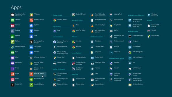
Since all my apps were transferred, I figure the old Windows 7 Snipping Tool is in there somewhere. No luck from the initial start screen, but the search button from the top right hotspot reveals the option to narrow down by apps, so I try that. "screen"… "snip"… "grab"… no results for any. Then I scan the list of apps, helpfully arranged in no particular order across the screen. Sure enough, there's the snipping tool. A search bug I guess, no worries. It turns out to be useless for taking snaps of the Metro interface though, as it kicks me back to the desktop every time. Random freeware to the rescue.
I install a few apps and start playing around with the default ones. This is by no means a comprehensive list, just a few that caught my eye.
Weather: Nice enough, but even though it figures out my location, it doesn't seem to know we Brits use Celsius, and it sure as hell isn't 50 degrees right now, or I'd be fried. I wonder if perhaps the settings button from the top right hotspot applies in the context of apps, and sure enough, it lets me change it to Celsius. I doubt my mum would figure that out though.
Xbox Live Games: locked out for UK users, apparently. Oh well.
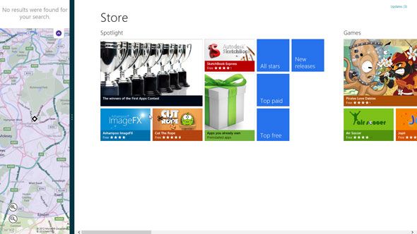
Maps: knew my rough location, but even a search for "London" showed zero results. I'm guessing UK users don't have maps enabled yet either.
Finances: looks nice, but customization seems to extend to adding your own stocks to the watch list, which took me ages to figure out in itself. Now I get some useless foreign market info on my home screen tile. Like most of these default apps, it seems rather vacuous.
Quitting Apps
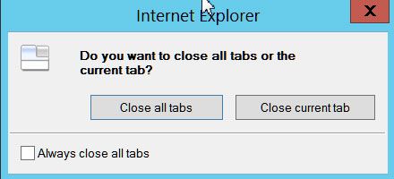
... is just not the done thing in Windows 8, apparently. I understand though - it's a paradigm shift, that's cool. It's still frustrating to this power user. Metro apps don't even have a back button in most cases - you hover in the bottom left and click back to the start screen, leaving the apps there as they are.
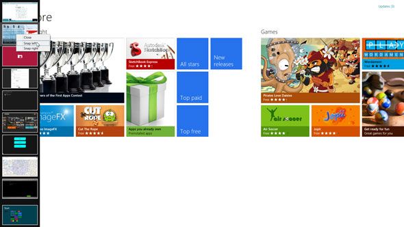
At some point, my mouse hit the top left and that thing appeared - thumbnails of all the running apps. At least, all except the one you're using now. Right clicking revealed an ominous close, as well as the option to "Snap to" left or right. To close the running app then, I switched over to another running app, opened the task switcher, and right clicked on the previously running app. Whatever.
Snap to splits roughly 1/5 of your screen space and gives it to the app selected. I can't figure out if you can still interact with it, but it seems to vary by app. I tried to drag out the snapped bit to cover 1/2 of the screen - that could be useful - like two browser windows. No such luck - it just becomes the main 4/5 window space, snapping the existing app to the other side of the screen. I'm not quite sure what you'd use this for to be honest, but after a little research I see others have snapped their email there.
The content of metro apps start screen tiles appears to be fixed; there are no options to display a specific stock instead of the 3 random markets it chooses for you, for instance. Perhaps this feature will come as apps develop.
General Interface
The general desktop dialog boxes for everyday apps strike me as childish; like a lightweight Linux or something. They're not pretty, not at all. Does 10 years of progress mean nothing to you Microsoft?
Switching back and forth between the desktop and start menu is surprisingly speedy, but at the same time really quite jarring. It feels like two distinct layers, two separate desktops. At least it's quick - like a blast of adrenalin given to a heroine user lost in an overdose of garish colors.
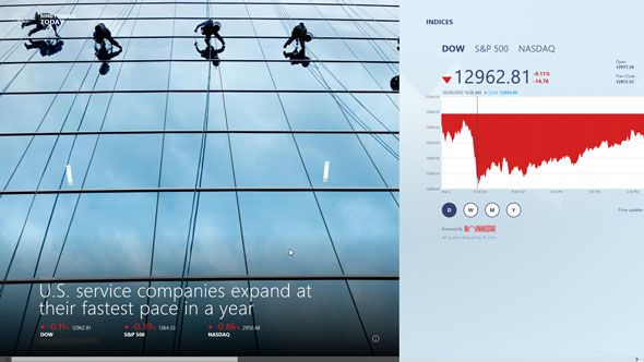
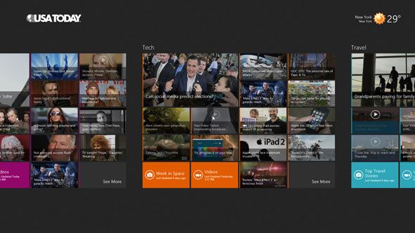
I try out the USA Today app to finish off my hour of testing. It looks gorgeous, and there's a lot of content on the screen. Unfortunately, you have to actually scroll right to get to the other hidden stories. And I don't just mean scroll your mouse wheel and it assumes right, I mean you literally have to put it into 2d scroll mode. Bug?
One click gets me to all the videos, so I enjoy a short clip about some Americans enjoying a new 24/7 muffin shop:
There's no discernible way to jump back to the main story halfway through the video though.
The app is nice for sure, but to be honest it's really no more than a well designed website, sadly missing key bits of an intuitive interface - like a back button.
Finally, I trim my start screen to the apps I actually want:
Snap Judgement
After an hour of using it, I still get frustrated by the start screen hotspot. When you hover, a large tile-like button comes up - instinct tells me I can loosen up my grip on the mouse and click on the middle of that tile for the start screen to appear, but no. Move away from that single pixel in the corner, and you end up clicking on Internet Explorer instead, or simply clicking away and having to do it again. It still takes me two or three clicks to get it spot on. Hopefully they can sort that out.
Generally, it's all quite snappy. Launching Metro apps for the first time takes far too long, but in terms of resource usage it outperforms Windows 7, so for many people that alone will be a good reason to upgrade.
Metro, though? I'm sorry, I really did want to like this. The apps feel like tacky widgets made of JavaScript and not much actual substance to them. Early days yet, I'm sure. The whole Metro UI strikes me as being great on a tablet, a real contender to Android and iPads. It's a snappy and touch-tastic simplistic interface for single purpose apps - assuming those apps come and developers get on board.
But on a desktop machine? Like Vista Gadgets and OSX Dashboard Widgets, I do not want this crap. Unfortunately, it takes the forefront and is burned into the core. It is the entire start menu, and it pervades every interaction on the desktop experience. It's not an optional extra, a bonus interface for those with touch screens. The desktop is shoved aside for legacy apps, and rudely beaten into a corner by Metro, and I don't like it one bit. If I could slice this obnoxious tumor of an interface out and simply have a speedier Windows, I would make this Windows OS of choice right now.
There's still time Microsoft. You can still fix this.

