Hiring managers and recruiters, like everyone else, use their mobile phones for everything -- and that includes reading résumés.
You can bet that if your résumé doesn't show up well on their phone, they're going to skip right over it. So you need to make sure that you'll put your best (mobile) foot forward.
1. Simplify It
Simplifying is the most important thing you can do to keep your résumé from looking terrible on a phone.
The following items don't translate well and you should eliminate them:
- Sidebars
- Colored boxes
- Images
- Unique fonts
- Visual touches of personality
You get colors in the wrong place, sentences showing up in the wrong size, sidebars appearing in the middle of the page, text overlapping, and all sorts of other problems. It looks really cool when it's printed, but on a phone, it just turns into a big mess.
Instead, keep everything simple. Use fonts that display well on any device, are easy to read on smaller screens, and don't take up a ton of space. Donna Svei of Avid Careerist recommends Calibri, Avenir, and Gill Sans. Avenir is a little bigger than the other two, so that might eliminate it as an option (or make it more useful, if you can't quite fill up two pages).
Using multiple columns, sidebars, pull quotes, charts or graphs, unique bullet points, background colors or images, and anything else that's not black text on a white background is also a bad idea for mobile reading. These things do help you make a résumé that stands out. But if it doesn't show up on a phone, it's not going to do you much good.
Keep things simple with a good font choice, no extra features, and a simple presentation. It's boring, but it might just keep a recruiter's eyes on your résumé long enough to get you an interview.
2. Front-Load It
Traditional wisdom holds that you have about six seconds to impress a hiring manager with your résumé. That still holds when your qualifications are on display on a five-inch screen. You might not even get that long.
Which is why you should consider the following sections at the top of your résumé:
- Career Highlights
- Career Summary
- Qualifications
- Accomplishments
This is a short summary of what makes you a great choice for the position you're applying for. It might highlight relevant experience and training. Or it could emphasize past results. Anything you think will help get you the job can be featured here.
Ideally, most or all of this section will fit on a small screen without any scrolling, so keep that in mind when you're working on it. A mobile résumé shouldn't have any sections that are more than a few lines long, and this part is no exception. A convincing highlights section will convince a recruiter to read through the rest of your résumé, where you can lay out your qualifications in more detail.
3. Make It Mobile-Friendly
Once you have a simple, front-loaded résumé, you can focus on making it mobile-friendly. Make sure bullet points and sections have enough space between them. This keeps your résumé from becoming one giant hard-to-read block of text. There are lots of other tweaks you can make to lists in Word to clean it up, too.
Executive résumé writer Donna Svei recommends using no more than two- or three-line blocks of text, and never going over four lines. If your résumé currently has long paragraphs or lists, you may want to reconsider how you're presenting your qualifications. Be more succinct, and don't use as much text. It will make it much easier to read from a phone, and probably on a desktop as well.
Donna also suggests using 1.25-inch margins (which can be found in the Layout section of the ribbon) to keep everything easily readable.
One good way to save space is to change up the formatting of how you write certain things. For example, dates can be condensed from "October 2016" to "10/16." If you managed $20,000 in assets, you might say "Managed $20k in assets" instead of "Oversaw the management and maintenance of $20,000 in liquid assets." Things like that can make a big difference in how your résumé shows up on a small screen.
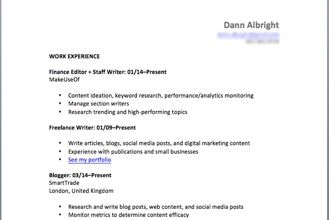
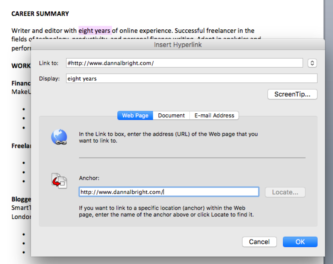
Including some hyperlinks in your résumé can also be very helpful to recruiters. Copying and pasting a URL from a phone is much more effort than it is on a computer. So a single tap to email you, check out your portfolio, or look at your social profiles will be very much appreciated.
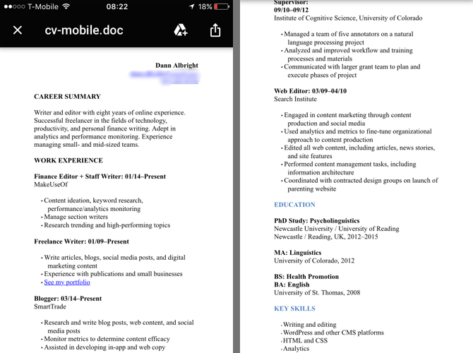
As you can see in the above image of my own résumé displayed on an iPhone, I took out things like the cities I worked in, and shortened the names of my degrees and skills. All of these tweaks create more white space and make your document easier to read.
4. Test and Send It
Before you send out your new mobile-friendly résumé, it's a good idea to test it. Send it to yourself and look at it on your phone and your tablet. Have someone else with a different device look at it, too. Try different formats if you don't like how it's showing up. PDFs tend to scale very well on mobile devices, so consider using that instead of a Word document.
Once you've made absolutely sure that your résumé looks as good on a phone as it does on your computer or a sheet of paper, you're ready to send it off and continue your job search. Make sure you're including the right keywords and send away!
The Mobile Résumé Mastered
Recruiters and hiring managers use their phone just as much as everyone else -- which means they're looking at your résumé on a very small screen. Not optimizing your résumé for mobile could mean that it gets overlooked. Don't make this mistake. If you take the above steps, your résumé will be simple, clean, and look great on a mobile screen. It might not get you the job, but it' will get you a step closer!
Do you make sure that your résumé is mobile-friendly? Do you have any experience with this process? Share your thoughts and best tips in the comments below!


