
If you have a data-heavy chart, it can often be helpful to have a visual representation of that data. Unsurprisingly, Excel has robust visualization features, making it easy to create powerful graphs and charts in Excel. You can even use Excel to create self-updating graphs!
If you want to play around with it but don't have any data to get started, you can always use sample data available from dummies.com.
Once your data is entered into Excel, you can create a chart using all of the data available by selecting it all with the keyboard shortcut Ctrl + A. You can also create a chart using just a selection of the data by selecting the cells containing those numbers.
How to Create a Graph or Chart in Excel
-
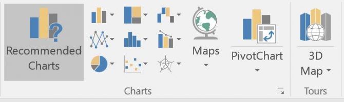
Once you've selected the cells containing the data you want to use, go to the Insert tab and you should see a Charts section. You now have two options:
- Click on Recommended Charts to get an idea of what Excel thinks is best for the kind of data you've compiled.
-
Or click on the specific type of chart you want to use: column/bar chart, pie chart, line graph, hierarchy chart, scatter chart, and more. (See our guide on picking the right chart for your data.)
- Click on the type of chart you want to use and Excel will instantly transform your data into a visual representation.
-
You can now customize the chart to appear the way you want:
- Click the Plus button to determine which of these elements will appear on your chart: Chart title, Data labels (i.e. the actual numbers in your Excel chart), axis titles, gridlines, the legend, and more, depending on the type of chart you've chosen.
- Click the Style button (paintbrush) to select the style and color of your chart. In the Style tab, you can choose from pre-set themes that make changes to your chart's overall appearance. In the color tab, you can choose from existing color schemes.
- Click the Filter button to selectively choose which values, or which pieces of data, will appear in your chart.
- Excel charts are "live" elements. This means that if you make a change to the selected data, the changes will be instantly visible in the chart.
- If you right click the chart, you can change to a different graph or chart type, add data call outs, and more.

You can also copy and paste your chart into other Microsoft products like Word, or into design programs like Adobe Photoshop, if you want to make a more elaborately designed chart.
What kinds of charts do you create with Excel? Is there another program you prefer to use for graphs or charts? Let us know in the comments.