This post originally centered on a tool called iPad Simulator, but it hasn't been updated in years so we've replaced it with a few alternative methods you can use instead.
If you want to test what your site would look like on an iPad, but don't have one, there's no need to rush out and buy such an expensive gadget. Several online tools make it easier than ever to get a sense of how responsive your site is with just a few clicks of the button.
Simulate an iPad With BrowserStack
BrowserStack lets you simulate an iPad Air. Free users only get a 30-minute demo, after which it costs $29 per month to keep going. While the paid account can test a variety of models and iOS releases, the free version is limited to the iPad Air running iOS 8.3.
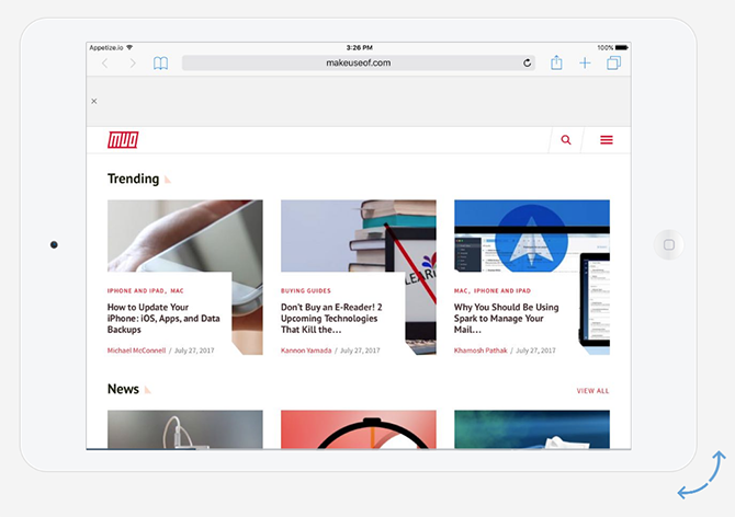
Once you launch the iPad simulator, it automatically opens up Safari. You can enter your website and preview it both in landscape and portrait mode. (Just click the Rotate button.) Go to Hardware > Home if you want to view the iPad home screen.
You can open up some basic Apple apps including Calendar, Photos, Contacts, Maps, Settings, Game Center, and the now-defunct Newsstand. That said, there isn't really much you can do with them.
With BrowserStack, you can also test local URLs, and if you're using Chrome or Firefox to access the service, you can also test audio support. Other features include testing extensions and upload/download support.
Simulate an iPad With Appetize
Appetize is another iPad-simulating tool with a limited free option. You can sign up for a free account and use the service for a total of 100 minutes. If you don't sign up, you can test it in one-minute increments: load an app, use it for one minute, and then reload and start all over again.
While that is admittedly a hassle, you can test what your site would look on an iPad Air or iPad Air 2, and can test from iOS 8.4 up to iOS 10.3. You can even choose between a black or white iPad.
When it first loads, Safari opens up on the Wikipedia app. Just click the iPad's virtual home button, click on Safari, and enter the link you want to test in the URL/search bar.
A Free Way to Test iPad Web Responsiveness
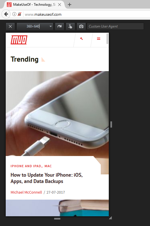
If you're looking for a simpler option and want to simply test a site or link for responsiveness, there are a few browser tools that make that easy -- but the easiest is Firefox, which has a native feature for this very thing.
In the browser menu, go to Developer > Responsive Design Mode. You can also use the keyboard shortcut Ctrl + Shift + M (or Cmd + Shift + M on Mac). Your browser will switch to a smaller interface. You can select preset dimensions from 320 x 480 to 1920 x 900, or you can enter a custom size, or drag the handles to change the size of the screen.
Chrome users can install the extension Window Resizer, which works in a similar way. Both of these tools make it easy to tell whether or not your site looks good on mobile and tablet devices.
If you don't use Chrome or Firefox and don't want to use any of the above methods, you could simply opt for a site like Responsimulator. Just enter the link you want to test, and click the arrow button on the right to see the iPad interface.
What tools would you add to this list? Let us know in the comments.


