Ready to present your findings? Find out how to visualize your data using Excel and PowerPoint.
We've all sat through boring PowerPoint presentations at one point or another, and they're no fun. You can use countless ways to liven things up and something as simple as a chart made with Excel can go a long way.
Here's everything you need to know about creating a data visualization in Excel and exporting that content directly to a PowerPoint presentation — you might be surprised by just how easy it is.
Prepare Your Data
The first step to a professional chart is ensuring that we have all the necessary data arranged correctly. The following section will show you how to do just that for all the most common types of data visualization produced with Excel.
Column, Bar, Line, and Area Charts
The data for these charts doesn't require much processing, just ensure that your data is separated into columns or rows, and properly labelled. These two examples below demonstrate that you can use either a vertical or horizontal layout for your data.
Pie and Doughnut Charts
For a single data series, lay out your data in one column or row, with labels in a separate column or row.
If you're charting more than one data series using a doughnut chart, just add another column or row containing the additional figures. Giving each series a label isn't mandatory, but it will help you keep track of your information.
Scatter and Bubble Charts
For scatter charts, place your data for the X and Y axes in adjacent columns.
For a bubble chart, include what size you want individual bubbles to be in a further adjacent column.
Create Your Chart
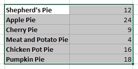
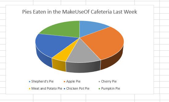
Next, we're going to create the chart in Excel — my example will be a pie chart about pies, but the same concepts will apply no matter what kind of visualization you're aiming for.
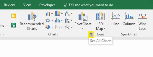
Above, you can see that I've arranged my data in the correct format for a pie chart and highlighted the entire selection. With that done, it's time to head to the Insert tab and click the pop-out button on the Charts section.
The resulting window is split into two tabs; recommended charts and all charts. The former option is helpful if you're not sure what's the best way to visualize your data, but otherwise you can simply pick the correct option from the full list. The All Charts tab offers up lots more options, so it's really worth poring through the list to find the most appropriate chart.
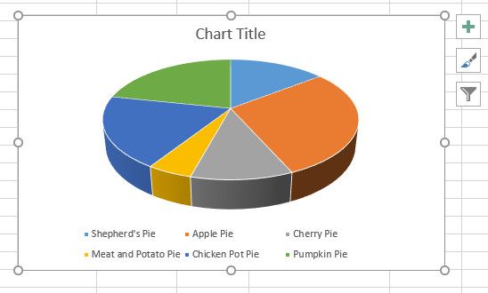
Once you've selected your desired option, Excel will create a basic version of the chart — but it's likely that you'll want to make some edits for yourself.
First, let's change that title to something a little bit more informative. All we need to do is click the text once to select the text box, and another to drop our cursor into it so that we can make edits.
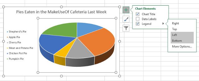
Next, let's take a look at the three icons that show up on the edge of our chart when we click on it. The box with a plus symbol helps us adjust Chart Elements, like its title and its legend. Marking the checkbox confirms that these elements should be included, while clicking the small arrow will offer up some more in-depth options.
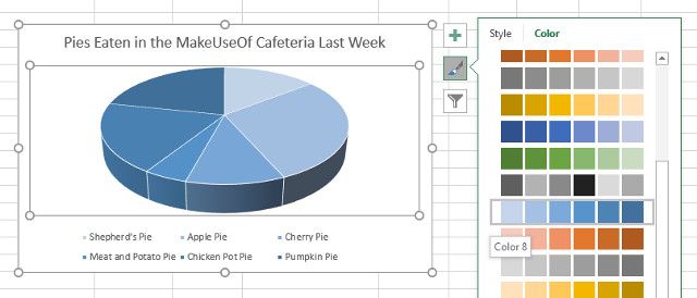
The paintbrush icon lets us adjust the chart's color scheme, either choosing from pre-made styling templates or picking out individual shades. I'm not completely happy with the default color palette, so I'm swapping it out for a monochromatic chart.
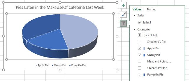
The third icon allows us to filter the data that goes into the chart, which is particularly handy if you're working with more than one series. However, there are plenty of other uses — below, I've used the tool to quickly create a chart that only looks at dessert pies.
Once you're all set with these adjustments, we can export the chart into PowerPoint.
Transfer Your Chart to PowerPoint
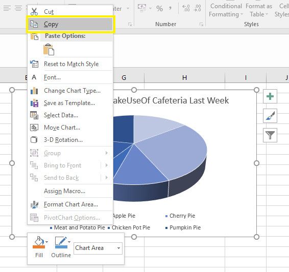
Exporting your chart from Excel to PowerPoint is as easy as copying and pasting it across — but there are a couple of pitfalls to avoid. Select your chart in Excel by clicking on the background, making sure that you're not accidentally selecting a particular element, then use CTRL + C to copy the data to your clipboard. You can also right-click on its background to copy from the context menu.
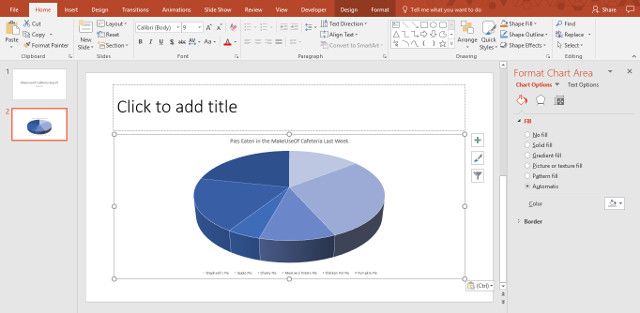
Once this is done, open up PowerPoint and navigate to the slide that you want the chart to appear on. Use CTRL + V to paste the chart in place.
However, there's one more step to complete if you want to do the job properly. While the chart might already look correct, now's the time to make an important decision about how it's placed in the presentation.
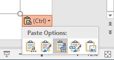
This small dropdown will help you decide if your chart is linked to the Excel spreadsheet it's based on, a straightforward way of making your data available to viewers. Choosing one of the options featuring the phrase Link Data will link your visualization to the spreadsheet, whereas those that feature the phrase Embed Workbook will make that document available as part of the presentation itself.
You can also opt to paste the chart as a picture, but this doesn't offer any of the same fact-checking benefits as the other two. Once you've made this selection, you're free to integrate the visualization into your presentation however you see fit.
Visualize It to Realize It
It's not difficult to turn data from an Excel spreadsheet into a chart for your PowerPoint presentation — but this kind of visualization can really help your audience digest the information.
Microsoft has gone to great lengths to make its Office suite work as a cohesive unit, so using individual programs in tandem can produce great result. Just consider the strengths of each of its component parts; PowerPoint is great for presenting to an audience, but working with data is definitely a job for Excel.
While this guide put the focus on PowerPoint, you can use the exact same method to export charts to other programs in the Office suite — keep that in mind next time you want to include a visualization in an essay written in Word, or add it to your OneNote notebook.
Do you have more questions about using Excel charts in your PowerPoint presentation? Or are you confident enough to offer help to other users? Either way, head to the comments section below to join the discussion.

