One of the biggest buzzwords in the online design world in the past two or three years has to be 'Responsive.' With the advent of browsing on everything from a 4 inch smartphone screen to a 27 inch display, it can be difficult to make sure that your website or blog looks good no matter what. That's why a responsive design is essential because it can automatically detect what device you're using to access the site, and adjust it to fit the size of your screen.
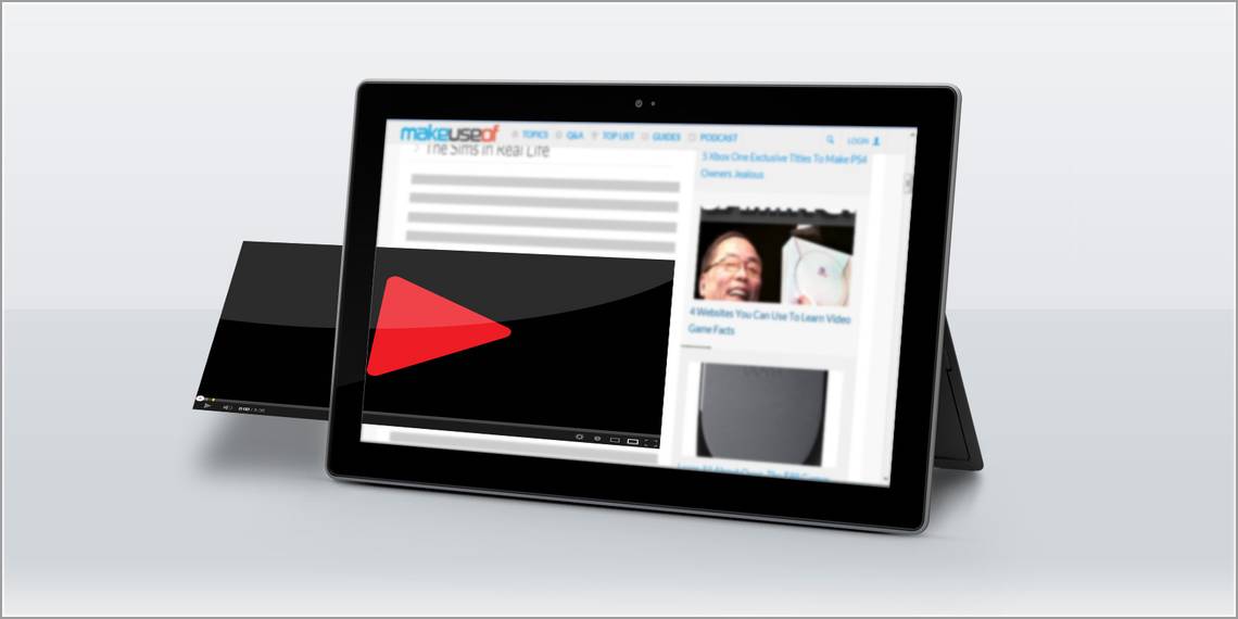
While you can design your entire website to be responsive, when you're embedding external content, it won't necessarily adjust itself to fit the screen or device your website visitors are using. Sites that don't provide embeddable responsive content include giants like YouTube and Instagram, but you can use a service like Embed Responsively to transform that content into responsive embeds.
The History of Responsive Web Design
The term responsive web design only dates back to 2010, when it was coined by designer Ethan Marcotte in an article on A List Apart. He wrote:
"We can design for an optimal viewing experience, but embed standards-based technologies into our designs to make them not only more flexible, but more adaptive to the media that renders them. In short, we need to practice responsive web design."
Now just three years later, and the importance of responsive web design has continued to grow, and in addition to making sure that you're using a stunning, responsive design or theme, there are a lot of interesting responsive tools that you can use to make sure that you're providing a completely responsive experience for your website visitors.
Embed Responsively
So while your theme might be responsive (like this list of gorgeous responsive WordPress themes), there are certain embeds that won't necessarily adapt to fit the size of a visitor's screen. While you can embed content from Twitter, Storify, SoundCloud, and Scribd, they've already done all the heavy lifting for you. So if you embed a tweet for example, the embed is responsive so it will be resized to fit your visitor's screen.
There are a few culprits, however, that haven't gotten around to providing responsive embeds so that when you share content from their sites, it will automatically adapt to the screen it is being viewed on. That's where Embed Responsively comes in. If you know your way around code, you can always edit the source code and convert it into a responsive one, but Embed Responsively just makes it a copy-paste affair -- dead easy!
The service currently words with Instagram, YouTube, Vimeo, Google Maps, and even with generic iFrame embeds. It's a wonder sites like these haven't got around to using responsive embeds; but perhaps that's why a tool like Embed Responsively has come around. You can click on 'More' on the site to see a small list of popular sites that are currently responsive.
How to Use the Service

Using Embed Responsively couldn't be easier. All you need is the original embed code from the service you want to use. To embed a YouTube or Vimeo video, all you need is the direct link to the video. If you want to embed an Instagram photo, it's the same thing - just get the link to the Instagram image on the web. With Google Maps, on the other hand, it's a little more complex because you can't just use a direct link - you have to access Google Map's embed code.
To get the embed code for your Google Map, open up the map and click on the link button in the top right hand corner of the sidebar. It will open up the embed code you can past into Embed Responsively. (If you're still trying to figure out how to create personal maps to share with your friends and followers, be sure to check out our guide to creating maps with layers.)

Once you've got the link/embed code of your choice, you can go ahead and paste it into the Embed Responsively window - just make sure you have the correct tab selected. Click the 'Embed' button, and the website will generate an embed code that you can use on your site or blog that will be fully responsive.

Conclusion
It's obvious of course, that your website has to be responsive to begin with because it's the website that is the wrapper for all the code. Embed Responsively is a simple little site which gets quite a lot done. If you're serious about responsive design and want to provide your visitors with a seamless experience , you'll want to add this site to your arsenal of blogging tools.
What do you think of Embed Responsively? Let us know in the comments.
Image Credit: Blank tablet via PlaceIt