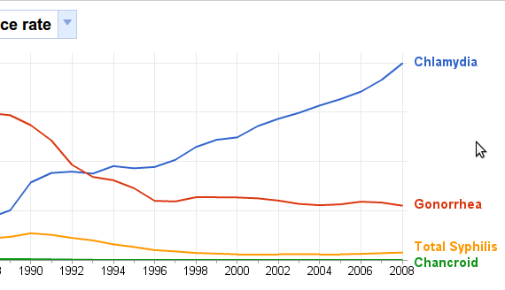
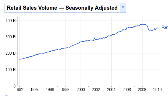
Numbers don't lie, but it can be very hard to figure out what they mean. Google Public Data Explorer seeks to clarify trends by letting you explore them in a variety of ways: graphs, maps and animations, to name a few. As the service's name implies, all information used is freely available information compiled from public services, including the US Census Bureau.
While this isn't something the average person would be itching to play with, it's great for number nerds, as well as journalists, public officials and politicians. Bloggers will be happy to know that all information, charts and animations can be embedded, allowing you to share your discoveries with your readers.
More than anything, however, this site is about interesting statistics, and discovering cool ways to arrange it. Check this out for that alone.
Features:
- Public data arranged into charts, graphs and animations.
- Explore information in interesting ways.
- Embed animations and graphs on your blog or website.
- Similar tools: ChartsBin, DataMasher, ManyEyes, Cynergy Systems Map and VisualEconomics.
Check out Google Public Data Explorer @ www.google.com/publicdata/tagectory


