The right typeface can communicate a lot to a reader about the "personality" of a design. But what if you can't find the right typeface? Or what if you want your design to be unique? Well, you might be surprised to learn you can make your own with a wide variety of software available for free and across different platforms.
I'll provide a bit of guidance on getting started and tackling hurdles along the way, share some of the software that I tried out, and recommend resources for learning more.
Note: I am neither a professional typographer nor have I designed a complete font before, but I have an educational background in design and I admire the work of the masters. That's why I'll be referring to the great Ellen Lupton for guidance, one of the best educators on typography I've had the pleasure of reading.
Your First Typeface: Where to Begin?
"The first step in designing a typeface is to define a basic concept. [...] The next step is to create drawings." - Ellen Lupton, Thinking With Type.
As Lupton says, your first task is to decide what kind of a typeface you are making. This doesn't need to mean just "serif or sans-serif". You can explore the purpose and personality of the typeface.
Is it for large display or body copy in a magazine? Do you want it to look feminine or masculine? Formal or informal? Cartoony or classy? Rigid or fluid? Knowing what your concept is will give you guidance when creating each letter.
As tempting as it might be to jump right into software and start making your font (which some designers do), you will probably find it best to sketch out your concept on paper first. The first time I started designing letters, I started on the computer and didn't realize how big I needed to make each letter to get the details I wanted, so I had to go back and re-do a lot.
Drawing out the letters on paper helps you sort out the relationships between them and test things out quickly. You don't want to be making all sorts of concept decisions while you're already designing on your computer screen, because if you decide you want to change something about the typeface as a whole it will be painful to have to apply the change to each letter.
This is definitely a field where "the devil is in the details".
The Psychology of Typography is an infographic that will give you some inspiration and guidance if you're stuck for what kinds of design elements give a typeface its personality.
"Begin by drawing a few core letters, such as o, u, h, and n, building curves, lines, and shapes that will reappear throughout the font." - Ellen Lupton, Thinking With Type.
These letters are popular suggestions for "the first ones" to make because you can re-use the parts over and over again. Nail a few core letters and your font will come together easier.
Generate Fonts Instantly Online
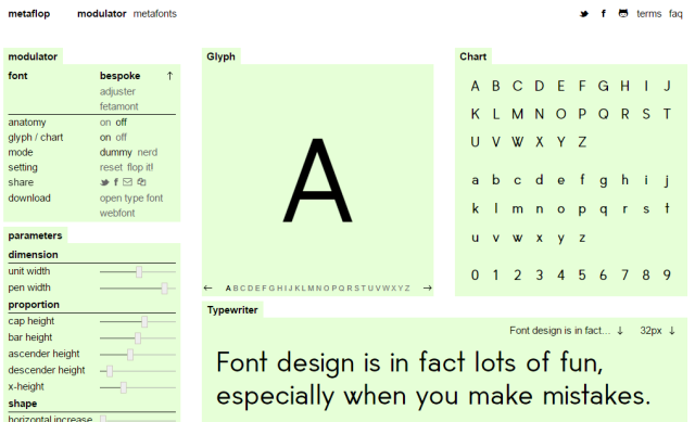
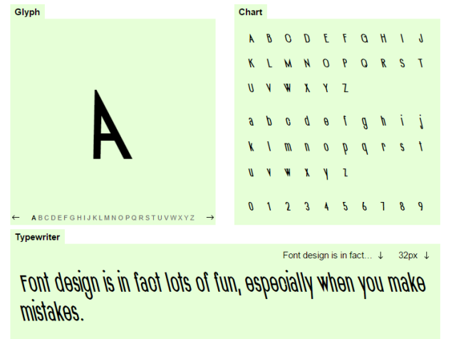
Metaflop is the simplest of the font-creation software I'm going to cover. It's a great way to explore how fonts can take on different feelings just by changing the geometry. Metaflop's Modulator feature lets you change the parameters of three different "metafonts".
Metafont is a font-programming language created by Donald Knuth, which means that the characters in a font aren't hand-designed by a human; rather, they are generated algorithmically, like other creative arts can be.
Each Metafont (bespoke, adjuster, and fetamont) has unique characteristics that can be changed by playing with the sliders on the left. Results are displayed in the Typewriter area.
Don't worry if you don't know what a "descender", "x-height", or "cap height" are (or any of the other type-jargon labeling the sliders). Turn on "anatomy" to see a chart of each part of the letter.
The big downside to Metaflop (as fun as it can be to tweak an entire character set in the blink of an eye) is that you don't get a whole lot of freedom or control in the overall shape because it's designed to affect only certain parameters of certain base fonts.
Construct Characters from Scratch
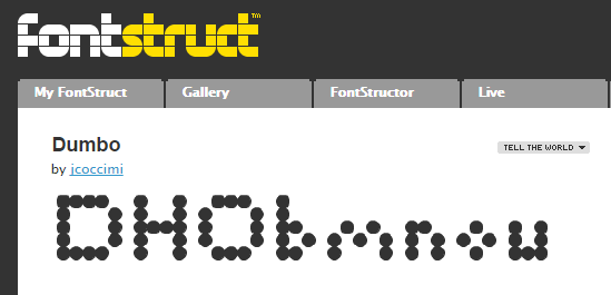
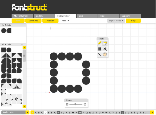
We covered Fontstruct back in 2008, but to do something a little different this time I decided to try my hand at designing my own font. The concept for my Fontstruct font is that it's made of dots. I called it Dumbo. It's not a great font, but it's fun to see what can be done just by playing with simple shapes.
One of the best things about Fontstruct is that the interface is relatively simple and bold. The learning curve isn't very steep, so font-making is more accessible. That makes it a good option for kids, teens, and graphic arts students who want to test things out and just experiment with different kinds of building blocks that you wouldn't necessarily think of.
Unfortunately, they force you to create an account if you want to experiment with the tool, and creating letters isn't exactly speedy.
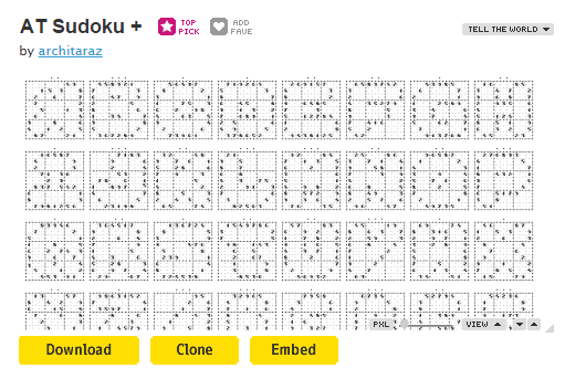
One of the most impressive Fontstruct creations I've seen is from creator architaraz, who designed Sudoku puzzles for his font! Talk about adding a layer of challenge to typeface creation.
A Powerful, Cross-Platform Option
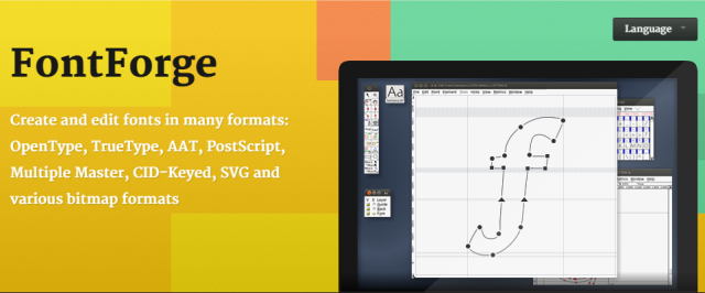
Finally, if you're getting serious about creating your own font, you need to check out FontForge. FontForge is a free, open-source font-creation software available for Windows, Mac, and Linux. It gives you a high degree of control over every letter and the ability to export your font in a wide variety of formats.
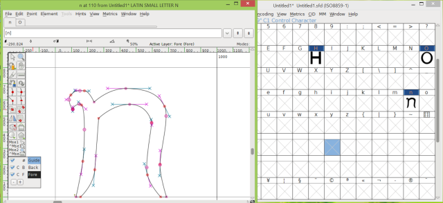
With FontForge, you can build fonts from simple shapes (as you can see from the "H" and the "O" designs I made) and bezier curves (as you can see in the "n" I created). Bezier curves let you create graceful swoops and curls and swooshes, controlled exactly to your liking with handle pairs.
Learning Bezier Curves
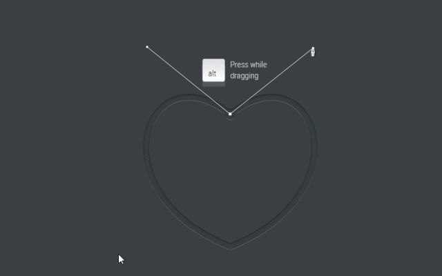
Bezier curves can be tricky to learn (as anyone who has tried them out in Photoshop, Adobe Illustrator, or Inkscape can tell you), but not impossible. Why learn them? Because they're important if you want precise control of the curves of your fonts.
There's a neat webapp game we covered called The Bezier Game that demonstrates how they work and lets you practice them, awarding points for creating designs without using too many nodes.
Wondering Which Format to Choose?
The three main formats you'll see for typography are TrueType, OpenType, and PostScript. There are lots of technical differences between them, but what you need to know is that OpenType is a robust evolution of TrueType that includes a larger character set and support for ligatures. Typographic ligatures are connected characters, which can be very sophisticated.
Here's a demonstration my friend, Michael Farrell, made that shows you just how beautiful OpenType can make your typography. Watch how the letters in "Zapfino" change as additional letters are added.
PostScript fonts are often favoured by professional printers for printing crisp magazines and books. Microsoft provides further details if you're particularly curious about font formats, but if in doubt, you're pretty safe choosing OpenType.
Great Resources for Learning More
"Design With FontForge: A Book About How to Create New Typefaces Using FontForge" is a fantastic, free, online resource for learning to think through all kinds of major decisions in typeface-creation.
There are many aspects of typeface design that aren't intuitive. For example, you may not know (as I didn't until reading Design With Fontforge) that it's important to make "O"s ever so slightly larger in the vertical direction than other letters, otherwise they will appear smaller than the surrounding letters.
So read a lot, and try to absorb and apply as much of the knowledge as you can, as it will allow you to stand on the shoulders of the typeface designers who have come before you.
Previously, we also pulled together seven quick guides to teach typography. If you're looking for more structured learning, check out Ellen Lupton's free course "Typography That Works: Typographic Composition and Fonts" on Skillshare.
If you're looking for an alternative font-creation software option for FontForge, check out BirdFont, a cross-platform, free font editor that lets you design your own font. It doesn't export in as many formats as FontForge, but the interface may make it easier for you to get started.
Final Thought: Is It All Worth It?
Have you ever created a font, or would you? It's a daunting task to create a complete and cohesive typeface -- and yet there are plenty of amazing fonts out there available for free. Some of my favorite free fonts come from FontSquirrel.com and they're gorgeous.
So, to all you lovers of lettering out there, how do you tackle a project as huge as font creation, especially given the competition out there? What makes it worthwhile? Do you do it out of love for the form (one letter at a time?), pride for a job well designed, or do you measure your project's worth in numbers of downloads or dollars?
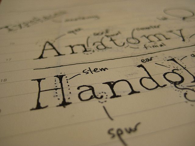
Image Credit: Typeface: Anatomy Sketches Via Flickr

