As information gets more tangled by the day, data visualization has stepped in to make it less baffling. As the world's chief information honcho, Google has taken note and launched an online tool that converts raw data into animated GIFs.
The Data GIF Maker is a search trend analysis tool from Google News Lab and is mainly meant for journalists who would like to throw in some visual storytelling in their reports. It is simple too and that's why you too can explore some creative uses for it even if you don't belong to the press corps.
Compare Two Topics
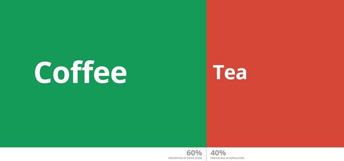
A tool that combines visualization with data can be complex. The Data GIF Maker avoids that by sticking to simple comparisons. You can compare two topics and display it with an animated GIF. For instance, demonstrate the relationship between coffee drinkers vs. tea drinkers or weigh in on two competing trends and their relative popularity around the world.
An idea is to tap the Google Trends explore tool to compare the relative search popularity of two terms and then use the numbers in the GIF Maker for the visualization.
Here are the steps:
- Open Data GIF Maker in your browser.
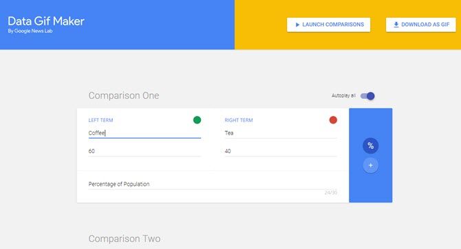
- Enter the Left Term and the Right Term in the space indicated.
- Enter the corresponding data value in a comma separated list. Click on "%" or "+" to indicate the relative weight of the values.
- Choose colors for both data points with a click on the color roundel.
- Enter an explanatory text in the last field.
- Hit Launch Comparisons to see it play in your browser window. Switch on the AutoPlay (if kept off, you can advance with the spacebar). You can also hit Download as Gif if you want to use the animated GIF elsewhere.
If you want to download the GIF, give it some time to generate. Choose between a low-resolution or a high-resolution GIF file. But pick the resolution based upon the device you plan to use it on.
You can use the GIF Maker to set up five different pieces of comparisons. Make your presentations vivid as you move from one comparison to the next. For instance, size up your sales figures in five different regions with the competition.
How Will You Use the Data GIF Maker?
There are far more powerful tools available for data visualization. The Data GIF Maker is a fledgling starter right now even compared to its own tools. Google already has Google Data Studio for advanced visualizations. And then there's Google Charts, which can render data in HTML5/SVG.
Even then, let's expect that Google will include more types of data with several data points and the right kind of animations to go along with them.
What immediate creative use can you put the GIF Maker to? Did you find it simple or more work than expected?


