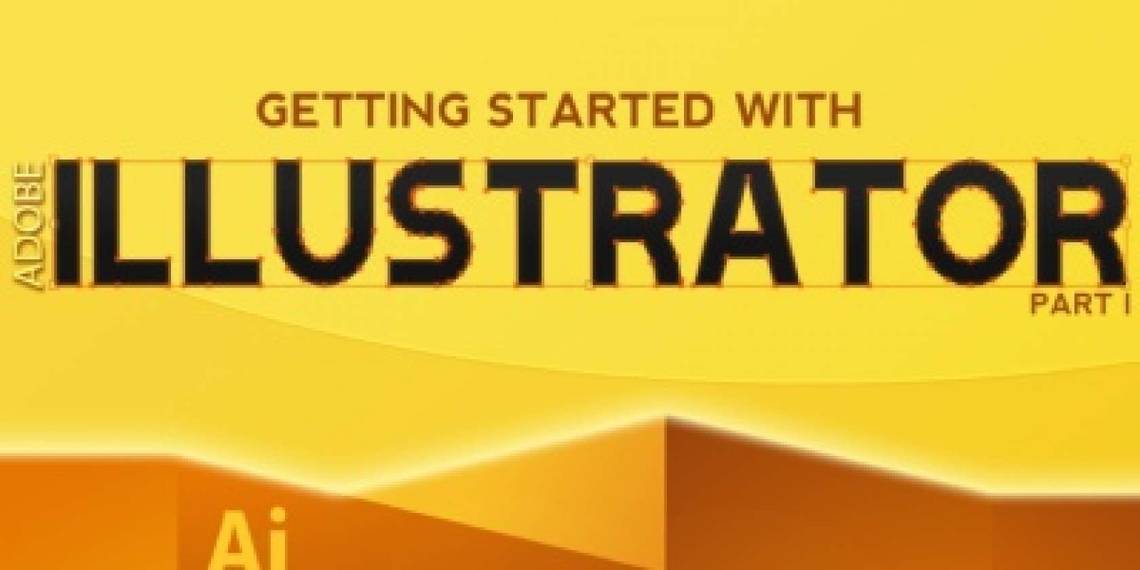
Want to get started learning Adobe Illustrator, but feel overwhelmed? Check out "Getting Started With Illustrator," the first Illustrator manual from MakeUseOf. With easy-to-follow instructions and plenty of annotated screenshots, this manual makes learning Illustrator simple.
Adobe Illustrator is a vector drawing program. It is often used to create logos, icons, illustrations, charts, infographics, t-shirts, business cards, stationery, envelopes, packaging design – you name it. All in all, it is mostly used to create high resolution graphics, which can later be printed as well.
Unlike Photoshop, which stores image information in dots, Illustrator uses mathematical equations when you draw shapes. Vector drawings can be scaled to fit skyscraper-size banners; raster images cannot. Because of this, Illustrator is used to make drawings that needs to scale easily – things like logos.
This Adobe Illustrator manual explains basic tools needed for making a logo, so check it out. Open Illustrator yourself and follow along to really get a feel for Adobe's amazing vector art program.
Table of Contents
§3–Creating a Logo in Illustrator
§4–Creating a 3D Text in Illustrator
1. Introduction
If you have decided to learn Illustrator, then you need to start with the basics. It’s a really powerful program, but also a complex one. Once you get familiar with the interface, basic tools, palettes and workspace, you will save a lot of time and nerves and your workflow will seem smooth and pleasant.
Adobe Illustrator is a vector drawing program. It is often used to create logos, icons, illustrations, charts, infographics, t-shirts, business cards, stationeries, envelopes, packaging design – you name it. All in all, it is mostly used to create high resolution graphics, which can later be printed as well.
Unlike Photoshop, which stores image information in dots, Illustrator uses mathematical equations when you draw shapes. What’s that about?
It means that vector graphics (like an Illustrator drawing) can be scaled or zoomed to any size without losing quality, while raster images (like an image edited in Photoshop) will pixelate as you scale:

Basically, vector drawings can be scaled to fit skyscraper-size banners; raster images cannot. So if you plan to use your work for various sizes, use a vector based program like Illustrator.
• Advantages of Vector Graphics:
• High resolution at any size;
• Small file size;
• High quality print;
• No resolution loss while editing.
Disadvantages:
• Hard to produce realistic drawings (but still possible).
Okay, so you are still reading this guide. That tells me that you really want to get closer with Illustrator, so I am here to share my knowledge with you. In this guide, I will introduce you to the workspace, basic tools, shapes and we’ll create our first logo using this awesome software.
Please note that I am using Illustrator CS5 on Windows, so Mac users will have to use slightly different key combinations: Command key instead of Ctrl and Option instead of Alt.
2. The Illustrator Workspace
If you are familiar with Photoshop, then the Adobe Illustrator workspace won’t surprise you much, since the main parts of it are basically the same:

You will primarily use the Tools panel, since all of the tools that you need are there. To configure an active tool, you will use the Control panel, where all options for the current tool are kept. And, of course, the panel docking area – it keeps such important palettes as Color Swatches, Layers, Stroke options, Appearance, Gradient settings, etc. (all palettes can be switched on or off in Windows menu).
Let’s check out the Tools panel first.
2.1 Tools Panel
There are many tools available in the toolbox, but you don’t have to memorize everything. Just a few of them will do the job.
Here’s a reference table (some tools, like Rectangle, contain more tools inside, which can be selected by holding the tool icon):

I always say that the best way of learning is practicing. So, let’s learn the basic tools by actually using them.
3. Creating a Logo in Illustrator
I usually use Adobe Illustrator to create logos for my clients. Why don’t we try one?
Let’s call our awesome company LimeWorks. We’ll need to create a lime and put the name under it. Like this:

Keep in mind though, that we will create a simple logo, just so you get familiar with some tools and methods. Let’s start with drawing lime segments.
3.1 Using Pen Tool
We’ll use the Pen tool, which is one of the most used tools in Illustrator. It is used to create all kinds of shapes and objects. Select it by clicking on its icon from the toolbox or use the P key.
Using the Pen tool, create your first triangle by clicking three times where you want the edges to be:

Note: as you see, I use Grid (Ctrl+) to be more precise.
To close the path, click on the first point:

Now it is ready to be filled with a color. Make sure the triangle is selected (click on it with Selection tool, V) and choose a yellow tone:

3.2 Making Round Corners
We need round corners in order to make our lime segment (triangle) look smoother. We’ll use the Round Corners effect:

In the Round Corners dialog box, put something like 4 mm (I use millimeters as units) and click OK to apply changes:

Looks good. Now let's add some texture, so it looks more realistic.
3.3 Adding Photoshop Effects
In Adobe Illustrator, when you go to the Effects menu, you will see that there are Illustrator Effects and Photoshop Effects:

We will use Stained Glass (Effects->Texture->Stained Glass).
But before that, we need a copy of our triangle above the original layer.
3.4 Copying Objects
I’ll show you some quick tips on how to easily copy and paste objects above the current layer and below, while keeping the exact position.
To paste a copy of a selected object above the original one in the exact position, first copy it (Ctrl+C) and then paste it using Ctrl+F (if you use Ctrl+V it will paste it in the middle of the screen). To paste it below the original object use Ctrl+B:

OK, so now you know the copy/paste tricks.
Copy and paste our triangle right in front of itself (Ctrl+F), and fill the pasted object with white color:

Open the Stained Glass dialog box and set as mine (Cell size=17; Border thickness=2; Light intensity=0):

3.5 Expand Appearance
Expand Appearance is located in the Object menu and is one of the most important tools in Illustrator. It may require a separate guide to describe in detail, but today we are only learning the basics.
So, in simple terms, Expand Appearance is used to divide an object into separate paths or images after an effect is applied to it. Well, that sounds a bit confusing. Let’s just use it and see it in action.
Make sure you have selected your white triangle with the Stained Glass effect on it and go to Object->Expand Appearance. Now our object is an image:

3.6 Live Trace
Another cool feature of Adobe Illustrator, Live trace is used to convert raster images into tracing objects. There are some default tracing presets already, but we’ll use Custom settings.
Go to Object->Live Trace ->Tracing Options and set values as below:

3.7 Expand
Expand is used to convert tracing objects into editable paths (vector). After tracing a raster image, you should use Expand.
As our textured object is now traced and ready to be returned to paths, we will use Expand:

As you see, our texture is now a set of paths, but we need to change its color from black to white. This time we will use Stroke (since the texture is a set of strokes):

OK. But it’s now a bit too sharp. Let’s blur it a bit.
3.8 Blur Effect
Go to Effects->Blur->Gaussian Blur, set radius to 2,8 pixels and you should have this:

At this point, we are done with our lime slice. The rest is easier.
3.9 Grouping objects
At this point our wedge of lime is ready, and we need to duplicate it. But it is composed of multiple layers (objects), so to make things easier while duplicating, let’s Group them.
To group a set of objects, select them all by dragging your mouse around them and clicking Ctrl+G. Another convenient way of selecting multiple objects is holding Shift and clicking on objects.
But since we don’t have any other objects on our artboard you can instead select all objects (Ctrl+A) and group them (Ctrl+G):

3.10 Using Rotate tool
Rotate tool (R) is used for ... guess what? Yes, to rotate objects or shapes.
Select the Rotate tool and Alt+click at the top of the triangle to set our center of rotation. In the pop-up box set as follows and click Copy:

You should have this now:

3.11 A little trick
There’s a little trick (one of many) that will make your Adobe Illustrator experience easier in future projects. The trick is just a keyboard shortcut (Ctrl+D). It repeats or applies the latest transformation to the selected object.
It’s handy for our practice as well. Select the new slice and use Ctrl+D 6 times:

Voila! We have a tasty lemon. Now for some details.
First of all, group all the slices together to keep things in order. Then make sure nothing is selected by clicking somewhere else on the artboard.
3.12 Drawing a Circle
Select a light green color for Fill and none for Stroke:

Select the Ellipse tool (a sub-tool under Rectangle or hit L):

Hold Shift+Alt, point your mouse to the center of the lime and drag the mouse until you get a circle which covers the whole lime:

Note: you don’t have to find the exact center to start with – we will align objects later.
3.13 Arranging Objects
As you see now, the green circle is in front of or above our lime. To send it back or below, select it and hit Ctrl+[ (Ctrl+] to bring it above current layer):

Good. Select that circle and duplicate it below itself (as we did in 3.4.) with Ctrl+C and then Ctrl+B:

Change its fill color to a darker green and make it a little bigger than the first circle by holding Shift+Alt and dragging one of its reference points:

That looks pretty good. Even better: we’re done with the hard part.
3.14 Adding Text
Let’s add our company name below the lime. Select Type tool (T), click under the lime and type LimeWorks:

Now let’s align everything to center.
3.15 Aligning Objects
To align objects perfectly, use the Alignment tools. Those tools are located in the Control Panel, when the Selection Tool is active. See below to understand various alignments:

Note that these examples are true for Align to Artboard:

If you choose Align to Selection, then objects will be aligned with respect to the outer boundaries of the selection.
OK. Select all objects (Ctrl+A) and from the control panel, click on Horizontal Align Center (number 2):

That’s it. Now you can play with sizes and colors if you want.
If you make the lime smaller and change the text colors it will look much better:

Alright, congratulations with your first logo!
Let’s get to Saving and Exporting.
3.16 Saving and Exporting
To save your Illustrator files, just hit Ctrl+S (as always) and it will save it in .ai format.
If you want to save your logo in .png, then you can make use of one of two ways: File->Export or File->Save For Web and Devices.
While the second way exports the whole Artboard, the first way lets you export only your object(s).
Here’s an example:

Note: you can always change the size of your Artboard (File->Document Setup and click on Edit Artboards). After that, when you use Save For Web and Devices you will see that the image size is the new size of your Artboard.
Also note: you can check Transparency when saving for web and you will have your logo with a transparent background.
Let’s go through another tutorial to learn other basic tools. We’ll create a 3D text with a grungy background.
4. Creating a 3D Text in Adobe Illustrator
While vector graphics are typically two-dimensions you can create nice-looking 3D objects as well. In this tutorial we will create a simple 3D text with a grungy background like below:

As I said, we are now learning the basics, so that you get more familiar with the interface and some useful tools. Once you are, you will see that there are no limits to what you can do with Illustrator.
4.1 Adding a Grungy Background
Let’s start with a cool background.
Go to your favorite website for free textures and backgrounds and find a nice grungy background. I took one from Stock Image:

Copy and paste it into your Adobe Illustrator document. Most probably it will be way too big, so you will need to scale it down. Use Transform Panel to control the size of your image:

Note: you can use your own values, just make sure it fits the document.
Now we have our background image ready, but let’s add some more effects to it. First, we’ll create a rectangle and then we’ll add Inner Glow effect and use the Transparency panel to change blending between the image and the rectangle.
4.2 Creating a Rectangle
Select Rectangle from Tools (M), draw a rectangle, same size as your background image (you may want to use the Transform panel to set exact values) and set the Fill color to light brown and no stroke:

4.3 Adding Inner Glow Effect
Go to Effect->Stylize->Inner Glow and set values as shown:

Here’s what you should have:

4.4 Using Transparency Panel
You can always use Transparency panel to change the way an object or a layer blends with layers below. First off, let’s send our rectangle behind the image. Select the rectangle by clicking on it and use Ctrl+[.
Now select the image layer by clicking on the image and open Transparency Panel (Window->Transparency) and choose Multiply as the blending mode:

Nice. We’re done with the background. Let’s get to the 3D text itself.
4.5 Working with Type tool
Using the Type tool (T) write MakeUseOf with some nice font (I chose Diavlo Bold, which can be downloaded at exljbris Font Foundry). Make it big enough like 65pt, set tracking to -20 and choose the White color:

4.6 Creating Outlines
Use Create Outlines - right-click on the text and choose Create Outlines, to convert text into vector paths:

4.7 Adding 3D Effects
3D effects can be applied to any objects as well as text. Select the text, go to Effect->3D->Extrude & Bevel and apply as following:

This is what you should have this far:

Now we need to separate the faces of the text and our 3D effect from each other. Use Expand Appearance to do that (Object->Expand Appearance).
With Direct Selection Tool (A), select only the faces of the text (hold Shift to select multiple objects):

Tip: while selecting, make sure that the anchors are blue and none of them white. To do that, zoom in a little bit and click somewhere in the middle of the objects (here – text faces).
4.8 Using Unite from Pathfinder panel
Now copy and paste your selection and use Unite from Pathfinder panel to join all selected faces into one grouped path:

Place the new layer on top of the old one and set its Stroke Color to white and Stroke Weight to 1pt:

We’re almost there.
4.9 Adding Gradient Style
Adding the gradient is pretty easy – just select the object, click on the Gradient panel on the right and set up your colors. Moreover, you can always make use of pre-defined Libraries from Window->Swatch Libraries->Gradients. But this time, let’s set it up manually.
In the Gradient panel, set Type to Linear, set first color at 0% location to dark red, second color at 80% location to orange and the final color at 100% to bright red, Angle to -90°:

Tip: use the upper slider to control the color range of the gradient.
4.10 Adding Shadow
To give our text some depth, let’s add some shadow to it. We’ll use the Gaussian Blur effect.
First, copy (Ctrl+C) our new layer and paste it in-front (Ctrl+F). Then, change its color to black and set stroke to none, send it behind the 3D effect layer with Ctrl+[ (make sure it is above the background layers):

Move it down by using arrow keys (you can also change Y coordinates from the Transform panel to be more precise):

4.11 Applying Gaussian Blur
Our shadow doesn’t look realistic now; we need to blur it a bit. Go to Effect->Blur->Gaussian Blur and set Radius to 9 pixels:

We are done!
5. Some useful tips
Tips and tricks are endless, but I will show you some of them:
• Lock layers – when you want to select some small objects which are in front of other objects (like a background), instead of Shift+clicking on each one you can simply lock the background with Ctrl+2, or put a lock sign in the Layers panel.
• Always check the Layers palette – when working with many objects and layers, it is really useful to name your layers and check how your layers are aligned (whether a layer is above or below the other one, is it locked, etc.);
• Re-edit layer styles any time you need – yes, you can always change style or effect settings that you have already applied to an object or a layer before through the Appearance panel (Window- >Appearance);
• Use Libraries – there are some nice pre-defined Libraries to make use of in your works. Go to Window->Libraries and select from Brush Libraries, Swatch Libraries, Graphic Style Libraries or Symbol Libraries. There are lots of them.
6. Conclusion
I hope everything was clear enough for you to start loving Adobe Illustrator. What I’ve covered in this guide is just the basics. Next time I will show more complex usages of other amazing tools and tricks. Until then – practice.
Guide Published: August 2012