Welcome to the May edition of Free Font Friday! For this month’s edition, I’ve scoured the well-regarded Behance network showcasing works of art from all over the world, and unearthed five beautiful free fonts, each with its own story, and one with a video showing how beautiful it can be in the hands of a skilled designer.
Slick and Shiny: Chrome
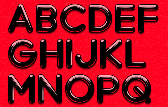
Our first free font of the day is entitled Chrome, and brings to mind images of shiny cars, glass-clad urban buildings, and industrial countertops polished to a high sheen. Then again, its rounded lines and general chubbiness also evoke a softer image – some of the letterforms almost look like they were sculpted out of bubblegum. Check out the capital J above to see what I mean.
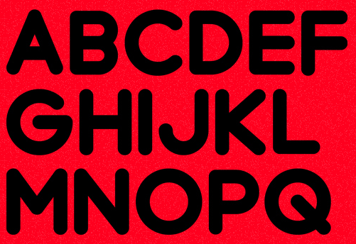
If you like Chrome’s general look but aren’t a fan of the shiny look, Chrome’s creator, Artem Sukhinin, offers Chrome Black (on the same page as Chrome). This is a version that maintains the letterforms and rounded, blocky look, but does away with the reflections:
The resulting look is less dramatic, but I can see it working as a title font, or even for signage or t-shirts.
Edgy and European: Nougatine
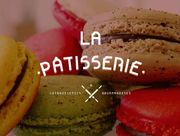
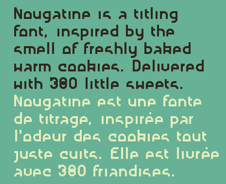
Fabien Laborie, creator of the free Nougatine font, claims that the font was “inspired by the smell of freshly baked cookies.” To be perfectly honest, I don’t see it. To me, Nougatine’s angular, truncated letterforms come off as more technological than anything else – it inspires images of printed circuit boards, tiny components, and etched pathways:
Note the vertically truncated letterforms – the word “cookies” almost reads like “caaries” above. But as the specimen above says, this is a titling font, and it does get extra points for creativity and for providing a comprehensive glyph set (380 glyphs).
Urban and Luminescent: Kabel
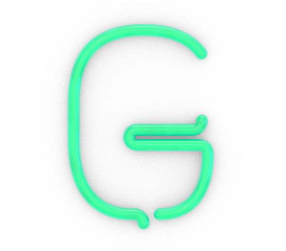
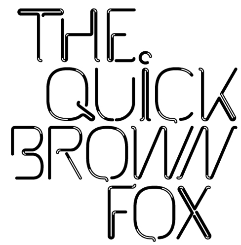
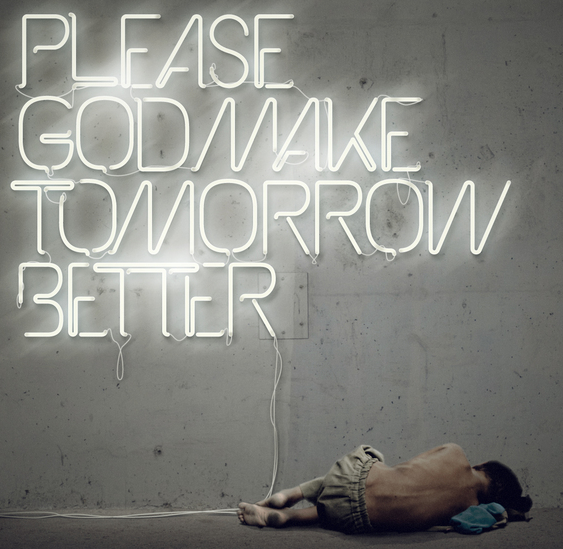
Kabel, a free font by Mathias Nösel, brings one word to mind: Neon. Mathias tells us Kabel is inspired by Pablo Alfieri’s work; this is a font begging for modification, Photoshopping, and typographical effects. Don’t get me wrong, the letterforms are strikingly modern and fluid on their own:
But Kabel truly shines when it gets some Photoshop love, as you can see here:
If you are curious to learn how this striking image was created, you’re in luck: Mathias created a time-lapse video showing the entire creative process leading up to this finished product, executed purely in Photoshop.
[EMBED_VIMEO]https://player.vimeo.com/video/27877827?title=0&byline=0&portrait=0&color=ffffff[/EMBED_VIMEO]
Sedate and Elegant: Valentina
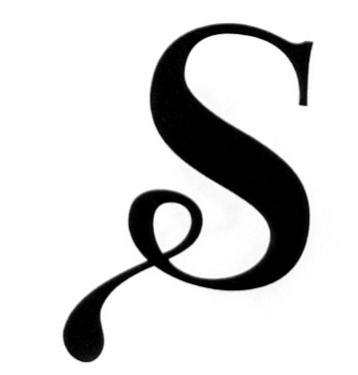
Valentina is a free font by designer Pedro Arilla, named after the creator’s grandmother. A comprehensive font, it comes with 457 glyphs, which include 125 alternative lower-case letterforms, and 46 ligatures. The specimen below does a lot to demonstrate the typeface’s flair and flourish:
Absolutely striking. Note the alternative form for the lowercase O used in the word Colutorio above, and for the lowercase a in Queseria. I would not necessarily use Valentina as a body font, but as a titling font is lends a classic, educated look to just about any text. Impressive work indeed.
Fun and Familiar: Sketchetik and Sketch Rockwell
Recognize this screenshot? It’s out of a recent Spotify video announcing their new iPad app. If you ever feel like giving your titles the Spotify treatment, you can do so with either Sketchetik Light or Sketch Rockwell, both free. Let’s start with Sketchetik Light first:
Note the prices on the top-left of each weight shown above. Only the Light weight is free font, but the other weights are not outrageously priced. Do you see the resemblance to Spotify’s font? It is not the exact same font, but it’s not very different, either.
If you’re looking for a medium weight and don’t want to spend $19 on Sketchetik, you should check out Sketch Rockwell:
Sketch Rockwell is a blocky, chunky serif, more full-bodied than Spotify’s font. But again, it uses the same sketched-out look, with diagonal pen strokes for shading.
Speaking of Spotify…
If you enjoy typography and liked this month’s Free Font Friday, here’s a challenge for you: Can you find out what is the exact font Spotify uses on their ads? It’s fairly easy to find the Spotify logo typeface, but I couldn’t find a conclusive ID for the hand-drawn font used in the ads. Do you know the answer? Let me know below!

![fonts[18]](https://static1.makeuseofimages.com/wordpress/wp-content/uploads/2012/05/fonts18.png)
![fonts[20]](https://static1.makeuseofimages.com/wordpress/wp-content/uploads/2012/05/fonts20.png)
![fonts[22]](https://static1.makeuseofimages.com/wordpress/wp-content/uploads/2012/05/fonts22.png)
