Most of the time when you run statistics, you want to use statistical software. These tools are built to do calculations like t-tests, chi-square tests, correlations, and so on. Excel isn't meant for data analysis. But that doesn't mean you can't do it.
Unfortunately, Excel's statistical functions aren't always intuitive. And they usually give you esoteric results. So instead of using stats functions, we're going to use the go-to Excel statistics add-in: the Data Analysis Toolpak.
The Toolpak, despite its rather unfortunate spelling, includes a wide range of useful statistics functionality. Let's see what we can do with Excel statistics.
Adding the Excel Data Analysis Toolpak
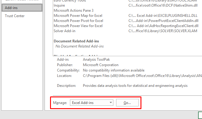
While you can do stats without the Data Analysis Toolpak, it's much easier with it. To install the Toolpak in Excel 2016, go to File > Options > Add-ins.
Click Go next to "Manage: Excel Add-ins."
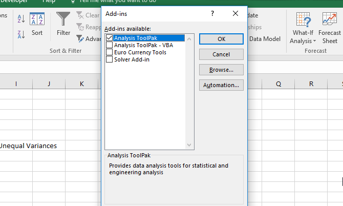
In the resulting window, check the box next to Analysis Toolpak and then click OK.
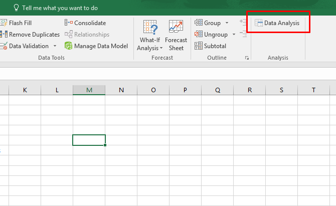
If you correctly added the Data Analysis Toolpak to Excel, you'll see a Data Analysis button in the Data tab, grouped into the Analysis section:
If you want even more power, be sure to check out Excel's other add-ins.
Descriptive Statistics in Excel
No matter what statistical test you're running, you probably want to get Excel's descriptive statistics first. This will give you information on means, medians, variance, standard deviation and error, kurtosis, skewness, and a variety of other figures.
Running descriptive statistics in Excel is easy. Click Data Analysis in the Data tab, select Descriptive Statistics, and select your input range. Click the arrow next to the input range field, click-and-drag to select your data, and hit Enter (or click the corresponding down arrow), as in the GIF below.
After that, make sure to tell Excel whether your data has labels, if you want the output in a new sheet or on the same one, and if you want summary statistics and other options.
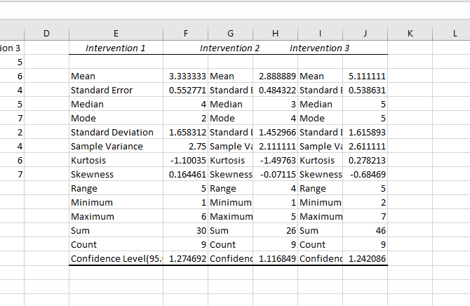
After that, hit OK, and you'll get your descriptive statistics:
Student's t-Test in Excel
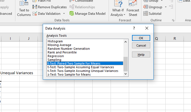
The t-test is one of the most basic statistical tests, and it's easy to compute in Excel with the Toolpak. Click the Data Analysis button and scroll down until you see the t-test options.
You have three choices:
- t-Test: Paired Two Sample for Means should be used when your measurements or observations were paired. Use this when you took two measurements of the same subjects, such as measuring blood pressure before and after an intervention.
- t-Test: Two-Sample Assuming Equal Variances should be used when your measurements are independent (which usually means they were done on two different subject groups). We'll discuss the "equal variances" part in a moment.
- t-Test: Two-Sample Assuming Unequal Variances is also for independent measurements, but is used when your variances are unequal.
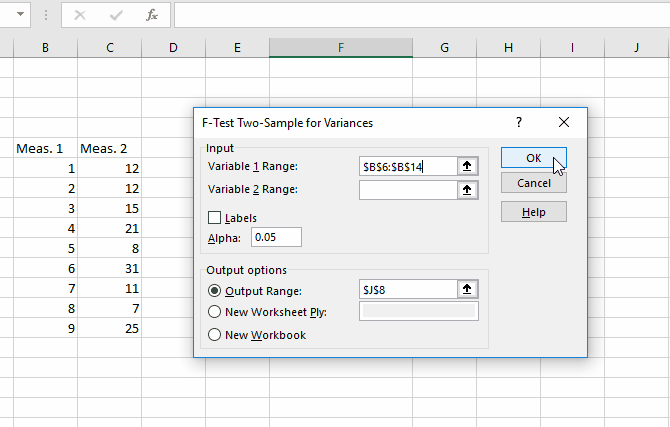
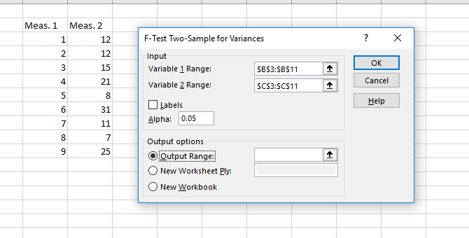
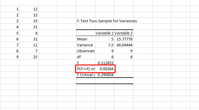
To test whether the variances of your two samples are equal, you'll need to run an F-test. Find F-Test Two-Sample for Variances in the Analysis Tools list, select it, and click OK.
Enter your two datasets in the input range boxes. Leave the alpha value at 0.05 unless you have reason to change it -- if you don't know what that means, just leave. Finally, click OK.
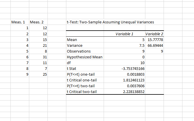
Excel will give you the results in a new sheet (unless you selected Output Range and a cell in your current sheet):
You're looking at the P-value here. If it's less than 0.05, you have unequal variances. So to run the t-test, you should use the unequal variances option.
To run a t-test, select the appropriate test from the Analysis Tools window and select both sets of your data in the same manner as you did for the F-test. Leave the alpha value at 0.05, and hit OK.
The results include everything you need to report for a t-test: the means, degrees of freedom (df), t statistic, and the P-values for both one- and two-tailed tests. If the P-value is less than 0.05, the two samples are significantly different.
If you're not sure whether to use a one- or two-tailed t-test, check out this explainer from UCLA.
ANOVA in Excel
The Excel Data Analysis Toolpak offers three types of analysis of variance (ANOVA). Unfortunately, it doesn't give you the ability to run the necessary follow-up tests like Tukey or Bonferroni. But you can see if there's a relationship between a few different variables.
Here are the three ANOVA tests in Excel:
- ANOVA: Single Factor analyzes variance with one dependent variable and one independent variable. It's preferable to using multiple t-tests when you have more than two groups.
- ANOVA: Two-Factor with Replication is similar to the paired t-test; it involves multiple measurements on single subjects. The "two-factor" part of this test indicates that there are two independent variables.
- ANOVA: Two-Factor without Replication involves two independent variables, but no replication in measurement.
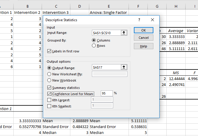
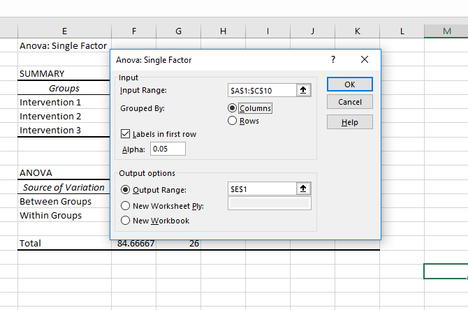
We'll be going over the single-factor analysis here. In our example, we'll be looking at three sets of numbers, labeled "Intervention 1," "Intervention 2," and "Intervention 3." To run an ANOVA, click Data Analysis, then select ANOVA: Single Factor.
Select the input range and make sure to tell Excel whether your groups are in columns or rows. I've also selected "Labels in first row" here so that the group names are displayed in the results.
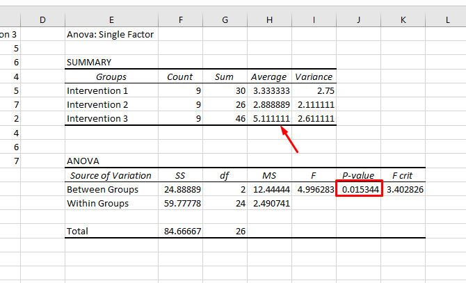
After hitting OK, we get the following results:
Note that the P-value is less than 0.05, so we have a significant result. That means there's a significant difference between at least two of the groups in the test. But because Excel doesn't provide tests to determine which groups differ, the best you can do is look at the averages displayed in the summary. In our example, Intervention 3 looks like it's probably the one that differs.
This isn't statistically sound. But if you just want to see if there's a difference, and see which group is probably causing it, it'll work.
Two-factor ANOVA is more complicated. If you want to learn more about when to use the two-factor method, see this video from Sophia.org and the "without replication" and "with replication" examples from Real Statistics.
Correlation in Excel
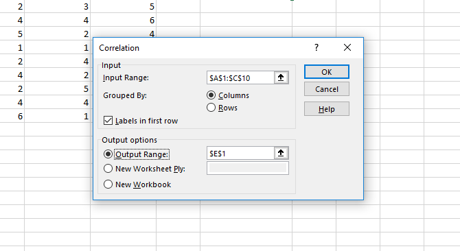
Calculating correlation in Excel is much simpler than the t-test or an ANOVA. Use the Data Analysis button to open the Analysis Tools window and select Correlation.
Select your input range, identify your groups as columns or rows, and tell Excel whether you have labels. After that, hit OK.
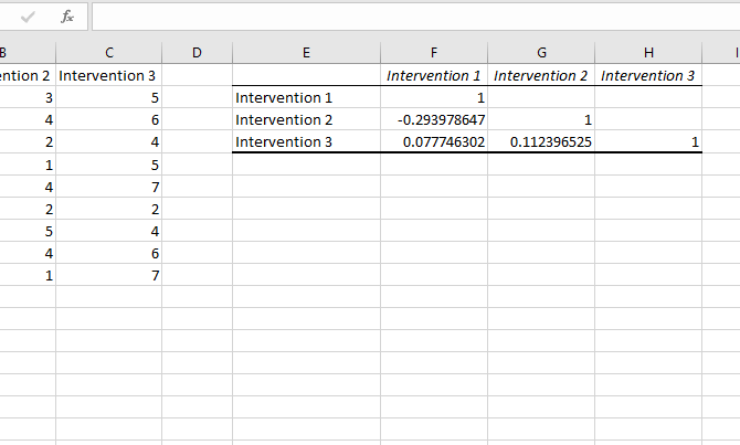
You won't get any measures of significance, but you can see how each group is correlated with the others. A value of one is an absolute correlation, indicating that the values are exactly the same. The closer to one the correlation value, the stronger the correlation.
Regression in Excel
Regression is one of the most commonly used statistical tests in industry, and Excel packs a surprising amount of power for this calculation. We'll run a quick multiple regression in Excel here. If you're not familiar with regression, check out HBR's guide to using regression for business.
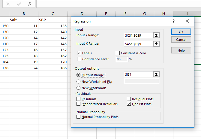
Let's say our dependent variable is blood pressure, and our two independent variables are weight and salt intake. We want to see which is a better predictor of blood pressure (or if they're both good).
Click Data Analysis and select Regression. You need to be careful when filling out the input range boxes this time. The Input Y Range box should contain your single dependent variable. The Input X Range box can include multiple independent variables. For a simple regression, don't worry about the rest (though remember to tell Excel if you selected labels).
Here's what our calculation looks like:
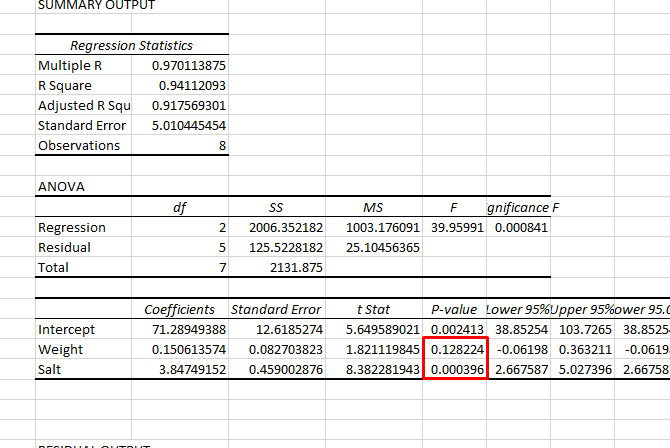
After hitting OK, you'll get a big list of results. I've highlighted the P-value here for both weight and salt intake:
As you can see, the P-value for weight is greater than 0.05, so there's no significant relationship there. The P-value for salt, however, is below 0.05, indicating that it's a good predictor of blood pressure.
If you're planning on presenting your regression data, remember that you can add a regression line to a scatterplot in Excel. It's a great visual aid for this analysis.
Excel Statistics: Surprisingly Capable
While Excel isn't known for its statistical power, it actually packs some really useful functionality, such as the PowerQuery tool, which is handy for tasks like combining data sets. (Learn how to generate your first Microsoft Power Query Script.) There's also the Data Analysis Toolpak statistics add-in, which really brings out some of Excel's best features. I hope you've learned how to use the Toolpak, and that you can now play around on your own to figure out how to use more of its functions.
With this now under your belt, take your Excel skills to the next level with our articles on using Excel's Goal Seek feature for more data crunching and searching for values with vlookup. At some point you might also want to learn how to import Excel data into Python.


