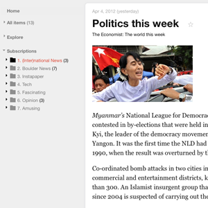
Flush away the crap you don't need in Google Reader and get back to what's important - reading. "Google Reader Readable" is both a Chrome extension and a userstyle that removes basically everything from Google Reader except for you what you want - the article you're reading right now and your lists of feeds.
Gone is the black bar, the Google logo, the unnecessary search bar and the various Google Plus-related nonsense. Even better, your lists of feeds is hidden unless you're mousing over it, meaning you can focus on what you're reading and nothing else.
If you love Google Reader but find it wastes too much screen space for things you don't care about, you really need to install this extension now.
Using Readable
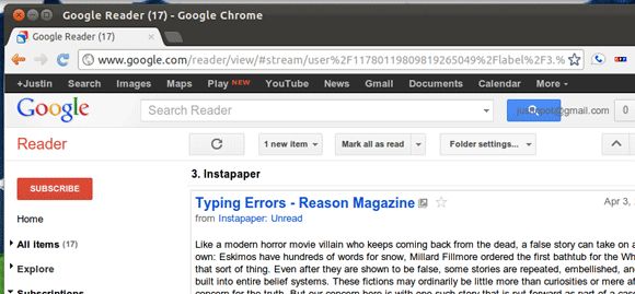
We all know how Google Reader looks by default. At the top is a black bar; below that is the Google logo beside a search bar and some Google Plus notifications. Below that is the stuff you care about - your articles.
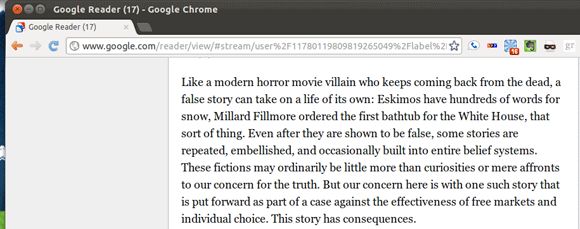
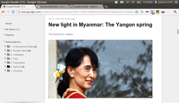
Install Readable and all that useless stuff at the top of the screen is gone, leaving you with only the article you're reading:
Are you worried about the missing sidebar? Don't be. It shows up when you move your mouse to that side of the screen.
There are no options to configure here - everything just works.
Keyboard Shortcuts
Read the comments for this extension and you'll find more than a few people complaining about the missing "Mark All As Read" button. This is annoying, but a simple keyboard shortcut gives you access to this functionality: "Shift + A".
Knowing the Google Reader shortcuts really helps when using a stripped-down version of Reader. "J" and "K", for example, allow you to quickly jump from article to article.
You could also check out Google's page of Reader keyboard shortcuts.
Download
Firefox and Chrome users can download the Google Reader Readable userstyle here. You're going to need the Stylish pluging for Chrome or Firefox in order to use it.
Conclusion
Early on Google earned a reputation for minimalism. Its home page was simple, featuring only a logo and the now-famous search bar. Hints of this minimalism remain: the homepage is still more or less clean and white backdrops and text ads still define most Google services.
Google's recent changes, however suggest that while aesthetically Google still leans towards whitespace, other concerns - the need to integrate Google Plus into everything, for example - are trumping that functionality. So we get red notifications for Plus when we're reading articles or looking at our email, and a black bar hovers over all of our Google activity.
It's a shame, because simplicity was one of the reasons we loved Google products to begin with. Geeks like us will always find a way to get the functionality we want, and to remove the functionality we don't; it's why you're reading this article. Everyone else, however, might just look for a replacement.
Will you be using Google Reader Readable? Why or why not? Let me know in the comments below, along with any other relevant hacks for removing clutter from websites.
Oh, and be sure to check out Minimalist for Everything if you want to strip functions from sites yourself. I've been meaning to review it for a long time, but it deserves a mention here.


