We've looked at how to use online tools to create databases, edit images, and improve your productivity – but something we've never investigated is how to create professional diagrams and charts by using nothing more than an Internet connection.
Contrary to popular belief, diagrams and charts are not solely the domain of office workers and people in the business world. In fact, there are all sorts of reasons you might want to create professional-looking illustrations – no matter what your vocation, you're almost certain to have the need for an analytical tool every now and again.
For example, if you run the family finances you can use charts to plan your budget and track incomings and outgoings, if you're learning how to invest in stocks you might want to monitor your portfolio's performance, and you could even use one to make decisions on something as mundane as which groceries you should buy this week.
The Power of Visualization
Numerous scientific studies have hailed the power of a good visualization. They can make a bland website engaging, make an academic study come to life, and make a sales presentation more appealing to the potential buyer.
A good chart or diagram goes beyond the mere visual. The more senses included, the better.
That's why something as simple as a PowerPoint presentation with accompanying background music and an element of user input has been shown to encourage learning. It strategically engages students in the learning process and lets teachers appeal to multiple learning styles at the same time.
Similarly, in the office a clear and well-presented chart has become a tool to elicit specific emotional reactions in employees, with the consequence of making them become more committed to a certain project.
So, without further ado, here are some of the best chart making tools out there:
Plot.ly
Plot.ly is a highly user friendly, project-based site. It lets you import your data to prevent long-winded typing, and lets you customize everything from the layout and the axes to the notes and the legends.
Your creations can be shared as freely as you want, but you cannot collaborate on a project without paying a monthly fee.
Available graph types include -- line graphs, bar charts, heat-maps, histograms, box plots, bubble charts, error bars, and many more. It also offers high-quality 3D graphs and charts. All its graphs can be exported to any image format through its "Workspace" or API libraries, with possible file types including PDF, PNG, EPS, SVG, JPG, and WebP.
If you're looking for an endorsement about the professional quality of Plot.ly's output, look no further than their list of clients - the Boston Globe, the Washington Post, the US Air Force, and the NOAA are all subscribers.
The free version will let you save only ten private files, though you can store unlimited public files. The paid version, which lets you save unlimited private files and collaborate with friends and colleagues, costs $20 per month.
Hohli: Online Charts Builder [Broken URL Removed]
Hohli is a simpler and more "stripped out" chart and diagram builder than some of the others on this list – managing to create professional visualizations without the hassle of registration and difficulty of coding. This is its biggest selling point -- a focus on the data and the output rather than unnecessary and under-used bells and whistles.

It is based on the Google Charts API, but doesn't offer the same range of graphs that Google does when used natively.
It offers eight major chart types – line, area, column, bar, scatter, pie, map, and trend. These styles can be further customized by changing the size, the orientation, and by editing the colors.
Hohli comes with three more major plus points – a real-time preview window so you can see any errors as you make them, and the ability to change from one chart type to another without needing to start over again, and the ability to determine how big you want your chart to be in "real life". This is a great tool for teachers and students, who might want to print out their work as part of a school project.
Google Charts
Google's offering is primarily a tool for developers who want to include charts and diagrams in webpages. It makes use of JavaScript that's then embedded in a site, and is rendered using HTML5/SVG to allow for cross-browser compatibility. It's not very easy or intuitive for people who are not skilled at coding or web design.
The range of charts and graphs available is impressive, ranging from bubble charts and bar charts to Sankey diagrams and histograms - in fact, they offer 28 different types of graph. All of them can be further customized in almost countless ways.
All the charts are interactive, and they can be linked to dashboards and integrated with other on-site experiences.
Rich Chart Live [No Longer Available]
Rich Chart Live offers a wide variety of professionally designed chart templates, data can be imported or manually added, and the resultant files can be exported to both Flash and Microsoft PowerPoint. You can also embed your graph directly to a website by simply copying and pasting the supplied HTML code.
For ease of use, data can be imported directly from a spreadsheet.

You can add links to your charts, make them interactive, and also add animation. Every part of your chart is customizable - including the axes, background, colors, legend, headings, subtitles, labels, and tool-tips.
The only drawback of using the free version over the paid version is the presence of a small watermark in the bottom right-hand corner of each project. The paid version is $4.95 for one day, or $19.95 for a month.
RAW
RAW is similar to Plot.ly in terms of professionalism, and is incredibly easy to use. There is no registration, no fee, and at no point are you asked to hand over any personal details.
https://www.anrdoezrs.net/links/7251228/type/dlg/sid/UUmuoUeUpU52520/https://vimeo.com/91605650
To use it, you simply have to copy and paste your data directly into the window on their webpage – though there is no feature to directly upload a file.
You're then presented with a choice of sixteen different charts. These charts include types not seen on other sites, including a Reingold-Tilford tree, a circular dendrogram, a bump chart, a stream graph, and a Voronoi tessellation. There is also an option to design your own.
The other standout feature is a drag-and-drop tool. Using it means you can move and rearrange your data on your graph until you're happy with the presentation. It makes it simpler and more appealing compared to using more traditional data-entry methods.
Cacoo
Cacoo makes the list thanks to its collaboration tools. Unlike Plot.ly, which makes users pay for its collaborative features, on Cacoo they are free.

Cacoo specializes in graphs and charts that make use of stencils. It means it's best used when creating flowcharts, wireframes, network designs, site maps, mind maps, and databases. A quirk of its reliance on stencils also means it can be used for tasks such as creating furniture layouts in offices or seating arrangements at events.
The free version does still have some drawbacks – for example, you cannot save projects, only individual diagrams, and you can only save the created files in PNG format. Furthermore, you can't see your editing history, and inserted images are limited to 0.5 MB in size.
And The Winner Is...
It's hard to anoint a clear winner. The choice you make depends entirely on what the goals of your project are.
The best all-round tool is arguably Plot.ly thanks to its blend of professionalism and intuitiveness, but the user-friendliness of RAW also makes it viable contender for the throne.
If collaboration is near the top of your list of requirements, look no further than the free offering from Cacoo, while if you are a skilled coder who needs visualizations for your website or blog, then Google Charts should be your first port of call.
Your Choices?
We've given you a range of options each of which have a unique feature, but what are your favorite online tools for creating professional diagrams and charts? Have we overlooked one of the best? Perhaps you have experience in using one of the tools we included in this list? Was you experience positive or negative?
Whatever your situation we'd love to hear from you. You can let us know your thoughts and feedback in the comments section below.
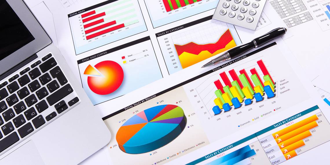
Image Credits: Graphs, charts via Shutterstock