A pie chart is a wonderful tool for displaying information visually. It allows you to see the data relationship to a whole pie, piece by piece. Plus, if you use Microsoft Excel to track, edit, and share your data already, then creating a pie chart is the next logical step.
By using a simple spreadsheet of information, we will show you how to make a useful pie chart. And once you get the hang of it, you can explore options using more data.
Import or Enter Your Data
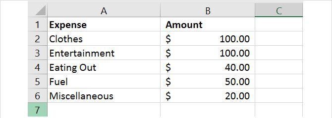
The most important aspect of your pie chart is the data. Whether you import a spreadsheet or create one from scratch, you must format it correctly for the chart. A pie chart in Excel can convert either a row or column of data.
The Microsoft Office support website describes when a pie chart works best:
- You have only one data series.
- None of the data values are zero or less than zero.
- You have no more than seven categories, because more than seven slices can make a chart hard to read.
Keep in mind that with every change you make to your data, that pie chart conveniently updates automatically.
Create the Basic Pie Chart
You can create a pie chart based on your data in two different ways, both begin with selecting the cells. Be sure to only select cells that should be converted into the chart.
Method 1
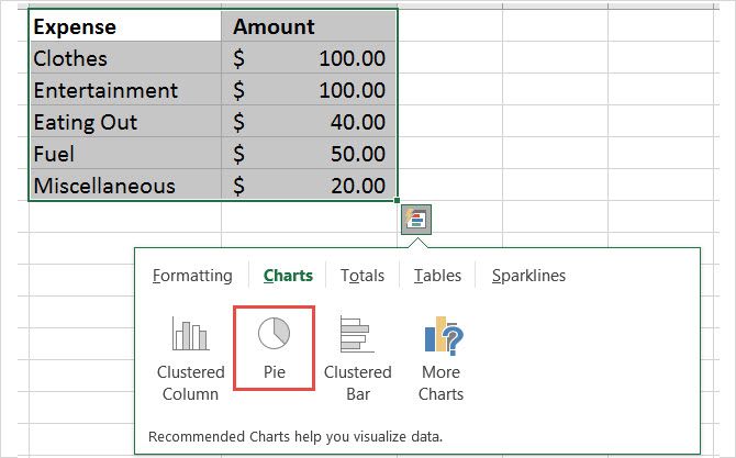
Select the cells, right-click on the chosen group, and pick Quick Analysis from the context menu. Under Charts, you will choose Pie and can see a preview by running your mouse over it before clicking on it. Once you do click on the pie chart, this will insert a basic style into your spreadsheet.
Method 2
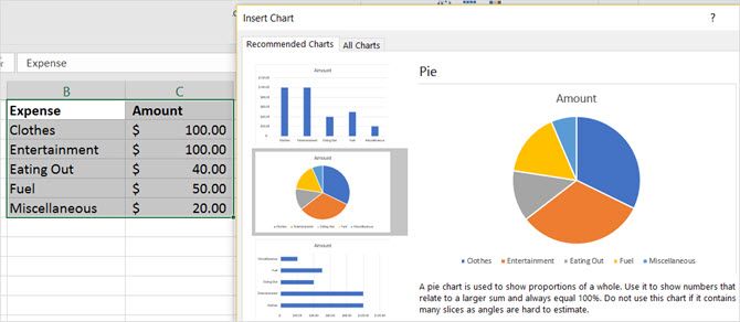
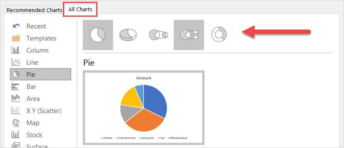
Select the cells, click the Insert tab, and click the small arrow in the Chart section of the ribbon to open it. You may see a pie chart in the Recommended Charts tab, but if not, click the All Charts tab and select Pie.
Before you click OK to insert your chart, you have a few options for the style. You can pick a basic pie, 3-D pie, pie of pie, bar of pie, or doughnut. After you make your choice, click OK and the chart will pop into your spreadsheet.
Format the Pie Chart
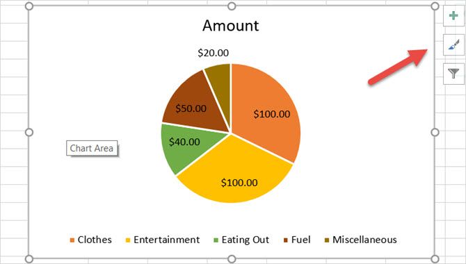
Once you have your pie chart in the spreadsheet, you can change the elements such as title, labels, and legend. You can also adjust the colors, style, and general formatting easily or apply filters.
To begin any changes, click on the pie chart to display the three-square menu on the right.
Adjust the Chart Elements
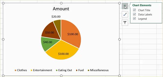
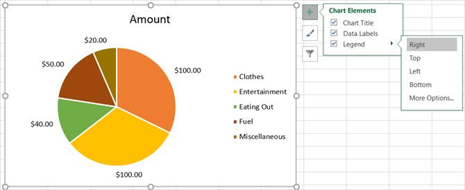
With the first menu choice, you can adjust the chart title, data labels, and legend with various options for each. You can also decide to display or not display these items with the checkboxes.
To access each of the following elements, click on the chart, pick Chart Elements, and then make your selection.
Chart Title
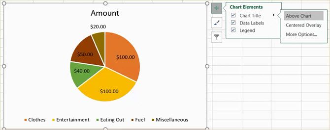
If you would like to adjust the title, select the arrow next to Chart Title in the menu. You can choose to have the title above the chart or as centered overlay.
Data Labels
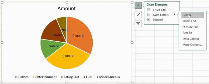
To change the labels, select the arrow next to Data Labels in the menu. You can then pick from five different locations on the chart for your labels to display.
Legend
As with the other elements, you can change where the legend displays. Select the arrow next to Legend in the menu. Then, you can choose to display the legend on any of the four sides of your chart.
More Options
If you pick More Options for any of these elements, a sidebar will open where you can add a fill color, border, shadow, glow, or other text options. You can also format the chart areas within the sidebar by clicking the arrow beneath Format Chart Area title.
Change the Chart Style
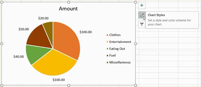
You can change the style and the color scheme for your chart from numerous options.
To access each of the following items, click on the chart, pick Chart Styles, and then make your selection.
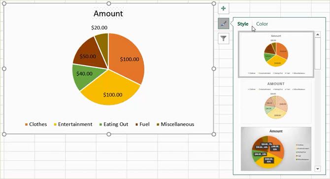
Style
Maybe you would like to add patterns to the slices, change the background color, or have a simple two-tone chart. With Excel, you can pick from 12 different pie chart styles. Run your mouse over each style for a quick preview.
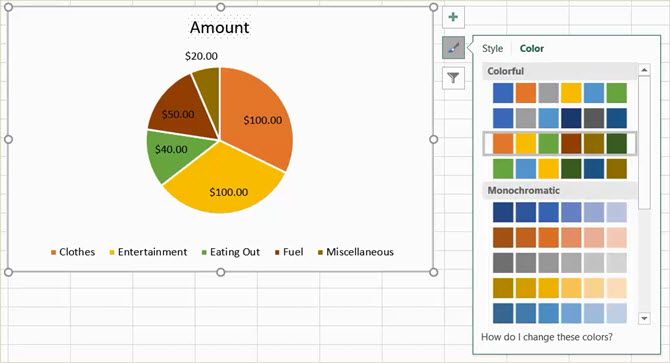
Color
You can also pick from many color schemes for your pie chart. The Chart Style menu displays colorful and monochromatic options in the Color section. Again, use your mouse to see a preview of each one.
Apply a Chart Filter
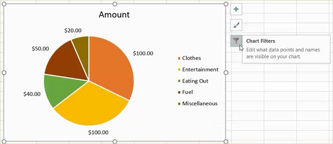
You may run into times where you would like to see only specific pieces of the pie or hide names in the data series. This is when the chart filters come in handy.
To access each of the following options, click on the chart, pick Chart Filters, and then make your selection.
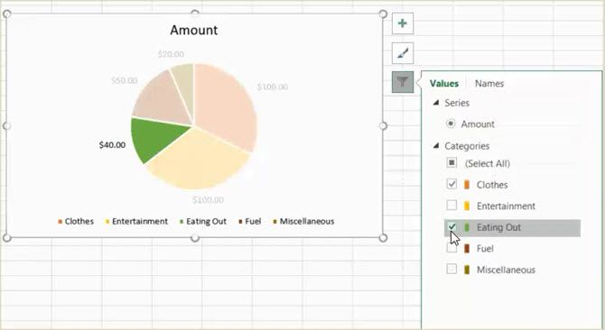
Values
Be sure you are in the Values section and then check or uncheck the boxes for the categories you wish to display. When you finish, click Apply.
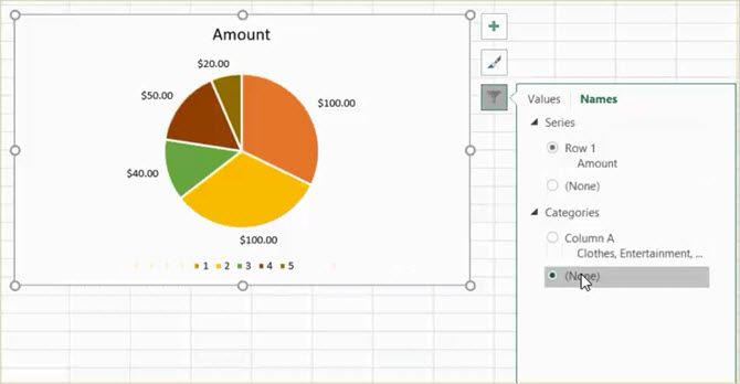
Names
If you would like to change the name display, click on the Names section. Then, mark the radio button for your selections for the series and categories and click Apply when you are done.
Resize, Drag, or Move the Chart
When you create your chart, Excel will size it and pop it into your spreadsheet in an open spot. But, you can resize it, drag it to another place, or move it to another spreadsheet.
Resize the Chart
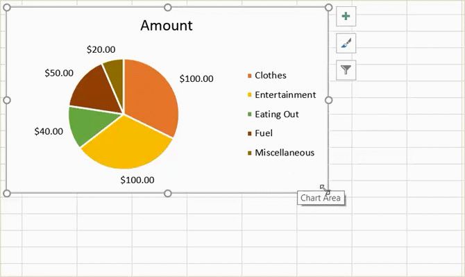
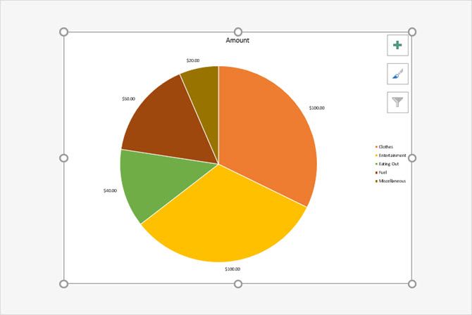
Click on your pie chart and when the circles appear on the border of the chart, you can pull to resize. Be sure that the arrow you see on the circle changes to a two-way arrow.
Drag the Chart
Again, click on your pie chart and with the four-sided arrow that displays, drag it to its new spot on the spreadsheet.
Move the Chart
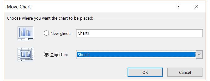
If you would like to move the chart to another spreadsheet, you can do this easily. Right-click on the chart and select Move Chart from the context menu. Then, pick Object in and select your sheet in the pop-up window.
You can also create a new sheet for the chart which will display nicely without spreadsheet rows and columns. Select New sheet and enter a name in the pop-up.
Add the Chart to a Presentation
If you want to include your Excel pie chart in a PowerPoint presentation, this is easily done with the copy and paste action.
Copy the Chart
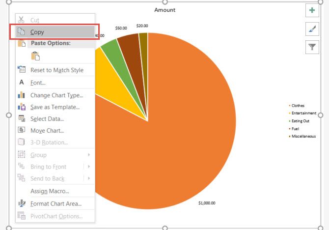
In Excel, select the chart and then either click Copy from the Home tab or right-click and select Copy from the context menu.
Paste the Chart
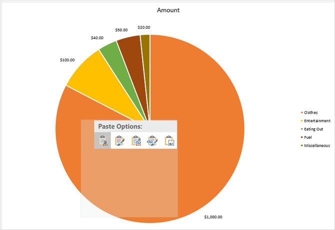
Next, open PowerPoint and navigate to the slide where you want the chart. Click on the slide and either select Paste from the Home tab or right-click and choose Paste from the context menu.
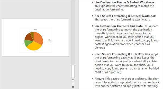
Keep in mind, that you have different pasting options in the Microsoft Office applications. You can paste with the destination or source formatting, each with embedded or linked data. Or simply paste it as a picture.
Are You Ready to Create Your Excel Pie Chart?
The initial creation of a pie chart in Excel is simpler than most probably think. And if you enjoy experimenting with different looks, styles, and colors to match your business, it is very easy. Excel offers a variety of options for you to create a pie chart that suits your needs and preference.
Have you created a pie chart in Excel yet or is this your first time? What is your favorite feature for perfecting your chart? Let us know your thoughts!

