Most Android launchers are relatively similar: Nova, Apex, and friends usually offer what you'd expect: One or more homescreens with some third-party widgets, an app drawer, and app folders. You can also change the wallpaper and customize the icons. Various launchers try to distinguish themselves by supporting screen swipes and other gestures (a Nova feature I use heavily), but at first blush, most are nearly identical. And then there's Chameleon Launcher for Phones [No Longer Available]. This is a bold rethinking of the launcher -- not quite on the order of Facebook Home, but definitely distinguishable from most other launchers. It will also set you back about $3. Being different doesn't mean it's necessarily better, but it does merit a close look, especially given its slick aesthetics.
First, a Video
Before we start dissecting Chameleon and prodding it for weaknesses (of which there are a few), let's give its makers a chance to present it and show what's great about it:
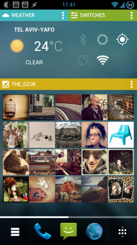
As you can see on the video, Chameleon tries to use every available pixel of screen real-estate by filling everything up with custom rectangular widgets. A homescreen can look like this:
That's very dense, and a bit of an acquired taste. Also making a brief appearance in the video around the 13-second mark is the innovative Contexts feature, which we'll discuss next.
Contexts
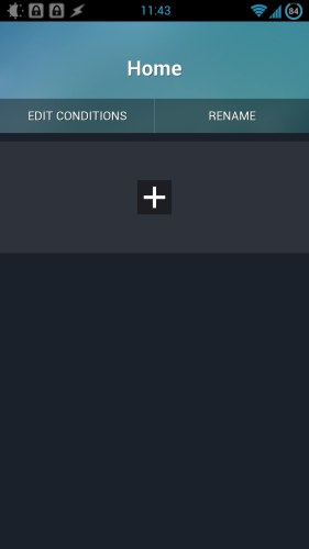
The theory behind this feature is simple and compelling: Different times of day, or different environments, call for different launchers. Your morning commute may call for easy access to the weather, your Twitter feed, and a bunch of news apps like Flipboard. When you're back home trying to unwind in the evening, you may not want a Twitter widget in front of you, preferring instead a list of your favorite games paired with an inspiring Instagram feed. By default, Chameleon ships with just a single context, named Home:
It is easy to rename it and add a new one. This simple screen is a good example of the interface style you'll find throughout Chameleon: It looks at home on Android and blends in well with the angular ICS/Jelly Bean aesthetic, but it's very much its own thing ,too.
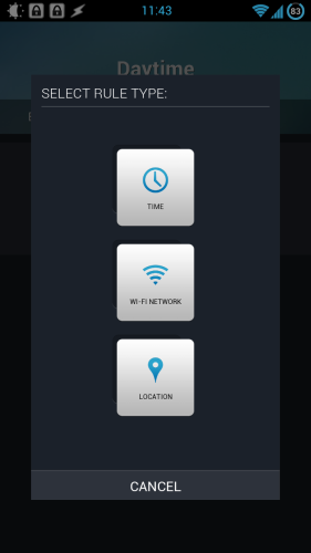
You can switch contexts manually, but Chameleon can also flip to a given context based on the time of day, a Wi-Fi network you're connected to, or a location:
You can also combine more than one condition.
Widgets and Folders
Chameleon's custom widgets make up a large part of the experience. Basically, everything is a widget -- even app icons you put in the screen have to go into an "icon container," which is just a widget:
This consistency makes it easy to create a screen that feels orderly despite being packed full of information.
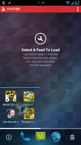
Widgets containing icons can't be scrolled. In other words, the widget you see above can only contain four icons. If you want to load it with more icons, you can either resize it so it takes the full width of the screen (your options are half-width or full-width, nothing in the middle). You can create folders containing multiple icons by dropping one icon on top of another. You have to be careful, though:
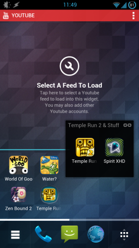
The screenshot above shows me holding the icon for Spirit XHD (the semi-transparent one) between Zen Bound 2 and Temple Run. In that position, dropping the icon just kicked one of the other icons off the grid, replacing it with the Spirit XHD icon. What I really wanted to do was to create a folder, but that requires more careful positioning. Once created, a folder looks like this:
"Temple Run 2 & Stuff" was the name Chameleon automatically assigned for the folder.
Needs Some Work
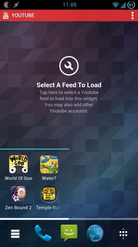
Do you see the empty YouTube widget in the screenshot above? This is not because I was too lazy to configure it:
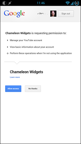
I granted Chameleon Widget with access to my YouTube account repeatedly, but to no avail. The widget remained empty.
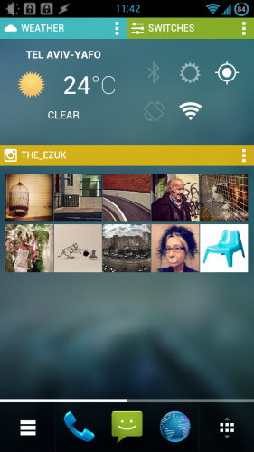
The Instagram widget did work, but would sometimes act up:
Above you see just two rows of images being pulled in from Instagram. This was an occasional issue: At other times, the widget pulled in four rows, correctly filling up all available space.
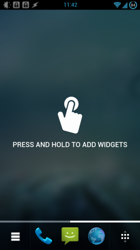
Also, keen-eyed readers may not that the screenshot above has a scrollbar at the bottom: By default, each context contains at least two homescreens. Scroll right, and you get this:
It's an invitation to use the homescreen, which is nice. What isn't as nice is that there is no way to remove that screen, so effectively, you will always have one more screen than you wanted.
Final Thoughts: A Solid Concept Marred By Technical Issues
Chameleon has a lot going for it. By offering intelligent contexts, making everything into a widget, and adhering to a strict grid, it transforms Android in subtle ways. The result looks fresh, but performance and reliability issues plague what could otherwise be a very compelling alternative for the traditional Android launchers out there.
Will you be installing Chameleon, or will you wait for it to become more stable?

