Some people like golfing. Some people enjoy surfing. Still other people are running enthusiasts. And then...there are the data hounds. Those are the people that see opportunity for discovery in every table and spreadsheet filled with seemingly meaningless and unrelated information. Once you play around with data - reorganize, repackage and resort - you can start connecting the dots and extracting clues that lead you to important and useful answers.
That's the beauty of data - something that most people look at and find boring, or overly complex, data-analysts find beautiful and revealing. We've covered a number of useful tools for analyzing data here at MUO, such as Bandalizer for CSV data files, which of course Excel can handle as well. Data analysis lets you do things like niche analysis research, and of course create cool data visualizations.
However, did you know that one of the greatest tools of all to conduct data analysis is actually Google Spreadsheet? The reason for this isn't only because a Google Spreadsheet report can do nearly everything you might want to do with Microsoft Excel (although you can), but it's actually because of a few very cool reporting tools that comes standard in Google Spreadsheet.
In this article, I'm going to show you how to use Pivot Report, graphs and charts in Google Spreadsheet, a few examples of how you can use them to analyze seemingly complex data, and how you can end up with some really awesome charts and graphs in the end.
Using Pivot Reports to Perform Wonders
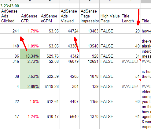
If you've never used pivot reports, then you're in for a real treat. In this example, I'm going to use Adsense data that includes three fields I want to analyze - the number of ads clicked, the number of ads viewed, and the length of my article titles.
What I'm curious to find a correlation for is whether title length of the article affects the number of Adsense ads that are viewed or clicked. It's this kind of seemingly unconnected data that a pivot report can calculate and reveal.
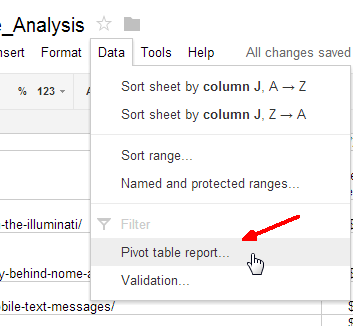
When on the table with that data, just click "Data" in the Google Spreadsheet menu, and select "Pivot table report..." in the drop-down menu.
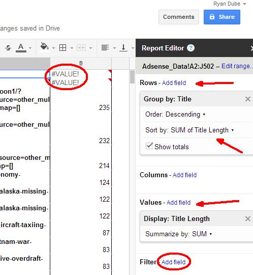
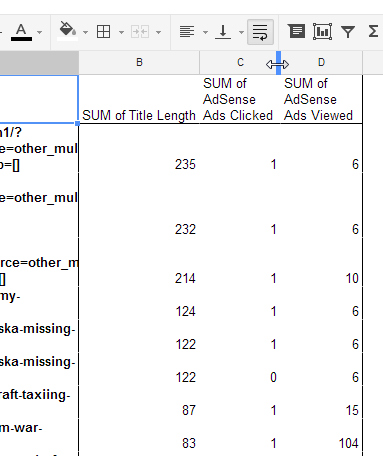
This will open a new sheet where you can start building your new pivot report. A "Report Editor" opens up on the right side of the sheet, which sort of acts like a wizard that guides you through creating your new report. You'll want to start out by adding the rows - the main data that you want to start with. In this case, I want to know if title length impacts ad performance, so the rows in this case would be titles.
Next, you want to add values to the report. As you add new values, it'll fill out the report with those values from the original spreadsheet, except the data is calculated in the way you define it in the report editor. In this case I use "SUM" because each title only has one value anyway. However, now I can sort by the title length under the Title row setting at the top.
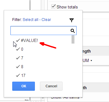
You may notice some "junk" data in your sheet - things like zeros, or fields where there's just no valid data. You can actually tell the pivot report to ignore those bad values by clicking on the "Add field" in the Filter section of the Report Editor. Then you can deselect all of the items that you want the report to ignore.
Now that you've summed and sorted all of the data, things may become much more clear. Suddenly you may see patterns, such as the fact that titles between 60 to 80 characters tend to perform much better for some reason (for example).
These are things that just aren't quite as clear in the messy, chaotic spreadsheet world where the data is unsorted and unfiltered. Pivot reports are extremely flexible, and will let you do other things with each column of data like summarizing by count, average, max or min, standard deviation, and a whole lot more. The power of pivot reports really comes out when you start messing around with the data and watching what amazing things come out of it at the end.
Using Charts and Graphs in Google Spreadsheet
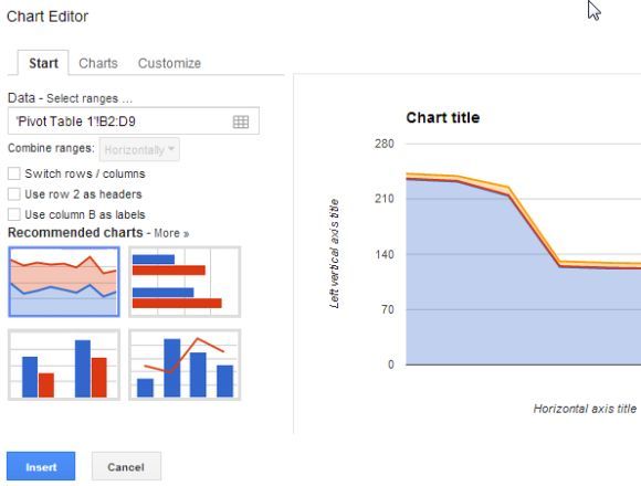
Another good way to analyze data is in a more graphical form. When you've got the data sorted the way you like using a pivot report, it's time to start charting that stuff. Google Spreadsheet comes with a good array of charting tools to help you out. To get to those, just highlight the data that you want to chart, click the "Insert" menu item and choose "Chart" from the list. A chart editor will pop up, with a preview of your data charted in the right pane.
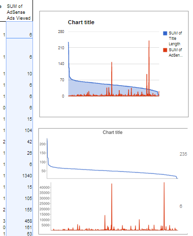
You can run through all of the chart types available to see what offers the best representation of data that you're looking for. There are line charts, bar charts, pie charts, and even some really cool gauges and also map charts that I'm looking forward to playing around with at some point. However, for my purpose here, the area line chart comparison really revealed what I wanted - two hot spot areas that seem to imply better ad performance at two specific title lengths of articles.
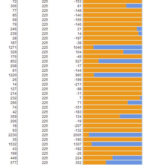
This is pretty interesting stuff, and not something that would be so easily revealed in a table full of raw data. Another cool tool that's available in Google Spreadsheet to graphically display data is a function called "Sparkline". This function actually lets you transform a cell in the spreadsheet into a bar chart. All you have to do is type something like the following into a cell:
"=sparkline(E8:F8, {"charttype","bar"})"
What does this do? Well, basically it lets you chart data right in the cell. In this case I'm comparing the numbers in column E and F and using a bar chart to show the percentages. Column F is represented in blue and E in orange, so with just a glance at your spreadsheet, you can quickly identify where the scales have tipped when comparing data or identifying "alarm" conditions.
These are only a few ideas to make use of Google Spreadsheet to analyze data using powerful tools like pivot reports and the charting tools. Google Spreadsheet is fast becoming (or maybe it already is) a major contender in the data analysis business, and it's accessibility online means that it's also convenient and easy to use no matter where you are.
When you're in a hurry and need to process a lot of information quickly while on the go, that's a huge deal. And the fact that you can simply import data or a CSV file into the first sheet, and all of the pivot reports and charts get created automatically for you -- that's just pure gold dust.
So if you haven't used it yet - I highly suggest giving Google Spreadsheet reports a try to automate your data analysis chores. And if you have been using it for a while but didn't know about these tools - by all means, give them a try. You'll be glad you did.
How do you make use of Google Spreadsheet? What are your favorite tools that you couldn't live without? Share your thoughts and ideas in the comments section below!
Image Credit: Businessman Hand via Shutterstock


