Tap tap, swipe swipe, goes your Android launcher. No matter how "unique" and "alternative" most launchers try to be, they end up looking pretty much the same. And that makes sense, because the basic launcher design just plain works. You've got your home screens, your widgets, and your app drawer -- what more do you need?
While mainstream launchers like Nova emphasize getting those basics polished to a high sheen, newcomers have to find other ways to stand out. So Buzz Launcher tries to do it with eye candy, while Action Launcher Pro [No longer available] goes for unique and interesting interface elements called Shutters and Covers. It also costs $3.73 at the time of this writing, and has no free trial -- so read on to see if it's worth your money.
Getting Started
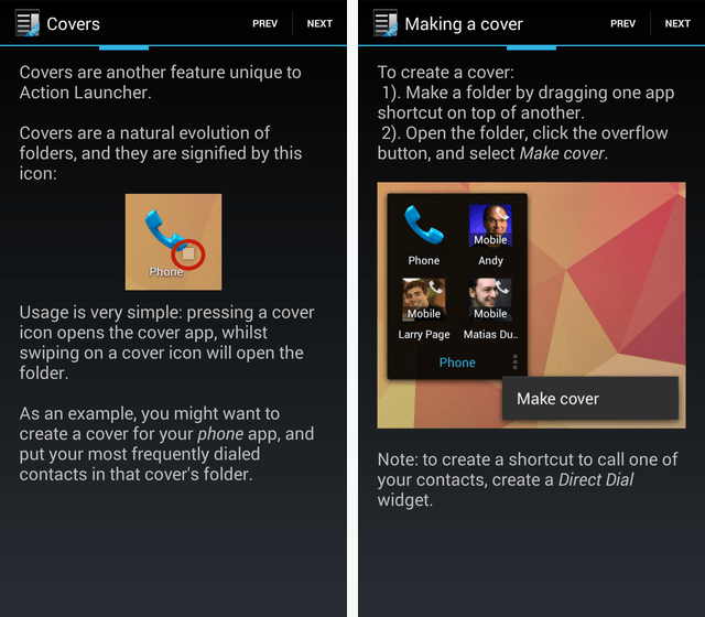
Like many other Android apps, Action Launcher walks you through an onboarding sequence the first time it launches. To me, that's a red light: If your app is so complex to use that you need to walk me through a tutorial, it might be a bit too tricky. The tutorial really is needed here, because of the aforementioned Shutters and Covers. Here's how Action Launcher explains Covers:
Headlining Features: Covers and Shutters
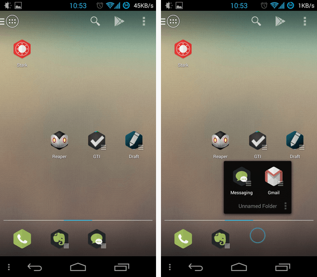
Covers are a hybrid of folders and shortcuts: Tap, and you launch the main app. Swipe, and a folder pops open. Neat. Here's what it looks like in action:
Were I to just tap the Messaging icon (on the left screenshot), it would pop open the Messaging app; but since I swiped up, it opened a folder.
This is a cool concept, but it's lacking some much-needed polish: For one thing, there is no way to hide the annoying icon overlay in the bottom-right corner -- the little square that signifies this is a Cover. After all, I made this Cover, so I probably remember what it is. This is also a pretty shaky feature to differentiate your browser on: Nova Launcher could probably match it with just a few lines of code, since it already supports gestures for icons.
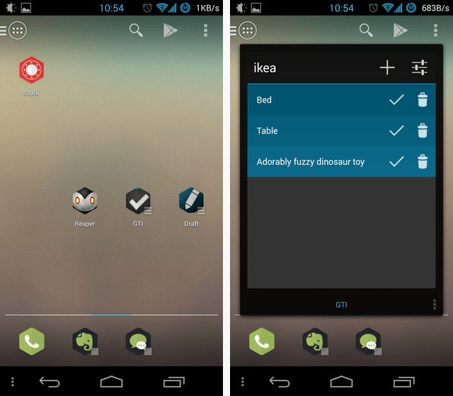
The next notable feature is called Shutters, and it's a bit more interesting:
What you're looking at here is basically an "instant widget". I swiped the icon for GTI, and bam, a widget showed up. So the widget is very accessible, but it doesn't have to clutter up your home screen. A neat feature which works well in practice.
Sadly, just like Covers, there is no way to switch off the annoying overlay on icons that have Shutters (those three lines at the bottom-right corner of the icon). The whole point of the Shutters feature is to let you create a beautifully minimalistic homescreen with no widgets to clutter it up -- but those overlays are just that, clutter.
In other respects, Action Launcher Pro is actually less customizable than Nova. For example, Nova lets you assign icons to folders, while Action Launcher Pro does not.
The App Drawer
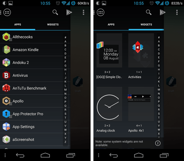
Shutters and Covers are not the only innovations Action Launcher Pro brings to the table. It also does away with the traditional app drawer, replacing it with a vertically-scrolling sidebar:
This is a controversial thing to do. For one, you lose the ability to have folders in your app drawer. Where Nova lets you create folders and even secondary tabs to help you group your many apps, Action Launcher Pro gives you just one long, long list (with hundreds of apps, in my case). Yes, you can quick-scroll using the right gutter (with the ABC on it), but it's still far less efficient than having folders.
Another problem with this interface element is that it can easily clash with increasingly popular sidebar apps like SwipePad or Sidebar Pro, because it activates when you swipe in from the left side of the screen. There's also a dedicated button to trigger it, though, on the top-left corner.
Settings
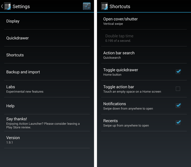
Action Launcher Pro doesn't try to overwhelm with settings, opting for a fairly concise Settings menu:
You get to pick the gesture that triggers covers and shutters, for example. The menu is useful mainly as a launching point for future customization: We can hope future versions of Action Launcher Pro would offer further customizations, and the menu's sensible structure should make them easy to spot and use.
Are We There Yet?
Nope, I'm afraid not. Action Launcher Pro still has quite a ways to go before it can truly challenge incumbents such as Nova and ADW. Offering your launcher in a paid-only version is a bold choice, especially since it is so difficult to evaluate a launcher in just 15 minutes (which is how long Google gives you to request a refund). As it stands, I'd be hard pressed to say that Action Launcher Pro is worth the money. If it ever lets you toggle the overlay icons for Shutters and Covers, implements folder icons, and does away with the sidebar in favor of a more standard app drawer, it could offer a truly viable alternative.
What do you guys think? Is Action Launcher Pro interesting? What do you even think about the whole idea of paid-only launchers, with so many free ones out there? Let me know in the comments.
Image Credits: Via PlaceIt

