<firstimage="https://www.makeuseof.com/wp-content/uploads/2011/02/Twitter.jpg" />
There's a lot of noise on Twitter. People use a variety of ways to filter through that noise, from following specific lists, finding like-minded people through third party sites, or using a variety of services and websites to find the information that matters to them on Twitter.
Another interesting way to filter through what is being said on Twitter, and better yet, analyse it, is to visualize it. This is certainly not a new idea, and we've written about some services in the past that will allow you to do just that. With the world around Twitter constantly growing and developing, it's no surprise that since then there are a ton more services allowing you to visualize your followers, Twitter stream and your own personal Twitter stats.
Portwiture
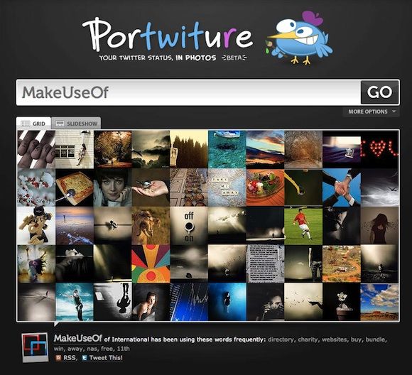
Portwiture is definitely one of the more unique visual Twitter apps that you'll find. Rather than tag clouds or graphs, Portwiture allows you to visualize your tweets in photographs.
Portwiture matches the content of your tweets to photographs that have been uploaded to Flickr. It may not necessarily be the most accurate of services, but is certainly an interesting experiment in combining online social services. Results can be viewed either as a grid or a slideshow.
Cloud.li
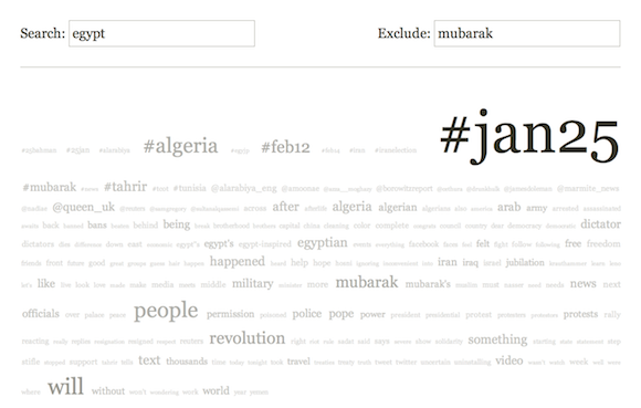
Cloud.li is a Twitter search engine which delivers results as a tag cloud. You can search for specific terms, while also excluding others.
Realtime results are constantly updated, with words associated with your search term, as well as Twitter usernames that are associated with the search term. Clicking on any given tag will open up a new cloud.
Tori's Eye
Tori's Eye is another unique experiment in visualizing Twitter search results.
It might not be the most practical way to search for information on Twitter, but it certainly is one of the prettiest. Search results take on the form of origami birds, and clicking on, or hovering over, any given bird will display the related tweet. All links and hashtags in the tweet are clickable.
TweetStats
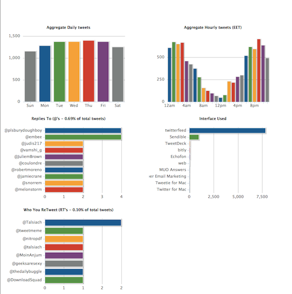
If you want to visualize your own personal use of Twitter rather than what's being said on Twitter, one of the best services for that is TweetStats.
Not only can you look up your own stats, but those of any Twitter user. Information that is displayed includes graphs of your Twitter clients, who you retweet and speak to the most, and how often you tweet, amongst others. Depending on how active you are on Twitter, it can take a while for the results to load, so you'll have to be patient.
Trendistic
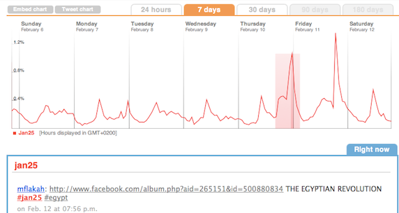
If you want to visualize trends or any search term for that matter, [NO LONGER WORKS] Trendistic is a site that graphs the movement of any given term on Twitter, showing when it peaks and falls.
The time frame in which the term has been tweeted can be anywhere from 24 hours to 180 days. While Trendistic is a free service, you do have to sign up to gain access to certain features, including the 90 and 180 day graphs. The graph is also accompanied by the latest tweets that contain the search term.
TwitterMap
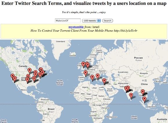
Because Twitter is literally accessed from all four corners of the world, it's interesting to see the locations from which a certain term is tweeted.
TwitterMap is probably the most straightforward way you can do this. Simply search for any given term, and the tweets will start to show up on the map. Hovering over the marker displays the tweet above the map, and clicking on the marker displays it on the map. You can search for a total of 10 to 500 tweets. It is disappointing, however, that links and Twitter usernames are not clickable.
5K Twitter Browser
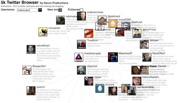
Twitter finally has a native feature in which you can see which Twitter users you and any given person have in common, but that said, 5K Twitter Browser is a great way to visualize those connections.
Search for a Twitter username, and you will see the latest users they have followed. Double click on any given user, and the network will expand showing their latest friends, and the connections between them. It can get a bit confusing if you open the network of too many users, but nonetheless, it's an interesting experiment.
TwitterSheep
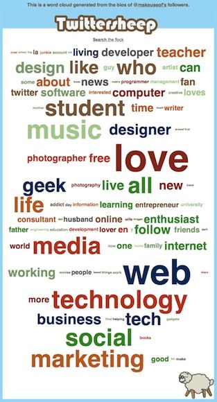
If you're curious about who your followers are, [NO LONGER WORKS] TwitterSheep gives you an easy way to visualize just that.
The website displays a tag cloud of words used in the bios of your friends. The more often a word appears, the larger it is.
Have we left out any of your favourite tools? Let us know about them in the comments.


