Contrary to popular belief, I'm not a Apple fanboy. I don't think I need to make excuses for advocating Apple as I have been known to do on occasion, but regardless, even us so-called 'fanboys' detest some of the nonsense that Apple comes up with.
Here's 4 user interface elements from OSX that really irk me.
Close Buttons - That Don't Actually Close
I really couldn't care less if the Apple operating system paradigm dictates that applications can be running without a window - it's ridiculous. When I click the close button, I want you to close - quit, be gone, vanish, cease to be running, and void your memory usage. If the app has multiple windows, it should be plainly obviously that after closing the last one, I'm done with the app. I don't want it sitting in my dock.
To this day, I end up with hundreds of apps sitting there redundant. I may have 12GB of memory, but that doesn't mean I don't care about conserving it when I can. Sure I could remember the simple CMD-Q keyboard shortcut, but why put that red button there at all? Red means STOP. Deal with it, Apple.
The Green Maximise Button
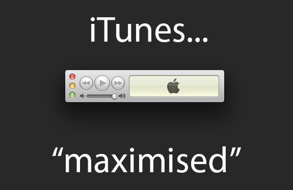
There is pretty much zero consistency as to what this button actually does, even within Apple's own apps. In Safari, it maximises the browser window vertically, making it fill the full height of the screen, but not touching the horizontal width. In Garageband, it maximises both vertically and horizontally, kind of how I might expect it to. In iTunes, the maximise button actually minimises the window into the tiny little mini-player thing.
What on earth is going on there, Apple?!
Non-Standard Button Positions
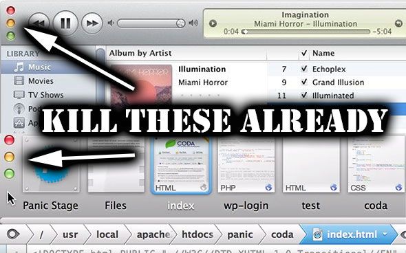
In the initial release of iTunes 10, the standard window controls were moved so they were positioned vertically rather than horizontally. Admittedly, this has been fixed now, but still some developers, such as Panic in their latest Coda release, chose to use the style. What's wrong with you? Do you think flying in the face of convention makes your app cool? It doesn't.
Launchpad
The latest absurd trend in computing - now present in Ubuntu's Unity GUI, Windows 8 Metro UI, and OSX - is the dreaded wall of icons. If I'm completely honest, I'd say this is a pretty bad way of browsing apps on iOS too, but I don't use nearly as many iPad apps as I do OSX apps, so the problem is somewhat mitigated.
On my iOS devices, I keep my most used apps in folders on the taskbar; everything else, I just search for. My 27" iMac allows for a lot in the taskbar too, but I only use it for apps with names I can't remember. That, and it just fills with stuff I forget to close properly because the damned red X doesn't do what it should do. This is your fault, Apple:
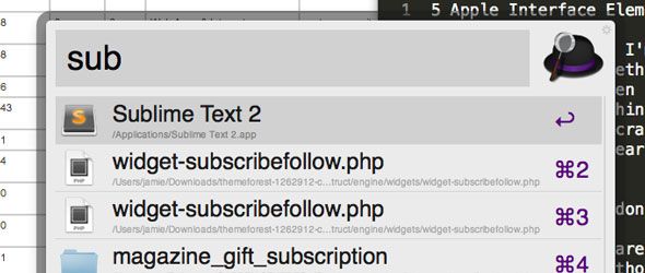
Faced with that, I simply invoke my favourite spotlight-style single search interface - Alfred - and type in the name, or even just the first few letters, of the app I want or a file I need to open directly for editing. Not once have I ventured into the LaunchPad other than to ask myself "WT* is this?".
So you see, even a so-called Apple fanboy is able to see faults in Apple products; they're far from perfect.
Perhaps we could stay away from abusive comments this time, eh? Let's think about how to move things on, instead. How would you fix these OSX faults? What would your ultimate interface be?


