The invention of fire and the wheel – nice. But from the first cave paintings to the beginnings of logographs, and then of course the alphabet, human achievement has been tied closely with how we put our thoughts across. Come to think of it, we are still learning how to communicate. Twitter and Facebook are bringing in subtle lifestyle changes that future sociologists will put under the lens.
The Wikipedia page captures the history of this visual science (or art) and tells us that infographics is by no means an invention of the digital culture. The only difference between then and now is the amount of information we are swamped with. Infographics gives us a tool to cut through the noise and into the meat. Patterns, trends, and relationships become a bit more understandable. Angela’s 10 Awesome Free Tools To Make Infographics gives you the gist of what infographics means when it comes to information design for anything from a business to a classroom and even for job hunts. She points you also to ten of the simpler tools that help you design some.
But if you need more of a leg up, here are ten more tools that will help you get the visual message across with eyeball catching infographics.
Visual.ly
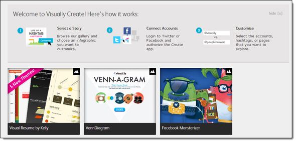
Visual.ly usually makes the top of any list that talk about infographic creation tools. It makes this one too. It is a community…of more than 35,000 designers who love visualizing data. When you land here, you can treat it as a showcase of the best the data visualization world has to offer. But beyond the welcome mat, the site has the free tools to offer if you are interested in creating an infographic. You can also upload your own to Visual.ly after a free sign-up.
The Process:
Sign in and grant access using either your Twitter account or Facebook account. Visually Create has pre-made templates which you can start with and customize with your information. The nice thing about Visually Create is that you don’t have to know any graphic designing or even come armed with analytical skills to use Visual.ly. It gives you a shortcut with its templates, even though they are limited in number.
Noteworthy:
Visual.ly is a showcase of creative designs. You can embed them in your blogs and forums without restriction. As the site itself says, it is all about visual communication. The Visual.ly blog is also a worthy read if you are interested in the cutting edge of image facilitation.
Easel.ly
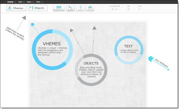
My friend Bakari took a comprehensive look when he showed us how to create your own infographic using Easel.ly. So, I will just give the highlights here. Easel.ly is still in beta and still free. Hopefully it will stay free as it is one of the few around that let you create an infographic from scratch.
The Process:
Easel.ly gives you pre-designed themes (or templates) called vhemes to drag and drop into the blank canvas. You can customize the infographic with objects, shapes, and text. Image uploads helps to bring in locally saved artwork too. Infographics are saved on the site, and shared from there.
Noteworthy:
Drag and drop, twenty different font styles, and a grid for precise placements are the features I liked. Plus, you can use any public visual on the site as a template for your own infographic. Absence of a download feature could be a minor limitation though.
Many Eyes
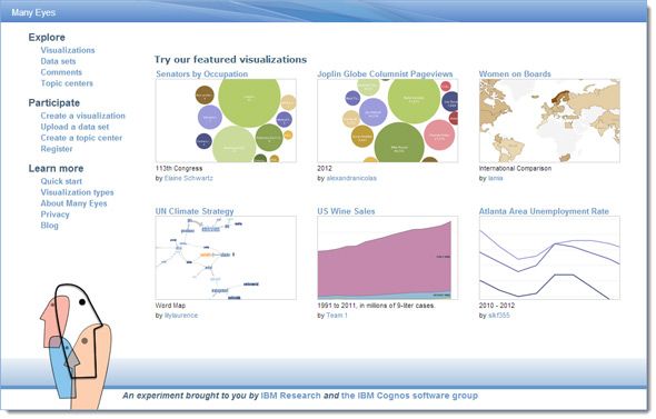
Many Eyes is a data visualization tool created by IBM. It is experimental, but still quite useful as many of the visualizations have discussion boards around them. You can comment and discuss any visualization. Plus, you can select any data on the visualization and link to it in your discussions. Many Eyes is also flexible if you want to create your own visualizations.
The Process:
Use the data sets on the site or upload your own. Many chart types are available to fit in the data, from scatter plots and matrix charts to word and tag clouds. The variety allows you to display structured and unstructured data.
Noteworthy:
Many Eyes lets users create Topic Centers which are like small portals where you can collect all visualizations and data sets that are related to your theme. You can start a discussion around the topic.
Infogr.am
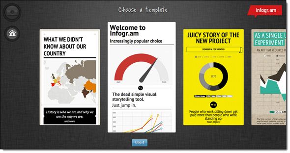
Infogr.am is one of the speediest tools you can use to create infographics. It also follows the template to customization model. If numbers are anything to go by, the tool has garnered nearly 400,000 infographics in just a year’s time. It is certainly one of the easiest to use as the only thing you need to start off with is the data. Infogr.am claims that you can publish and embed your first work within minutes of signing up with Facebook or Twitter. You can store all your created works in a library.
The Process:
Use the WYSIWYG editor to pick a theme and fill it up with data. One of the coolest things about Infogr.am is its design richness and the interactive charts you can create without getting hit with complications. For instance, if you are someone who finds the Google Chart Tools to be complex, give Infogr.am a try.
Noteworthy:
The drag and drop interface coupled with the Excel like grid for entering statistical data is user-friendly. You can also upload MS Excel or CSV files and edit it in the Excel compatible page. Interactivity is supported and also aided by videos from Vimeo and YouTube. The Online Charts tool helps you make an interactive chart in minutes.
Dipity
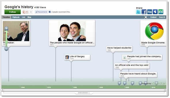
With Dipity, we move away from the usual infographic creation sites and look at a more specialized one. If you want to place your data according to the sequence of time (anything between 9999 BC to 9999 AD), then this is the one for you. Dipity is a free digital timeline website. It has a feature enriched Premium account too.
The Process:
You can manually create an event, adding a title, date, description, picture, link, location and video. Data can be pulled in from various online services like Flickr, Twitter, YouTube, Vimeo, Tumblr, WordPress, Blogger, Pandora, Last.fm, Friendfeed, Yelp, Digg or any RSS feed you choose to include. Nancy has talked a little more about it while showing how you can create a timeline for free.
Noteworthy:
Dipity can be a useful tool to create mashups using the many information sources it supports. One of the more useful ones is to watch YouTube videos on a timeline.
Also: If you are looking for another timeline tool, look at Timeline JS which also supports Twitter, Flickr, Google Maps, YouTube, Vimeo, Dailymotion, Wikipedia, SoundCloud and more for pulling in data.
GeoCommons
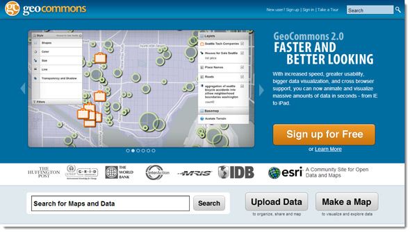
From timelines we jump on to visually representing information on maps. GeoCommons GeoCommons is a free online mapping application and a public community that can help you to find, use and share geographic data and maps. You can create rich interactive visualizations to put everything on a map and thus seek answers using traditional mapping tools. No experience required.
The Process:
In contrast to other GIS tools, GeoCommons is relatively easy to use. The whole process is a bit too detailed to recreate here, but making a map is quick and easy from a choice of base maps.
Noteworthy:
You can download a KML file of your saved map or any other map in GeoCommons. KML files can be used with 3D visualization options like Google Earth.
ChartsBin
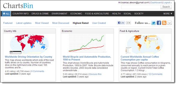
On first appearances, ChartsBin looks like a huge, well categorized repository of visualizations from around the web. But if you want to create interactive infographics of your own, then just register and wade in. The map based visualization tool (VizBuilder) has a shallow learning curve and you can go about creating infographics with your own data without any pre-requisite skills.
The Process:
ChartsBin says using the VizBuilder is a quick 2-minute process. You just need to upload your dataset and then visualize the interactive (or static) map. Currently, the tool only supports map-based visualizations. You can choose from different maps according to world regions to fit in the type of visualization you want. You can manually create your own interactive map. This video tutorial shows how to create an interactive map.
Noteworthy:
You can search for map visualizations based on categories and tags. ChartsBin supports most of the map projections like Bonne, Cylindrical Equal Area, Gall-Peters, Mercator, and Miller Cylindrical etc. The site seems slightly latent for the past year or so as far as I could make out from the latest updates on the site. But the visualization tool works just fine.
Google Chart Tools
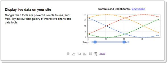
Like most of Google tools, it is free, versatile, and powerful. You can choose from a variety of charts – from the common pie charts to the relatively uncommon candlestick chart. Charts are also fully interactive and you can connect it to real-time data. Google also has Image Charts which are static.
The Process:
Charts are JavaScript files and can be customized with complex event handlers and APIs. The Dashboard allows you to manage multiple charts that share data and make them interactive with widgets (sliders, category pickers etc.).
Noteworthy:
The Google Charts forum (Google Groups) is the place to get all your queries answered on using the Google Visualization APIs and the chart tools.
Software: Tableau Public
http://youtu.be/ZJlbN-jluz0
Tableau Public is a free download if you are looking for a desktop tool to create rich infographics and data visualizations and embed them on the web. It is Windows only and a 51MB download.
The Process:
The above video gives you an overview of the process. Basically, the workflow is to upload your data, choose the type of visualization, and finalize it all. Check out the 10 training videos which come with sample data.
Noteworthy:
All datasets and visualizations are uploaded to the Tableau Public servers. It is not saved locally. All data is available to the wider community. So, do remember to use data that can be shared publicly.
And If You Decide To Go Manual…
If you fancy yourself on tools like Adobe Photoshop and Illustrator, you can get down and dirty to create your own infographics. Allow me to recommend the following links:
- The Do’s and Don’ts of Infographic Design – A Smashing Magazine article.
- How To Create Outstanding Modern Infographics – a nice tutorial with Adobe Illustrator as the weapon of choice.
- Vector Infographic Kit for some reusable resources to cut short your design time. The free 3.5 MB file has about 50 infographic components. Do attribute the source files.
It is very easy to admire an infographic and absorb the information. But to dismiss the visualization of information would be belittling this creative form of information presentation. Creating an infographic is hard work. Hopefully these ten tools would save you a few buckets of sweat. Have you ever tried your hand at visual learning with an infographic? Do you have your own tools to recommend? Fire away!
Image Credit: Wikimedia Commons


