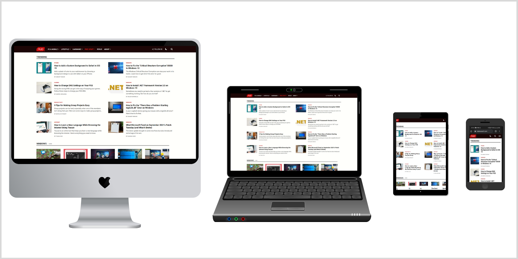
Nowadays, it’s common practice to build a website or app that adjusts its user interface depending upon the browser or the device. There are two approaches to achieve this goal. The first involves creating different versions of your website or app for different devices. But it’s inefficient and can lead to unpredictable errors.
In a search for a reliable, future-proof approach, the responsive — or adaptive — design was coined. It focuses on building a single version of your layout that adapts to different browsers or devices automatically.
In this article, we’ll learn about responsive web design and the fundamental principles that will help you make an awesome website.
Responsive Web Design Ingredients
Responsive web design is not as complicated as it sounds. It’s a set of practices that you can use when writing CSS, not a separate technology that you’ll have to learn from scratch. You might already be following several of these principles without realizing it. You can understand responsive web design by exploring its four ingredients: fluid layouts, responsive units, flexible images, and media queries.
Fluid Layouts
With a fluid layout, you can create web pages that adapt to the current viewport width and height. Common practice includes using the max-width property instead of giving a fixed width to an element. Also, using percentage (%), viewport height (vh), or viewport width (vw) helps improve adaptability that is not possible with pixels (px). So, next time you’re building a layout, make sure to introduce these small changes and start benefitting from responsive design techniques.
Responsive Units
As you move to more advanced CSS, you’ll often see the use of rem and em units for length instead of px units. This is because the rem unit makes it super easy to scale the entire layout. By default, 1rem equals 16px because it's proportional to the <html> element's font size, typically 16px. However, you can set 1rem equal to 10px (or any other value) for easier calculations, by adjusting the top-level font size.
Flexible Images
Images are a prime concern while designing even the most basic layout. You always have to take care to size them properly so that they fit the design. Also, by default, they don’t scale with changes in the viewport. So, you should use % for the dimensions of your images, along with the max-width property.
Media Queries
You can bring responsive sites to life by using media queries. Fluid grids are good to start with, but you’ll find that there are a few points where the layout starts to break down. Adding breakpoints for these viewport widths tunes the layout for different devices. Media queries help you to selectively apply CSS based on the results of media feature tests. You can explore new CSS features to make a responsive website in less time.
Responsive Web Design Principles
Though responsive web design is a savior when it comes to multi-screen problems, you may not have a fixed physical constraint to refer to. Therefore, there are six basic responsive web design principles to get started with when designing a responsive layout.
Use Content-Based Breakpoints
One of the fundamental design principles states that your website design should support the content, not the other way around. Media content such as videos, photographs, and text content like long and short web copy should be optimally rendered on all screens. The key to responsive web design is to use content-based breakpoints rather than device-based ones.
Choose Web Fonts and System Fonts Wisely
Web fonts look stunning! You have numerous options to modify your design with cool-looking web fonts. But you should know that browsers will need to download each web font. More web fonts, more download time. In contrast, system fonts are lightning-fast. If the user does not have a named system font on their local device, it will fall back to the next font in the font-family stack. Therefore, make sure to consider load time and design demand when choosing fonts.
Optimize Bitmap Images and Vectors
Do you have different icons on your website, supporting the content? It’s often good practice to use a bitmap format if your icons have a lot of detail. On the other hand, vector formats are the way to go for icons that scale up and down nicely. Vectors are often tiny, but the downside is that some older browsers may not support them. Also, there are cases when vectors are heavier than bitmaps, such as when the image is very detailed. Therefore, always ensure that you are optimizing your bitmap images and vectors before they go online.
Conduct Tests for Responsive First Fold
The first fold of a website is the view that visitors see when it first loads, before any scrolling. It often includes a hero section with a responsive navigation bar, introductory copy and media, and a CTA. Responsiveness isn’t merely limited to mobile devices. You should consider tablets, gaming consoles, and other screens too. So, the key is to conduct frequent tests at least for the first fold view of the website. You can use Chrome DevTools (Lighthouse) to test the web page quality.
Don’t Hide Content on Smaller Screens
Many people used to assume that mobile users are always in a rush, looking for bite-sized information, while desktop users are more into long-form content. We now recognize that this isn’t true in today’s world. People are using mobile devices everywhere, looking for complete content and full access to all services. You should ensure that, instead of hiding content, you are managing the layout and breakpoints to present it as easily and effortlessly as possible.
Manage the Layout Using Nested Objects
Building a site layout and positioning elements correctly takes a decent amount of effort. You may also have experienced difficulty in managing a lot of elements that are dependent on each other. Therefore, you should consider wrapping related elements in a container or <section>. This helps to reduce the task of laying out several elements to one in which you're laying out just a single element.
Responsive Design: Should You Go With Desktop First or Mobile First?
The desktop first approach means you’ll write CSS for large screens and then apply media queries to shrink the design for smaller screens. In contrast, the mobile first approach involves writing CSS for mobile devices, with smaller screens, and then applying media queries to expand the design for larger screens. The prime focus is to reduce the website and the apps to the absolute essentials.
If you are just starting out with responsive web development then you should go for the desktop-first approach as at the end of the day, you’ll have to stack the container one upon another on mobile devices. Although it is completely a personal decision, the mobile first approach helps you in structuring the HTML in a better way while the desktop-first approach will help you with layout and spacing techniques.


